Ecommerce Product Pages That Wow And Convert
Getting traffic to your eCommerce product pages takes time, effort, and no small amount of financial investment. Optimizing every preceding step of your sales funnel is virtually pointless if the product page doesn’t do its job: convert a visitor’s interest into action.

In case I’m not making my point clear enough, phoning it in here will hurt your bottom line. Don’t assume the interest you’ve drummed up in your marketing material is enough to guarantee a sale. Your product page has to engage. It has to generate trust. Most importantly, it has to SELL.
Read on for some actionable strategies for creating eCommerce product pages, and have a look at the perfect product page examples that play a material role in boosting your conversion rate.
1. Show Only What’s Necessary on eCommerce Product Pages
This rule applies to the entire product page, but it is doubly essential above the scroll line. You have limited time to communicate with your visitors, and the last thing you want is for them to be distracted by UI elements that don’t play a direct role in enticing action.
Sure, a decade’s research may have gone into product development. Your design team might have a combined total of four PhDs, and perhaps the company has been in your family for five generations. While these messages may speak to your overall credibility, they do little to drive immediate action on your visitors’ part. It’s more likely to distract them from content you want them to see.
You have the width of a laptop screen at your disposal. Don’t feel obliged to fill all of that real estate with information. Embrace negative space to draw attention to crucial visual and informational elements.
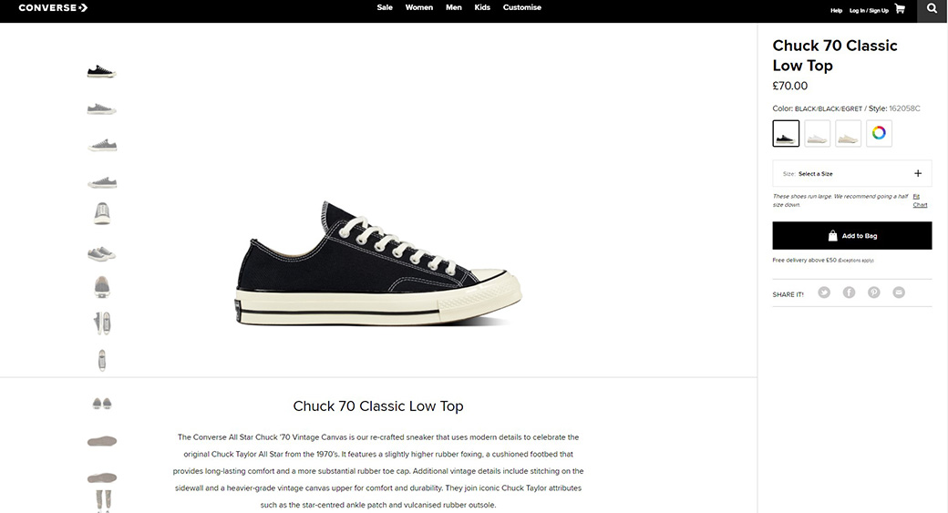
Converse shows us how to do this on their product pages. Cashing in on their sneakers’ iconic visual appeal, they offer almost nothing but an interactive gallery, price, and CTA above the scroll line. The product description is placed further down the page and is limited to 80 words. This is minimalist selling done right.
2. Keep Descriptive Copy Focused on Value
While a minimalist approach may work for brands that can afford to let their reputation do the heavy lifting, lesser-known companies may need to elaborate on what makes their product valuable. In this context, I will oversimplify the concept of value and define it only as “reasons why the potential customer needs your product.”
These reasons can be diverse. They don’t necessarily relate to a practical, functional purpose. Filling an emotional need is equally valuable. Ultimately, it comes down to understanding how your product’s unique selling point (USP) overlaps with your target market’s needs and how to speak their language when doing the selling.
Understanding Who You’re Selling to
Build buyer personas. There is no shortcut to getting into your audience’s heads and hearts. You will understand their needs and motivations once you’ve fleshed out the characters you’re trying to reach. This knowledge informs the content and tone of your product’s value propositions.
Ban.do is a terrific example of a product page that describes its products creatively without compromising details. Each product’s description is relatively text-intensive – usually around 100 words. But the tone is playful, and the content is meaningful – in short, there’s a perfect balance between being informative and engaging.

Sell Solutions
Establishing an appropriate tone is not the only reason why understanding your target audience is essential to creating buyer personas. When you know who you’re selling to, you also understand the problems your product will solve for them. This is arguably the most important thing to know when writing sales copy for your product page.
Every point you make via text has to speak to some need or pain point your audience is experiencing. Sometimes, this is done by addressing the need directly; other times, you can be a little more subtle by simply listing key features.
The Ban.do example from above does this elegantly in their “Details” section. Bullet points (no longer than five words) summarize meaningful product specifics that speak directly to a practical need the shopper is likely to have.
Solution-focused copywriting creates credibility and promotes action. Always keep this in mind when you populate your eCommerce product pages.
3. Showcase Your Product in Its Best Light
No, I’m not only talking about image quality here. You shouldn’t be uploading product photos that are overly compressed or poorly cropped. It goes without saying that a great product page includes a gallery of high-resolution images showing the entire product and strategic close-ups.
There’s more to these basic rules when showcasing your product, though. Let’s look at visual strategies that go further than the fundamental guidelines.
Take Custom Images
Hire a photographer and take various custom images with a consistent visual feel. You’re buying a ton of credibility for your brand when your gallery comprises unique visuals you didn’t source from the manufacturer.
Show Everything the Product Has to Offer
If you’re selling a backpack, show each and every compartment. Likewise, show screenshots of various levels and environments when selling a computer game. If you’re selling headphones, show how they can be folded and stored in the accompanying case. You get my point. Consider how your product can be perceived visually and offer as many views as possible.
Give Context on eCommerce Product Pages
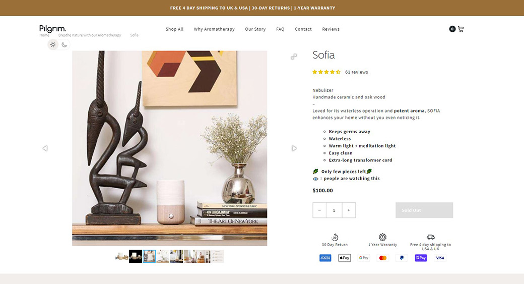
Show your product in use. This will help you showcase the features and more importantly, help the viewer connect with it. It’s easier to imagine yourself holding a particular handbag when you see a photograph of someone else walking down the street with it slung over their shoulder. Pilgrim Aromatherapy does a fantastic job of showcasing its products in various environments.
Let the Visitor Interact with Your Gallery on eCommerce Product Pages
Most eCommerce platforms have features allowing gallery interaction built into their core functionality. Finding interactivity-extensions also won’t be much of a problem. The basic things customers expect are:
- a zoom function that magnifies a section of the main image when they click or hover
- swapping the color or style of the product by clicking on a swatch selector
One of the best examples I’ve found showcasing these features is at Bellroy.com.

4. Make Use of Video
It’s not uncommon to see a moving image showcasing the product. In fact, the Bellroy example from above leads with a video in their gallery.
However, I’m specifically addressing this medium outside the “Gallery” section because its use extends so far beyond merely showcasing the product’s visual appeal.
LFA Capsule Fillers shows us how to add exceptional value to video content on their “Empty Capsules” product page. They don’t just highlight the different options available to the customer; instead, they delve deep into the technical aspects of the production and applications.
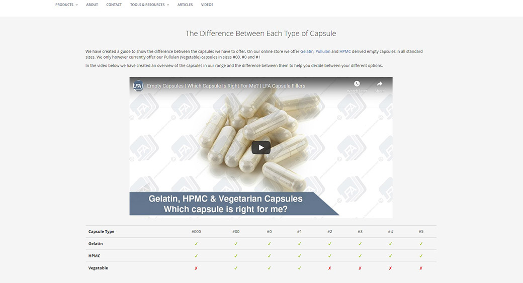
The production quality is of a high standard. The script is sales-oriented without being bombastic. There’s a great balance between pitching the product while also being highly informative.
Video is becoming an increasingly popular medium on eCommerce sites, and it’s not hard to see why. A recent study by Tipping Point Labs revealed that shoppers are between 64 and 85 percent more likely to complete a purchase after watching an explainer video.
5. Provide Live Assistance on eCommerce Product Pages
Some customers need to build a little extra trust before going through with an online transaction. This applies specifically to first-time customers or those new to online shopping. For many of these visitors, being able to interact with a real human – asking questions about product options, payment processes, warranties, and shipping options – is hugely comforting.
Sure, they can click around to your site’s FAQ section, but do you really want them to navigate away from the page where conversion is triggered? According to Forrester, half of the adult online shoppers will abandon a purchase if they can’t find a quick answer to their question. This is an incredibly valuable statistic to bear in mind when thinking about pre-sales support.
Implementing a live chat feature is incredibly easy, affordable, and it could inspire a significant boost in your conversion rate.
Further statistics on this topic abound:
- Anderson Consulting found that 62% of online shoppers would buy more products if live chat was available.
- Anderson’s research also states that live customer support reduces shopping cart abandonment by 30%.
- Customers who use the live chat feature also spend 60% more than those who don’t, says Invespcro.
- Invespcro also found that customers are 2.8 times more likely to go through with a purchase if they’ve had a satisfying interaction with a support agent.
We can see a great example of a site that’s done this elegantly and successfully in Scottevest. Not only does this travel clothing company support customer queries with live chat, but they also proactively reach out to site visitors, asking whether they can be of assistance.
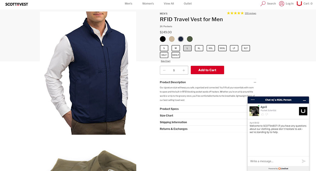
In the words of the company’s founder, Scott Jordan: “The costs are so insignificant that it would be impossible to believe that it wouldn’t pay for itself. It allows our customer service people to multitask. You can be only on one phone call at a time, you can be on two live chats at a time. There is no way that it does not pay for itself.”
6. Provide Credible Social Proof
By now, most eCommerce sites understand the importance of showing that a potential shopper won’t be the first to buy a specific product. There’s no shortage of information and statistics supporting the implementation of various forms of social proof.
From star ratings and customer reviews to testimonials and celebrity endorsements, online shoppers love to have their choices validated by peers and influencers.
One website that implemented social proof in a unique and intuitive way is Glossier. Clearly understanding the importance of social proof, this online beauty store places their customer reviews front-and-center on their eCommerce product pages.

Unlike many of their competitors, reviews (with star ratings) are integrated into the UI element ordinarily reserved only for product descriptions and specifics. This shines a very bright light on the product’s popularity, as well as the reasons for it.
Site visitors also have the option to click through to a dedicated review section, where customer feedback can be searched and filtered based on several different criteria. Simply by providing these features, Glossier positions itself as a brand that truly values transparency. This goes a long way towards building trust and goodwill – the primary objectives of social proof.
7. Create Urgency on eCommerce Product Pages
This is a fascinating technique for spurring conversions. The fear of missing out is a terrific motivator, and innovative eCommerce companies keep coming up with new ways to leverage it.
For this section of the article, I’m going to eschew the format I’ve been using thus far, and simply list some of the best methods and examples I’ve found over the past year.
- Amazon offers shoppers free shipping if they place their order before a certain time. A prominently displayed countdown clock shows the amount of time left before the offer expires.
- Online footwear merchant Zappos displays an alert right above the “Add To Cart” CTA when there is limited stock available. Only 2 left in stock, the warning reads in red text.
- Booking.com prominently displays the number of people who are currently viewing the same hotel room as a visitor.
- Hotels.com shows a small, unobtrusive popup telling the user how many people have booked that particular hotel in the preceding 24 hours.
- Forever 21 offers first-time customers a 10% discount, but only if they complete the purchase within a specified time.
In Closing
Your product pages exist to convert. It’s as simple as that. Every element on your product page needs to speak to this objective, directly or indirectly. There’s no space for obtrusive, distracting vanity content.
Techniques to boost your product pages’ likelihood to convert are in no short supply. I’ve listed seven of my favorites here, but I guarantee you that a quick search would yield two dozen more.
As you audit your existing eCommerce product pages for effectiveness or you start building your new eCommerce site, remember the core message of this article. Many of these techniques are extremely affordable and simple to implement. Don’t be left in the dust by your competitors who take this more seriously than you do.


Leave a Reply