Checkout Page UI and UX Best Practices for the Best Payment Conversion Rate
Many e-commerce owners focus on optimizing their overall website and online store design but neglect to pay serious attention to their checkout page. Optimizing your checkout UI and improving the checkout experience will lead to fewer card abandonments and increased sales.
How Much Does Cart Abandonment Cost You?
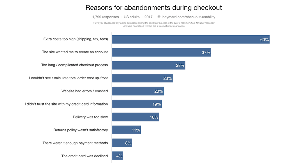
According to the Baymard Institute, the average documented online shopping cart abandonment rate is a whopping 69.89 percent. This number was reached by taking the average of 40 different studies on cart abandonment, some of which place the average cart abandonment rate as high as over 81 percent!
Here are the top 10 reasons consumers abandon online carts, according to Baymard:
- 60 percent – extra costs (such as shipping or taxes) were too high.
- 37 percent – the site required registering for an account.
- 28 percent – the checkout experience was too long or too complicated.
- 23 percent – the user was unable to calculate the total cost upfront.
- 20 percent – the site crashed or had bugs.
- 19 percent – the user did not trust the site with their credit card information.
- 18 percent – delivery was too slow.
- 11 percent – there wasn’t a good return policy.
- 8 percent – there weren’t enough payment methods.
- 4 percent – the credit card was declined.
In this article, we’ll focus on how to fix these 10 issues so that more consumers follow through with their purchases. We’ll also introduce additional tips on how to optimize the checkout process to increase sales.
What Can You Gain From Improving Your Checkout Page UI and UX?
According to Baymard, statistics show that by optimizing your checkout experience, you can increase your conversions by over 35 percent. This will help your bottom line and enable you to invest more in your business and grow it faster.
Thirty-five percent of total recoverable e-commerce sales in the US and EU translates to $260 billion – not a trivial amount!
Following are 22 tips on how to improve your checkout UI and UX. These tips are divided into four main categories:
- Improving the actual checkout and purchasing process
- Increasing user trust
- Improving site and checkout page designs
- Using proven marketing techniques to get more conversions
If you notice that you are lagging behind when it comes to the top 10 causes of cart abandonment that are mentioned above, focus on fixing them first.
Improving Checkout Page UX
The following tips will focus on improving the checkout UX on your site.
1. Be Upfront About Total Costs
There’s nothing more frustrating for online shoppers than to find great products that they think they can afford, only to be hit with additional fees, taxes, or shipping costs when they are taken to check out and asked to enter their payment information.
An example of what not to do can be seen by looking at hotel booking websites. When users search for listings, some sites will sometimes display each hotel’s prices BEFORE taxes and additional fees, according to a MoneySavingExpert investigation. Users only find out about those additional fees after they click the booking button.
Not being told final prices makes it hard for consumers to choose which products they want (for example, which hotels are the cheapest). That’s not the worst of the problem. However – many consumers may be put off by the extra checkout payments and leave your site without paying. Therefore, make sure that any taxes or shipping costs for a product are clearly displayed and indicated before a user adds them to their cart.
In addition, when a user is taken to see to complete their checkout payments, they should see each product’s individual cost and how much their total cost will be for all products in their cart (again, including taxes and shipping fees).
2. Let Users Check Out as a Guest
Don’t force users to register and create an account before they can check out. Visitors may be in a rush and in no mood to create an account, which often involves taking the time to fill out several forms, checking their email for a verification link or code and then sometimes logging in again.
Even if you do want to encourage users to register for an account, you should still include an option to check out as a guest. Better yet, present them with the registration option after they have already checked out and completed their purchase. At that point, you can present to them the benefits of registering, such as the ability to track their orders.
3. Keep It Easy and Quick
Having a lengthy checkout process will increase your cart abandonment rate. You want to fast checkout with only one page. A one-step checkout extension will be the most reasonable choice for the Magento website, helping reduce the abandonment rate and increasing the conversion rate dramatically. Don’t include unnecessary fields for your users to fill out on the checkout page. This includes information you don’t need (such as their home phone number).
If the nature of your business requires you to store certain information, such as a user’s phone number or social security number, consider including a short explanation of why you need that information and what you will do with it. Remember, small businesses, musicians, artists etc., can quickly put together their site since it doesn’t involve many intricacies but an online store requires a well-designed, smooth, fast, performing, and easy website builder that can enable end-to-end transactions without a glitch.
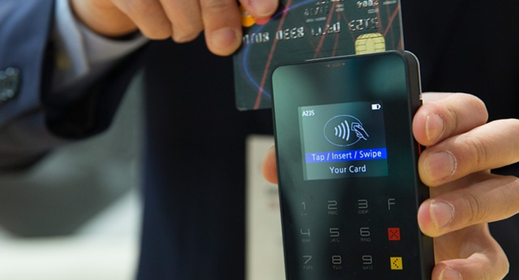
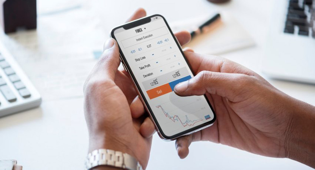
4. Support Multiple Payment Options
Offering multiple payment methods will make it easier for many of your customers to send you money. Don’t limit payment options to credit and debit cards; at the very least, include Paypal as a quicker payment option. As you get more customers, consider including advanced payment methods, such as Stripe, Apple Pay, Skrill, Google Pay, Square, and Payoneer. You can even accept Bitcoin or other cryptocurrencies. Get a good payment processing service that supports multiple payment options.
Depending on the price of your products, you can also offer customers installment plans that let them pay over the course of several months with a small down payment upfront.
Also, let customers have the option of saving a payment method for future purchases. This will make checking out in the future much quicker and easier. You can also let them use one-click purchase buttons to instantly purchase an item from your store (Amazon does this). If you support this option, make sure it is easy to cancel an order if the button was clicked by mistake.
5. Update Your Shipping Options
Better shipping options will lead to more conversions. In this infographic, you can see the substantial effect free shipping, for example, has on consumer purchasing decisions. Here are some interesting points:
- Nine out of 10 consumers said that free shipping is their number one incentive to shop online
- 61 percent of consumers are somewhat likely to not go through with a purchase if they have to pay additional shipping fees
- 58 percent of consumers will add additional products to their cart to qualify for free shipping
The last one should be of particular interest to you. Even if you can’t afford to offer free shipping on all of your products, there is still a lot to gain by offering free shipping with a minimum purchase. This will actually encourage consumers to make buy additional products.
Another idea is to offer free shipping as part of a loyalty or rewards membership program. Thirty-one percent of consumers said that they would join a loyalty program to qualify for free shipping.
6. Make It Easy to Make Changes to an Order
Make it easy for customers to make changes to their shopping carts. For example, they should easily be able to modify the quantity of each item they are ordering or delete items from their cart.
You should also have a “save for later” option or let customers add products to wish lists. There should also be a “continue shopping” option so that customers can go back and shop for additional products. Doing so shouldn’t delete any of their data. The following tips will focus on increasing trust so that users feel comfortable purchasing from you.
7. Have a Good Return Policy or Guarantee
Including a 100 percent customer satisfaction guarantee will increase trust in your service. If you can guarantee your customers that they can get their money back if they are unsatisfied, they will be more likely to take the leap and spend their money. The actual guarantee will depend on the type of product you are selling. If it is a digital product, such as a membership, you can offer membership cancellation up until a specific time for a full refund.
For physical products, have a good return policy. Make it easy for customers to return products by including clear instructions on how to do so on a separate page. You can include the price of return shipping in the refund or have a small restocking fee to cover expenses related to returns. Larger companies can set up deals with shipping companies to offer free returns by allowing customers to print out automatically-generated shipping labels.
It may be worth offering a free trial for membership-based products. Whether you require credit card information to register for a trial membership depends on your service; make sure to test out different options.
8. Have a Privacy Policy
Include a link to your privacy policy at checkout. Make it simple and easy to read. Knowing that you have a privacy policy and that their data will be safe will increase customers’ trust in you.
9. Keep It Secure
It is important that your checkout page is secured via HTTPS. Make sure your website has an SSL certificate installed, if not on all pages, then at least at checkout.

Even if you have an embedded payment form that is secure, you still want that green lock icon displayed in the browser bar. These kinds of small things are what will influence your visitors’ gut feelings about you.
10. Include Icons and Badges
Including security badges and payment icons on your checkout page will positively affect your conversion rate. Payment icons include small logos of the payment methods you accept. Examples include Paypal, Mastercard, Visa, and Discover logos. Many payment processing services include these on payment forms automatically.
Making sure your customers feel secure when handing over their payment information is also crucial. 19% percent of people who abandoned shopping carts said that their reason for doing so was due to their not feeling that their credit card information was secure, as mentioned above.
According to the Baymard Institute, any kind of visual seal will increase trust. This includes even seals that you yourself created, such as a generic “Secure Checkout” or “Satisfaction Guaranteed” seal. This is because users rely on their gut instinct when determining whether it is safe or not to hand over their personal information.
This instinct isn’t necessarily calculated; rather, it is influenced by visual cues such as a professional-looking website, an HTTPS certificate, and security sales.
Trustworthiness Stats
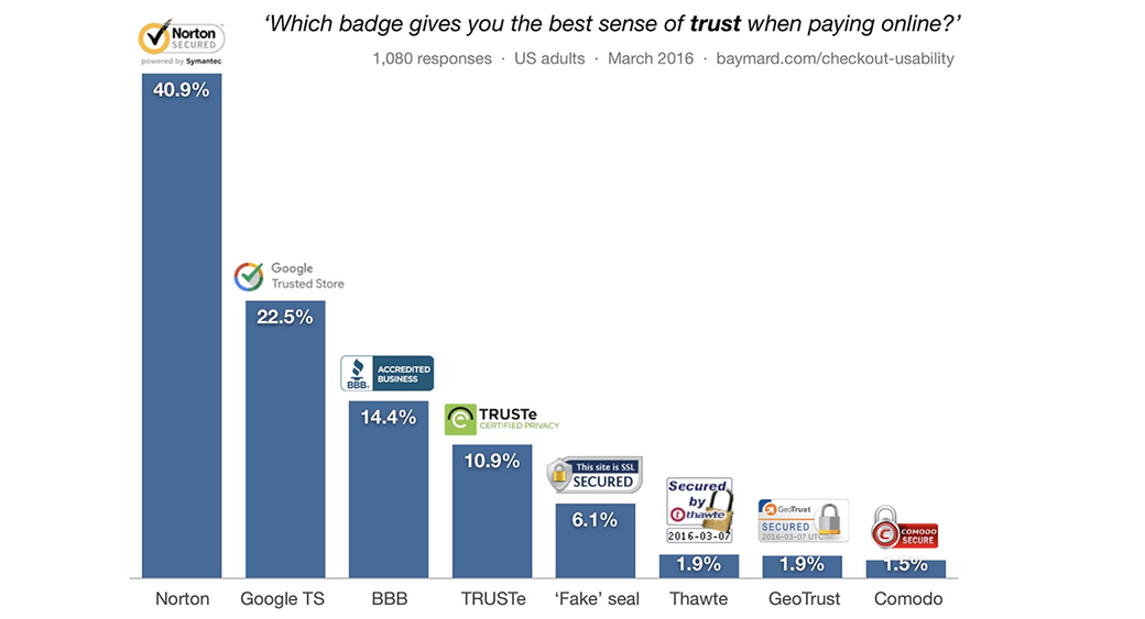
However, certain seals were deemed more trustworthy than others. The Baymard Institute conducted research where survey participants were presented with certain seals and were asked to choose the one that inspired the most trustworthiness.
Here are the results that they found, in the order of trustworthiness levels:
- Norton (40.9%)
- Google Trusted Store (22.5%)
- BBB Accredited Business (14.4$)
- TRUSTe Certified Privacy (10.9%)
- A fake seal indicating SSL site security, not belonging to any organization (6.1%)
- Secured by Thawte (1/9%)
- GeoTrust Secured (1/9%)
- Comodo Secure 1.5%)
Baymard’s research also found that simple bugs in the payment forms or other minor tweaks, such as encapsulating credit card fields with a solid background color or including security lock icons next to the fields, can also impact a site’s trustworthiness. Of course, you can’t just randomly add third-party verification badges to your site without actually qualifying for them and getting verified (though nothing is stopping you from making up your own, which will also help). It’s worth investing in getting verified for some security seals, such as Norton, BBB Accredited, McAfee, Google Trusted Store, or any other well-known seal.
11. Include Ratings or Reviews
Eighty-eight percent of consumers trust online reviews as much as personal recommendations from friends or family members. You are missing out if you’re not leveraging online reviews and ratings to boost your sales.

Here are some additional statistics which highlight the importance of online reviews and ratings:
- Only 57 percent of consumers would use a business if it had a three-star rating
- On the other hand, 94 percent of consumers would use a business with a four-star rating. This goes to show the significance of a single-star rating increase.
- Eighty-eight percent of consumers form an opinion about a business by reading just up to 10 reviews.
Make sure to include reviews of a product after its description on your online store. Encourage customers to leave these reviews by sending them an automated email after they have purchased an item. You may also be able to pull reviews from the manufacturer’s website. The test displays average star ratings next to each product on the checkout page. This can act as a final push of encouragement to convince consumers actually to purchase the product.
12. Offer Awesome Support
Good customer service is essential for building trust. You want your customers to feel like they have somewhere to turn to if they are unsatisfied with their purchase. A good example is offering live chat support on your site. You can have a small chatbot or popup in the bottom corner that lets customers quickly contact your support team with any questions about your products.
In addition, customers often are uncertain about whether a product would fit their needs and don’t have time to do extensive internet research to figure that out. Being able to ask a quick question and receive a quick answer can help sway them toward purchasing.
13. Keep Your Branding On Par
Your visitors shouldn’t feel they are being taken to a different website when checking out. This starts with ensuring that your checkout page is hosted on the same domain name as the rest of your site.
Additionally, the branding of your checkout page designs should be on par with the rest of your website. For example, keep the color scheme the same and make sure your logo is displayed somewhere at checkout, such as in the header.
User Interface and Checkout Design Tips
The following tips focus on improving your actual site design for better conversions.
14. Speed It Up
If your checkout page takes too long to load or too long to process payments, some visitors may get frustrated and just leave. Speed up your site by switching to a better hosting provider or signing up for a better hosting plan. Use a trusted payment processing system that is quick and efficient.
15. Be Friendly to Mobile Devices
Some pages and payment forms look great on desktop devices but aren’t optimized for phones and tablets. Make sure your checkout page designs are mobile responsive.
You may want to reduce the number of forms included on the mobile version of checkout, as it is harder to fill out forms when you don’t have access to a keyboard and/or are in a rush.
16. Keep It Organized
Keep your checkout UI organized. You can use grids to organize product information in rows or columns. Include information such as the product name, product image, pricing, rating, shipping times, and order quantity and organize all the information clearly.
17. Reduce Clutter
Keep your checkout page simple and straightforward. Don’t clutter it with too many call-to-actions, such as an email newsletter signup form; a single buy button is enough. Of course, there are some things you should always include, such as an image of the product and the final price.
Marketing Techniques for Better Conversion Rates
These tips focus on how to use better marketing techniques to get more conversions.
18. Offer On-Page Promo Codes and Discounts
Discounts and promotion codes are great incentives to make a purchase. If a product is usually sold for a higher price and is currently being sold at a discount, you should indicate that information at checkout. The same goes for promo codes. Having regular or seasonal promotion codes and indicating current ones available on your checkout page will likely increase your conversion rates. Test our offering promotion codes on different products and see how it affects your conversion rates and overall profit.
19. Employ Urgency
Limited-time discounts or promotion codes can be used to increase urgency and encourage customers to go through with a purchase. Highlighting when a discounted price, free shipping, or promotion code expires, for example, can increase your conversion rates. Another way to increase urgency is by showing how much of a product is left in stock. Amazon and eBay always do this – they will tell you to hurry and make a purchase if there are only a few items left in stock. Yet another way to increase urgency is by indicating how many people are currently viewing an item or have added it to their watch list.
20. Upsell, Cross Sell, and Downsell
You can increase your sales by cross-selling or upselling to your customers by recommending different products they may be interested in. A “related items” widget is helpful for this. However, as mentioned, you don’t want to clutter the checkout with too many promotions, call-to-actions, and information. A better idea is to upsell to your customers AFTER they have already checked out and made all necessary checkout payments.
This can be done on the purchase confirmation page, for example, or even in your emails that should be drafted smartly. It doesn’t have to be on the checkout page, however. Test cross-selling before checkout, when users are still shopping on your site, and see the effect on conversions.
A good example of this would be how Amazon displays items that are “usually bought together” to encourage customers to add products to their carts. Besides upselling and cross-selling, you can also down-sell. In other words, if a customer declines an upsell, you can offer them a cheaper product they may be interested in.
21. Use Exit-Intent Popups
Exit-intent popups at checkout may help bring back some of those customers who are exiting your site without going through with their purchase. These pop-ups are triggered when it is detected that the user is moving their mouse toward the “X” button on their browser. On the popup, you can offer them a unique promotion code they can use. Consumers who are on the fence about purchasing a product may reconsider their decision to leave if they can get a particular discount or bonus.
22. Send Follow Up Emails
During the checkout process, gathering a guest’s or new user’s email should be one of your first steps. This way, even if they don’t end up going through with the purchase, you can send them follow-up emails reminding them about their abandoned cart.

Many times, people are simply in a rush and have no time at the moment to search for their credit card and type in their digits. Sometimes, they may be undecided about whether they want to spend their money. By reminding them gently about their non-purchased products (and possibly offering them a discount), you will be able to bring many of them back.
How Weblium can help
If you want to create an online store that not only looks great but also converts visitors into customers, Weblium is a powerful and convenient solution. Whether you’re launching a new business or improving your existing e-commerce system, Weblium helps you create a professional, conversion-optimized store without the need for programming.
Here’s how Weblium supports your e-commerce success:
Seamless checkout process
Weblium’s checkout templates are designed with UX best practices in mind. They include guest checkout, one-page designs, and clear progress indicators, helping your customers complete their purchases without hassle or confusion.
Built-in payment integrations
Connect to popular payment systems such as Stripe, PayPal, Fondy, and others in just a few clicks. Offer multiple payment options to give your customers flexibility and reduce last-minute abandonment.
Flexible shipping settings
From free shipping thresholds to real-time shipping rates, Weblium lets you customize shipping options to fit your business model. Easily set up local or international shipping methods based on your customer’s location.
Checkout Page Best Practices – Wrapping It Up
Optimizing your checkout page UX should be one of your top priorities. As mentioned, you can increase conversions by over 35 percent. Regardless of the size of your business, using the above tips will help you increase your sales, revenue, and profits.


Leave a Reply