Ecommerce Design Elements to Wow Visitors Into Converting
So, you’ve established that people want to own your products – there’s a market for what you’re selling. All your research shows that your price points are within a range that your customers are willing to pay. Furthermore, your lead-generation efforts are extremely effective. Traffic is virtually streaming to your online store via all the usual channels. Essentially, you seem to be doing all the basics right when it comes to running a successful eCommerce website. Why, then, are your visitors not getting products into their shopping carts? And why aren’t they completing the purchasing process? The answer is extremely likely to involve your website’s eCommerce design elements.

Jeff Bezos, a guy who knows a thing or two about eCommerce and conversion rates, famously said about Amazon’s customer-focused culture: “We innovate by starting with the customer and working backward. The focus is not the product, but the customer.” While this quote undoubtedly covers more than just the customer’s experience on Amazon’s website, it’s safe to assume that this approach is one of the driving factors behind their exceptionally effective user interface.
In this article, we’ll take a look at what you, the owner of an eCommerce store, can do to maximize conversion rates by implementing customer-centric eCommerce design elements. Some of the design approaches we’ll discuss here involve simply creating a first visual impression that’s good enough to retain your audience’s attention, create an impression of credibility, and initiate further engagement. Other tactics will address more specific problems that affect conversion rates.
Embrace White or Negative Space
Whitespace, or negative space, refers to the visual “real estate” that is unpopulated by any eCommerce design elements like photos, text, or CTAs.
Sure, it makes sense to not totally overcrowd every inch of your user interface with visual information – after all, it’s not 1996 anymore. But there’s also something to be said for leaving large areas of the site’s UI “empty”.
If this is done correctly, visitors not only feel a deeper, abstract sense of comfort with the site itself, but you also have more opportunities to direct their focus to visual eCommerce design elements that are critical to conversion.
In an eCommerce context, white space is very commonly used in and around elements that display the product itself. By limiting the amount of descriptive text and “Buy now” buttons in the immediate vicinity of product visuals, the user’s focus is immediately drawn to the thing you want them to buy.
Online fashion retailer Everlane and eyewear specialists Oliver Peoples are both excellent examples of how to draw the user’s attention to the product with the use of white space.
Without distraction, the customer’s relationship with the product can be created and nurtured. This is further enabled by the quality of the visual media depicting the product, which leads us to our next point.
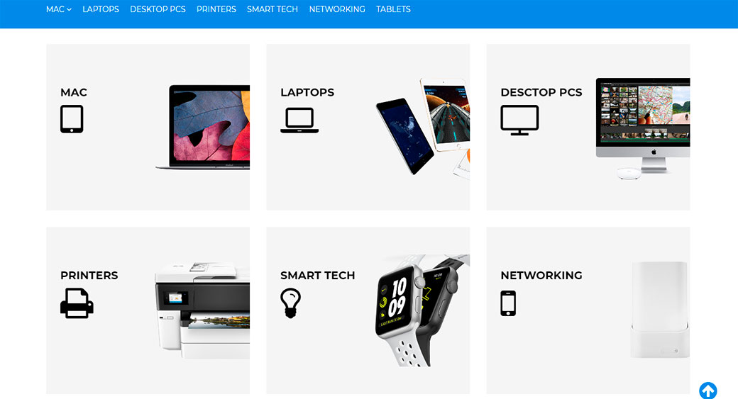
Showcase Your Products by Using Ecommerce Design Elements
We’re not talking about simply ensuring that photos depicting your products are of the appropriate resolution.
All website owners (should) know that blurry or pixelated images that haven’t been properly deep-etched won’t only create a poor impression of the product itself, but will also likely result in a catastrophic loss of credibility for the brand as a whole.
What we want to discuss in this section goes beyond simply using a high-quality image.
By properly showcasing your product, you’re giving the potential customer as much visual information about it as possible within the confines of the available space.

The person designing your eCommerce store’s front-end has to be briefed on the importance of enabling multiple views without cluttering the user interface. Many approaches exist to solve this problem.
Urban Outfitters’ category view, for instance, shows a second image of the product on mouse-hover. On the product page itself, two other highly effective techniques are used to showcase the product:
- Firstly, a mini image-navigation element allows the user to browse multiple photographs of the product without compromising the page’s simplicity.
- Secondly, a mouse hovering on the main photograph results in a “zoomed in” layer next to the full image, allowing the user to inspect specific areas of the product in a much higher resolution.
Footwear retailer Zappos is an excellent example of taking this tactic to an even further level by providing videos that feature each product among the image gallery. Crucially, Zappos has harnessed the power of video to its full extent by not only showing the product being used (walked around in) but also allowing a salesperson to talk about what makes the shoe special.
The use of video is becoming an increasingly popular method of showcasing aspects of a product that still images simply can’t.
Emulate a Personalized Shopping Experience
What an eCommerce retailer knows about their customer is often linked to knowing the person’s previous activities and purchases on the site. And that information won’t always be available. Firstly, a large number of visitors will be first-time customers with no browsing or shopping history. And secondly, not all eCommerce stores will have the money to invest in such functionality.
With this in mind, it is possible to emulate a personalized experience by identifying customer segments and assigning each to a specific product.
High-end mattress retailer Amerisleep’s memory foam landing page immediately and elegantly communicates the category of customers that a specific product will appeal to by placing clear labels above the product image.
On this page, customers who identify as people who sleep on their backs instantly feel a connection with not only a specific product but also an affinity for the store itself. They are being listened to without having to say a word.
This tactic gives customers the impression that their individual needs are being proactively addressed – even in the absence of interaction with a salesperson. The strategy works well for product segmentation because it doesn’t feel intrusive.
This approach proves that there’s not always a need for a personalized experience to rely on gathering information on the customer – a process that could prove cumbersome and act as an obstacle to conversion.
Ecommerce Design Elements: Simple Checkout Process
One of the web designer’s main objectives is to allow the customer to complete a complex process with as little effort as possible. And no aspect of completing an online transaction is as frustrating as a complicated checkout process.
Research has shown that an eCommerce site can be as effective as possible in getting a customer to place items in their shopping cart, but still fail at the final step in the conversion process.
Cart abandonment is a serious problem for online retailers, and the best way to avoid it is by limiting the complexity involved in finalizing the sale.
Here are some strategies that successful eCommerce sites regularly use to combat this scourge:
Checkout Without Registration
Not all customers will want to go through the trouble of registering as an official user before making a purchase. If your online store’s sales and delivery model allows for it, consider removing this process entirely.
Apple’s iStore is an excellent example of an eCommerce site that allows “guests” to complete a purchase.
Real-Time Validation
Of course, the information that your customer enters in order to enable delivery is critical to completing a sale. However, cumbersome, outdated technology that only shows errors in captured information after the form has been submitted can lead to enormous frustration on the part of an impatient customer. And it will certainly lead to carts being abandoned.
The online art store iCanvas not only marks fields that have been captured incorrectly as soon as the user enters information into it, but it also goes the extra mile by showing a very clear description of the error and how the user can correct it.
Progress Indicator as One of Ecommerce Design Elements
The nature of completing an online transaction means that online retailers will seldom be able to obtain all the necessary information on a single web page. And even if this was possible, the number of fields displayed on this single page may overwhelm a customer.
That said, not knowing how many steps there are ahead of them or exactly where they are in the checkout process can be an impediment to finalizing a sale.
Online furniture retailer Urban Ladder is an excellent example of how to do this elegantly.
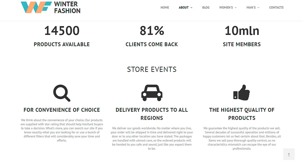
Provide Believable Social Proof
Social proof – the concept that seeing evidence of peer behavior provides motivation to copy that behavior – has long been used to drive conversion to great effect.
By showing that your store has recently served customers to their satisfaction, you will be creating enormous credibility for a first-time customer. And on top of that, you will also be tapping into an abstract need for people to have their decisions validated.

There are several ways for a savvy eCommerce web designer to include social proof as part of a user’s online shopping experience:
Illustrate Scarcity
Scarcity, or the notion that only a limited number of a particular product remains in stock, communicates to the shopper that they need to act fast if they want to get a hold of it. Not only that, but it also illustrates that the product is highly desirable.
Online accommodation portal Booking.com is an excellent example of how to use this technique effectively.
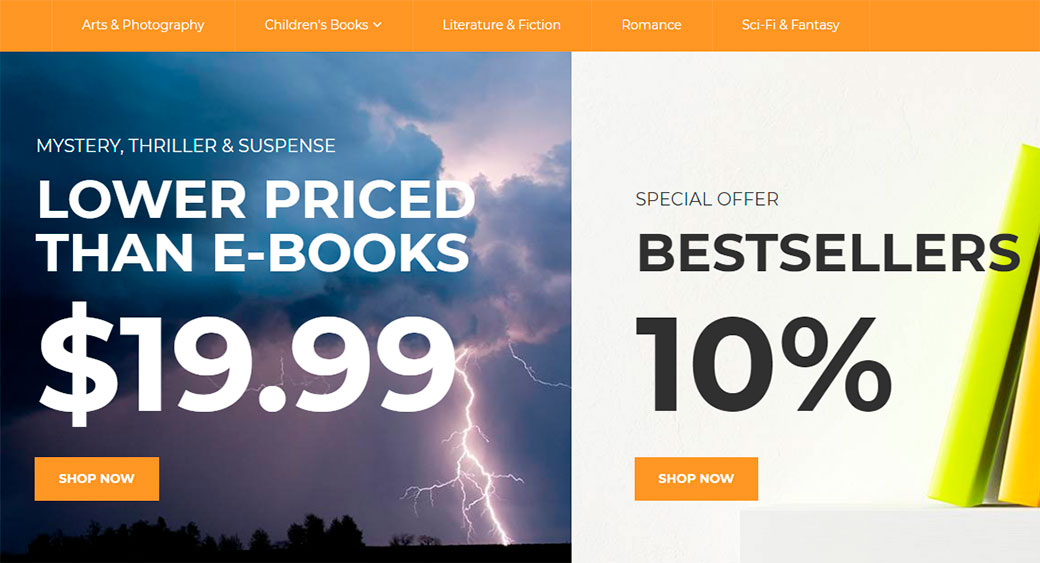
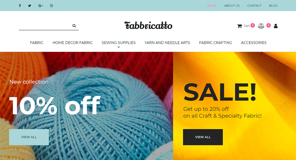
Create Urgency
Related to scarcity is urgency – a motivator that’s somewhat more under the store owner’s control than scarcity.
While the latter is dependent on stock and sales, urgency can be created by offering specials, discounts, or deals that expire after a specified length of time.
Ecommerce specialists Growcode report that they see an increase in between 7 to 9 percent when they are contracted to implement a collection of urgency stimulators.
An effective method of applying this strategy is to include a countdown timer indicating exactly how much time is left on a particular deal expiring.
Online retailer Asos is known for frequently offering customers discounts on products that fall within a particular category and indicating the time left using these e-commerce design elements.
Provide User Reviews and Ratings
A 2018 study conducted by Bizrate Insights found that 40% of online shoppers often refer to user reviews before making a decision on whether or not to purchase a product online.
Furthermore, Spiegel Research Center found that a product that has as little as five customer opinions posted about it is 270% more likely to sell than a product with no reviews at all.
These are astonishing statistics that eCommerce store owners would be negligent not to leverage.
Amazon and Overstock are excellent examples of how to do this right. Not only are customers enabled to provide descriptive reviews of the product, but their aggregated star-rating system also provides prospective customers with a comprehensive summary of what existing customers thought of the product.
Show Purchasing Events and Statistics
There are a number of highly customizable third-party tools that your site can use to illustrate that another customer has performed a validated purchase.
Text messaging and calling software company CallLoop uses this technique to great effect on every page on their site – a move that saw them report an increase of 53% in their conversion rate.
Another great example of this is Lawnstarter. The lawn care service shows unobtrusive popups indicating that their services have been booked, as well as general statistics, such as the number of sales that have been completed in a specific period.
How Ecommerce Design Elements Can Boost Conversion
Conversion rate optimization is a science – a complex, multi-faceted challenge that many eCommerce store owners contract professionals to improve.
However, not everything that will lead to greater profits is entirely in the hands of those that do it for a living. There are numerous, extremely actionable ways that smart user interface and eCommerce design elements can limit your bounce rate and abandoned carts, and hopefully, we’ve illustrated them well in this article.
We encourage you to go through each of our suggested strategies, discern which will apply to your store, implement them, and consistently run tests to obtain data on how your store’s conversion improves.


Leave a Reply