Right Color Selection in Web Design [INFOGRAPHICS]
The designing industry has seen huge progress in the past few years. In the past, people didn’t care about the appearance of their business website. Even the large organizations relied on simple designs that were not at all appealing. However, things have changed and the business owners are always trying to improve the visual presentation of their business websites. Most people think having a unique design and complicated features makes the website look more professional and premium. After a few months, they realize the fancy website is not adding any real value to their business. This is because the amateur developers don’t know about the right color choice.

Meaning of the Right Color Choice
Color selection is a very important aspect of web designing. Unless you pick the right color, it will be really hard to give you a clear idea about your product. Some of the business owners often develop a complicated design with too many colors and eventually fails to create the perfect design. But if you want to make your website look good, you must focus on the color selection. Think like the professional web developers so that you can pick the right color for the right task. For instance, if you use a too bright color on a website that deals with heavy machinery chances are high it will lose weight. You need to come up with a matured idea that truly represents an industrial company. This might be a little bit tough for the naïve designers but if you focus on the core design concept, it won’t take much time to develop your skills.
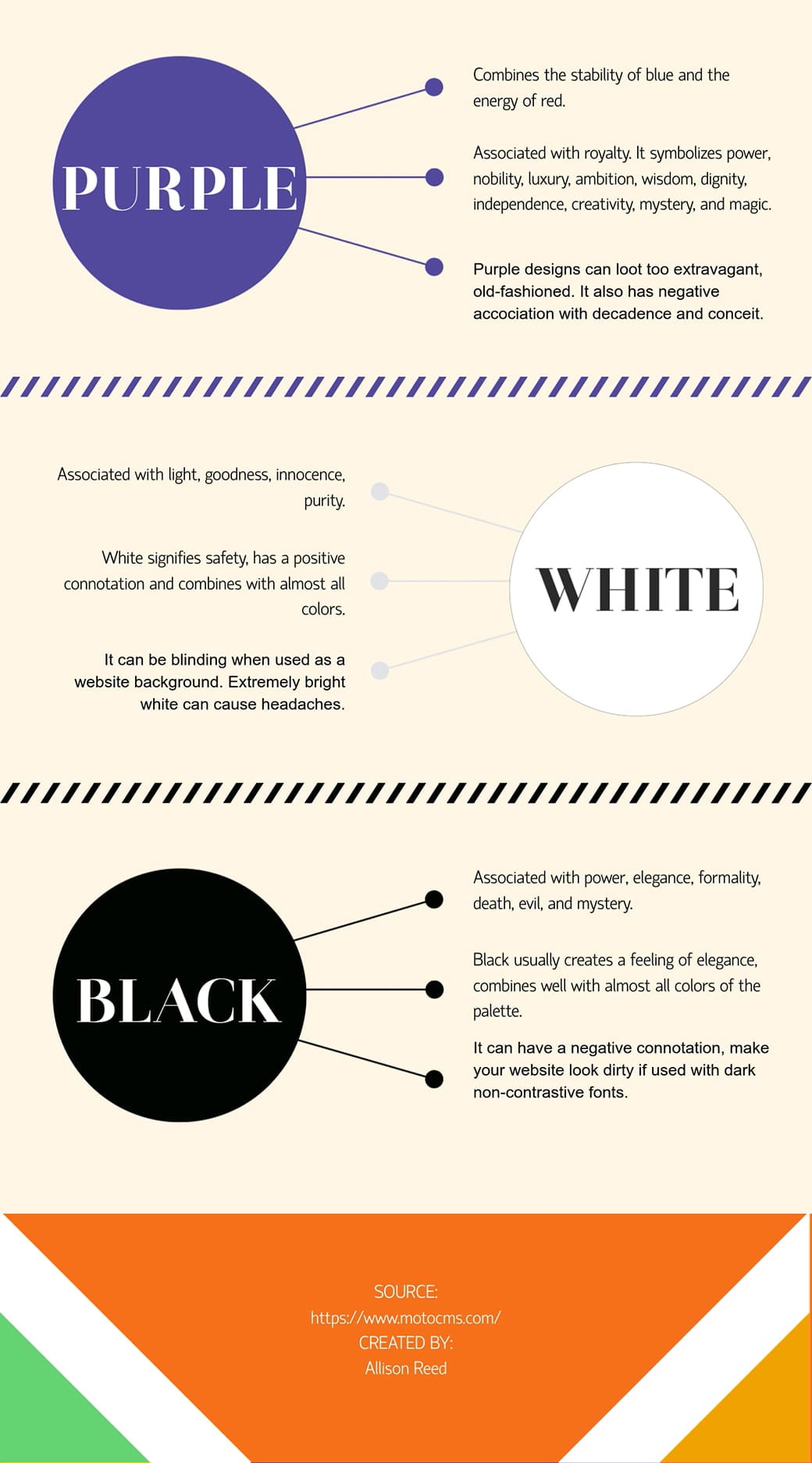
Color Anatomy
Choosing the right color for your website is very crucial. Let’s learn about the use of different colors on the websites and their impact on the users.
Use of Red Colors
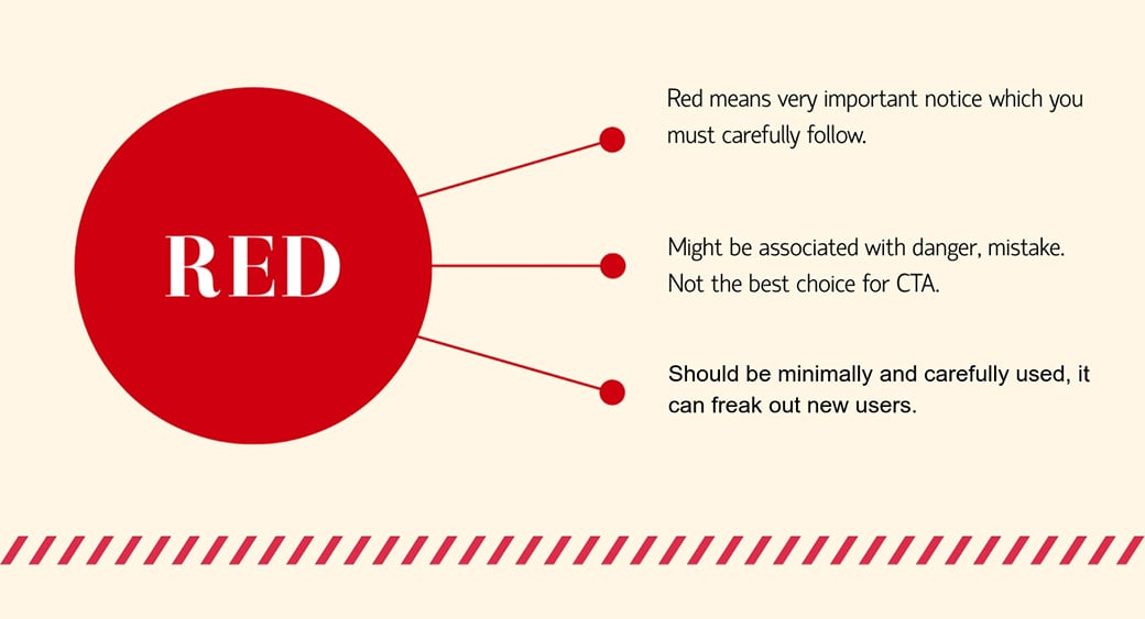
The first thing that you should learn in the color guide for web design is the use of red colors. Those who use red color in the fonts and call to action buttons are making a big mistake. Usually red color indicated very important notice which you must carefully follow. If you fail to do so, you might be in trouble. But this might not be the ideal case on many websites. Some of the red colors often suggest to the readers that they are dealing with sophisticated information. However, web developers can greatly alter the purpose of red colors since the colors convey different messages based on their associated contents. So, focus on your content if you want to convey an important message by using the red color.

So, if you design your website based on the red color chances are high the users will not feel comfortable. Most importantly, it will be hard for developers to emphasize the important part of the web content. Red color should be used in a very precise way. And for this very reason, you need to hire a professional web developer who skills in this section.
Some of you might think by adding red colors, you can easily emphasize on a certain topic. But this might not be the case when it comes to a mass audience. Though the advanced users will definitely give priority to the red color code, the amateurs will avoid the red colors thinking it’s a sign of dangers. The web developers need to have the unique ability to craft the perfect design based on simple color combinations. Using too many red objects in web pages creates a negative vibe in the mind of the mass audience. Web developers need to think like the user’s point of view. Just picking a random object or text and emphasizing it with the red colors is not going to work. The use of red colors should be minimum on the website since it will create a soothing experience for the new users.
Choose the Right Color for Your Logo
![]()
People often think the logo color doesn’t matter. But if this was so easy, the big companies would have spent such a big amount of money on designing their logo. The logo color must be selected based on your preferred target industry. As an option, you might look for professional logo designers in the Tailor Brands.
Logo plays a great role when it comes to branding. Some of the business owners often try to make the logo too simple which makes it hard for the marketers to promote the product. It’s very important to have distinctive colors in the logo. But never think by using too many colors you attract potential clients. You need to find a perfect balance between the concept of the logo and color. Though some of you might say this is not a part of the web design project but in reality, it plays a great role in creating a stunning design. Unless the web designers are fully satisfied with the website logo, it will be really hard to attract new customers. The logo needs to be stunning with specific colors so that people want to see the logo in their product. It should bear the mark of elegance or else promoting your website via multi-color logo will be a tough task.
Use of Green and Yellow

Green and Yellow colors give users safe and happy feelings. Usually, when people see green color on the websites, they consider it as a safe website. On the contrary, the yellow brings a sensation of happiness.

However, the new web developers often rely on heavy color in all the important segments of the websites. Excessive use of the yellow color might result in eye stress. Just like this, you don’t want to convey a message to your potential clients by adding too many green-colored contents on the websites. This two-color should be used in a very precise way or else it will be tough to make your website look beautiful.
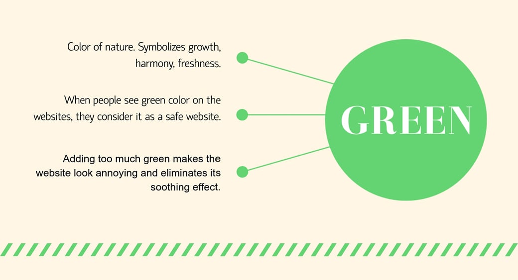
Some of you might get biased and use too much green color on the website to make it safer. But adding too much green kills the design. Web designers are well aware of this fact and they never add too much green to make the website look safe. The green color should be placed in a very natural way so that the users get peace when they browse the websites. And excess use of the yellow color also ruins the web designs. Use the yellow color where it is necessary. Never think to add random colors based on the psychological factors will promote your business website.
Use of Colors for Decision Triggering and CTA
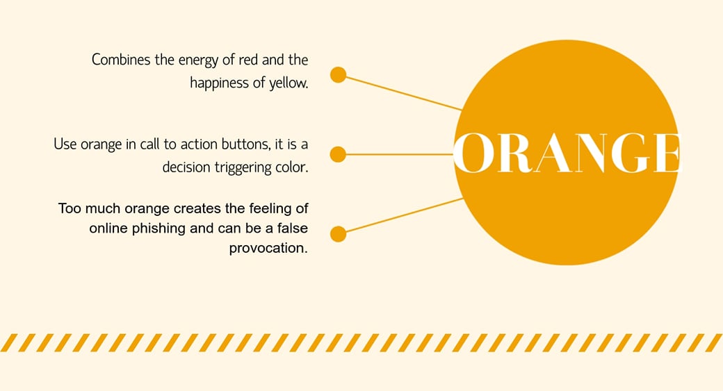
You can use the orange color in the call to action button since it is often considered as a decision triggering color. When people see orange color they get excited. Such excitement usually leads them to take action without thinking too much. Still, you should limit the use of orange color on the websites since using too much will make your website look like a phishing website. You need to focus on the color context to make the website look more authentic. Stop placing random colors since it makes the website look more immature. Webmasters always chose the color carefully so that the users never think that the contents are presented in the wrong way. A powerful presentation of the web content greatly depends on the developer’s skills since they are the ones who will choose the decision trigging color.
At times the decision triggering color varies based on the age of the users. For instance, if you try to provoke a senior citizen to buy unique products with the orange color presentation, chances are high you will not get any sales. On the contrary, if you promote any product to the teenagers giving importance to the orange color, chances are high you will get a decent number of sales. So, focus on the age and demographics before you start selecting the decision making color. And your business industry also plays a great role when it comes to the selection of text color. Always remember, the text color helps a lot to make the decision. If a user reads the red color text he is most likely to be warned rather than taking steps to pay you the money. So, think about the decision triggering color for your website.
Summing Up the Right Color Tips
Choosing the right color for your website is not so easy. Only highly skilled developers and graphics designers understand this art. You need to find a perfect balance and logically use the important colors. So, always work with the professionals to get the best result when it comes to color selections for your website. Use them wisely and check the influence of other colors on the infographics below.


Leave a Reply