How to Choose Brand Colors that Work for Your Corporal Identity
Your corporate identity is the way you present your business to the world. It is how the world sees you. From your company logo design and name to your fonts and stationary – your corporate color is constantly under the microscope from potential consumers. That’s why it’s essential to know how to choose brand colors that work for you.

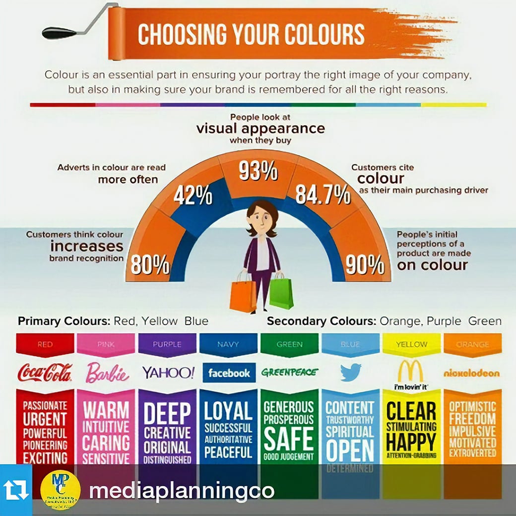
Believe it or not, the color palette you choose and your website color schemes play a large part in how your brand is perceived. Who doesn’t recognize the bright yellow and fiery red of the McDonald’s signs? Or the serene blue and stark white of Facebook’s company logo design? What about the candy apple red and bright white of the Coca-Cola company? The colors you incorporate into your brand carry weight and have the power to sway the modern consumer—for better or for worse. Knowing how to choose brand colors for your corporate color has therefore never been more important.
Luckily, choosing the right colors for your business doesn’t have to be so hard. Follow our favorite tips below to find out how to choose brand colors that work for your corporal identity.
How to Choose Brand Colors in Six Simple Steps
Decide What You Want to Convey
This is the first step in how to choose brand colors for your business. Before zeroing in on your color palette, you’ll want to define your objectives. What is it that you want your brand to say to the world? How do you want people to feel when they look at your logo or see the colors on your website? For instance, if you’re a security company, you’ll likely want your corporal identity to radiate feelings of trust and protection. On the other hand, if you’re a party supplies company, you’ll want your branding to be happy and fun. You’ll want your website color schemes to be upbeat and bright. Determining your focus is the first step to finding the colors that will accomplish your goals. Sometimes, creating a mood board can help with this!
Consider the Effects of Color on the Brain
Humans are visual beings. That’s why this step is so vital when it comes to the ins and outs of how to choose brand colors. Humans continuously process the world around us through our senses, and our sense of sight is often the most powerful. When it comes to sight, colors are huge influencers in our experience. Color has a profound effect on our brains, and even our moods, and employing the psychology of color is a great idea when sourcing your palette.
- Yellow: Yellow is a happy color, associated with feelings of positivity, optimism, and enthusiasm. It is the color of sunshine, after all!
- Blue: Blue has a calming effect. It is related to feelings of trust, loyalty, and security. Think of how you feel when looking at the ocean ….. relaxing, right?
- Red: Red is an energized color, full of passion and excitement. It is attention-grabbing and is sure to stand out.
- Green: Green is the color of nature, and is therefore synonymous with peace and tranquility. There’s nothing like a long walk through lush green woods to set the soul at ease!
- Black: Black conveys power. It is bold and asserts its authority while maintaining its elegance.
- Orange: Orange is a fun color, full of vibrancy as well as playfulness. It’s similar to yellow with its positivity.
- Purple: Purple is a color commonly associated with royalty. It is decadent and rich, and also great for showing compassion, creativity, and sensitivity.
- Pink: Pink is a compassionate color, often seen in flowers and candy, and used in Valentine’s Day cards. It is young, fresh, and conveys love and admiration.
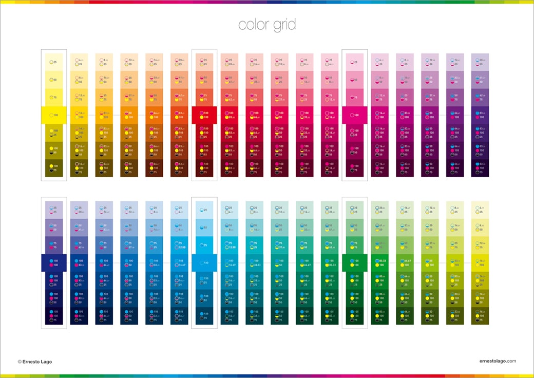
Experiment with Your Palette
Your color scheme is likely something that will stick with your brand throughout the years. You’ll want to make the right decision, and that means that you should audition a variety of options until you’re certain you’ve found your ideal pairings. Don’t shy away from some good old-fashioned trial and error— this process will help zero in on your perfect match! Look at this as an opportunity for exploration and have some fun with it. Work with your web developer to audition different website color schemes, and with your designer on your company logo design until you find the best option. If you’re wondering how to choose brand colors that work for you, this is certainly one of the most adventurous steps!
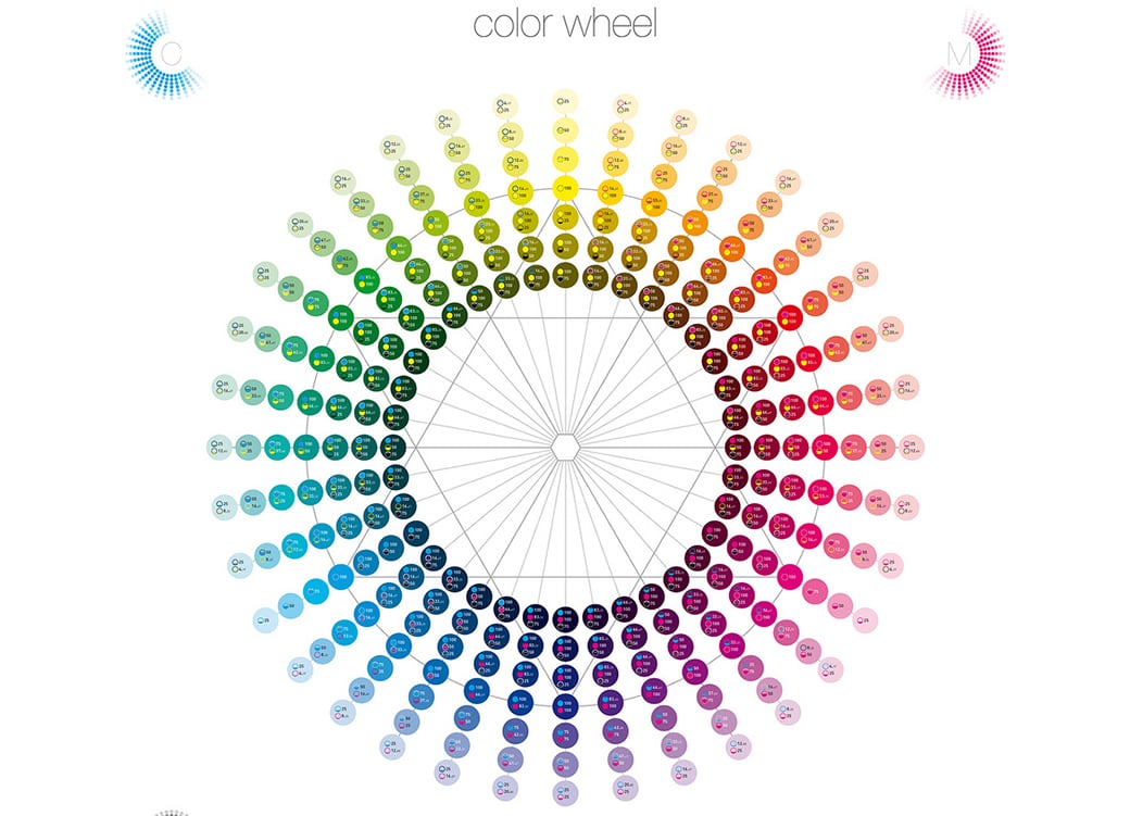
Consult the Color Wheel
There are some colors that traditionally just fit well together. This is due to a variety of factors, and using complementary colors together will lead to a pleasing aesthetic when it comes to website color schemes, company logo design, and other offline and online branding. This isn’t to say that colors that aren’t traditionally paired don’t work well together — in some cases, “clashing” or mismatched colors work fantastically well (this is where the whole trial and error bit comes in!). But for those wanting to play it extra safe, these are some classic color combinations you can rest assured look great alongside one another.
- Black and white: It doesn’t get more classic than this. The black and white look is dramatic yet refined. It is what’s used on the Apple logo, after all.
- Blue and red: Red and blue, when used together, create a clean, bold look that certainly grabs the attention of consumers while maintaining its professionalism. Kraft Foods uses this combination for their logo.
- Red and yellow: Red and yellow together communicate vitality and positivity—no one’s going to overlook this high-energy combination! Perhaps that’s why Kodak, McDonald’s, Shell, DHL, and Lays/Walkers use it in their logos.
- Blue and white: Blue and white looks professional and trustworthy when used together. It is simple and not too flashy, but very visually appealing. Facebook, Twitter, IBM, GE, HP, LinkedIn, and AT&T all use this.
- Green and yellow: Green and yellow work well together, and convey a fresh, natural, look. This combination calls nature and the outdoor world to mind. BP, John Deere, and Subway all incorporate this color scheme in their logos.
- Red and white: High energy, but not too over-the-top, a red and white color combination will grab your audience’s attention and make them feel intrigued and confident in your company. Think – Coca-Cola, Netflix, Pinterest, Swiss Army, and Target.
Use Light and Dark Tones
Once you have your basic colors, mix different tones within the same family for a comprehensive, pulled-together look. This works great on websites, especially when using background colors, dominant colors, and accent colors. You’ll know you’re safe when you stay within the same shade — so there’s no need to be nervous or second guess yourself!
Don’t Mix too Many Colors
You don’t want your brand identity to look scattered—in fact, it should be nothing if not complete and professional-looking. Mixing in random colors will make your identity seem confused, and no one wants to rely on a company that can’t even determine who they are! Therefore, settle on a few colors and use those across the board.
Your corporal identity is uniquely you, and you deserve a color palette that is also. You want your brand’s corporate color to reflect the best of who you are and really speak to your consumers. If you’re wondering how to choose the brand colors that suit your identity, look no further than the above tips! While there are no exact rules to follow when embarking on your color journey, the advice above is certainly a great place to start.


Like!! Thank you for publishing this awesome article.