Logo Color Schemes and Top Converting Brand Colors
Logo color schemes to logo design are like clothes to person. This article walks you through the golden logo codes for the best flat design brand-color combinations and helps you to come up with your logo color schemes and achieve an excellent logo design.
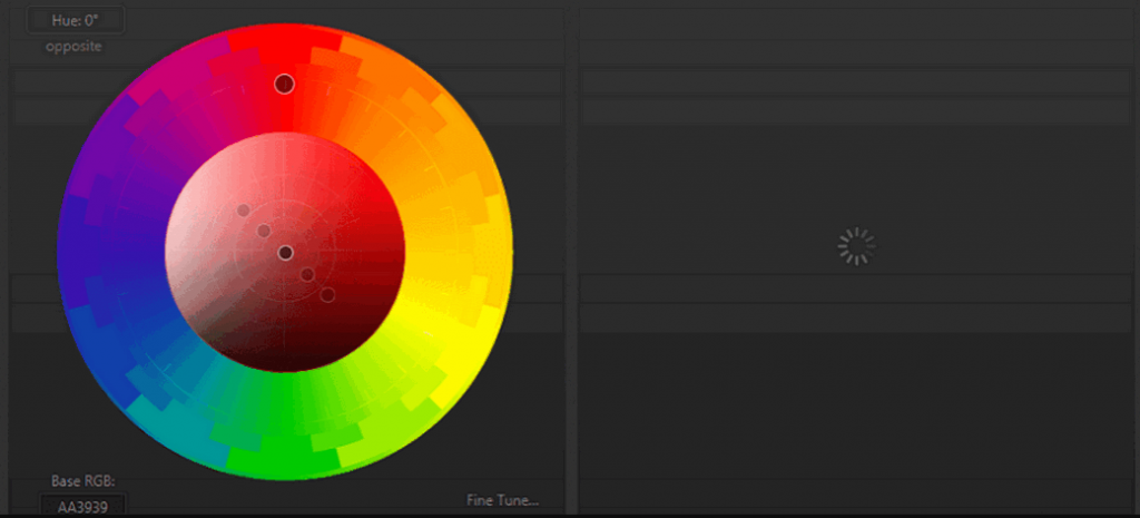
![]()
Color Meanings
Before moving anywhere else, let’s peek at the main colors and their meanings.
- Black Color – rigid & trusted color; luxury, value, elegance, sophisticate, power, classic.
- Red Color – passionate & a bit of dangerous color; youth, power, danger, fearlessness, outstanding, energizing, discovering and passion.
- Yellow Color (a color between orange and green on a visible light spectrum) – fascinating & mild color; learning, innovation, joy, fun, strength, and happiness.
- Green Color – environmental and natural color; life, renewal, nature, growth, harmlessness, freshness, security, stabilization and money.
- Gray Color – traditional and conservative color; friendliness, profession, formality, and neutrality.
- Orange Color – warm and passionate color; joy, creativeness, impulse, confidence, and movement.
- White Color – pure and faithful color; unique, brilliance, spirituality, freedom, virtue, innocence and perfection.
- Purple Color – luxurious and privileged color; romance, mystery, royalty, lavishness and wealthy.
- Blue Color – calm and dejected; relaxation, peace, loyalty, openness, and safety.
Above are the main perceptions of the colors, but do realize that there are certain circumstances where a color meaning varies. In addition, color can mean differently in various cultures. For example, white can mean morning in China. White and Black can mean death for the Chinese. And Brazilian uses purple as a color hue for death. Hindu sees yellow for highness, Greek thinks yellow means sadness, while French takes it as jealousy.
Logo Color Schemes
For most green hands, multicolor is an insecure decision. Often, multicolor plus complex shapes ruin a logo and interfere you to build a brand. Unless you are an experienced designer, be careful to use a color scheme with more than 3 colors.
Simplest Logo Design And Single-Color Scheme
Basically, the simplest logo design is plain letter logo. Just use words, no shapes, no icons and utilize only one color. A famous example is Wikipedia logo. Fewer ploys, fewer mistakes.
![]()
Multicolor Letter Logo
Multicolor is OK with letter logos. Examples are Google, eBay and many more. It implies multiple products and services. In reality, the rainbow is multicolor, standing for beauty, happiness, and all the bests.
![]()
Three Color Logo With Letters And Shapes
Think of the Pepsi logo for this. Not using too many shapes, just use curves and texts instead. But it requires true designing experience and solid color knowledge.
![]()
The Codes For Brand Colors – Golden Rule
When we try to use more than one color, we are trying to create some sort of visual contrast, which simulates the visual impact. In most cases, we need to apply a number of theme-related elements for the professional logo design.
Famous 6:3:1 Golden Color-Combination Rule For Flat Logo Design
We can easily find the rule has been applied to a number of logo designs. Always, the best flat logo design follows this color combination rule to create wonderful vision impacts and color comparisons. What’s the rule all about? Technically speaking, a good logo design consists of 60% main color, 30% auxiliary color, and 10% finishing-touch color. Those all, in an overview, will level up your logo design and create something unbelievable, if you’ve used a good logo color scheme.
Deep into the rule, when an audience sees a logo design, he usually feels the color combination whether warm or cold, which is the impact of 60% logo color scheme. This is what we previously worded 60% of the main color will render audiences the main atmosphere, other 30% is to balance color feeling and create some mild extension. Speaking of 10% color magic, it’s used to add something different, funny and vivid, so that logo design does not look rigid. That’s the 6-3-1 golden rule for logo color schemes.
Top Logo Color Schemes for Conversion
You may have also heard about top color schemes that convert better. For example, hyperlink uses blue, purple converts good; blue or red button gets you more hits. But for logo designs, there are fewer logo color schemes, since your design is different and your product is not the same. But do pay attention to common symbol color scheme, when you apply them to your color scheme: Use blue for trust, green for health/ growth, gray for balance, purple for wise creativity, red for excitements. That’s what we called top conversion color schemes for a logo.
After reading the above things, you may get confused or get overwhelmed. The question comes: how can we easily find a perfect color scheme when trying to design a logo for our products? Luckily, we find one of the best logo makers that happen to support us in finding nice color schemes to get started.
Find A Color Scheme for Your Logo Design
Firstly, we should think about something related to logo design and color scheme. In a logo tool – DesignEvo, it validates retrieving logo templates from color scheme description or logo design themes. So once we’ve made a choice for our logo color scheme, we are good to run DesignEvo app. Or when we find a word to describe our logo theme, we are cool to run the tool to find some stunning color schemes for considerations. Let’s check it together!
Over 5000 logo templates stored in the library. Entering the app, we shall see some of its logo templates. Notice that there is a search box on the left top, where we can enter “Warm”, “Cold”, “Good” to get view logo color schemes along with logo designs.
![]()
Or alternatively, we can try with keystroke “technology”, “Ideas”, “Internet”, “YouTube” or many more business-related theme words. Likewise, this app will get us tens of templates in a good color scheme. Its search engine retrieves the most related logo templates in fingertips.
![]()
After that, we can browse the color schemes and find one to our liking. Give it a press, we will jump to the navigation canvas, where we are entitled to make all modifications. Moreover, we can take advantage of the default color scheme for this very template, and make some changes regarding the fonts, logo name, slogan by deleting, replacing or whatever.
![]()
See? The color scheme is all good to go. If satisfied, we will move next, that’s Preview and Download our perfect color-scheme logo. For instance, DesignEvo offers the Preview feature on the top of its function bar. Find the Eye icon button on the right, give it a run. You will get a view of your logo in six scenarios: Business card, document header, notebook cover, website, T-shirt and PPT wall.
![]()
When downloading the logo, we usually find it friendly, since it gives a totally-free option to get our design in a png and jpg package. But alter that the free option sets a limitation here: the logo canvas must be within a size of 500 px * 500 px. As far as we go, it’s cool given the default canvas is 500 px * 500 px. We find no trouble to download the logo for free in our tests. However, if someone needs a logo image larger than 500 px * 500 px, you are fine to go with the Basic plan ($19.99, high-resolution plan) or Plus plan ($39.99, vector + royalty-free + Basic plan). The pricing is inexpensive compared with other design tool charges.
Conclusion
Therefore, finding a good color scheme requires a lot of works and experiences, while some logo tool alternative to Photoshop, can really help millions of non-designers or someone needing inspirations.


Leave a Reply