Gray Marketing Website Template with Red Accents

Similar templates

- Overview
- Reviews
Description
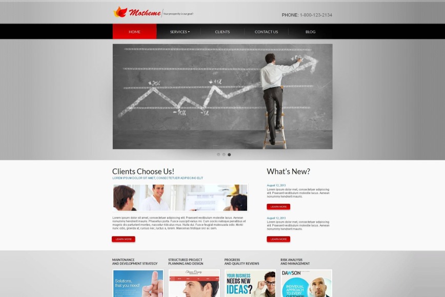
Gray Marketing Website Template with Red Accents
One-color websites are rare to find on the Web. A good design is often a combination of neutral and bright colors, like this gray marketing website template with red accents.
The template is a working tool for any business. The background consists of several gray tones. They are stylish and pleasing for users. Important details are differentiated by their red tone. It is a very successful idea to point out the most needed buttons, slogans etc.
The navigation is provided via a drop-down menu bar. Regularly the menu is colored in black, but a selected item turns into red. Plus, there is a tiny arrow for a drop-down part, thus the visitors may see that a particular page includes subpages. It is done to prevent the pages skipping.
Let this useful tool work for you and you won’t loss!
Customer Ratings & Reviews
Requirements
-
PHP v. 5.4+, 5.5+, 5.6+ -
Zend Guard Loader