Landing Page Design Best Practices, Examples and Ideas
Landings seem too easy to be discussed, but they bridge the gap between inbound traffic and client acquisition activities. Hence, I feel that designing landing pages is extremely crucial for businesses with industry best practices included. The visitor shall be able to find everything they expect and seamlessly provide their details. So, how would you make them agree within a few seconds since 9 of 10 people leave the page right away? In this article, I am going to share some industry landing page design best practices with examples and ideas for the readers.
We shall understand the dynamics of landing page design best practices and how to choose a template specifically tailored to your needs. They introduce your organization to the visitor, connect with them, and convince the inbound traffic. A landing page primarily generates leads and gathers customer information, including contact person, company name, contact info, and sense of the inquiry. While setting every element, you have to ensure that they contribute to the purpose. You can assemble all of them in multiple ways, but striking the right balance is an art in itself. I will use some of the world-leading websites for our readers as almost everyone is familiar with those brands. Dive below to learn more about methods to make the most out of every opportunity.
Landing Page Design Best Practices – Universal Consistency
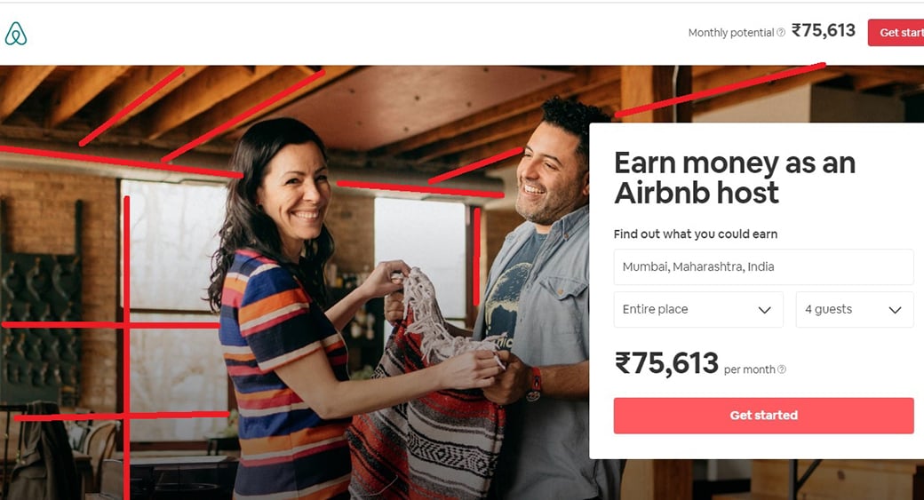
The most common occurrence I have observed so far is the illogical placing of components that are neither relevant to the previous interaction nor providing utility to the owner. This mistake may sound frenzy, but it is a reality for a lot of folks. As a rule of thumb, do not overdo things and try to KISS (Keep It Standardized, Solid, and Streamlined). I reckon that your audience will appreciate a clean landing page with everything in harmony with their expectations. A good example is Airbnb.
Have a look at the following details:
- Personalization: When you land on the ‘Become a host’ page, it tracks your location to provide an estimate.
- Clarity: The image used in the background is relevant to the feeling of a homestay experience. It also separates every element while adding to the purpose.
- USP: The page displays the probable income figure based on the location and accommodation capacity.
- CTA: Call To Action (CTA) button is placed just below the earning potential. It smartly allures visitors into getting started with earning money. They also put the same CTA button on the top right corner near the minimize button.
They are in line with every entity within the page without conflicting with the purpose. The friendly faces, color contrast, value proposition, CTAs, and fonts are very expressive. On the contrary, the required information like location and further fetches the capacity to serve guests without bothering the visitors. The exchange of business prospects goes hand in hand with this landing page. Perhaps, when you lay your hands on the designing process, things get clumsy. Whether you are using a full-fledged CMS or coding it from scratch, I have got your back with these methods:
Placing Product and Copy in an Accessible Manner
We will try to understand the art of displaying products and the copy with some examples of landing page design best practices here. They are oriented towards rendering an aesthetic appeal and help to make decisions promptly. Organized, streamlined, and user-friendly landing destinations are an asset to any company and we have brought some of the best-in-town features for your ready reference.
Best Practices for Design Philosophy in General
The visitor will like the page if it is predictable and proactive. Reduce the number of page elements to a minimalistic level for better search engine visibility. Colors play a critical role in association with the brand. Use vibrant color palettes that compliment your business. For instance, if you are a tour operator, nature-based themes will suit your landing page. Or if you are into gifts, warm colors are a perfect choice. On the other hand, fonts should be friendly to all browsers and device sizes.
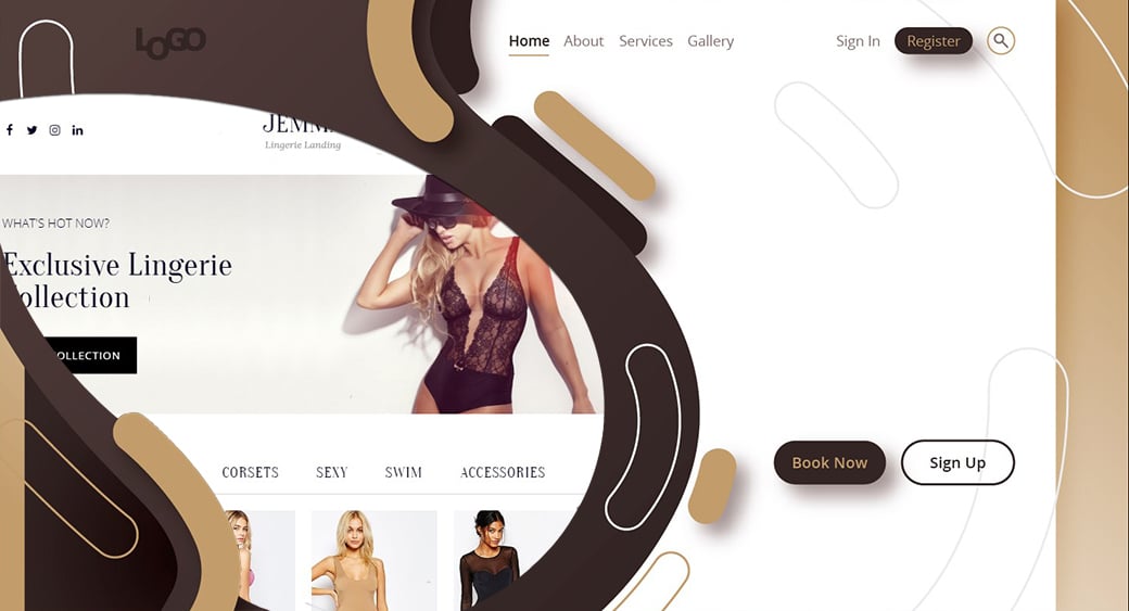
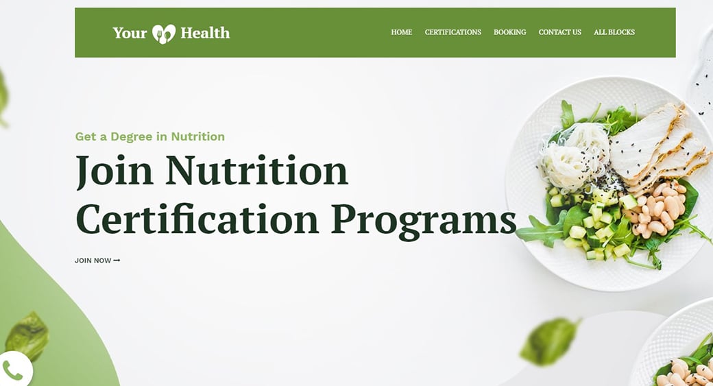
Bright Color Landing Page with CTA
It is always favorable to highlight your products and services in visual proximity near the CTA button. I recommend designers to be conservative in setting navigation tabs and non-relevant features as they hurt the chances of attracting undivided attention.

As far as the copy is concerned, make it productive sufficient for subject matter experts and understandable enough to newbies. Structuring your headline, CTA, and core content are essential than cramming all information in small areas. UI Copywriting shapes the nature of engagement, so keep that on the tab.
CTA Landing Page
Call To Action Website Design

I am dividing the placing of landing page elements into two lists for your ready reference.
Ideas For Readability From Newspapers
- Keep only the vital entities in the upper fold like a newspaper front page.
- Follow the rule of F/Z for positioning texts on the page. Newspapers generally have 5-9 columns for placing the textual information. Reading wordy content becomes problematic when the length exceeds a specific limit. Newspapers keep the column width around 4 cm ballpark.
- Make sure to curate the landing page in such a way that there is enough blank area on the page. Stuffing too many words will lower the chances of visitors reading anything out of it.
- Using relevant icons will help convey the meanings promptly.
- Avoid abrupt changes in the font size in the same paragraphs for highlighting specific words.
Ideas For Visuals From Cinema
- Always use eye-level framing for the human figures on the landing page for friendly interpretation.
- Apply the rule of thirds or the golden ratio for placing the subject in the image.
- Leading lines play an important role in helping concentration. Like in the Airbnb image, you can see that the subjects are around the intersection of the leading edges (marked by red color). Use them to your advantage.
- Your color pallets shall complement the products/humans and clearly define the boundaries. Check ambiance in the case of human subjects as screen brightness and color quality are dependent on the user devices.
- Your CTA buttons enjoy higher visibility when separated from graphics/videos.
All of these tricks make your landing page easy to analyze and encourage quick decision-making. They create an enticing, relatable, and emotionally coherent page for any brand. They don’t increase the design cost exponentially but have much higher conversion ratios.
Chatbots for Higher Conversions
I find this idea very compelling and user-friendly at the same time. Using chatbots on landing pages converts the whole experience into an engaging, interactive session for the visitors. They can make inquiries, submit contact information, disclose the purpose of the visit, and subscribe to your mailing list on the go. Chatbots are diligent and available on a 24/7 basis, contributing to a higher conversion ratio.
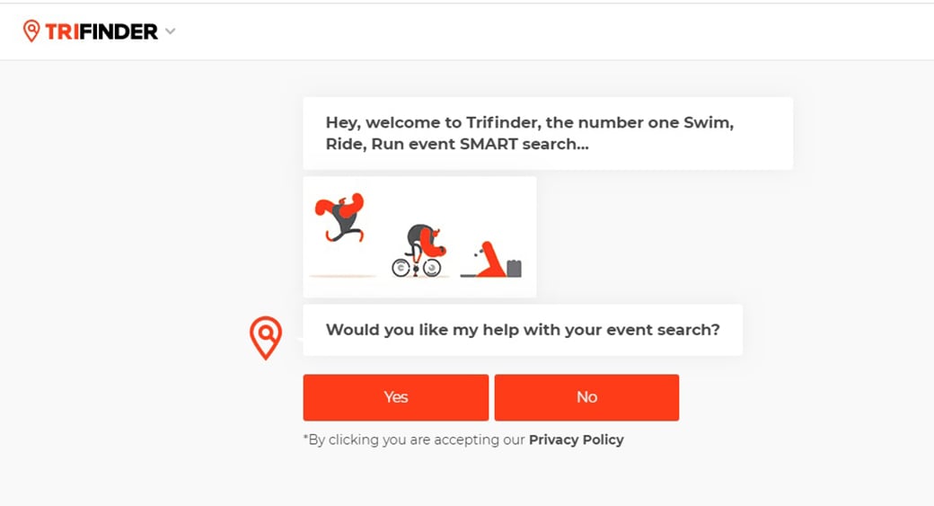
On the other hand, as a user, when you land on a company website through an advertisement on social media or Google, you would like to accomplish your purpose promptly. If you are surfing to get payroll software or an insurance policy, putting effort to understand or navigate will never please you. The same goes for the visitors to your page. A chatbot attends the inbound traffic like a sales rep and facilitates the exchange of information seamlessly.
Insight: By 2020, 80% of the brands expect to use bots for customer interactions.
Instant responses give us a distinct edge since most of the customers require support on arrival. In case they want to purchase an item with 30 variants, bots can keep them engaged while fetching the right product for them. Bots also answer FAQs if the customer has any doubts. Nowadays, most chatbots place CTAs right during the chats to make the data and consent acknowledgment more natural.
Let us understand the best practices with the help of some examples.
Best Practices for Using Space Wisely
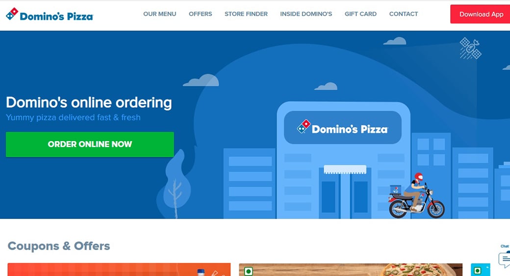
Domino’s Pizza has made excellent use of the available spacing. They have placed two CTAs on the page. The green one (Order Online Now) is big enough to attract attention and well-differentiated from the bluish theme. Moreover, the USP displayed by both the tag line (above CTA) and the vector showing a pizza delivery boy helps decision-making. The second CTA (the red one) enables app installation.
Well, they also have placed a chatbot window on the lower right-hand portion of the page with a preview of coupons and offers. None of these entities conflict with each other or hinder viewing efforts. It’s lean, consistent, and concluding in nature.
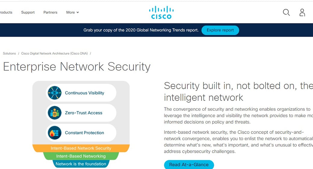
Cisco’s landing page in the above image is another example of efficient usage of spacing. Interestingly, they’ve made it informative and crisp without bothering clarity. The traffic on this website in terms of demographics belongs to techies and senior management personnel. Hence, we can agree that keeping the landing page informative is imperative to serve clients with higher expectations.
Another thing I noticed is that their webpage has plenty of blank areas. It helps reducing complexity by leaps and bounds. The copy is lean and crisp while it serves its purpose to describe the content in a nutshell. Infographics also aid in the decision-making process.
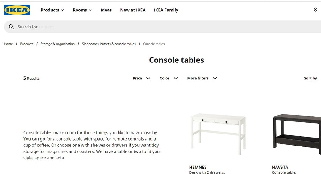
Ikea also demonstrates a beautiful blend of products, pricing, and information on its product destination pages. It also offers responsive fields where you can choose the desired type and attributes of the products. The whole experience is identical to a walk-in store brought right to your screen.
Here is another example that might inspire you.
Key Industry Practice – SEO
Using long-tail keywords is one of the best ideas when it comes to building a destination page URL. Also, custom URLs are one of the most overlooked yet vital parts of landing page design best practices. The CMS solutions integrated with web hosting services provide an option to develop a custom URL for better SEO. Apart from the tags and meta description, optimize the images/videos/GIFs using Alt text. The size of the file, its name, and even EXIF data aid the SEO process.
Ensuring high loading speed remains one of the most common practices as Google continues to emphasize it. Also, link your destination page to the Analytics tools. Clubbing the generic keywords with your products is also an excellent idea for enjoying higher authority. Interconnecting the keyword headings and links will enlarge the visibility range of your webpage.
52.2% of the website traffic comes from mobile phones, finds Statista. Using responsive mobile app web pages is essential to ensure Omni-device compatibility. Nobody likes zooming in and out of the webpages on their smartphones. Unrewarding efforts like these also hurt your SEO game. Having to scroll too long increases bounce rates. Therefore, place CTAs at the right places so that they g encashed during the dwell period.
Example of Driving Credibility and Relevance
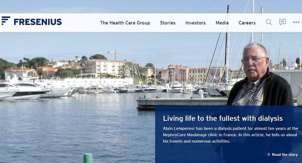
Social proof is an unmatched element for building trust through landing pages. Like in the one above from Fresenius, the third party referral is smartly used for capturing visitors. The healthcare industry banks on trust, and this page leverages it by displaying a person with prolonged illness history. They have curated content to look like an interview, as it seems relevant for patients searching for successful healthcare options. Personal opinions impact better than industry statistics when it comes to such products/services. Crafting such destination pages plays a pivotal role in the conversion ratios.
The patient is shown near boats to establish the idea of an active lifestyle. The ten-year time frame adds substance to the claim of reliability. Together, they create an emotional relevance to the desired solution in a fraction of seconds. You can always tweak your copy to suit the goals but maintaining coherence with the theme is a must.
Example of Efficiency in Terms of Funneling
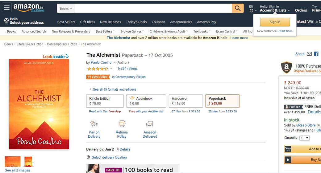
The landing pages on Amazon are one of the best examples of excellent sales funneling. You can buy different versions of the same book with the help of these CTAs. Just click on your favorite item, and all information gets sorted to suit your preferences.

“Add to cart” option is another way to map the interest of the visitors. The ability to share the link on social media is another feature that contributes to the overall utility of the web page. The e-commerce destination pages shall proactively link to the analytics tools for optimizing the sales funnel. Each click funnels down buyers to each product version with a CTA resonating to make a purchase.
Summing Up Landing Page Design Best Practices
All the best practices mentioned above are used in varying proportions depending upon the needs. You cannot go for anyone combination all the time, even if you are building them for the same website. Hence, devising an optimal mix remains at the heart of creating beautiful destination pages. I hope that this article, along with the industry practices and ideas mentioned here, will help you to get some awesome landing page design ideas for your business.


Leave a Reply