Best Practices for Website Navigation: The Complete Guide
Can you imagine a website without navigation? Some business owners don’t pay attention to this section and don’t realize it is essential for any site. It improves user experience and significantly complements information architecture. That’s why today we offer you to consider the best practices for website navigation, learn how to plan and improve it, find out all the possible valuable elements and consider some bold navigation solutions.
Why Designing Website Navigation Is Important
In simple terms, it helps visitors find the necessary product, page, contact information, prices, subscription form, anything they are looking for. Please, pay attention that users should get what they want in up to 3 clicks. Otherwise, you risk losing potential clients.
Also, we recommend you not rely only on a well-known navigation menu as it’s just the tip of the iceberg. You might be surprised to learn how many navigation elements a website contains. Let’s check the most prominent of them and learn where, when, and how to use them to provide the perfect user experience.
Most Popular Elements
- Website navigation bars and menus;
- Breadcrumb navigation;
- Search bars;
- Site maps;
- Text links and anchors;
- Icons and buttons;
- Tags;
- Logo linking to Homepage;
- Footer;
- 404 Page.
Main Website Navigation Types
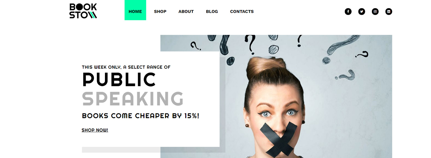
Navigation Bars
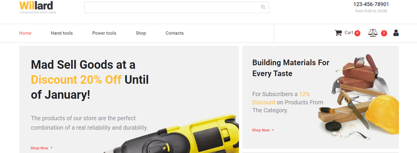
Among the best practices for website navigation are navigation bars and menus, which are the traditional means of guiding a visitor through the website. Most menus use the hierarchical principle for the structure: from general sections to more specific. It’s the easiest and the most natural way to provide navigation across the website to any category and page.

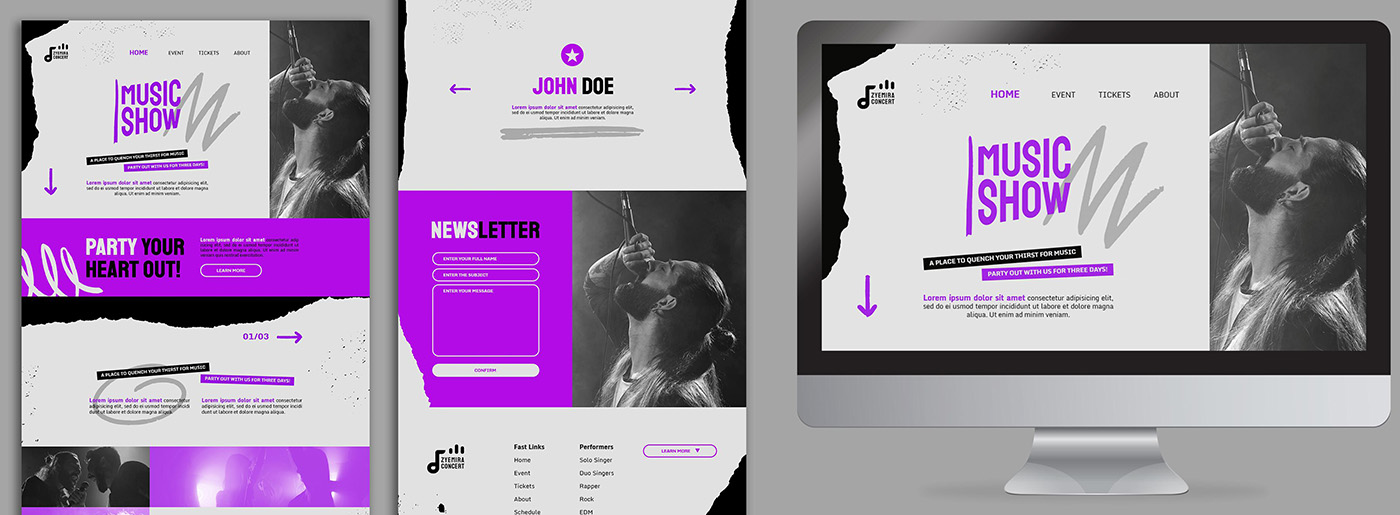
The navigation bar is a panel placed on the top of a page, and it usually contains the main categories of the website. Sometimes it may appear on the right or left side of the page or even on the bottom. Some creative examples of the navigation bar may include navigation in the center of the page(still, it’s better to avoid such bold decisions).
Hamburger Icon – Use or Not to Use
The navigation bar is often hidden to save some space on the website. In most cases, it appears when you click or tap on a “Hamburger Icon” in the corner. There are many pros and cons to its use for menu labeling. Most haters claim it is bad for the UX and engagement because it hides important stuff under the icon and makes users perform more actions to reach the content they want to. However, we can notice a hamburger icon used on many websites, and for now, there’s no better solution to replace that icon.
Besides, in-page navigation for one-page websites is mostly similar to that of the sliders. It depends on the type of scroll – horizontal or vertical. This type of navigation is often presented in the form of a fixed transparent panel with a row of points. You may scroll down to discover all website content, or you may use these navigation points to jump right to the next section.
Best Practices for Website Navigation: Navigation Menus
Today you can come across multiple versions of navigation menu styles. Drop-down menus rank first in this category as the most popular and often used style. It appears when the element in a menu bar is clicked, and another menu drops down. The drop-down menu may contain many levels to lead a user to the most specific areas of the website.
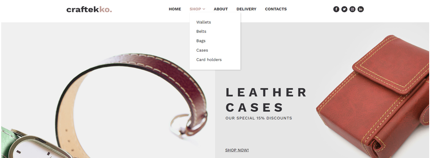
There’s a common misconception that multi-leveled drop-down menus worsen user experience. However, mega menus with large 2-dimensional drop-down panels work well for most users. They are perfect for big websites with complex navigation systems where regular drop-downs are not too handy and miss most of the options users may need. As in real life, here balance is essential – it’s evident that those who have up to 5 pages don’t need it, and those who can’t structure their products also won’t succeed.
Still, there is an unpleasant problem with drop-down menus that irritates visitors: they usually appear when hovered and stay visible while the pointer remains on the menu field. When the pointer is moved from the panel, the drop-down menu hides away, and the user should start over again. It’s evident with the so-called “diagonal problem” when the pointer temporarily goes outside the menu area to reach the content on the other side of the panel. This issue may be solved with the drop-down menu staying visible for some time, even if the pointer is moving outside the menu panel.
Besides, the second most popular menu among users is a sticky one as it’s incredibly convenient. Thus, there is no need to return to the top; just click on the desired page.
Logo Linking to Homepage
Most website owners add a link to the Homepage on the logo. For example, if you click on MotoCMS heart on the left, you’ll be forwarded to our main page. It’s a quick and easy life hack that we recommend you to use.
Breadcrumb Navigation
This navigation type works in reverse to the navigation menus. It allows a user to track a path back from any place on the website. The term comes from the Brothers Grimm’s fairy tale “Hansel and Gretel,” where children were leaving a trail of breadcrumbs to find their way back home.
Breadcrumbs navigation usually appears on the top of a page and shows the hierarchical position of this page in the website structure. Parental categories for the page may be highlighted in bold or shown in different colors or fonts. They are usually separated with a “more-than” sign or other glyphs and allow users to jump right to the section they find interesting.
Breadcrumbs may be Path- or Attribute-based links that provide additional navigation. As said above, path-based navigation may appear on any website, while Attribute-based breadcrumbs appear mostly on eCommerce websites. This type of navigation doesn’t display hierarchy but shows characteristics of the item on a page that can be reached in many ways.
Footer Navigation
Footers are often neglected or paid little attention in terms of design and structure. It mostly happens due to the famous web design principle – what is below the fold is less important. However, footer is one of the best practices for website navigation as it’s often the best place to display important info about the company, its address, and phone number.
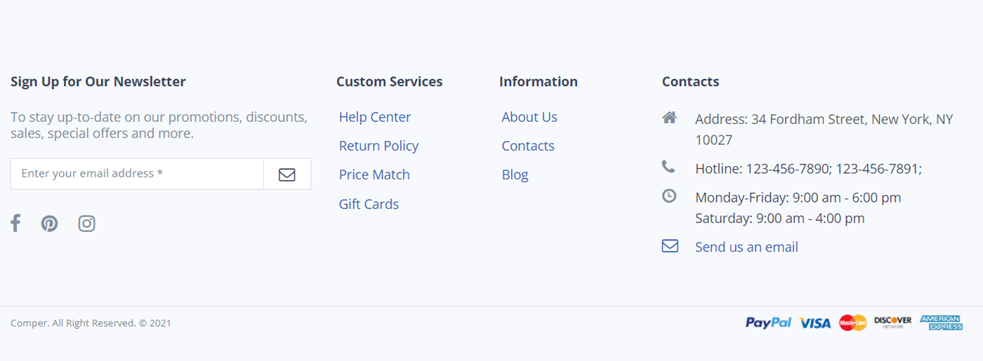
Footer is a common place for social buttons, so it guides visitors to social media pages of the company. Sometimes we can find some surprising categories in websites’ footer sections, like on the Chickenbot page: it contains an Ingredients section in the footer between the “Privacy” and “Credits” tabs.
Footer is a perfect place for other additional data of the website like Recent or Popular Posts, Comments, and Testimonials sections or some useful stuff like banners, call-to-actions, or various offers. Moreover, we can notice even menus there.
Separate Pages
Separate pages navigation is a bit similar to mega menus, but it can’t be depicted as a mega menu due to the content. Making a visitor use a separate page for navigation may not be the best UX solution. But when choosing between creating a huge clumsy menu or using a separate page to show the content, then a separate page menu may not be the worst option.
Best Practices for Website Navigation: Additional Items
Search Bars
One of the most underrated navigation types is the search bar – it offers a great way of browsing a website without wasting time. Actually, the search bar is not the main navigation means because it cannot guarantee that a user will find what he looks for. It only gives hope that this or that website may possibly include this kind of info.
However, the search bar is still one of the most important elements of the website design. It helps a user to find necessary content directly, without having to use a navigation menu. The search bar should be definitely included in 404 page design. It improves UX and stimulates a visitor to provide navigation from the error page without having to leave the website unsatisfied.
Site Maps
Unlike search bars, site maps are losing their popularity and functional meaning. Firstly because users are offered enough navigation means used to find what they need.
Another reason is that site maps usually contain plain text, which makes them not too appealing and handy for visual-craving users. Even though adding icons or other visuals to the site map is not a problem, it won’t make them more useful or attractive. Users are to miss some info anyway due to scanning website pages instead of carefully reading them.
Today site maps are mostly created for search engines that crawl a sitemap.xml file, while their functionality for users diminishes. By the way, in the MotoCMS admin panel, you can automatically create such a file.
Text Links and Anchors
Often considered as a separate element in website building and more used for SEO options, links are a perfect way to guide visitors through your content. Thus, links should be considered not just a part of the link-building process but a way of showing visitors more on your website, helping them find more valuable info on the topic.
Tags and A – Z Lists
These additional means of navigation do suit any website. Actually, tags are still widely used, but they are not highly popular among website visitors in terms of functionality.
In general, tags are some kind of keywords or sub-categories that narrow existing categories of the website and allow users to find more specific content. Visitors may use tags when the website doesn’t offer a “Related Articles” section or when this section’s content doesn’t satisfy a visitor.
Another pitfall is that tagging the article is mostly an intuitive process, and there’s always a risk of overusing tags and creating a cloud of thousands of meaningless tags. Thus, categorizing tags and organizing a tag cloud are essential for any website owner.
Among the best practices for website navigation are A – Z lists. On the one hand, they’re easy to use because they remind of a library catalog that is familiar to anyone. On the other hand, they are usually too large and complex to help find info easily and quickly. Those lists are appropriate for big portals like recipes websites where a mega menu may be not enough.
Up Button
When users scroll a page to the bottom and should return to the beginning, it’s convenient for them to click on the Up button and save a few seconds. Such a tool fits websites that contain lots of information and long landings. Usually, such buttons are created in the form of an arrow.
Icons
It’s a new way of interacting with clients. The most popular icons are magnifying glass, house(for Homepage), basket(for products users want to buy), heart(for favorite goods), and so on. Also, social media icons are widely used in footer. Note, you should follow the same style for every on-site element.
404 Page
If visitors open a page that doesn’t exist, they leave the site immediately. So it would help if you tried to engage them, redirect them to other pages, add a search field and call to action.
Best Practices for Website Navigation
To succeed, you should consider the following three concepts:
- structure(logic distribution of information and navigation that provides access to it in a few clicks);
- brevity(simple, intuitive, and user-friendly elements, especially menu, for effective interaction with potential clients);
- design(the same style, good readability, and standard navigation techniques; unique and unknown icons and buttons may negatively affect user convenience, so it’s better to follow such a rule “less but effective”).
We want you to achieve better results; therefore we’ve created a short list of elements which is a must for your site:
- Header: logo, company name, and a short description/vision and mission statement, location, contact information, working hours, basket icon if you have an online store, call back button.
- Website menu: Catalog of products or services, About us page, Payments and Delivery pages, Repayment guarantee, Portfolio, Discounts, Reviews, Blog, Contacts.
- Footer: links to all essential sections, contact information, social media icons, callback button.
Unusual Website Navigation Example
These are the examples that don’t fit standard best practices for website navigation. For some people, it may seem not convenient at all. For others, it’ll become a breath of fresh air. First, we offer you to look at Litkovskaya website that includes lots of bold decisions, unique icons, and web design elements. It seems strange, and we are sure that not every user is ready to spend his time learning how to manage those pages and find what he needs. Still, it’s a new solution on the web that can become a new trend; who knows.
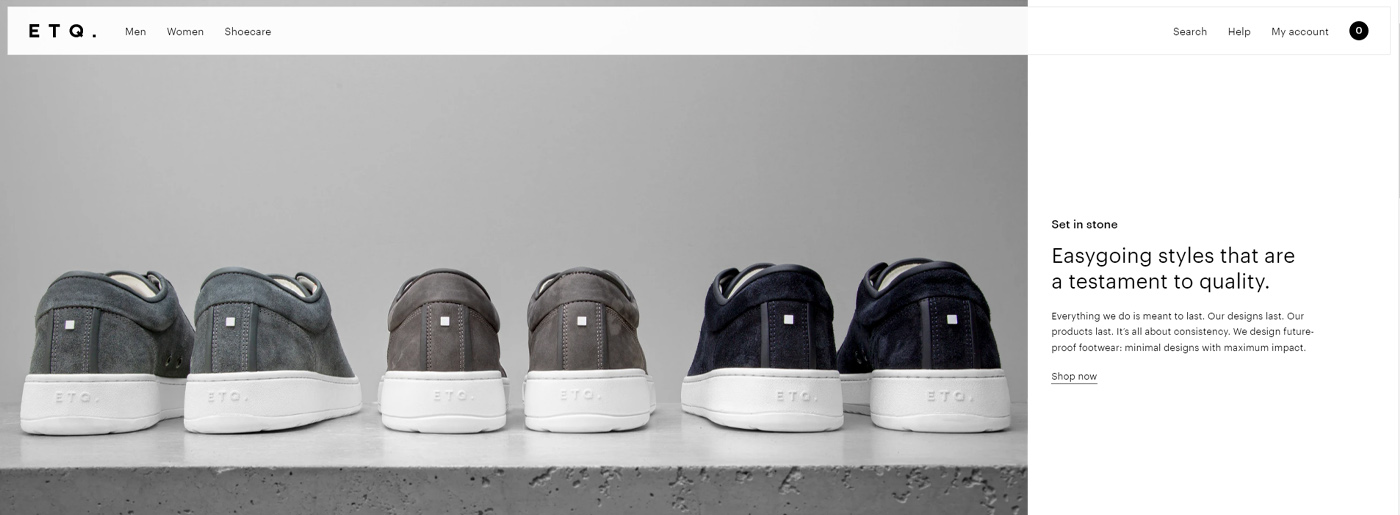
The second example is ETQ. which has three category pages on the left(Men, Women, Shoecare), three on the right(Search, Help, My account), and only three buttons(namely Explore, Grid, Filter), so there is anything extra. You’ll find information about the company, contacts, info(Shipping, Careers, Wholesale), social media links, and newsletter in the footer.
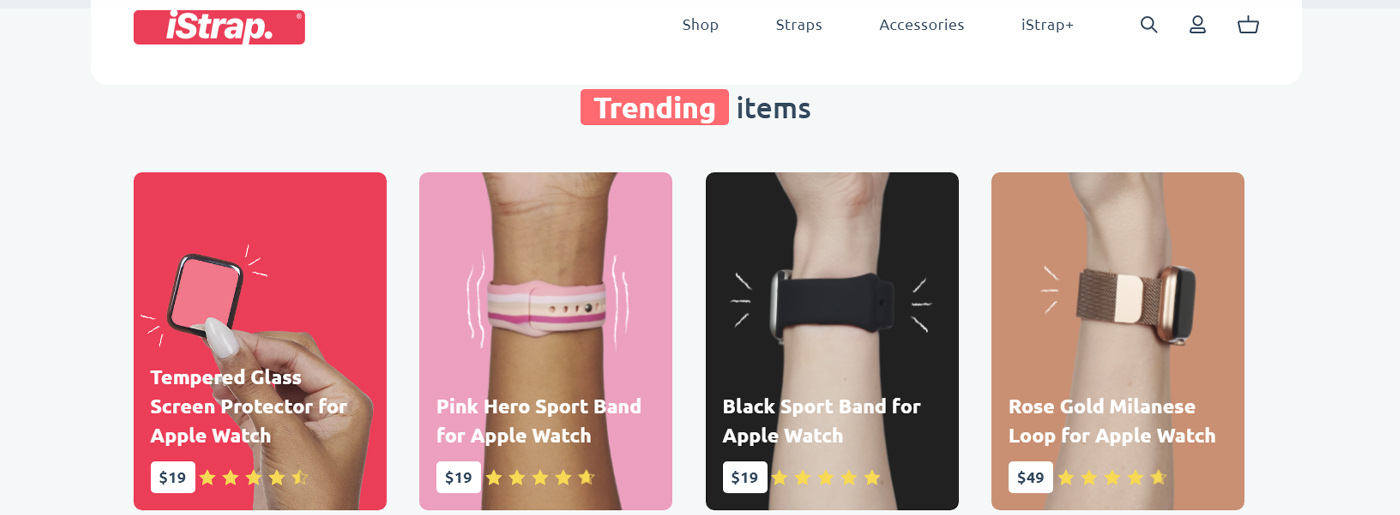
And the last one is iStrap with a bright and eye-catching design. It offers only necessary content and structures it with the help of a mega menu. Also, you’ll stay pleased by the unique icons they use on site.
How Weblium Templates Make Navigation Easy and Effective
Building a website with all these navigation elements may seem overwhelming, but modern tools like Weblium templates simplify the process dramatically.
Weblium offers a vast library of beautifully designed, fully customizable templates that already incorporate best navigation practices. Whether it’s a sleek top menu, intuitive breadcrumb trails, or sticky headers, Weblium’s templates come ready to deliver seamless user experiences right out of the box.
For example, if you’re launching an online store, Weblium’s e-commerce templates include mega menus, product filters, and search bars, all designed to help customers find items quickly and keep them engaged. For portfolio or blog websites, templates feature clean navigation bars and footer menus that showcase your work or posts without clutter.
Plus, Weblium’s drag-and-drop builder lets you tweak menus, icons, buttons, and more—no coding needed—so you can focus on what matters: your content and brand story.
Using Weblium templates isn’t just about speed—it’s about building navigation systems that are tested, user-friendly, and visually appealing. This means visitors stay longer and interact more, boosting your site’s success.
A Few Thoughts About Navigation Use
When it comes to the choice of navigation types for the website, the main thing is the simpler – the better. Your navigation should be easy to use and understand, not misleading, visually attractive, and harmonious.
- The style of navigation menu should present your website content in the best possible way. Remember: if categories don’t fit in one row, consider a drop-down menu.
- A drop-down menu will be great for a small website with a small number of categories. A vertical menu doesn’t worsen UX and adds to the design.
- Mega menu is suitable for websites with wide structure and multiple categories that may be displayed with images. Add A – Z list for a better search if your users know exactly which items they need.
- If you need to add images and descriptions to the categories – choose a separate page menu.
- Don’t neglect a search bar. Add it to the header or footer and leave it visible on the 404 page to offer a handy user navigation from the Error page.
- Tags, lists, and search bars are only additional means of navigation. Don’t rely only on these styles.
You may freely combine best practices for website navigation, but the bottom line is making it comfortable for users.
2 responses to “Best Practices for Website Navigation: The Complete Guide”
Leave a Reply


great article many thanks
My pleasure)