Web Design Elements to Increase Conversion Rates
How big of an impact do web design elements have on conversions? Many people believe that a good-looking website is just that – pretty. But research suggests otherwise. A 2015 study by Adobe found that 38% of people stopped engaging with content if it was poorly presented. So, if the quality of your web design holds the risk of driving away more than a third of your potential customers, you’d better start looking for ways to make it better. For example, address a professional website branding agency and follow the tips listed in this article.
UX vs. Aesthetic Appeal – Which Converts Better?
Now, most resources will tell you that a webpage needs to provide a stellar user experience in order to convert visitors. And that’s absolutely true. Following design principles such as Gestalt, Unity, Hierarchy, Dominance, and Scale, all of which focus on UX, you can select and arrange visual elements in a way that guides users towards their end goal efficiently and without any bounce-inducing distractions. If you would like to learn more about web design that converts, check out Envato’s web design trends for 2021.
However, highly converting web design does not mean skipping aesthetic appeal in favor of familiarity or practicality. Instead, it relies on a combination of visual and practical user-oriented features. When done right, these can do a lot to increase your conversion rates from the average 2.86% and help you gently nudge the remaining 97% of your visitors towards becoming customers as well. So, if you’re ready to take your website to the next level, it’s not a bad idea to do some performance-boosting reorganization. The following are the top website elements to increase conversion rates.
Web Design Elements – CTA Buttons
Back in 2013, Small Business Trends conducted a study and found that as many as 70% of small business websites don’t display a clear call to action. Now, things have undoubtedly changed for the better since then, but CTA design still seems to perplex many designers and business owners. The purpose of CTAs, just as their name suggests, is to direct consumers to take action. That can be adding an item to their cart, subscribing to a newsletter, or giving your business a call. Calls to action aim to prompt an immediate response. Thus, they prevent your audience from navigating away from your pages and (most likely) forgetting all about your business.
As one of the most valuable elements of effective web design, well-placed and well-made CTAs can not only help you boost sales, but they can also ensure that you lock in quality leads you can then go on to nurture. But what can you do to make sure your CTA buttons stand out?
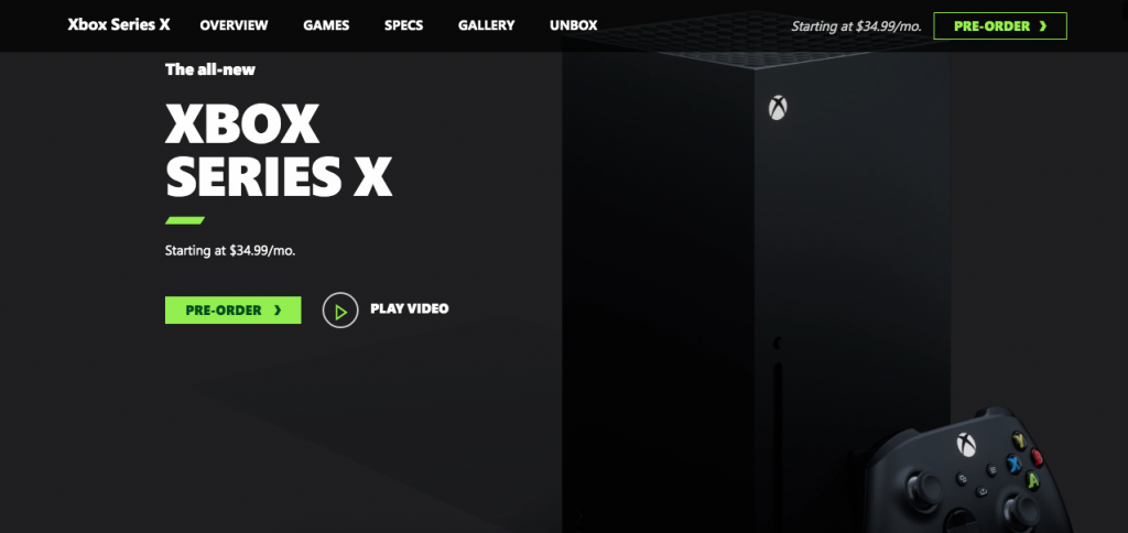
The first thing is that they need to be placed in a highly visible spot. Ideally, a CTA will be repeated several times on the same page, allowing web users to take action in a way that’s logical and convenient. If you take a look at the Xbox Series X product page, you’ll see that there are two “Pre-Order” CTA buttons above the fold: one in the top right corner and one in the main section of the page. What is more, the page contains no other CTAs that would lead visitors away from the page. This ensures that their attention is focused on one action only: purchasing the new gaming console.
Other things to pay attention to when designing CTAs include:
- Text length. Ideally, these buttons should contain four words or less.
- Attention-grabbing design. The button should be large enough and stand out from the surrounding elements.
- Personalization. Speak to your audience and use language that resonates. Place them at the center of the UX, and they’ll be much more likely to convert.
- Non-competition. CTA buttons need to be the most noticeable element of your landing pages. In case you have to include more than a single variant, make sure that the one with the highest assigned value stands out the most. The rest can be slightly more subtle.
Web Design Elements – Visual Hierarchy
If you’re in eCommerce or SaaS, you’ll want to offer your customers versatile products and services. But have you ever thought about the fact that multiple product options don’t necessarily lead to higher conversion rates? On the contrary.
In consumer behavior psychology, decision fatigue is known as the process that occurs once a person is forced to choose too many times. The more choices a person makes, the less energy they will have for the next instance requiring their attention. And so, decision fatigue impacts the way they shop. The four main effects of decision fatigue include:
- Reduced capacity to make sound choices;
- Impulse shopping;
- Impaired self-regulation; and worst of all (for your website)
- Decision avoidance.
But the thing is, web design elements can help you avoid overwhelming your web visitors. Moreover, the right visual hierarchy in scrolling website design may even increase conversion rates.
In web design, visual hierarchy refers to the arranging of different elements based on their level of importance. In addition to placing conversion-driving details, it also dictates that the highlighted data needs to be bigger, de-centered, and of a contrasting color to its surroundings.
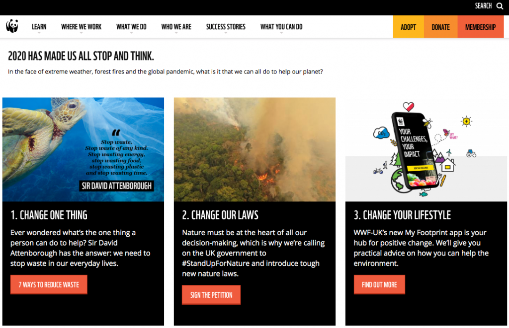
If you’re looking for great examples of visual hierarchy being implemented in web design, take a look at the WWF How You Can Help Nature landing page. Here, the design team had to come up with a way to inspire people to take action. So, their choice was to present web visitors with steps. The first requires the least commitment, and the last entails the most. When the actions are presented in this way, even if web visitors do get decision fatigue, they’ll have done something to support the environmental cause.
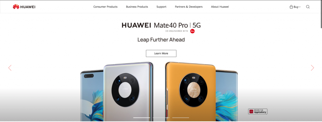
For a more commercial example, however, you can check out the Huawei homepage, where the most eye-catching section features the company’s latest releases. Again, this is a conscious choice that was made with the knowledge that web visitors may only take one single action after landing on the website. So, naturally, the first thing they’re shown is the company’s flagship smartphone, which they can go on and explore in more detail.
Web Design Elements – Colors & Contrast
One of the elements of web design that many experts believe contributes to conversion rates is the use of color. According to color psychology, each hue is capable of evoking an emotional response, which may, consequently, inspire web visitors to take action on your website.
Based on social and cultural factors, website users are likely to associate different colors with different meanings. According to Verywell Mind, white is commonly connected to modernity, black to power, blue to stability, and yellow to adventure. Nonetheless, it’s key to keep in mind that each person will have a different perception of color based on their personal experience.
Still, color meaning shouldn’t be disregarded just because it’s difficult to pinpoint. In terms of branding, it’s one of the most effective ways to set yourself apart from the competition. In addition to helping you define your brand visually, color can also attribute meaning to your logo. So, if the color blue is perceived as trustworthy and secure, it’s natural that it would be the go-to choice for tech, transport, and security companies.
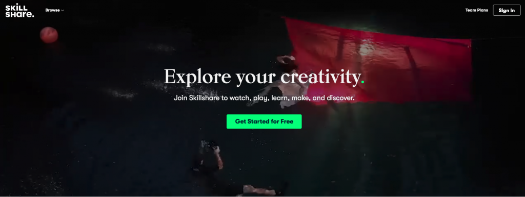
But how can color help you increase conversion rates? Well, for one, you can use colors and contrast to call attention to conversion-boosting elements such as CTA buttons and unique value propositions. Take a look at the Skillshare homepage. You’ll notice that the company’s hero section features a mission statement in white (chosen to contrast with the changing background) and a bright green CTA button. Both of these elements are sure to catch the eye, resulting in a higher likelihood of visitors.
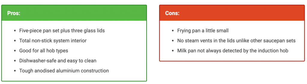
Of course, there are other ways you can use color and contrast. If you’re putting together content that’s supposed to help readers make up their minds, you can use widely accepted color signals. Take a look at how BestSpy does this in their saucepan buying guide. Instead of just listing the pros and cons of each of the products, the designer chose to visually separate them. It’s a simple strategy, but one that works without fail.
Web Design Elements – White Space
White (or negative) space is the web design principle that proposes using space around different elements. This might seem counterintuitive to some, but negative space is actually a beneficial concept. For one, it allows web elements to “pop.” Secondly, it lets you break up large chunks of text (which often deter web visitors from engaging with your content). Lastly, it positively impacts the buyer journey by directing attention in the right direction. All of these improve user experience and automatically increase conversion rates.
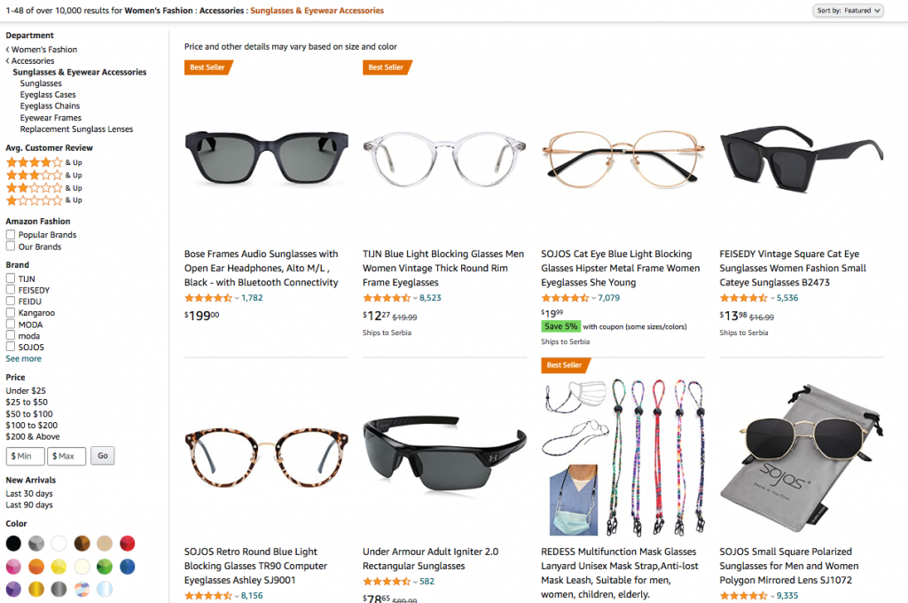
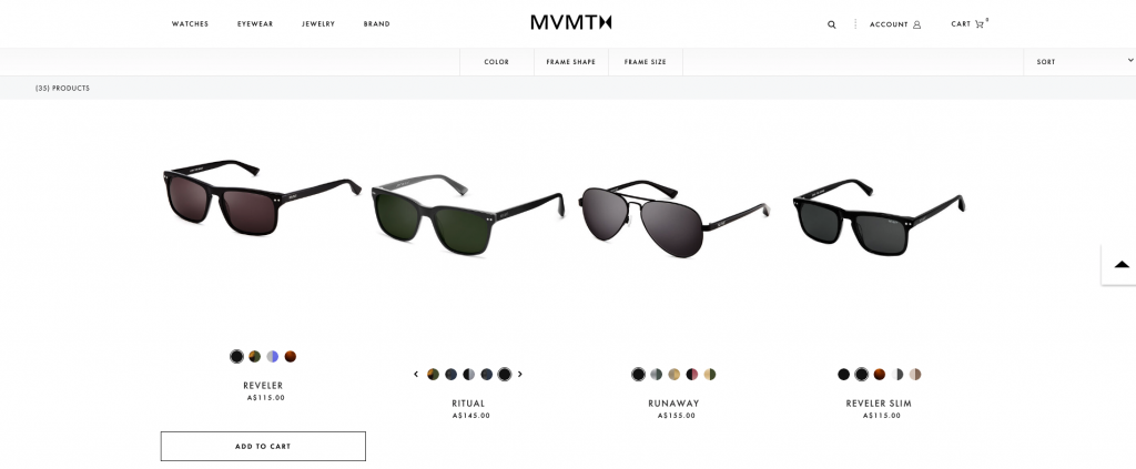
So how can you include more white space on your website? First of all, understand that it doesn’t have to be white. It can be any surrounding graphic that allows your message to get across effectively. For a great example, take a look at this template. Of course, negative space isn’t just something you’ll use on your homepage. It’s equally beneficial on eCommerce collection pages, product detail pages, as well as your blog. If you compare Amazon search results pages with a well-designed collection page, such as this one by MVMNT, you’ll see which of the two showcases the products in a more flattering way.
High-quality Imagery
Speaking of eCommerce, don’t forget about the impact of product photography on conversions. As humans are prone to making decisions based on visual information, you must choose product photos that wow. But there’s more to conversions than choosing pretty pictures.
If you consider that online marketplaces don’t allow shoppers to get a tactile feel of a product, it becomes clear that you need to create a shopping experience that can compete with brick-and-mortar stores. For the most part, this means including plentiful information and views from multiple angles. Providing detailed views will further increase your chances of making a sale.
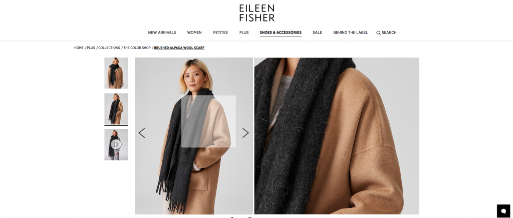
If you look at this product page on Eileen Fisher’s website, you’ll see that the brand allowed web visitors to take a closer look at the items through a zoom feature. Even though potential buyers can’t feel the material in their hands, they can better understand how it will behave by looking at the weave and structure. Of course, visuals aren’t just relevant for eCommerce and product pages. They’re equally impactful on your homepage, your feature pages, and your content strategy. What’s crucial? You should always use high-quality, original images that do a good job of representing your brand and the unique benefits you offer.
Performance
The last aspect of your website that will increase conversion rates is its performance. Design elements can often add to user experience and even impact user behavior. However, in some cases, they can also take away from the overall efficiency of your online presence. For example, images are key to communicating features and benefits to your consumers. But, if they don’t display well over various devices, they cause high bounce rates. The same goes for loading speed. A mere one-second increase can bring your bounce rates up by over 5%.
When looking to boost conversions, think about your audience’s needs. What devices are they using to view your pages? Where are they coming from? What are they expecting to find? One of the biggest mistakes in marketing includes creating costly PPC ads, then sending visitors to a homepage that doesn’t answer their questions or show them the products they’re after. For the best results, you always need to think about customer experience and what you can do to make them feel comfortable shopping with you.
For different businesses, that will mean different features. The main takeaway is that you must experiment, test, and measure, then make any necessary changes based on your audience’s response. Yes, it’s a time-consuming process. But, then again, slow and steady wins the race.
Web Design Elements – Optimizing Your Website for Conversions
You can use these tips whether your website is already up and running or just starting. Therefore, you can ensure you’re getting as many conversions as possible. Of course, keep in mind that creating a great website takes preparation, expertise, and the readiness to make adjustments based on measured performance. So make sure you surround yourself with a stellar team. It will be capable of supporting and advising you when things get confusing.


Leave a Reply