You can also check out Weblium’s website templates — they follow the latest design trends, including the smart use of bold typography. Whether you’re creating a portfolio, landing page, or online store, Weblium templates make it easy to build a modern, stylish website that uses bold fonts to grab attention and guide visitors through your content effectively.
Bold Typography and Thick Fonts – How and Where to Use It Right
Allison Reed 2 April, 2022
Bold typography has got an incredible potential when used appropriately, meaning in the right place and in the right quantity. In this article, we have gathered the best pieces of advice from top web designers on how and where to apply bold letters. Having learned about the qualities of the (un)appropriate bold text, we will offer you ten free bold fonts that belong to our favorite ones. Keep reading to learn more about the main advantages of bold text as well as risks that using bold typography involves.
Appropriate Bold Text: Why to Use the Bold Typography
Reason 1. Let us start by saying that there is only one true reason why you need bold letters on your website. And this primary reason is to provide emphasis. In other words, the right way to use bold typography is to specify the content that needs to be emphasized and pick the appropriate thick fonts.
Reason 2. Thick fonts can also be used to demonstrate the visual hierarchy on a web page. It is especially important for multi-pages websites that contain lengthy descriptions. In short, bold fonts can function as guides when a document or a page looks overloaded with information.
This being said, you should remember that there are other effective tools to be used for this purpose, like underlining, a bigger font size, italics, the white space, tables etc. Ask yourself a question why thick fonts and not, let’s say, caps. Do you want to use bold website typography for no good reason (or in other words – “It looks more appealing to me right now” and “This is the way I see my website”) or to make a certain point? If you answer involves “making a point”, then go for it – find a bold font and use it! If not, then obviously you should reconsider applying bold typography to your online project.
Reason 3. One more reason for adding bold fonts to your website is to attract more attention of your prospective online visitors. But again – explainer videos and galleries can be much more helpful than plain bold text in this case, can’t they? So, make no mistake – there should be a clear understanding of the role of bold fonts on your website from day one.
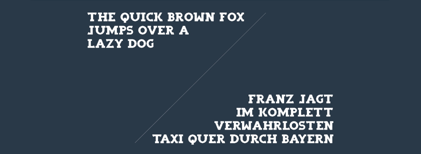
Reason 4. It is also worth mentioning that bold fonts are used to ensure high readability. It is already scientifically proven that people tend to notice (and read) large-print content first. When combined with minimalistic design, people can not help reading bold letters.
Appropriate Bold Text: Where to Use the Bold Typography
A good place to start testing your bold fonts is a header. This is where your online customers expect to see bold text, so why disappoint them? Adding bold letters to your header usually places the emphasis on your logo design and a company slogan. As a result, these two elements according to the font psychology are easier to remember and recognize. Of course, this marketing strategy will work only if you use bold and neutral text in reasonable proportions.
Moreover, it always makes sense to opt for bold typography when designing headlines for your blog posts. Bold fonts create a stunning combination of the classics and modernity and can catch the eye of an online visitor like no other typography instrument.
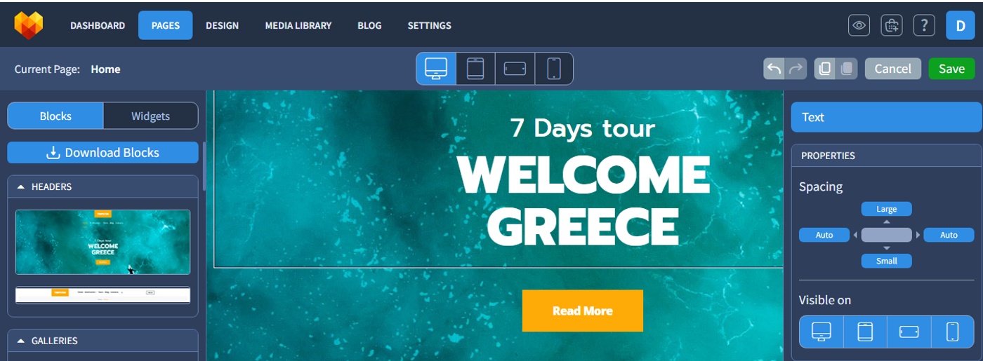
Another content element that can be designed in bold letters is jump lines, like “Read more” or “Continued from Page 1”. Directing your online visitors to the next/previous part of your current blog post with an elegant button can bring you additional clicks. As a result, bold fonts can improve the conversion on your website.
Inappropriate Bold Text: Bad Bold Typography
There are several cases where bold letters would be perceived negatively. They include:
Too Much Bold Typography
As you have read above, bold fonts should be used to emphasize a piece of important information. If you use these fonts too intensively, you may end up with online visitors who are too disoriented to pay attention to any of your content. So, make sure that you define the important information correctly and make it the visual center on your website.
Too Lengthy BoldText
If you are planning to have more than a couple of words (up to 6) emphasized with a help of bold typography, think again. The visual stimulation works only when it is accompanied by the substantial neutral content.

Overlapping Emphasis
As we have already mentioned above, there are many different tools to demonstrate the hierarchy on the web page. Bold typography is simply one of them. However, when you opt for bold letters, it is advisable to minimize the usage of other (often overlapping) tools for emphasis. And sure thing there is no need to combine any of them. Believe me when I say that underlined bold italics can be defined as a web design disaster.
Inconsistent Thick Letters
Once you decide that bold fonts should become an integral part of your website, do your best to save them for special occasions only. Pick a web element that is going to be bold and stick to it. Do not mislead your online visitors with the inconsistency, like having a bold logo on About Us page and a neutral one on all other pages. Now that you are fully informed about the advantages of bold letters, feel free to browse through the collection of free bold typography.
10 Free Thick Fonts
Abro Sans – Editorial Sans Serif Font Thin to Bold

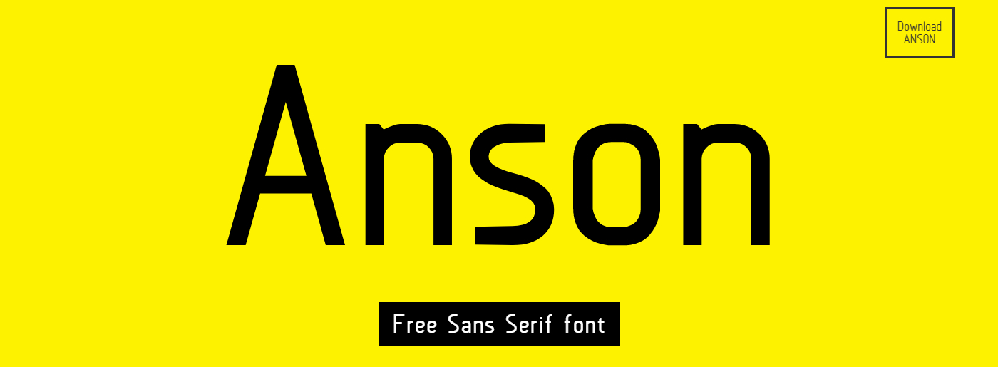
Anson Free Sans Serif Font
ADAM.CG PRO

Godnes – Free Unique Font

Thiket Typeface

Cred – One-of-a-Kind Fat Typeface

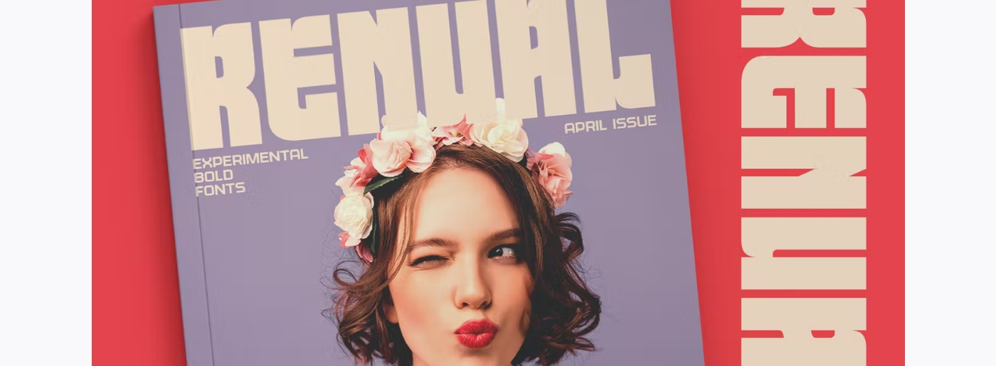
Renual Contemporary Loud and Bold Typography
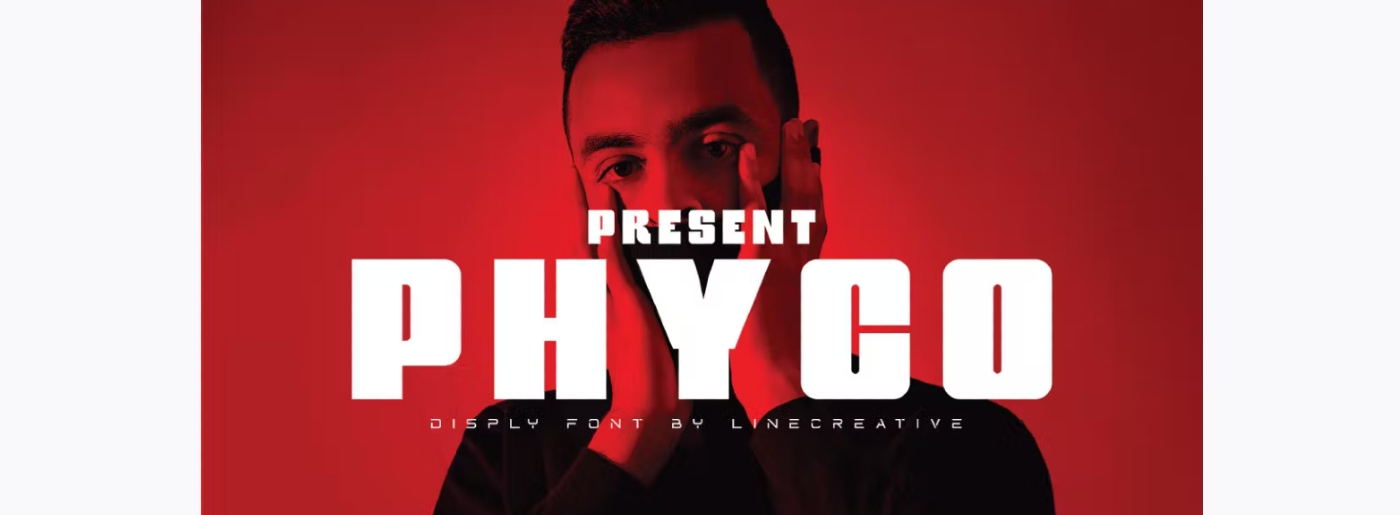
Psycho Font
Fela – Free Font for Personal and Commercial Use
Mortar Brush Font

MotoCMS Also Chooses Bold Typography
Our team strives to follow trends and new design solutions, therefore most of our website templates also include bold typography. The clients can change its style, format, and size in the intuitive admin panel if necessary. In case you still don’t have a site but want to promote your services or products, MotoCMS can offer you a ready-made solution and help you launch a responsive website in a few days!
Summing Up Bold Typography
We hope that you like the tips and a free collection of the best thick fonts we handpicked. If there are any of your favorite bold fonts we`ve missed – help us and comment on them in a special section below ;). And sure, there are some other relevant articles on our blog you might be interested in.
Thank you for subscribing to MotoCMS blog!
This email is already in use.
Something went wrong. We are fixing this. Try a bit later.


Leave a Reply