Using Visual Hierarchy Web Design Principles to Create Compelling Content
Throughout the ages, designers of readable content have faced many challenges. One common obstacle has always been displaying content in a way that the reader can comprehend. Over time, a hierarchy of visual elements was created and reinforced, giving content creators a means by which they could deliver content effectively. However, the debate remains on how best to do this, with new forms of media further complicating this process. As a result, some guiding visual hierarchy web design principles surfaced that help content makers determine how to get their information across to the readers.

Basic Visual Hierarchy Web Design Principles Everyone Should Know
Patterns for Page Scanning Hierarchy
People around the world differ in languages and cultures, but they still share patterns in reading and design. All websites read top to bottom, with a majority reading left to right. However, people scan a page in ways that vary from those simple categorizations. This leaves a very complex job for designers when they create content meant to draw the eye. They need to not only take these factors into account but also scan patterns people demonstrate when viewing pages, as most readers scan content distinct patterns.
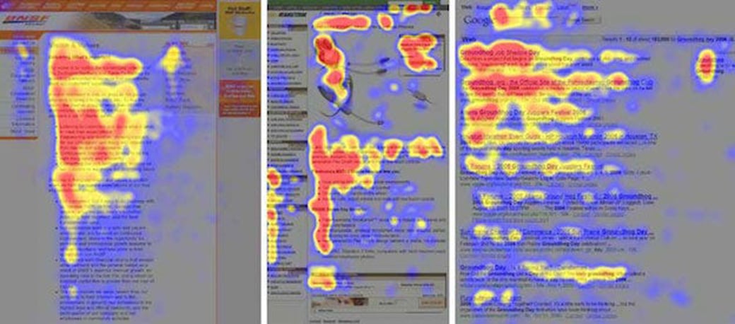
Source: Nielsen Norman Group
When viewing pages dominated with text (often referred to as “wall of text”), readers eyes move in a pattern that looks like an F, hitting hotspots across the top of the text and down the left side, occasionally scanning from left to right to explore areas of interest along the way. Keywords placed as the initial word or in a topic sentence draw the eye across the page before the reader continues scanning.
A smart designer will target these hotspots to maximize views on the most important content on the page, either by simply seeding important information into those spaces or by using keyword bullet points or subheadings to get the readers’ attention.
For pages not dominated by a wall of text, the eyes tend to scan from left to right at the top of the page before shifting at an angle to the bottom of the page and repeating the left to right sweep. Designers take advantage of this visual hierarchy web design pattern by positioning critical information in the four corners and aligning other important points across the top and bottom. This guarantees the viewer will see everything the designer wants them to see while also displaying some other important points for them to consider.
Bigger Is Better
This phrase may seem like a cliché, but, in marketing, the statement holds a lot of weight. The human eye moves toward large objects first. It’s a basic visual hierarchy web design principle which influences the content creation: larger size draws more attention. Newspapers and magazines use this tactic prolifically, placing their strongest message in the larger elements.
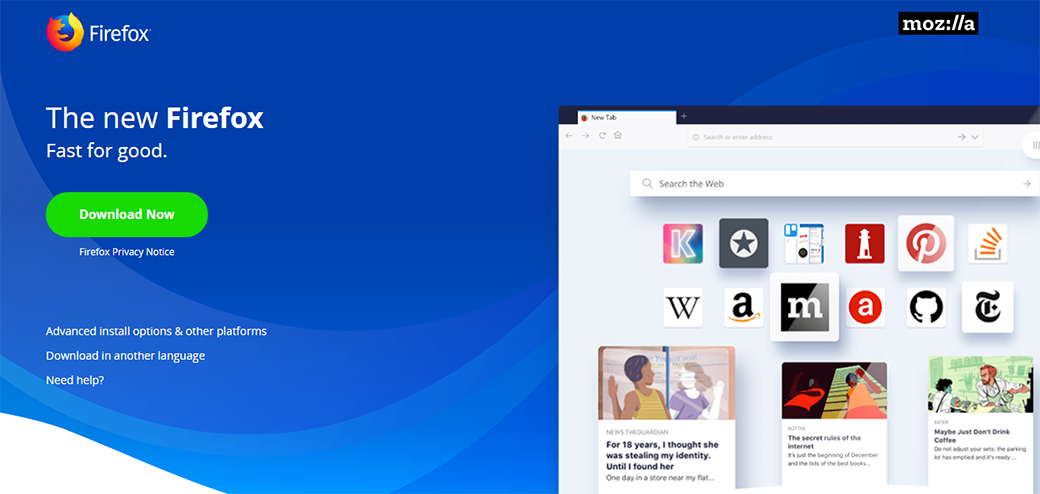
Source: mozilla.org
Another aspect of this concept lies in scale or the relationship of objects to each other within the visual hierarchy web design concept. An object sitting alone on a page has no scale, or impact, for the viewer unless another object exists. When two or more objects are juxtaposed, the concept of scale becomes important. The largest object may only take up three inches on the page but, if all the rest measure 2.5 inches or shorter, that three-inch object will draw attention first.
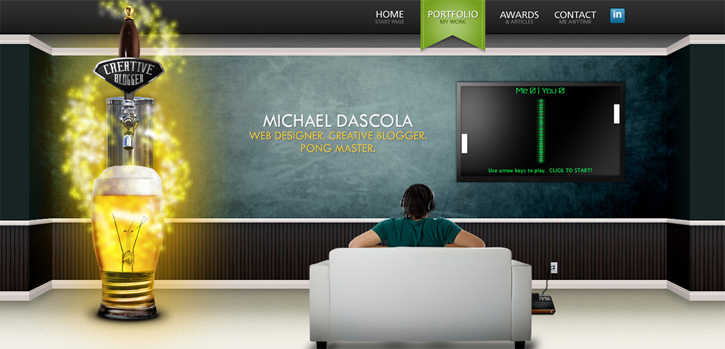
Perspective Illusions
Depth gives an image a more powerful impact on the viewer. It adds complexity and scale to a scene. Imagine a room of students rendered in a sketch all seated at their desks. By shortening the legs of each successive row, the artist creates a sense of depth in a flat, 2D image. A picture of a road offers depth in the road’s width and the size of objects within the landscape. Similar concepts can be used in web content and promotional material, using surrounding images and object relationships to present more robust imagery. For example, web designer Mike Drascola creates such visual hierarchy web design illusion of depth in his portfolio website.
Room to Breathe
To draw the eye, a designer might choose to separate objects on a page, giving the pairing room to breathe, so to speak. Large negative spaces around a button push the object’s visibility out toward the eye. Visual hierarchy web design principle states that relatively small object on the page can gain importance if surrounded by substantial negative space. An item placed close to others can gain relevance by means of a border.
Texture, in visual terms, focuses on the arrangement of objects in a space or patterns used in the space, text, or arrangement of other objects. A large word in a rectangular space will dominate a smaller word in the same space, regardless of how far apart they are; however, a border gives the smaller object relevance in relation to the larger object.
If another object different from the rest appears in the larger space between the two objects, interacting with the larger object while staying outside of the border surrounding the smaller item, the new object redefines the space and moves focus to the bordered object.
Typeface Choices
Typefaces carry weight in stroke width, style, and emphasis through fonts such as bold or italics. An image with text displayed in different typefaces, of varying sizes and fonts and laid out like blocks stacked on top of each other, creates a visually intriguing display. However, a call-to-action (CTA) surrounded by a border below immediately takes precedence over the other, more complex object. The size of the CTA and its placement lend it a stronger visual attraction.
source: Kommigraphics
Some designers want to display all content equally and lay it all out in similar sizes and weights across the page. However, this creates a boring page that loses all urgency relating to anything displayed. To get around this, designers use visual hierarchy web design principle and pair typefaces that work well together but differ in weight just enough to make each object look slightly different.
Contrast Your Color
Bright colors also draw the eye, particularly amid a sea of dull hues. The opposite holds true as well; a single, dark book cover with a simple design on a shelf full of multi-colored covers filled with images and text will stand out more. A magazine could choose a high-contrast image filled with bright oranges and pinks, then place a solid dark color title, to draw your eyes. The same effect exists when a photographer uses black and white photos with near black, gray, or white text across the page but places a single red title in the middle of the image. The eye will not miss the words.
Millennial are particularly receptive to bright colors. This generation is expanding in economic influence and represents a growing majority of professionals and business owners. Staying ahead of the curve by incorporating popular color arrangements can help improve your site’s UX and aesthetic perception.
How artists combine colors is known as the color scheme. Artists can aim for balance or unity or choose to emphasize by way of contrast. In such choices, the key lies in not choosing too many colors, thereby creating a very busy image that fatigues the eye. A designer could set a dark background, then color objects from light colors through to darker hues to create depth, with the light objects being the nearest. The designer could do the opposite as well, using a light background and coloring objects from dark to light. Choice of colors and mixing them greatly influences how a viewer will separate an object from the background or distinguish it from other objects.
One response to “Using Visual Hierarchy Web Design Principles to Create Compelling Content”
Leave a Reply


I think the main word here is `simple`. Starting from colors, the elements that you choose and their number, the contrast, and how they all interact. Also, I see that some web designers / artists leave there some elements that are not necessary, just so the user sees `the struggle`. I think that is a bad way of thinking it.