What Is A Pop Up and How to Use It Successfully
A quality product is a 99.9% successful product, don’t you think? You won’t have a chance to keep visitors on your website if you do not give them what they want, and that’s all about pop ups. Nowadays, users don’t wait and leave websites with intrusive ads and forms, but a pop up in good hands can become a fantastic marketing tool for generating leads and getting more subscribers. You should only take care of the user experience and provide valuable products. Let’s figure out what is a pop up and all the essential features and practices to consider.
What Is a Pop Up
Pop up is a small window displayed on a web page while browsing a website. Usually, this user interface element appears suddenly without a request. Therefore the view of the page is blocked, and the visitor is irritated. We hope that your pop-ups will stop interrupting user experience and become a powerful functional addition to your website with our tips.
Its Purpose
It’s not a secret that the primary purpose is a call to action. Thus, if you have a website with a pop up, you can share some good time-limited offers, discounts, exclusive access, and novelties, and make visitors subscribe to your newsletter or social networks, fill in an application form, or even order something.
Besides, you can tell some essential news(“we are not working tomorrow,” etc.), and provide tips or support (contact the manager via chat or callback).

By the way, if you are looking for an easy way to implement smart pop-ups without involving a developer, website builders such as Weblium have everything you need. You can set up pop-ups based on scrolling, delay, exit intent, or email collection in just a few clicks. Set up the timing, audience, and appearance — no coding required.
Pop-ups on Weblium can be used for:
- Offering discounts or limited-time offers
- Collecting email addresses with beautiful forms
- Reminding users about free trials or exclusive content
- Gently guiding users before they leave your site
With Weblium, it’s easy to make sure your pop-ups are useful, not annoying.
What Is a Pop Up – Essential Elements
There are no exact rules, but a form of pop up should consist of such parts as:
- Title. Simple words and short phrases are used to clarify what kind of form it is and its purpose. For example, “Subscribe to the newsletter,” “Get a discount.”
- Main part. If you want to share information about the current promotion, a great offer, or a gift, add SOME text. But if you need to collect user data(name, email, phone number), insert some forms(not more than two).
- Call to action . With the help of a button or a link, visitors can take the targeted activity. For example, if you have an online courses website, you can offer to download a pdf book for free, try a free trial, subscribe to a newsletter, or purchase a program.
Besides, there are no standards for pop up content design. The only thing to keep in mind is that a pop up window should be easy to understand. When planning it, answer the following questions:
- What are you planning to talk about? Formulate your answer in a clear title.
- What will the user get?
- What action should the user take? It can be registration, subscription to a newsletter, or following a link. By answering, you will understand what text on the call-to-action button should be.
Types of Pop Ups
To achieve the best results, it’s necessary to understand a pop-up and tailor it to the type of audience and their needs. Where to place a form is the first question to consider.
Entry Pop Ups
We don’t recommend placing a pop up immediately after the visitor opens your website. In most cases, they consider it annoying and leave a page even without interacting with it.
It’s OK to notify about technical problems, invite to webinars, and talk about a significant update but not to buy something or subscribe as potential clients don’t know what they’re going to deal with.
Besides, if you want to place it as early as possible, make it in the form of a top banner (not take a whole page). Thus, users know what benefit or offer waits for them and can decide after proving their trustworthiness.
Scroll-based Pop Ups
Adding a pop up at a particular place on a page is an excellent decision for those who have long pieces of information and don’t want to mix it with CTA. Moreover, if you find out the average point of page scrolls, you’ll get the ideal match.
In the scroll pop-up, you can share content, tell users about news and current promotions, and offer a welcome pop-up subscription form to a newsletter.
Delayed Pop-Ups
It’s a pop-up that a visitor views after a certain period. With Google Analytics , you can identify the average time users spend on a page, divide it into two, and set a pop up.
Through the timed pop up, you can offer to subscribe to the newsletter or view another section of the site, collect requests for a callback, provide demo access to the service, and so on.
Interaction-Based Pop-Ups
A visitor hovers over or clicks on a link or specific element on the page and then sees an interaction-based pop up. We think this kind of form is a must as a visitor shows that he wants to learn more and take action.
You can use this type of window to display a subscription or feedback form. Click pop ups can also show hints or clarifications. For example, a user clicks on the “Call me back” button, and a window immediately pops up with a callback order form.
Exit-Intent Pop Ups
What is an exit-intent popup? It’s another way to prevent users from fast leaving your website.
Its task is to keep the visitor’s attention. Therefore, the exit-intent popup is usually used to offer additional relevant material, invite to another section of the site, or receive an email for mailing.
Email Pop-Ups
Using pop ups is one of the most effective tools in email marketing programs .
Why Using Pop Ups Is a Good Idea
After we’ve defined what is a pop up, let’s consider some benefits of using it on your website:
- attracting users’ attention
- promoting products or services
- focusing on a specific call to action(on a page, there can be lots of them)
- growing your email list: getting more subscribers and generating sales
- reducing bounce rate(for example, if a visitor wants to close your site, a pop up appears and interests them; thus, they spend more time on your website)
What Is a Pop Up – Look at Good Examples
You’ll undoubtedly succeed – just try to create adaptive and relevant pop ups with an intuitive interface and a clear call to action.
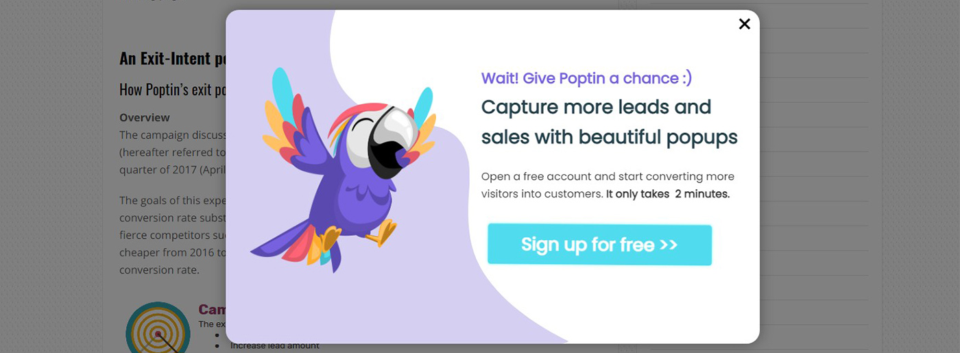
Poptin
Let’s start from a friendly and funny design attracting visitors’ attention. We doubt it can irritate somebody, and even if this pop up doesn’t look beneficial to somebody, they will close it and continue reading. It’s clear what Poptin offers you. Moreover, bonuses in the form of a free account and CTA indeed do the trick.
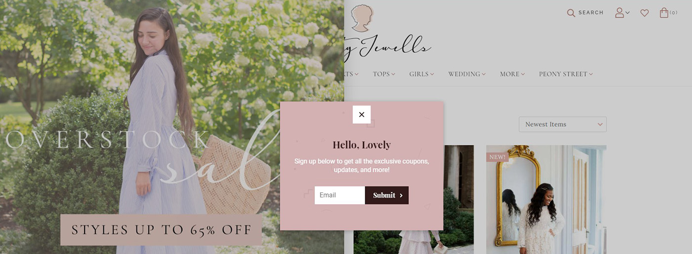
Dainty Jewells
It’s great that the website owners place a pop up that doesn’t cover the screen so it doesn’t look intrusive. The structure we discussed is followed: even though the title doesn’t give a clear understanding of what to expect, it wins the visitors over by creating a unique atmosphere of a wonderful women’s world where you can feel comfortable and beautiful at the same time.
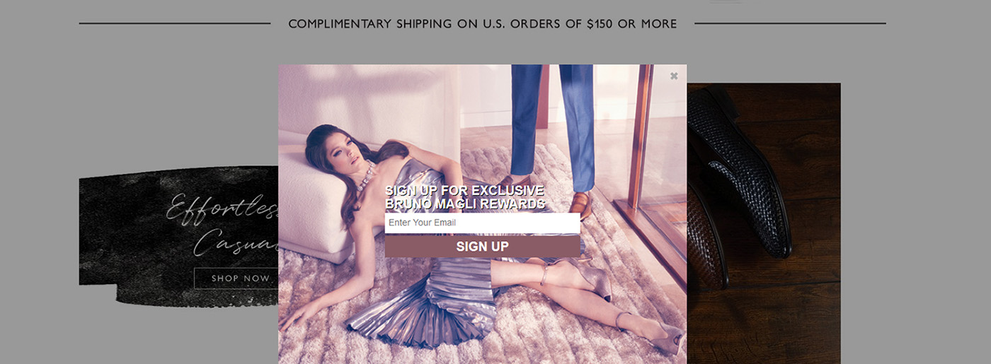
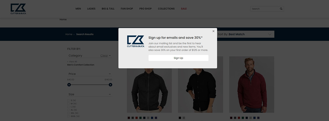
Cutter & Buck Website
Here we observe an excellent example of a pop up offering a discount for a subscription. There is nothing redundant here, and still, you can find anything you need.
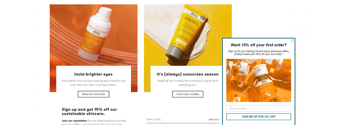
REN Skincare
This pop up doesn’t disturb visitors at all. A bright image matches the content on a website, which is highly important, and we understand what opportunities we get due to a subscription.
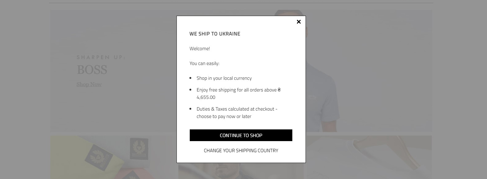
Woodhouse Clothing
We’d like to present a cool entry pop up! It was the first time we didn’t want to close a website as it didn’t worsen the user experience. Moreover, it provided a summary of conditions and thoughts about our convenience(option to choose a shipping country). It may seem not appealing for some people, but maybe that’s what hooks in – there are no distracting images, bright colors, and fonts.
What is a Pop Up and Its Interaction with SEO
As we’ve noticed at the beginning of our article, it’s essential to manage some elements or tools rather than elements themselves. Thus, pop ups affect the level and type of interaction between the site and the user. Still, the interaction can be positive as well as harmful for performing SEO optimization and website promotion. If the window forms block access to content, it results in low interaction with your website (less spent time on it, less-visited pages, higher bounce rate, and so on).
That’s why we recommend you never forget about quality, think about users’ experience and check these productive SEO site optimization metrics as often as possible:
- The time a person spends on the site after the item has appeared
- Users who return to your site
- The percentage of scrolled text
- Bounce rates .
Google and Pop Ups – Friends or Enemies
Since 2017, Google threatened to penalize sites using pop ups and interstitials on mobile because of UX problems and the bad user experience it caused. Still, not all of them may be affected by Google algorithm :
- forms displayed on desktops and tablets
- ones for cookie usage or age verification
- forms taking not all screen space
- ones created with love
How to Create a Pop Up Form
Statistics show that people hate ads – pop ups have a 73% disapproval rating. Still, 83% of users aren’t against suitable ads and only want to get rid of bad ones.
Thus, you have a chance to create engaging pop up for your website and improve statistics. How to do that? Let’s observe some possible ways:
- create pop ups with CSS and JavaScript manually;
- use paid and free pop up builder software ( Poptin with free pricing plan, drag & drop editor, ready to use templates and responsive design; Hellobar; MailMunch, AWeber, etc.);
- try mailing services with a built-in pop up form editor (f.e. UniSender with detailed analytics and advanced metrics);
- ask a professional to assemble the form manually and put the code on the site (you can always appeal to MotoCMS designers on any issues ).
After you’ve decided how to create a pop up, choose its style layout, customize the form, add an image if necessary, and insert input fields(for name and email or phone).
What Is a Pop Up and How to Make it Effective
After you’ve realized that using pop ups can be risky for your website and business at all, it’s essential to understand how to place them correctly and how they should behave.
Make the Text on Pop Up as Short as Possible
Show that your proposal is valuable and add a concise call to action. If a form is related to the information on the page, it will be enough to present it in a couple of lines. For example, if a user looks for a summer collection of T-shirts, offer a discount in exchange for an email. If you have a restaurant website , you can invite the user to reserve a table through the online form on the menu page and receive a compliment from the chef.
Don’t forget that:
- the message should be relevant to the content on any page
- you don’t need pop ups on every page.
Tell the Truth
Don’t put in the window the counter “the promotion will end in 14 hours” if it will last for a year. Also, try to identify the most appropriate time for placing a pop up.
Give a Feedback
It’s even better to explain to visitors what awaits them and provide a pop up with feedback. Examples:
- We’ll send a letter to the provided address. You’ll get it within 10 minutes.
- Thank you! We will call you within 5 minutes to discuss the project.
- Your discount has been activated. When paying for the order, we will automatically deduct 10% from the total amount.
- The file will start downloading in 10-15 seconds. If the download doesn’t start, click on the link.
Check Pop Ups on Different Devices
The forms should be adaptive to all screen resolutions, not to provide a poor user experience.
Don’t Forget to Warn About Data Processing
If there is a form in the pop up window that collects information about the user(name, email address, phone number, etc.), check whether they agree with it. You can put a link to the rules in the phrase “I agree to the processing of personal data” and a box for a tick.p
Imagine Yourself as a Client
Would you become interested and click on your pop up?
What Not to Do
- Hide the “Close Window” button. If the users don’t understand how to close the form, they will leave the site.
- Show the “Close Window” button after the countdown. They are ready to endure it only while watching the series online. In other cases, it is easier to open another website. The more difficult it is to close an offer, the stronger the visitor’s negative impression of using the site. Accordingly, it is less likely that they will become your client.
- Automatically turn on sound.
- Cover more than 30% of the screen with a static window. It will be inconvenient to review the page.
- Hide all content and scare the user by opening a full-screen pop up for the mobile version of the site.
- Overload your site with pop ups. If the user has already canceled the offer once, do not show it again. Don’t put them on every page; use alternatives.
What Is a Pop Up – Final Thoughts
Good user experience, reputation, and the promotion of your business are what you should take care of. Using pop up can become a powerful tool for improving website conversions and generating leads, but you should weigh up all pros and cons. Only relevant and helpful content is worth interrupting users’ experience. Check and analyze statistics to evaluate your results and make changes not to lose valuable clients.


Leave a Reply