Web Design Trends 2018: Top 10 Eye-Openers That Will Rule the World
There’s much fuss about trends in web design. Some come and go; others stay in for a while. What’s actually the role they play? No matter, whether you see trends as waning fads or as milestones for creative industries, you’re here to learn the top 10 web design trends 2018. So, get ready for a big journey!
Creativity is a flow. Creation is the process when inspiration takes shape. However, have you ever considered creativity on a global, rather than personal, scale?
It appears that there’s a global stream of creativity. Some things that make us wow here and now will be passé in a year or so. In this vein, the web trends are the markings of the imaginary landscape where the creative flux roars and seethes right now.
Overview of Web Design Trends 2018
So, we’re here to predict the stream way that creativity will take on the web in 2018. Making these predictions made the MotoCMS team rack their brains. Believe us, it was worth it. So, let’s dig the latest web design trends that will turn into the biggest web design trends 2018.
Broken Grid Layouts
Using the grid went without questioning since Web 2.0. Where there’s a grid, there’s clarity, logical structure, and, most importantly, responsiveness. Invisible lines of the grid are ubiquitous, giving the website much-needed organization and harmony. They help users structure the digital space and move in the direction you wanted them to go.
However, the latest web design trends 2018 show us the ways to question the grid. They want us to challenge it, and to find the unique proportions of chaos and organization. This opens up new opportunities for you as a designer.
The question is: Are you ready for this? Well, breaking the grid takes a skilled designer. The designer knows the grid inside out. The one that breaks it playfully and with a purpose in mind. If you’re in, let’s see the ways to break the grid for the good of your website:
Layer It
Layered designs break the grid for unity’s sake. Our brain sees the elements that cross planes and overlap as the ones that belong together. There’s no more the text and the image, there is the unified text-image cluster. This cluster is the whole, and it hits stronger than its parts.
However, taking chances with layering elements on the screen, you still need caution. Double-check if they’re distinguishable. On all screen resolutions. At once. Moreover, use layering with caution. It works well for captions, and ‘big words’. However, it kills paragraphs.
Play With Details
Breaking the grid for the sake of breaking it is, maybe, the in-thing for aesthetics hunters. However, you built your website with more down-to-earth goals in mind, don’t you? If something like conversion, sales, or lead generation rings the bell to you, stick to a happy medium and go off the grid with a simple, yet powerful detail.
The recipe: Start out with a common grid website. Then, think of a detail that you want to emphasize. Is it a caption, and dazzling background, or a CTA? Play around with it: shift it vertically and/or horizontally, tilt it, and embellish it with an offset container. All in all, make it slightly break the pattern. Voila! You’ve got the grid broken. If you go a bit further and sprinkle that detail with bright colors, you’ve got a creative piece that catches attention and serves its purpose more effectively.
Pretend You Break It
You can mask the grid and use it as an underlying structure. The layouts you get will pass as broken grids, but retain the harmony that comes from sticking to the basics of visual organization.
Let’s say, you want to build an asymmetric cluster of imagery. Use a small vertical grid to position the images. Go for an odd number of elements for more impact (5, 7, maybe 9?) Then, play around with alignment, offsets, and margins. As a result, you’ll get something like this:
It’s up to you how far you go in breaking the grid. However, do this with caution and follow these tips:
- Firstly, don’t get to the point when your homepage turns into a hodgepodge. Know the right time to stop.
- Secondly, do not go off the grid completely. Graphic design trends may take over just some sections of your website. Others should remain clear-cut and legible. Don’t stretch user’s brain too much.
- Thirdly, never let the broken grid get out of hand. This is a frequent responsive design mistake. Responsiveness should be always above your web design ambitions.
Drop Shadows & Depth
For web designers, drop shadows are as old as time. However, it’s the new spin that web design takes. Along with the gallop of web technologies, the long-standing drop shadows now find their new implementations. In 2018, the employment of drop shadows will skyrocket as web design trends 2018 re-embrace the importance of turning the web into a 3-dimensional space.
In our list of web design trends 2018, we see broken grids, motley fonts, animations, and custom illustrations. That’s a lot in comparison to the minimalism of the past years. To make all the elements play well together, designers have to jug their memory and come up with ways to establish visual hierarchy. This is the point when the concept of depth comes into play.
If you have lots of intertwining, overlapping, and ‘floating’ elements, showing what’s most important it is vital. In addition to such means as color and size, why don’t we cast the fear of outdatedness aside and re-embrace the depth? Then, we can simply show what’s in the foreground, and what’s behind. By this, we not only add to the aesthetics of the page but also boost UX by providing much-needed clarification.
So, what’ll be the right way to use depth on 2018 websites? Here come a couple of tips to help you do it the 2018-ish way:
- Firstly, let skeuomorphism rest in peace. The shadows you use should not be realistic. So, create the feel, the illusion of depth, nothing more.
- Secondly, be creative when it comes to the shadow length and direction. For example, long shadows of multiple elements that point in one direction, create the illusion of motion. It will seem, that the objects that ‘cast’ these shadows gradually ‘come out’ of the screen.
- Thirdly, why don’t you experiment with it? For example, let’s play around with color. No one ever saw pink shadows? Then, use them as hover image effects on your website. ‘Wow’-effect guaranteed 😉
So, if you go for complex layouts and superimpose design elements, sprinkle them with some sense of depth. By simply dropping shadows here and there, you’ll boost the UI and help your users see what’s most important over there.
Variegated Typography: Pick Your Style
In terms of typography, 2018 brings you a wider choice of options than ever. There’s no single trend, as it used to be in the past. Whatever is well-thought and well-done counts? The ‘no-serif’ taboo is lifted, and it isn’t all about ‘big and bold’.
Let’s see what new web design trends 2018 has to offer us in terms of typography. So, in 2018, you’re cool if you:
- Embrace the ‘big and bold’ typography trend. Give your titles a headline-like appearance, and users will get the message.
- Actively employ highlighting and underlining. By giving prominence to certain words, you not only create an intricate visual effect but also make your text more readable and usable.
- Turn your letters into art objects. Earn your kudos for creative word art and make sure users remember your website.
- Lay images over your bold captions. Create an intriguing façade by giving your letters a feel or a personality.
- Use gradients for captions. Complementary and analogous hues from the 80s are 100% in for gradients.
- Embrace serifs. No matter whether you combine serifs with sans-serifs or let them go solo, serifs come back as one of the web design standards.
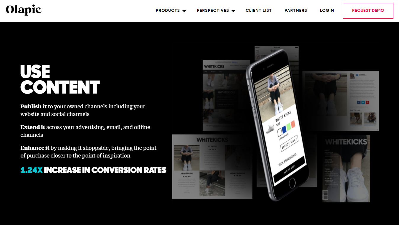
- Make text and image overlap. No matter, whether text hides or rides across the image, combining the two is the in-thing.
- Use typography with transparency over multi-color backgrounds. This is one more way to make the two play together, isn’t it?
So, there is plenty of room for creativity when it comes to typography website trends in 2018. Choose the option that appeals most to you and think carefully about implementing it right. Keep in mind, that 2018 creative typography is good for captions and art texts. At the same time, your creative efforts shouldn’t leak into the large portions of text and harm the overall readability of your content. So, feel free to be creative without harming (or better improving) the UI and UX of your website.
Particle Backgrounds
Particle backgrounds are one of the new web design trends 2018 that were already adopted by multiple websites to their good. The most successful particle backgrounds are animated and adorn the ’welcoming’ sections of home pages.
There are a number of advantages that particle backgrounds bring along. First of all, they are an elegant cosmos-inspired solution, which is new to the audience. If particle backgrounds are not frequented in your niche/area, you get the first-mover advantage and get people coming to check out your website. Secondly, implementing particle backgrounds takes just HTML, CSS, and a sprinkle of JavaScript magic. Thirdly, you can even go for free space imagery, like the space imagery made by the Vista telescope for ESO.
Most importantly, particle animations are highly engaging and work great for decreasing the bounce rate. They have the potential to react to mouse movement and change their shapes. For instance, some developers make particles move at different speeds, collide, move around something, avoid the mouse cursor, or even dance. On the other hand, others make their motion more ambient, so that the animation doesn’t interfere. All in all, animated particle backgrounds give the UI the sense of new-gen motion and dynamics that are hardly achieved by other means.
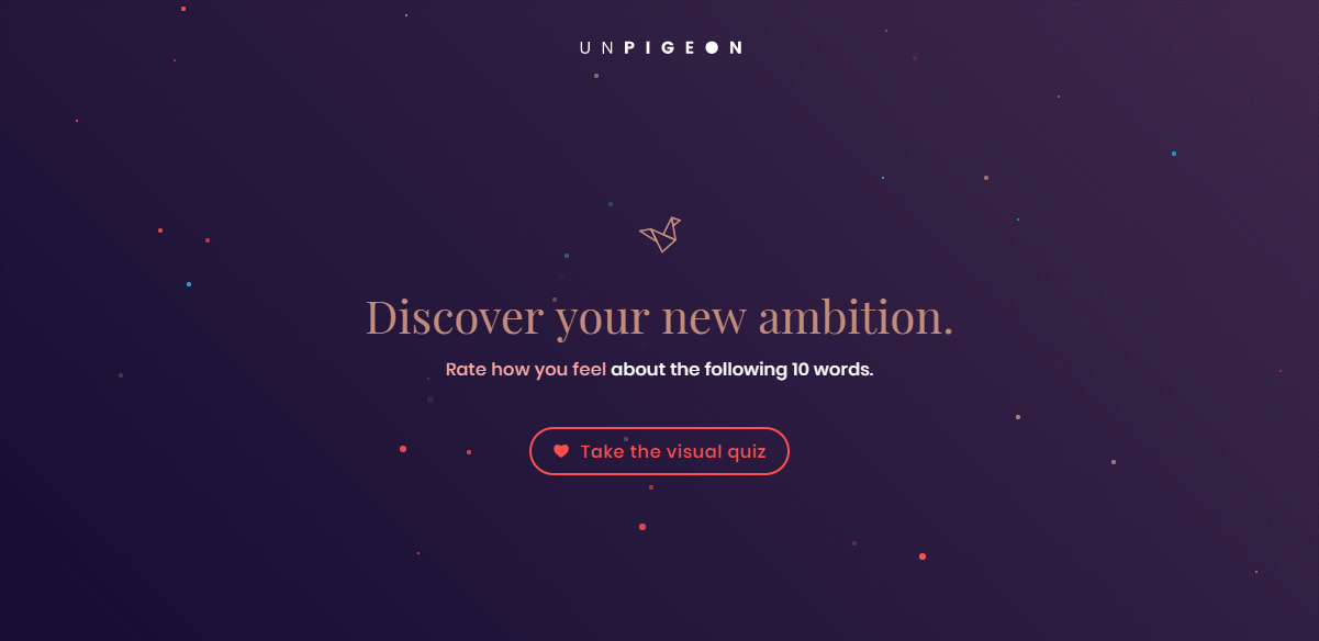
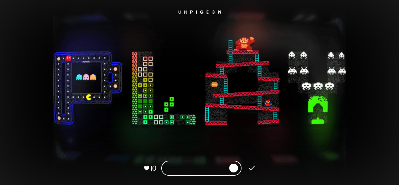
This is the welcoming screen of the Awwwards-winning unipigeon online quiz, which helps people find new ambitions. Its simple particle background reacts to the cursor movement, with the particles following it.
So, if you like this trend and want to join in, let me share a couple of tips:
- First of all, skimp on the video particle backgrounds. They miss the chunk of the engaging potential that interaction with the mouse cursor gives.
- Secondly, if you’re into creating your very own particle background, check out the plug-n-play particle animation by Julian Laval on CodePen.
- Moreover, if you want to use a ready-made solution, download the free JS file by Vincent Garreau on GitHub.
- Last but not least, join the trend as soon as you can. This trend has a ‘booming’ potential among web design trends 2018. So, jump in while the popularity of particle backgrounds is on the rise.
Custom Illustrations
Let’s say you use stock photos for your website. That’s what the majority do. So, even if you spend a fortune on them, you won’t stun the modern user. Then, let’s say you go for authentic photography that depicts real people in real situations. This is better. However, the authentic photography trend climaxed this year. The average user is now tired of seeing the smiling faces of people they don’t relate to. So, it’s time for something new.
2018 will see the rise of custom illustrations and graphics. Custom illustrations are the ones that were created for your website and reflect the very gist of it. Even if the design of your website is not custom, with custom imagery it looks one of a kind and sticks up in users’ minds.
However, there’re multiple reasons that make this trend worthwhile. Let’s enumerate:
- Illustrations focus on the scene rather than on actual people. This lets users imagine themselves as a part of it.
- Next, illustrations don’t stick to reality. The power of imagination can turn to browse your website into an unforgettable journey.
- Custom illustrations shape and reinforce the design of your website. Moreover, you can use them to support your corporal identity.
- Illustrations don’t get outdated quickly. Your investment in the art will make your unique web presence remarkable for years.
So, there are obviously many draws for featuring custom illustrations on your website. On the other hand, this may seem like one of the costly graphic design trends.
Let’s think out of the box for a while. Do you have friends who’re into digital art and need practice? Find a way to challenge them. Alternatively, find a burgeoning artist on the web and ask them to create illustrations for a small reward/promotion. Finally, you can be the one behind custom illustrations. On the net, you’ll find plenty of free drawing apps, plugins for Photoshop, and kits that provide you with the elements that you can mix-n-match to create custom illustrations.
So, there are different ways you can amplify your brand and website design with custom illustrations. For some inspiration, spot different illustration styles in web design and try to choose the one that fits your website.
Dynamic Gradients
The era of flat design is coming to an end. Perhaps, the biggest evidence of this is the rebirth of the gradient. Of course, now you won’t see the comeback of Web 2.0 clumsy relics. The new gradients are subtle and skillfully executed. Moreover, they’ve adapted to 2018 graphic design trends and embraced both bright neon and relined subtle shades.
However, most importantly, the new-gen gradients are dynamic. What this actually means, they are animated by the means of CSS and/or JavaScript. Gradient animation lets modern designers achieve a couple of stunning visual effects. First of all, it creates an illusion that the colors fluctuate and constantly mix in an endless motion. This adds dynamics to the otherwise static gradients. Next, modern gradients transition one into another on scroll, hover, or image change. This, once again, creates the illusion that colors transform dynamically.
Let’s see an example. The designers behind NYC Pride pass the dynamic gradients test with flying colors. They sprinkled image overlays with color transition animations for extra flare. You can’t scroll the homepage. So, you end up playing with the gradients until you see all of them. And this is just the right time for you to get interested in what these guys actually do. Well done!

Fortunately, getting started with dynamic gradients is simple. You can use the free CSS gradient animator by Ian Forrest or fork a gradient/transition hack by Sasha Lack. Alternatively, get started with the comprehensive Animating CSS Gradients, using only CSS articles on Medium.
More Organic And Oblique Shapes
This year, card designs and minimalist layouts were among web design standards. Along with these web design trends 2018, designers stuck to the basics of sharp grid angles and strict block organization. In line with the change of web design standards and the breaking of the grid, web designers of 2018 are ready to go the extra mile to round the corners and embrace oblique, organic shapes.
As you can see, it’s all about making the website a dynamic space with its own personality. By embracing organic, more spherical shapes, designers add motion to static pages and interconnect the elements of the page. Moreover, organic shapes give their creators more freedom. As with all in nature, organic shapes are imperfect, irregular, and asymmetrical. And they’re not uniform. Every shape is unique and evolves over time.
This is the concept that web designers learned from nature and added to web design trends 2018. Organic, oblique shapes support broken grids and create more immersive, palpable journeys for website guests.
Designing your website, you’re free to measure the degree to which you embrace this trend. By mixing straight lines and geometric shapes with more organic ones, you can create a unique mix of the two that becomes characteristic of your website. For example, take a look at how creatively and subtly Symodd designers rounded hexagons and other shapes:
Integrated Animations
This trend also goes in line with the general shift towards dynamics and improved user engagement. Browser technologies move on and let you swap static imagery for dynamic, engaging content. Unlike the particle backgrounds we talked about earlier, integrated animations are smaller and less complex. At the same time, they’re scattered throughout the page and accompany the browsing process.
The main purpose that integrated animations serves is to keep the user engaged throughout the browsing experience. Bored with lots of text? Laugh at a GIF. Wait till the content loads up. Animated pre-loaders are fun to observe. Integrated animations can hide behind literally every element of a web page, turning the drowsing process into an amusing sequence of small discoveries. On the other hand, they can be the meaning-laden components of the webpage or even constitute the focal point of the entire website.
The main benefit of integrated animation is making users a part of the website story. They no more passively watch it unfolding in front of their eyes. They participate in it, and their engagement moves the plot. This is a trick that helps users view themselves as your clients and fully appreciate the value that you can generate for them.
3D Effects
If you watch the latest design trends carefully, you’ll see that in 2018 visual impact gradually takes the floor. One more trend that proves this is the growing popularity of 3D effects in web design. As designs become more abstract and rely more heavily on digitally generated imagery, the added sense of depth becomes the way to make the browsing experience more immersive and build a lasting impression.
3D imagery enters the list of the latest web design trends 2018 as it surfaces the number of deep shifts that take place within the web design industry. First of all, it reflects the website trends of the growing incorporation of VR and AR into digital experiences people have. 3D effects aim at partially recreating the VR immersion and leaving lasting impressions (if properly implemented). Next, they reflect on the latest web design trends 2018 we discussed in this article: adding depth to website designs and using custom illustrations. Being the product of digital art, they enable the interplay of two- and three-dimensional space that unfolds right before the user’s eyes. What’s more, 3D imagery embodies the shift from real life to abstract, similar to authentic photography currently giving way to abstract particle backgrounds and oblique shapes.
All in all, 3D effects are a strong means to create visual impacts that provide thoroughly memorable experiences. What’s more, 3D effects play well with all the new design trends that we mentioned. So, in 2018, we’ll see a greater number of spacious and immersive designs that let the 3D and 2D spaces interact with each other and create digital landscapes that we’ve never imagined before.
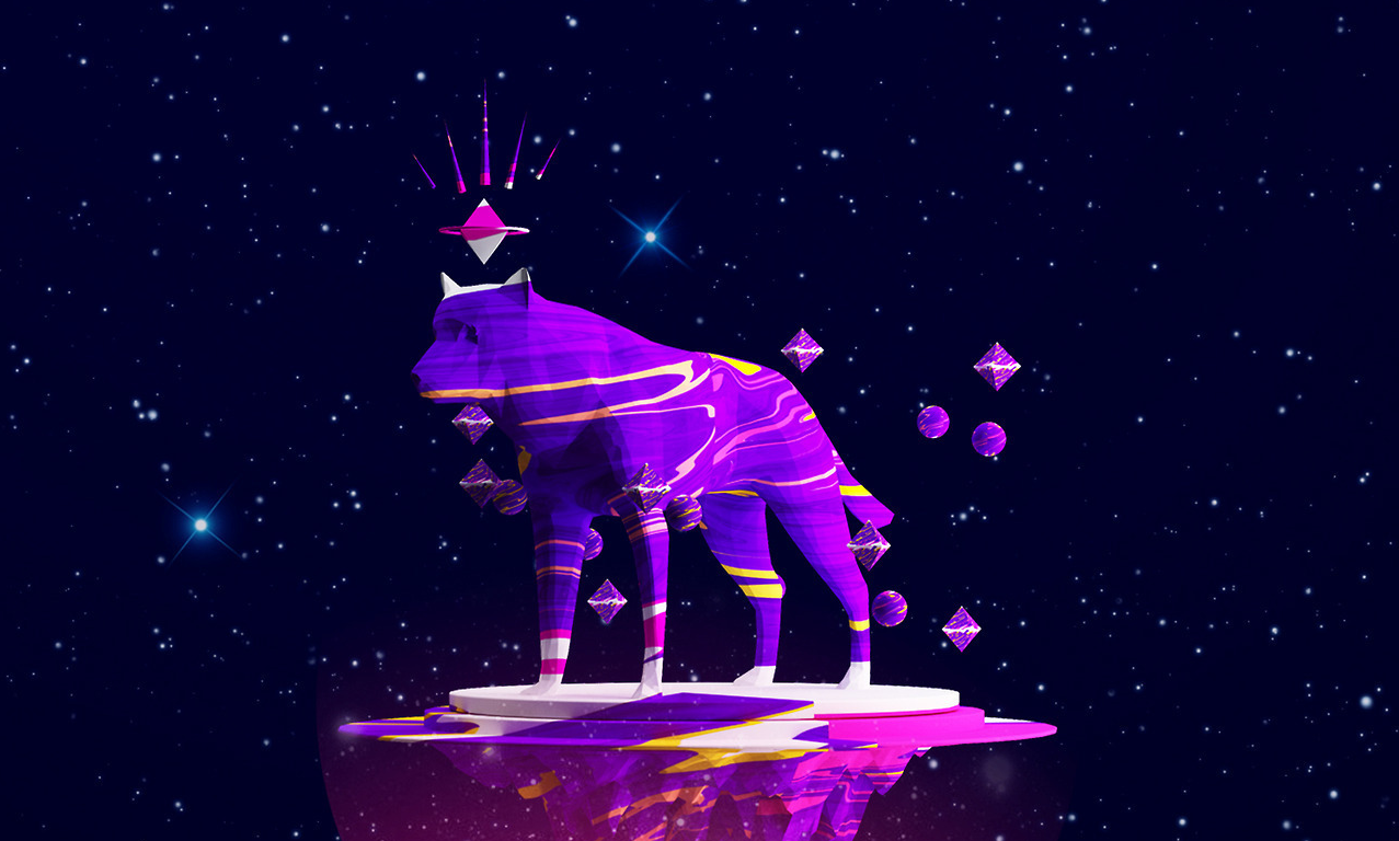
For more 3D inspiration, check the digital portfolio of Niyi Okeowo, a graphic designer and photographer from Nigeria.
The Rise Of The UX Writer Continues
In 2018, the importance of UX and UI is expected to reach new heights of web design trends 2018. Users are choosier now and want their digital experiences to be simple, informative and well-prepared. Search engines are pushing towards this as well. As the abundance of web content grows, the way you present it determines the choice of the audience.
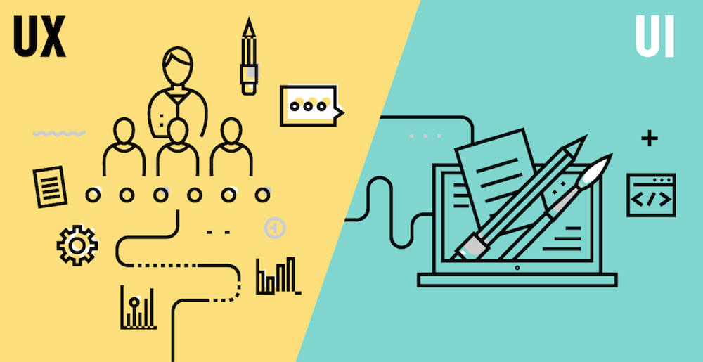
In 2018, UX is expected to heavily influence web design, functioning as a counterbalance to the growing freedom of web design. First of all, the 2018 UX makes web designers keep the experiences they create content-centered. They still can’t break the good visual hierarchy, get away with whitespace, and abandon some minimalist features. Secondly, designers still have to toil upon creating time savings designs that provide users with a linear journey with clean navigation and guidance. What’s more, the demand for personalization grows. So, web designers should also account for the specific needs of different user groups. All in all, taking the UX to new heights is the thing that will keep wed designers occupied way more than aesthetics concerns.

What’s more, UX writing is turning into one of the most important web design standards. The task of creating content for the audience has never been as complex as it’s expected to be in 2018. The importance of the UX writer grows in direct proportion to the growing demand for the skill to build user-facing touch points that not only embody the voice of the organization but are also considerate and useful to the user.
Online Graphic Design Tools
New online alternatives of the most popular design tools are now reaching popularity. Cool examples are Figma, Sketch, Canva, etc. They can speed up your workflow and save you much time for creating new awesome designs.

Wrapping Up
Web design trends 2018 set the main directions for web designers to explore. First of all, they underline the growing role of impactful 3-dimensional visual experiences. Secondly, they emphasize user engagement and the role of unique browsing experiences. Thirdly, new website trends make web designers think of design in terms of creating experiences rather than static web content. All things considered, the latest design trends push the borders that web design trends 2017 have reached and, fortunately, give creative minds more room for self-expression.
Are there any new web design trends 2018 that you expect to rock in 2018? It’ll be awesome if you share your thoughts in the Comments section below.
May 2018 open new horizons for you and lead you to success and prosperity!
Take care!
Web Design Trends 2018 Related Posts
Web Development Trends 2018: Your Ultimate Top 10
8 Hottest Web Design Trends 2015 Our Experts Expect to See


Great job!
Thanks, Michael!
I saw some of your designs, not bad too 😉
Nice informative article!Thanks for sharing……
My pleasure, John 🙂
I`m more than glad that you like the content. Also, I have in mind several more articles that will strongly expand the topic. Thank you, and follow the updates.
Good job. It`s really very informative. you explain everything in such detail. Trends change so fast and not all designers can get on the track. now I just realized that of all the projects I give my preference only to fuselabcreative.com. the guys apparently are good at their business.
Hi Alex, yeah, you are right concerning the changes. Even my mom is crazy about all those VR clubs, lol. So, why not use the technology in web design and development.