CSS Image Hover Effects In 2018: Simple Guide and Best Practices
Let’s imagine that browsing a website is a game. It’s the process of exploration and learning something new in an interactive way. Every element of the website is a piece of the puzzle. To see the whole picture, website guests should explore these pieces one by one to be able to bind the pieces of the whole together. For the game of website browsing to be interesting, you should use the pieces of the puzzle that aren’t static and stale. When it comes to the imagery of your website, you should make sure that every picture has its own nature and character and compliments the whole. To make the visual aspect of your website even more stunning, you can animate the imagery on mouse hover by adding CSS image hover effects.

Today, we gonna learn the most powerful CSS techniques to implement image hover effects. By using the well-structured strings of code, you’ll be able to set images to either grow or shrink on hover, slide up, tilt, morph, focus and much more. Just imagine what degree of awe such effects elicit when spotted for the first time! They intrigue, amuse and mesmerize. What’s more, they’re not that complex to implement. You just have to try them out once and you’ll get the hang of it. What’s great, you can experiment with CSS and create your own image hover effects that have the potential to make your website unsurpassed.
So, you want to learn the recipes of magic CSS image hover effects? You’re in the right place as below you’ll find the coding with which all the magic begins. Let’s enter the enchanted realm!
Basic Setup for Your Images
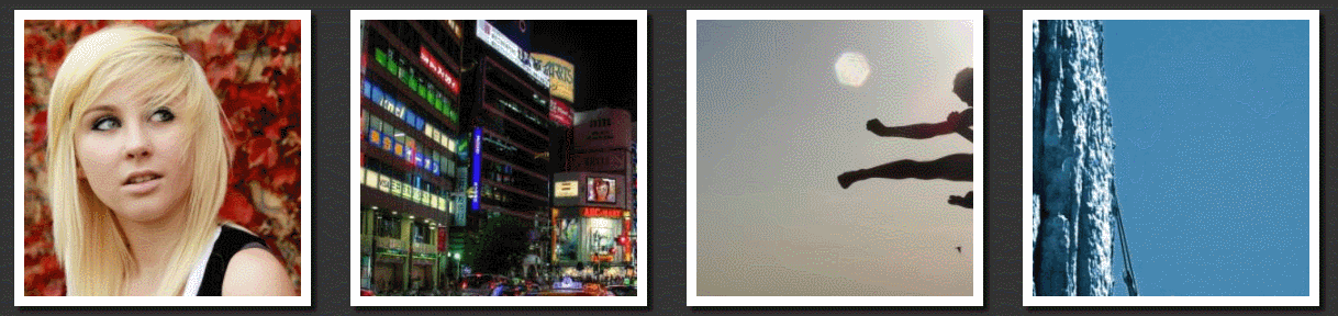
Before we get into the specifics of the CSS image hover effects, we’ll have to add some basic rules for the images that dictate their look. Generally speaking, we’ll manipulate the box-sizing and specify the border and dimensions of the images. For setting up the appearance of images you see on the screenshots below, use the following set of rules:
 * {
  -webkit-box-sizing: border-box;
     -moz-box-sizing: border-box;
      -ms-box-sizing: border-box;
          box-sizing: border-box;
}

body {
  background: #333;
}

.pic {
  border: 10px solid #fff;
  float: left;
  height: 300px;
  width: 300px;
  margin: 20px;
  overflow: hidden;

  -webkit-box-shadow: 5px 5px 5px #111;
          box-shadow: 5px 5px 5px #111;
}
So, we set box-sizing to border-box as we want the height and the width of the image stay the same, no matter what kind of a border and padding is applied. In this rule, -webkit, -moz, -and –ms are vendor prefixes that let you take the specifics of different browsers into account and foster cross-browser compatibility.
Next, we give our page a background (this is up to you what color to go for). Furthermore, we set up the image. For example, we go for a 300px by 300px box, make it float to the left of the page, use 20px margin and a solid white border with a box shadow. Finally, we set ‘overflow: hidden’ for the image, so that the parts of it that do not fit the image box (300px by 300px) do not display.
The preliminary part of it is over. Let’s drill our first group of hover effects that play around the ‘overflow’ property. This group comprises four effects that you can see in action below:
Effect #1: Zooming In
This popular CSS image hover effect is frequented on Portfolio pages. It temps to click the image to see every detail of it that’s not discernible on a thumbnail. Moreover, images that zoom in on hover won’t be out of place on your homepage. They add dynamics to your home page and serve as a good starter.
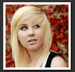
If you hover an image with this effect applied, the photo will enlarge without surpassing its initial boundaries. As a result you’ll see it zooming in.
To begin with, add a class to your image’s ‘div’ in HTML code of your page. For instance, we’ll use the ‘grow’ class. What’s more, we’re also using the ‘pic’ class for which we’ve set the rules previously. As a result, the HTML code of your image will look the following way:

Next, set the CSS rules for the ‘grow’ image. They are the following:
/*GROW*/
.grow img {
  height: 300px;
  width: 300px;

  -webkit-transition: all 1s ease;
     -moz-transition: all 1s ease;
       -o-transition: all 1s ease;
      -ms-transition: all 1s ease;
          transition: all 1s ease;
}

.grow img:hover {
  width: 400px;
  height: 400px;
}
The first thing you need to do is to specify the standard dimensions of the ‘grow’ image. They are the ones that mirror the dimensions of ‘pic’ image specified above (300px by 300px). Next, zoom the image smoothly over the needed duration with CSS ‘transition’ property. As both the width and the height of the image will change, specify ‘all’. Then, specify the duration of the effect in seconds. Finally, add ‘ease’ to define the speed curve of the transition effect (with ‘ease’ it’ll start and end slowly).
The last thing to do to is to specify the desired photo dimensions on hover. For this, you’ll need the ‘: hover’ pseudo-class that’s clipped to the selector. Basically, it indicates that this rule applies to the element only when a user hovers it. Then, set the dimensions of the photo larger than the initial ones and you’re done.
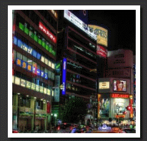
Effect #2: Zooming Out
This effect is a twin brother of the previous. However, it all comes vice-versa. The image zooms out as its initial dimensions are set to 400px by 400px (again, ‘overflow: hidden’ hides the excess). The transition ends when the image reaches the standard 300px by 300px dimensions and perfectly fits the box.
For this one, we’ll use the ‘shrink’ class. The HTML code for this picture:

In CSS, invert the values of width and height for standard and on-hover states. All the other coding is the same:
/*SHRINK*/
.shrink img {
  height: 400px;
  width: 400px;

  -webkit-transition: all 1s ease;
     -moz-transition: all 1s ease;
       -o-transition: all 1s ease;
      -ms-transition: all 1s ease;
          transition: all 1s ease;
}

.shrink img:hover {
  width: 300px;
  height: 300px;
}
Effect #3: Side Pan Hover Effect
This one creates the effect of a camera swiveling horizontally. As a result, hovering the image reveals more on one of the image sides:
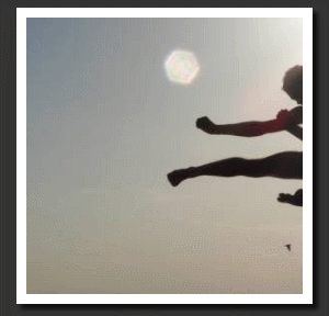
Side pan effect is great in conveying motion and energizing. So, it can be a great fit for you action-laden home or About Us page.
For this effect, you’ll need a rectangular image with the width twice larger than the one of the picture. For example, we opted for an image of 600px width and 300px height. Therefore, we’ll be able to achieve a capturing effect with an impressive transition. The HTML part of this effect comes below:

For this one of CSS image hover effects, we’re playing around with margins. To pull the image to the left on hover, use the ‘margin-left’ property with the value that corresponds to how much of the whole picture on the left you want to reveal. Moreover, give it a negative value, so that it pulls the image where you need.
/*SIDEPAN*/
.sidepan img {
  margin-left: 0px;
  -webkit-transition: margin 1s ease;
     -moz-transition: margin 1s ease;
       -o-transition: margin 1s ease;
      -ms-transition: margin 1s ease;
          transition: margin 1s ease;
}

.sidepan img:hover {
  margin-left: -200px;
}
On the other hand, if you want to have the right pan effect, either go for a positive value for ‘margin-left’ or for a negative one for ‘margin-right’.
Effect #4: Vertical Pan CSS Image Hover Effects
This effect is analogous to the previous. However, the picture moves vertically:
Start out with the following HTML code string for it:

In CSS, experiment with ‘margin-top’ property by assigning it the desired negative value. If you want the top of the image to come into view when hovered, use a positive value instead. As a result, your CSS code should look the following way:
/*VERTPAN*/
.vertpan img {
  margin-top: 0px;
  -webkit-transition: margin 1s ease;
     -moz-transition: margin 1s ease;
       -o-transition: margin 1s ease;
      -ms-transition: margin 1s ease;
          transition: margin 1s ease;
}

.vertpan img:hover {
  margin-top: -200px;
}
It’s time to get to something more creative. Now, we’ll review 3 CSS image hover effects that lead to changes in the position or shape of the picture itself. Undeniably, using them will truly ‘wow’ your site guests as they hardly expect to see something like this when hovering the image. After mastering the basics below, feel free to experiment with the code for more fun.
Effect #5: Tilting the Photo Hover Effect
This hover effect creates an illusion of a photo crookedly hanging on the wall. All in all, it’s a nice one to use for the photographer and traveling websites as it’s reminiscent of a paper card.
Coding this effect is a piece of cake. First of all, you should add a class for the effect in HTML:

Next, you add just the ‘transition’ property for the ‘tilt’ class in CSS. Moreover, for ‘tilt’ on hover, you add the ‘transform’ property and set it to rotate the image ten degrees. Pay attention that this time you add the rules to the class itself and not for the image of the specified class. As a result, you should have the following lines on your stylesheet:
/*TILT*/
.tilt {
  -webkit-transition: all 0.5s ease;
     -moz-transition: all 0.5s ease;
       -o-transition: all 0.5s ease;
      -ms-transition: all 0.5s ease;
          transition: all 0.5s ease;
}

.tilt:hover {
  -webkit-transform: rotate(-10deg);
     -moz-transform: rotate(-10deg);
       -o-transform: rotate(-10deg);
      -ms-transform: rotate(-10deg);
          transform: rotate(-10deg);
}
Effect #6: Circle Swirl CSS Hover
One more from our collection of CSS image hover effects. This jaw-dropping effect is the one to be crazy about and keep hovering the image back and forth. Once you hover the image, it starts rotating and turning into a circle at the same time. Then, it makes a full turn and appears as a neat circle.

Fortunately, this CSS hover effect is not that complex in terms of coding. Basically, besides the ubiquitous ‘transition’ part, you have two main ingredients to it. Firstly, you add the 50% ‘border-radius’. It makes the image of hover look like a circle. Then, you add the ‘transform’ command that makes it rotate to 360 degrees. The resulting piece of code should look the following way:

/*MORPH*/
.morph {
  -webkit-transition: all 0.5s ease;
     -moz-transition: all 0.5s ease;
       -o-transition: all 0.5s ease;
      -ms-transition: all 0.5s ease;
          transition: all 0.5s ease;
}

.morph:hover {
  border-radius: 50%;
  -webkit-transform: rotate(360deg);
     -moz-transform: rotate(360deg);
       -o-transform: rotate(360deg);
      -ms-transform: rotate(360deg);
          transform: rotate(360deg);
}
Effect #7: Focus It Hover
This one also belongs to the flock of inventive and intricate CSS image hover effects. Similarly to the previous one, it makes the image circle, but also creates the effect of focusing on the central part of the image by making the border of the image thicker and recoloring it. Check it out:
To begin with, go for the HTML part of it and create the ‘transition’ CSS rule. Next, add the ‘: hover’ pseudo-class and change the thickness and the color of the border. Finally, make it go circle with a 50% border-radius. All in all, you should get something like:

/*FOCUS*/
.focus {
  -webkit-transition: all 1s ease;
     -moz-transition: all 1s ease;
       -o-transition: all 1s ease;
      -ms-transition: all 1s ease;
          transition: all 1s ease;
}

.focus:hover {
  border: 70px solid #000;
  border-radius: 50%;
}
Effect #8: Rollover Image CSS Effect
Image rollover effects are quite popular and are frequented by website developers. When the user hovers the original image, it’s replaced by another image or by a piece of text/a button with a background. Years back, you had to use JavaScript to power image rollovers. Fortunately, those days have passed and now you can implement the desired effect with pure CSS.
There are several ways to implement the rollover image effect with CSS. Let’s review them.
Method #1. Do you remember the way you made the image move horizontally for the side pan effect (Effect #3)? This method uses the analogous HTML and CSS coding. You just have to work on the image. First of all, you should combine the images for regular and hover states in one picture so that the part of the image revealed on hover looks like another picture. Moreover, if you don’t need that sliding effect, just delete the ‘transition’ rule.
Method #2. For this one, you need different images that you set for regular and hover states with the CSS background shorthand property. As a result, you get the following rollover image effect:
To implement this type of css image hover effects, you don’t need to set the image in HTML as you’ll add it to CSS. For instance, we’ll add the rollover image to the link. In HTML create a link with a class for the effect. Basically, it should look the following way:

Next, you get down to CSS. First, you set the ‘rollover’ to be a block of the needed width and height. Then, you set the background for it, specifying the URL of the image and add the transition. Finally, you specify another image URL for the image that’s displayed on hover. Check it out:
.rollover {
    display: block;
    width: 400px;
    height: 300px;
    background: url(https://www.nps.gov/common/uploads/stories/images/nri/20160426/articles/5097608B-1DD8-B71B-0BB1933DB95CC94C/5097608B-1DD8-B71B-0BB1933DB95CC94C.jpg) no-repeat;
    -webkit-transition: all .7s ease-in-out;
    -moz-transition: all .7s ease-in-out;
    -o-transition: all .7s ease-in-out;
    transition: all .7s ease-in-out;
}

.rollover:hover {
    background: url(https://www.nps.gov/common/uploads/stories/images/nri/20151216/articles/C6E16F5A-1DD8-B71B-0BAB45B9358DD9C8/C6E16F5A-1DD8-B71B-0BAB45B9358DD9C8.jpg)
}
Wrapping Up CSS Image Hover Effects
So, now you know 8 awesome CSS image hover effect to use for your Portfolio, Homepage and other pages of your website. Feel free to adjust the coding for them up to your needs to make visitors ‘wow’ when exploring your website. I hope these CSS hover effects prove helpful to you and get you more admiration from your website guests.
Are there any other CSS hover effects that you find jaw-dropping? Share them in the comments section below.
If you liked this CSS image hover effects tutorial, you may find a couple of our related posts very useful. Check them out!
Related posts:
Free Online Image Optimizer Tools for Better Page Speed and Performance
Sketch vs. Photoshop: Which of These Web Designer Tools is for You?
Newbie’s Guide To React JS: The Value Behind React and Your First React JS Tutorial
Top 5 Free Logo Maker Tools to Create Free Custom Logos within Minutes


Leave a Reply