5 Web Design Tips for an Outstanding Site
From bold to minimalist, from classic to playful, from retro to modern… there are many directions you can take your website into. The best web design tips for your site will depend on your style, the project’s purpose, and the needs of your audience. You have to pay attention to all details in order to come up with a timeless, yet modern website design.
5 Simple Web Design Tips for a Perfect Outcome
Everything starts with the choice of a solid best website builder. It has to enable effortless testing, site navigation, payment processing, and maintenance. But even the most sophisticated builder won’t do the work on itself. You are the one who sets up the vibe. Well designed websites share a few common characteristics, which help us come up with universal tips that work for any project.
1. Make It Clean
The best web design may be bold, but it is never busy. This is one of the most common mistakes that beginners make: they get overwhelmed by all the options, so they use all elements they could possibly include in the design. They make a single page too busy with visuals, menus, statements, and all kinds of distractions. The end result is not good, since the viewer’s eye doesn’t know what direction to look at.
- You need lots of white space. It’s the main element of good website design. It doesn’t have to be white; you can use any background color that you like. However, you need this clean space in order to emphasize the main elements that draw the viewer’s attention.
- Rely on your senses. Add the elements one by one into your design. If something feels off after you added it, remove it. Maybe it can be placed on another page.
- Ditch the sidebar. Visitors are distracted by it, and it takes too much space. Use your main navigation menu to fit all options and organize the site’s structure.
- Use negative space around all important elements of the design, so they will draw the visitor’s attention.
2. Develop Visual Hierarchy
When reading web design tips online, you usually focus on the main elements that you should use and those that you should avoid. The hierarchy is rarely mentioned, but it’s very important. As a principle of design, visual hierarchy teaches you to position the most important page elements first, so it won’t take long for the visitor to see them.

- If there’s an important call to action that you want to make, position the button in the center of the screen.
- Create a list of priorities that you want to be visible on your site. For example, the business logo should be a prominent element of the design. You want to make it large and position it above the fold.
When you establish a visual hierarchy and you position the main elements on the page, the remaining details shouldn’t overwhelm them. After that, use contrast, color, and white space to emphasize that hierarchy.
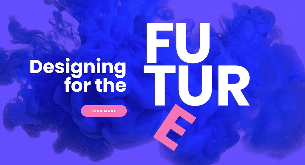
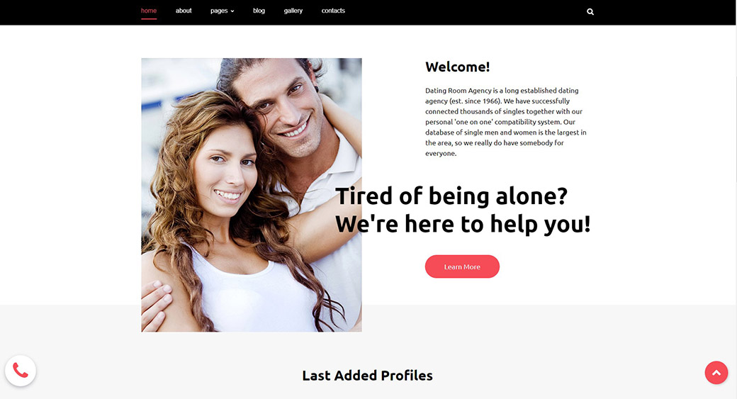
3. Rely on Professional Photography and High-Quality Visuals
The best web design never involves free stock photos. They look cheap, and you can’t fit them well into your design no matter how hard you try. If you choose to use real photographs in your design, they have to be taken by a pro photographer in a professional setting. This is not the aspect of web design where you can save money. If you use visuals, you need to hire a graphic designer who will follow your instructions to capture the brand’s voice in the designs.
- The visuals help you set the right atmosphere. Think of the mood you want to capture and be aware of the site’s color scheme when creating the visuals.
- Low-resolution photos might be easier to load, but they will ruin a good website design concept. You must use HD photographs, but you can reduce their file size with a compressor.
4. The Color Scheme Is Essential for Good Website Design
When you’re analyzing well-designed websites, you might come to the conclusion that there’s a contemporary color scheme you should stick to. For example, it may seem like sites are getting darker and “moodier” in their appearance. But that’s not a general rule. There’s no rule for colors in terms of modern website design. The main concept is to choose a palette that helps you catch the vibe of your brand.
TRY FOR FREE
Each color and each shade has its emotional connotation. In general, blue expresses tranquility, and red is for passion or attention. Children’s sites stick to bright colors, such as orange, yellow, and green. Websites that cater to a more serious audience choose a more neutral scheme, which leaves an elegant impression.
- Do with color what you did with website elements: establish hierarchy. Choose your primary color in accordance with the impression that you want your site to make. Then, choose secondary shades for highlights and a milder shade for the background.
- Keep the scheme consistent on all pages. Don’t even think about experimenting with different palettes on each page!
5. Readable Content as a Part of the Web Design Tips
The usual website design tips focus on the overall appearance but fail to mention content as part of it. The concept of readability is crucial for developing the best web design. You should collaborate with your writers, so they will know how to format the phrases and paragraphs. As a result, the visitor should be able to skim through the content effortlessly, while getting all the important information they need.
TRY FOR FREE
Once you have readable content, the way you present it on your website is important, too.
- Don’t make the font too small. People use smaller devices nowadays, so you want to make the text easy to read. 16pt is the standard font that’s readable on web pages.
- Make sure there’s enough contrast between the text and its background. Do not use faded colors for the text; they make the reading process difficult.
- Mind the type of font, too. Stay away from artsy fonts that only you can understand. The typical choice is a clean sans serif font that doesn’t make your eyes tired.
- It’s best to stick to a single typeface on your entire website. Versatile font combinations rarely look good; they tend to clutter the design.
Are You Ready to Create Your Site? Follow Simple Web Design Tips
If you’re a beginner or you have no knowledge of web design, a good builder can help you develop a nice project. Still, you need to follow basic website design tips, which prevent you from making the mistakes that most beginners are guilty of.
You can follow the trends in terms of style, visuals, and color, but it’s best to stick to the elements of design that work in all circumstances. When you gain more experience, you’ll adjust those elements to upgrade your design.


Leave a Reply