Pantone Colors for Web Design
Have you ever heard about Pantone? If you deal with design, you probably are obsessed with the Color of the Year provided by this company. However, if you are far from the fashion industry, you still need to keep informed of the trendy Pantone colors for web design if you’re going to launch a website.
First of all, the color of the year influences the companies’ marketing strategy that releases them. Nevertheless, if you want to create a successful online platform for your business, you should use the trends. Look through this guide and develop the most appropriate yet stylish color for your site and blog to focus the visitors’ attention and motivate them to become your loyal customers.
The Latest Trends in Pantone Colors for Web Design
The color has taken center stage in the web design trends. The visual strength and expressiveness of color can both attract users and discourage prospective clients. Therefore, it is crucial to follow up-to-date tendencies to find the most appropriate Pantone colors for your site’s web design.
The Combinations of Vivid Colors and Neutral Shades
This year, the combination of vivid colors and neutral shades is one of the most prominent color trends in web design. After a period of “soft pastels” prevalence, hazardous colors and pairings are emerging. Unlike the previous trend, the vibrant colors modulated by neutrals illustrate an impact rather than a harmony.
As a rule, such color blends help direct the clients’ attention to where it should be focused. If you want to make your site look modern and attractive, you can also use isolated notes of luminous colors that capture users’ sight. Implement significant substantial areas of color to comply with this trend in Pantone colors for web design.
The Mixing of Saturated and Muted Colors
Regardless, color-blocking has been a common practice in fashion design way back; it appeared to be trendy in Pantone colors for web design. This trend consists of the combination of vivid, bold colors with their complementary color shades. They even don’t have to be on precisely opposite sides of the color palette. But you should pick a strong contrast between solid areas of color to find thrilling combinations.
Weblium offers website template designs that come with colors unapologetically invading the background. Besides, the builder provides themes with organic abstract shapes exploring how hue and shapes interact.

The Blend of Highlight Color and a Few Neutrals
Using appealing color mixing, you can achieve your products’ growth or services’ popularity and demand. Do your best to create and standardize a great color palette for drawing attention to your brand and website with MotoCMS web templates worldwide.
Today, the color palette has widened further than before, and it’s an excellent opportunity to stand out and become unique using exclusive color combinations. Typically, there is the basic color of the brand with a highlight color and a few neutrals. Check out the MotoCMS catalog to find the appropriate theme and test it for free!

Strong Multi-Colored Combinations
The “soft pastels” popularity is starting to wane. A range of soft pastels dominated by pinks could end up with an extensive range of color shades. And we already see this tendency in many web design trends. According to the experts in Pantone colors for web design, the new trend is characterized by a broad color palette with strong multi-colored combinations. MotoCMS uses this trick in numerous website themes so that clients could make their platforms look eye-catching, modern, and trendy.
The Alternating High Contrast or Complementary Colors
According to this web design trend, you need to use color as a graphic element that doesn’t depend on the text’s communicative value. Backgrounds and text sections play around alternating high contrast or complementary colors, which eventually switch into thrilling animation sequences. Therefore, the colors group together, suggesting a strong contrast between the background and the contents.
How Can Pantone Colors for Web Design Influence Users’ Emotions?
To create a specific atmosphere on your website, you should focus on how Pantone colors for web design influence clients’ emotions. According to the recent analysis of color trends, certain colors used in the web design industry cause-specific associations. Therefore, it is critical to get to know how these emotions form. Check out the following aspects to apply current trends in Pantone colors for web design reasonably.
Blue
The blue color is a synonym for openness, reliability, and security. However, its meaning also depends on the shade. Thus, the light blue shades are associated with friendliness, during the dark ones with sadness. Therefore, you should be careful when choosing your platform’s color, as it will influence your clients’ attitude toward your brand.
Green
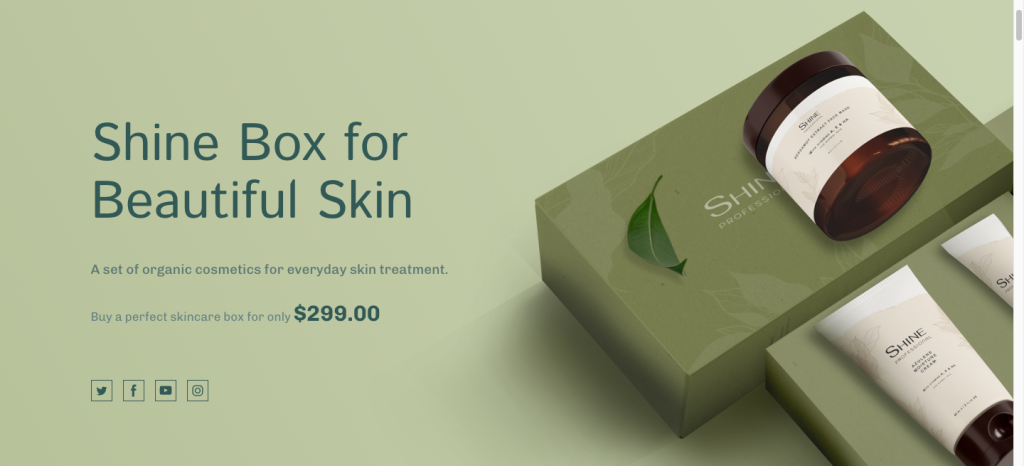
The green color is always associated with positive emotions like calmness and peace. If you consider this factor to be one of your main priorities or want to cause that feeling, this color will provide your site with a stable atmosphere. Such shade perfectly fits for financial institutions, construction companies, and other reliable businesses.
Yellow
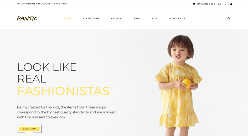
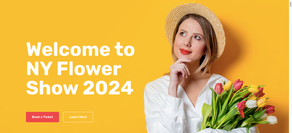
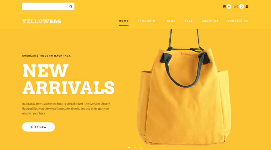
This is a universal warm color that conveys positive emotions in all website visitors. The yellow color is the optimal solution for those companies that earn various consultations. Besides, it does so without excessive sharpness.
Orange
The first thing that comes to mind when thinking about orange color is youth, energy, and movement. Moreover, it is one of the quietest warm tones among the whole collection of Pantone colors for web design. If you pick orange as the primary color of your web design, it will emphasize your company’s dynamism.
Red
Red color stimulates attention; therefore, it perfectly suits important announcements and warnings. If your website contains a lot of educational or preventive information, the moderate use of this color shade will come in handy. At the same time, try to avoid it if you don’t want to cause increased users’ aggression.

Where to Start Picking Pantone Colors for Web Design?
Today’s Pantone colors for web design represent everything from pale sage and mint greens to contract dark colors, including bright shades, muted shades, neon shades, and everything in between. Therefore, there is no doubt that you will find the perfect color combination of trendy shades in the Pantone palette for your website design. The best part of such diversity is that it gives a ton of options to choose from for the Year’s Color. Nevertheless, it also makes the process of color selection quite challenging.
If you’re running a website or planning to go online, you have a lot of important decisions to make:
- choosing a company name;
- customizing the layout;
- creating a logo;
- picking a hosting;
- making fascinating web content;
- and of course, selecting your brand’s colors.
Many of these decisions will be challenging as you are new to web development and web design. However, with the MotoCMS website builder, you will quickly solve all of them! Try to figure out what colors can be associated with your business in people’s minds? Analyze the latest Pantone colors for web design and check their influence on visitors’ emotions to define the most winning color combinations. Use your competitors’ platforms as the source of inspiration, but don’t copy someone’s style. Be unique and better borrow color shades from your favorite landscapes.
Think of the pros and cons of your preferred colors. Consider how they could influence perceptions and emotions, as well as website conversion. Keep in mind that web design forms your brand’s first impression; therefore, you should figure out every detail when determining your company’s final year’s color.
Pantone Colors for Web Design Matching System
To create an attractive color combination, you need to know how these or other colors match each other. Some combinations can look brilliant in your imagination but won’t work for your website. Therefore, you should use the colors for your website design properly, as it will help you make the right impression on your target audience.
Pantone is widely accepted as an industry standard, with very few exceptions. Its color-coding system is used by experienced designers and marketing professionals, including web designers. MotoCMS applies the latest trends in Pantone colors for web design to meet customers’ expectations towards growing their businesses. Thus, if you choose one of the MotoCMS eCommerce sites, landing pages, or multipage websites, you can rely on the best color combinations!
Identify Pantone Colors for Your Brand
A color swatch is a useful resource for designers and a convenient reference tool for business owners, which can be used in web design. When a client has specific color guidelines for everything from website design to brochures, Pantone color swatches are the most precise resource to use.
If you have a Pantone color number, you can quickly reference that color using Pantone’s color finder represented on the Internet. Once you determine the picked color, the individual Pantone color is digitally broken down into color value equivalents or codes referred to as RGB, HEX, and CMYK. If you’re going to design a website, this trick will be beneficial for you! Once you start working with a website builder like MotoCMS, you will be able to choose and set custom colors with the color picker by entering their hex codes.
As soon as you figure out what Pantone colors for web design suit your brand, you can proceed with the website customization. However, make sure that your website’s color scheme is the same as the one used on your social media sites, business cards, and other online and offline sources. Keep in mind that consistency is crucial in color, and with Pantone, you will definitely achieve this goal.

Pantone Colors for Web Design – Pick an Appropriate Hue
Before selecting the final hue, you have to eliminate some out of trend this year. Firstly, forget about red, blue, and purple, as they were cut from the running. Be aware that the Color of the Year 2021 should be attractive and accessible to all; therefore, you better focus on more warm and calming shades.
This year, among the most popular Pantone colors for web design, you’ll find such options as:
- brown;
- green;
- yellow;
- and orange.
The brown color is the perfect solution for businesses that want to show their trustworthiness and excellent reputation. Despite its simplicity, this color will highlight your high expertise compared to other sites from your niche. If you want to pick something more vivid, pay attention to Yellow and Orange. These colors will make your site look more festive and eye-catching. MotoCMS offers an extensive selection of templates designed in different yellow shades, ideal solutions for photographers, advertising companies, interior design companies, online stores, and other creative businesses.
The color trends also include all shades of green color, which work well in various designs. Whether you want to launch a site for entertainment services or corporate companies, this color will bring more upbeat or soothing vibes to your brand.


Leave a Reply