Create Websites for Kids – the Zen Way
If you’ve ever spent a day or two with children (when being a grown-up actually) you probably know that they are more active, curious and tireless than anybody of us. They can be absolutely terrible if you are not ready to play, jump and sing with them for the whole day long. When designing a site for children with a kids website builder you may face the same problem when children become bored on your site and immediately go away. They are not like grown-ups who may consider it to be valuable to look better for the appropriate info. Children are super intuitive and they evaluate things in a few seconds – if a site doesn’t look attractive it is bad. And there is nothing to talk about.

Thus we hope you understand that it’s not the same matter to create websites for kids and for adults. These audiences are too different by psychology, lifestyle and the way of thinking. What’s good for one type of site visitors won’t work for another ones and vice verse. So let’s try to find out more about how children perceive the web and how to make them become interested in your site to come back for more.
Define the Audience
If you’re thinking that children are the target audience of the future website you’re initially wrong. It’s quite natural to suppose all children as end-users. However, it’s an ideal variant that is quite difficult to be realized.
There are different types of people who may be interested in using your site, among them are parents, teachers, tutors, baby sitters and children of different age groups. We’d like to range children for 3 groups. Please note that the differentiation is rather relative and it can have some practical specifications.
3-5 years old (pre-school): Websites for the smallest kids should be very simple and intuitive. If you need a clear explanation of this age group preferences you should view a few movies of The Mickey Mouse Club. Most adults will consider this cartoon yelling and silly but that’s what kids are really interested in. Apply large layout elements, vivid colors (you’d better choose a few clear and contrasting tones), etc. Base your on-site activity on repetitive actions that are well taken in by under 5 years kids.
6-9 years old (school aged): Those who enter primary school already can read, so you may enter short generic phrases like cues and exclamations. These children act more deliberately, however, they still explore the web, so you shouldn’t use complex navigation schemes.
10 – 12 years old (pre-teen): This is the age of change for children. They are still similar to toddlers in some way but they need a self-dependence and become more changeable. Pink unicorns and cartoon characters won’t work for them in case their friends don’t respect this kind of fun. Middle-schoolers become interested in social life, so you may give them a chance to communicate with children of the same age via blog posts, chats, forum or instant messages.
13 – 19 years old (teen): Teenagers instead of younger age groups use the web to do a task-oriented search. They have many questions to the world and want to find their place to live well. Use this characteristic when planning a website for teens. Don’t use trite phrases because young people won’t listen to them – they need sensible and fresh solutions.
All people who are too old for this range are adults and younger kids are not able to completely use Internet. That’s why we won’t take them into account in this post.
In general children are learning how to make searches effectively and how to navigate websites, so the better designs they see at the beginning the better taste they’ll have in future. If you want to see less ignorant layouts year after year make sure you produce qualitative product now.
Control Visual Appeal
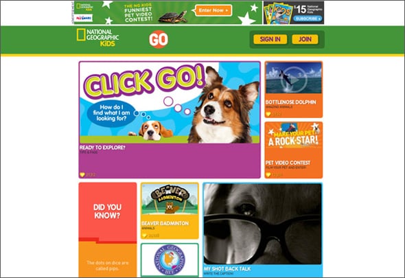
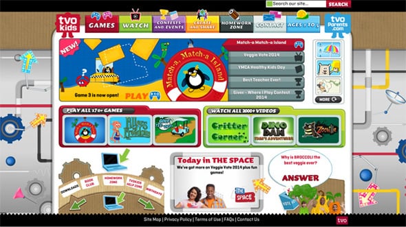
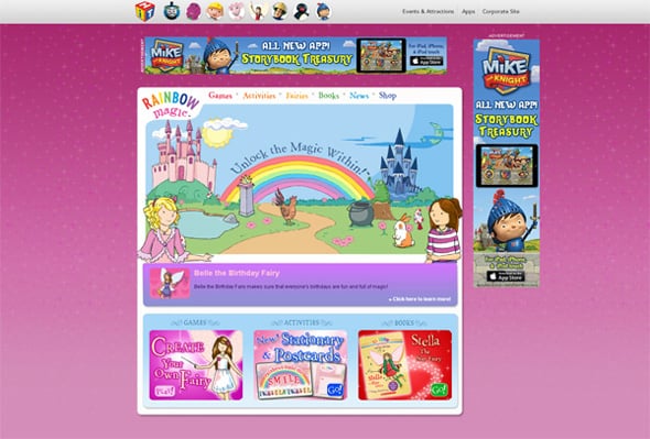
Color saturation and hue are primary factors that determine whether children like something or not. Infants from the first months of life react to vivid colors and this peculiarity is inherent in later ages.
So when designing a website aimed at kids and children with baby website builder don’t be afraid to use too many colors. More likely, your vivid design will be welcomed with enthusiasm. Websites for kids don’t use ‘standard’ color schemes that are well perceptual by adult auditory. They are looking for more bright solutions that are very informative, informal and sensual from children’s point of view.
As long as young web surfers live in accordance with associations and hints given by parents and teachers they may be on the look out of red web design elements. Red is a color of danger and prohibitions, so you may lose users just because having too aggressive call-to-actions. Red can be a kind of tricky so be careful when choosing this color for icons and buttons.
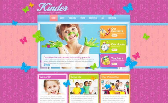
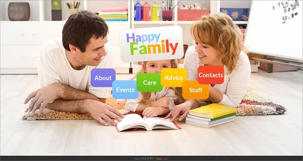
Children Day Care Website Template
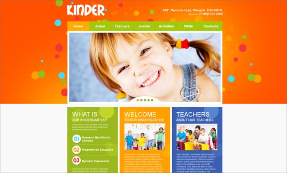
When designing a site with a daycare website builder, it’s also essential to remember emotional nuances. Generally, children are living happy lives and they will try to experience positive feelings again and again. If you’ll be able to make them smile they’ll tell their friends about you. It’s simple and hard at the same time. You never know what will inspire young site visitors but you should try to play with colors, animations, and images.
Let’s talk a bit more about images. They are very important for children who experience the world in pictures. Children, especially kids, look for recognizable elements all around. It brings them a feeling of comfort and safety. Characters that children can relate to some cartoons or real surroundings are more preferable that some imaginary ones without past history. You can also apply real elements from life that are cartoonized but still recognizable.
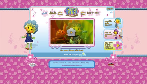
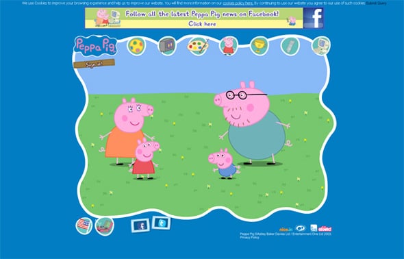
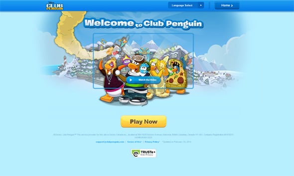
A lot of sites for children as well as for adults have mascots – drawn characters that represents the project. It’s a kind of fun that works for all age groups.
When designing a mascot for kids use up to 3 different poses and arrangements for the character. Thus it will be easier for children to recognize the mascot on every turn and to remember it. Friendly smiling and welcoming characters engage children the most.
It is worth mentioning that on a recent past people actively used clipart on their sites. It’s considered to be great and you may find a tip ‘Use cliparts’ in some posts published earlier. Please note that times have changed and most site visitors don’t like simply drawn pics that are often out of context. Of course, kids oriented websites welcome simple drawings and funny mascots but their usage should be diligently balanced. Moreover, remember that parents and teachers will look through your site before allowing children to use it. They will hardly appreciate a heap of mixed pictures especially if their quality is low.
Children Care Website Template
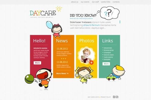
Usually, there is one more thing that catches visitors attention on every site regardless of its subject area. It’s navigation and buttons. A menu bar can be placed in a header or a footer as well as in both areas. Just make sure that it’s well visible on all pages and users won’t be confused with labels.
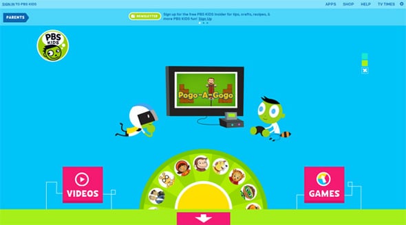
When it comes to children websites you’d better replace text labels with icons or combine them to one. Children are more visually-oriented than adults and they don’t want to read when having fun.
Some companies integrate menu bars into designs, so when looking through web pages young users feel like playing a game. This is a beneficial method because a user acts without any compulsions that regular menu bars can cause.
Features to Remember About
In common web design for grown-ups it’s become increasingly popular to use gamification techniques. They seem to be effective for world-weary people. However, if you apply them to children projects all the badges and rewards will also work great.
Today’s children are digital-savvy and they are crazy about video games. They know how to act to win a prize online, so you won’t surprise them by offering some digital goods for actions. More likely kids will be confused if not seeing such features on the screen. That’s why it’s so important to integrate game elements into online content that is intended for children.
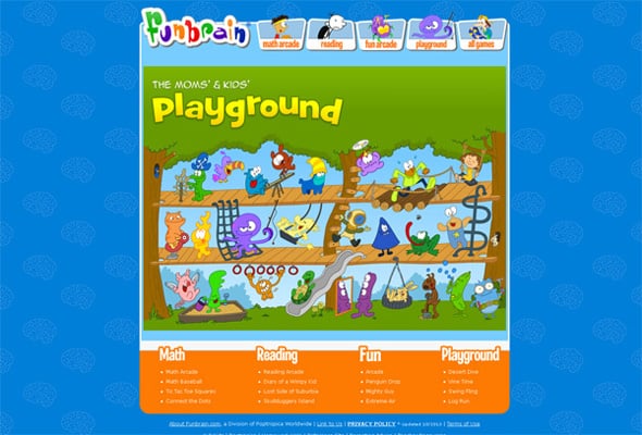
If you’re thinking that highly animated sites will abuse your end-users you should remember that they are children. They like everything that sparks, glazes and moves, so there is no sense to care too much about website loading time. You may still find a lot of kids aimed websites that feature Flash games and Flash players. The whole web declines Flash elements but here we work with a specific audience, so forget about web design trends you’ve read about.
When deciding to use animation apply it to large eye-catchy elements, so that a child has time to take a good look at it. You shouldn’t activate several objects at a time. Small kids won’t be able to concentrate their attention on several moving elements. They may cause them to cry.
As long as we talked about animation lets refer to users’ interactions with the site, whether through its pages or digital communications.
Kids need some freedom for better exploration activity. When being combined with animated elements’ transitions and interactive dialogs it engages and pleases children a lot. So create a few scenarios that little users may follow and implement them. You may use good proven ideas like dressing a Barby, coloring a picture, dancing with a character, cooking a cake, etc.
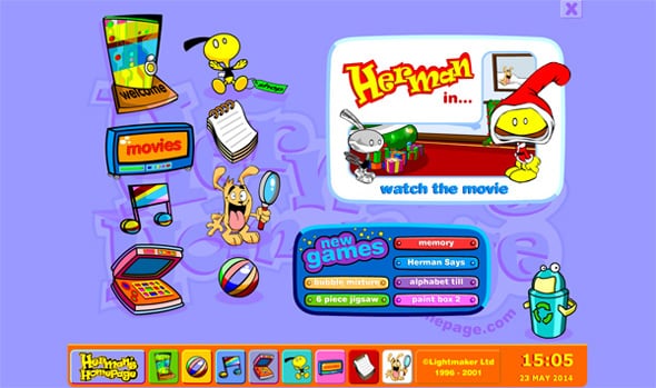
Herman
We were trying to get together tips for designers that help you create websites for children. If earlier you were afraid of such projects, now you can enjoy the most interesting ones.


Arcsketch is a simple tool, kids can use to draw their imagination.
http://www.arcsketch.com
ArcSketch is free online sketch pad to Draw/Paint anything freely, In very simple steps you can create a wonderful sketch, painting, drawing etc.