Mobile Typography Best Practices: Create a Better Website
Sometimes even creativity can’t save a website from meeting a disastrous end unless and until you do something to get its clumsy typography back on the right track. Things get even messier when you are to create responsive typography. There are challenges galore when it comes to create great web typography for mobile devices as their screen size and their resolutions vary widely.
Making a web page perform seamlessly on both desktop and mobile devices has never been easy for web designers. Different factors like responsiveness, readability, space and contrast are to be taken into consideration while trying to make the typography work on both fronts – desktop and mobile.

Here we are going to discuss in detail some of the factors that play pivotal role in the making or breaking great typography for mobile websites.
Contrast
Would you like to visit a website with red texts on a pink background? Of course, you would not because that can make your eyes bleed, metaphorically though. When you are creating typography for mobile devices, you don’t have to do anything remarkably different. Try to follow the standards that you usually follow while designing a traditional website for desktop users.
Of course, there are some technical differences when it comes to determining the amount of contrast for mobile and desktop devices. For example, most mobile users tend to browse websites under the sun (somewhere outside) and that means mobile devices have higher screen brightness. You don’t have to deal with such issues while designing a website predominantly for desktop users as the targeted audience is more likely to browse a website from a controlled environment like from home or office. This is the reason why it is imperative for website designers to make use of Contrast to help mobile users see the texts and other designing elements clearly.
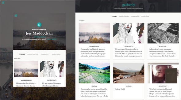
The designer of the Gather.ly website has done a great job with the contrast. White texts on a black shadowy background help the text gain more importance.
Readability
Web is all about written language and that means if you are not careful with typography, your website might fail to impress the mobile users. If people are having difficulties while trying to read the content of your website on mobile devices, your website is going to have a tough time ahead. The less effort a visitor has to put in to understand texts on your website, the better it is for the success of your website on mobile platforms.
Use Helvetica or similar Sans Serifs fonts as they go easy on eyes. You can tinker with the line breaks and the size as well. On average 60 characters (including space) per line are perfect for the desktop version of a web page, whereas for a mobile-friendly website 40 characters per line are the best. You need to strike a perfect balance while determining the number of characters you should include in a line. Make it too long and people will lose interest while reading; make it too short and the flow of reading will be interrupted.
Don’t make the font size too large because that would eat up much of the available space on mobile devices. Make sure, people can read your website text without zooming in. Alignment is another area that you should concentrate on. Don’t try to experiment with the alignment because most people are in the habit of reading from left to right; any change in the alignment particularly on mobile devices might make them feel disoriented.
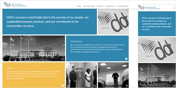
In DDR Corp.’s Corporate Social Responsibility website, the designer has used a simple font and its is ideal for mobile devices. The interface is clutter-free, thus offers an optimal browsing experience. The use of flat color has also added to its simplicity and attractiveness.
Space
Don’t squeeze characters or words because that would make it very tough for people to read. Since the mobile screen size is very small, you will have to go extra mile to ensure that the design looks fresh and not claustrophobic. It makes sense to increase the size of the margin so that the texts don’t jump out of the screen.
Tightly packed texts are definitely not a good sign of a healthy typography; you need to give the website design some room to breathe. Mobile users would not mind scrolling sideways and therefore, you can increase the space between words just to make the design look clean and simple.
Apart from text spacing, there should be ample space between different designing elements. It is all about removing redundant elements and making space for more important elements like texts or so.
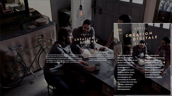
In Belle Epoque website the texts fit precisely within the screen on both desktop and mobile designs. There is enough white to offer a better reading experience to the visitors.
Responsive Design
The great thing about responsive design is that, as we are all aware, it makes a website render differently in different devices. It helps create unique and optimized browsing experience for both mobile and desktop users. Pixels, Rems and Ems are the units of measure used to define responsive typography.
Traditional point system is not used for mobile typography though they are used widely for desktop based web designing project. Rems or Ems units are flexible and therefore, they help create type for different mobile devices.
The type should be large enough to offer comfortable reading experience. The space between the lines should be enough to make it easier for people to read texts while browsing on small screen devices.
To offer optimal reading experience on mobile devices, you need to make the best use of responsive grid system.
Screen Width
Screen width plays crucial role in the mobile typography. And it is not just the vertical width; you need to take into consideration the horizontal width as well. Don’t use too large texts because that will unnecessarily eat up too much space. Large texts would cause type breaks and this is certainly not desirable.
Functionality
Mobile typography differs from traditional typography employed for desktop based websites, as the mobile typography has to play some roles in the functionality as well. Designers often use Text Links instead of a colorful Call to Action Button as they have to make sure that the website gets loaded fast on low end mobile devices. Sometimes mobile typography is used to help people make a call. On mobile devices, functionality and typography work together to offer a better browsing experience to the end users.

Mobile version of Becherovka website uses typography means to help users navigate the website properly. The bottom navigation consists of only texts that are linked with respective pages.
Other Mobile Typography Factors
Don’t use fancy typefaces like Novelty, Cursives or Scripts as they look hideous on small screens. And under any circumstances, you should not use these typefaces in bold format as this would lead to further clumsiness.
Don’t forget the fact that mobile screen is very small and that means, you need to get rid of unnecessarily elements. The use of too many designing elements in a mobile-friendly website will undermine the importance of mobile typography.
And lastly, you should test the website in different mobile browsers and in different screen resolutions to ensure that the site looks great and people can go through the text without any difficulties.
Try the above tips to create a stunning typography for your website.


Leave a Reply