How to Increase Your Conversion Rate by 5x (In a Week)
Over the last week, using conversion rate optimization software, I conducted 36 tests on my bodybuilding website, Insidebodybuilding.com, across 14 different pages. For each failed test, we continued experimenting until each page saw a notable improvement in conversion rate. In the end, 18 of the tests were successful, significantly increasing the conversion rate for 12 of the 14 pages. I will share everything I learned from testing on increasing your conversion rate by over 5x on certain pages.
Note: Conversions will be defined as clicking on a link that sends users to a merchant site. Thus, the goal for each of these tests is to increase CTR and thus maximize affiliate income.
How to Increase Your Conversion Rate – What I Learned From 36 CRO Tests
1. Above the Fold Doesn’t Always Work
Let’s begin with the previously converting page, which was 1%, yet with a simple tweak, it rocketed up to 5.26%. Previously, this article began with a text link above the fold, directing users to the merchant site. Although this worked reasonably well, with a CTR of 1% for an informational query, I believed there was room for improvement.
Thus, I removed the text link and replaced it with a product box (recommending a supplement) halfway down the article. Interestingly, 100% of visitors saw the text link above the fold, and only 67% saw the new product box. However, as the product box was more relevant to the target audience, it produced an exceptionally high CTR.
Takeaway: Relevance > above-the-fold placement.
2. Subtle CTA’s = Ingenious
Some could say that the product box received a much higher conversion rate from the last test because it was a button. At the same time, the original CTA was a text link. Although this may be part of the reason (with buttons generally being substantially bigger and ‘more clickable’ than text links), there are exceptions to every rule. I found this to be the case specifically on a couple of pages that seemingly refused to budge despite my multiple attempts to improve CTR. We’ll call these stubborn pages A and B.
I previously ran several tests on pages A and B, adding relevant product boxes and attractive comparison tables. Yet, the CTR remained very low. However, after analyzing a heatmap of my site (using zoho.com), I found many visitors were clicking on text links, especially in the table of contents and naturally flowing internal text links. Thus, I concluded that my monetization strategy on these two pages might need to be more subtle.
Therefore, I replaced the product boxes with a text link, naturally mentioning a supplement in the article’s context (relevant to the target audience’s interests). Surprisingly, my hypothesis was confirmed – with Page A jumping from a 0% conversion rate to 1.55%. Page B also followed suit, going from 0% to 1.33%. These results were quite shocking, considering the new product being promoted was less relevant than the initial product (in the featured box).
Takeaway: Subtle CTA’s can work wonders on certain pages (depending on the audience), and text links can beat buttons.
3. Move Your CTA Higher Up the Page
Google increasingly rewards long-form content when ranking websites for queries requiring in-depth knowledge on a broad topic. Consequently, the average word count of websites has increased significantly in the last few years. As a result, with many marketers placing CTA’s evenly throughout a page, some end up near the bottom. Although CTA’s placed lower down the page can work, when they are too far down the page, only a fraction of visitors will see them, and conversions will suffer. Out of the 18 successful CRO tests, 7 of them involved moving the CTA higher up the page.
One specific page was a good example of this working well, a beefy page with over 3k words. On the original page, I had a product box of a relevant supplement placed near the bottom. 22% of visitors only saw this CTA previously, however after moving it higher up – 61% of visitors now see the ad. This resulted in 5x higher conversions, increasing CTR by 0.2% to 1%.
Generally, moving the CTA higher up the page doesn’t guarantee higher conversions. However, if only a small percentage of visitors see your CTA because they don’t scroll to the bottom of the page, it may be time to move your CTA northwards (potentially multiplying impressions by severalfold).
Takeaway: Don’t make users scroll too far down to see your CTA (many will leave before that point, and those who otherwise may have purchased the product).
Don’t Just Track Conversions (But Also Revenue)
EPC stands for earnings per click. One of the biggest mistakes people make when performing CRO is measuring conversions and not revenue. I’ll give you a good example of how not tracking this metric can have a devastating effect on your bottom line.
Button Colour is a Big Deal
I recently changed all CTA buttons on my site from turquoise to orange. After running a split test, I found that visitors clicked the orange buttons 34% more. Despite liking the original turquoise button (from an aesthetic perspective), I changed all buttons to orange, expecting a 34% increase in revenue.
However, sales fell off a cliff. Here’s a comparison of how the two buttons performed (in terms of revenue) once landing on the merchant website:
- Orange button: 3.23% conversion rate (£1.46 EPC)
- Turquoise button: 5.16% conversion rate (£2.17 EPC)
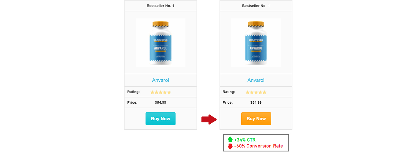
Despite switching to orange buttons and seeing a higher CTR, we found that visitors were much more likely to purchase on the merchant website after clicking a turquoise button from our website. The turquoise button yielded a 59.7% increase in purchases, with a 48.6% higher EPC than the orange button. Thus, we successfully increased our CTR by 34% by switching to a new orange button. But were actually hurting our total revenue by approximately 20% (despite the extra clicks).
How to Increase Your Conversion Rate & Why Did This Happen?
I have a couple of theories. The orange button stood out a lot more, making the product ‘recommendations’ appear more like adverts, potentially causing users to be less trusting (upon landing on the merchant website). Interestingly, the original turquoise button color was the same hex code as our internal links seen throughout the page. Thus, it blended nicely with the site design, possibly helping users subconsciously connect the CTA button to being more of a website recommendation (than a 3rd party ad).
An alternative hypothesis is – for niches where users are wary of being scammed (i.e., supplements), it may be advantageous to use a more ‘mellow’ or ‘calming’ button color (blue or turquoise), rather than a harsh one (such as orange or red). This may subconsciously ease any anxiety, combined with users perceiving your website as more professional (and an authority), as it won’t have a CTA color that shouts at them. Blue has been shown to impact a person’s mood, evoking the following thoughts and feelings: reliable, calm, peaceful, secure, and orderly.
Takeaway: Button color can make a big difference to CTR and sales. While trying to increase your conversion rate, make sure you track revenue (or EPC) and not just conversions.


Leave a Reply