How to Improve the UX of Your Contact Forms
When you visit a website or use an application, you will likely come across a place where user input is required. There might be a form, there might be a questionnaire, or you might need to put in personal information before making a purchase. Learn how to improve the UX of your contact forms to make the most of it for your business.

Why is it Necessary to Learn How to Improve the UX
The types of forms mentioned above are as old as the Internet. Still, some designers find it difficult to create a form that is intuitive and easy to use. Statistics show that 65% of website visitors would refuse to fill out a contact form if it requires too much personal information. Another important thing to consider is that 44% of visitors will leave a company’s website without contact information. Therefore, you need to figure out how to improve the UX of a website to make it popular among internet users worldwide or at least reach out to an experienced specialist in user experience consulting.
UX designer’s job is everything but easy. Since they focus on how users interact with services and products, proper education is crucial for UX designers. Thus, they can understand how people respond, how their needs change, what they find both visually pleasing and functional while combining different aspects of design, technology, psychology, market research, and business.
Good user experience designers have to keep in mind every aspect of the website, which means taking care of contact forms, to consider how to improve the UX of the site effectively. Poorly designed contact forms and the ones that lack functionality are considered extremely unprofessional. UX designers, especially if they are working on a contact form displayed on mobile devices, need to think about the user’s end needs as they go through the contact form design process. They have to remember that mobile device users do not interact with forms the same way they would on their desktop. The forms should be designed to respond to touch and swiping movements.

Be Selective About the Information You Request
From a UX standpoint, the less information a person needs to fill out, the better. You don’t want visitors to your site or users of your application to wonder why they fill out so much information? Focus on how to improve the UX of your website to simply raise its demand on the web. If filling out a contact form becomes tedious, users will probably navigate away as opposed to providing the requested information.
Many people cannot see the link between these contact forms and drop off rates. Contact forms and conversion rates go hand-in-hand. The more information users are required to input, the less information they are going to give. Proof of this is seen by the popularity of using Facebook or Google. Conversion rates when social logins are used jump by 20 to 60 percent. If people can sign in with a single click, they are going to opt for it.
From a user experience standpoint, social login is not always the best option. Still, think about why you are asking for information. For example, if you are selling a digital product, do you really need a person’s mailing address on a contact form? If you are selling a T-shirt, how much information do you need? You need the address you are going to ship it to, the email to confirm the order, and the credit card for payment. Anything else is excessive.
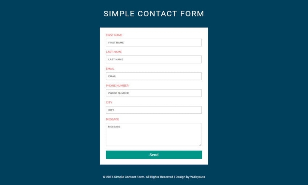
How to Improve the UX by Tailoring Your Labels in Contact Forms
Contact forms come with a bunch of generic fields. You don’t always need these fields. Sometimes the way they are labeled makes it difficult for the user to understand what information you want them to input. To improve user’ experience with your site created by functional web builder, the labels should be kept outside of the input fields. If you don’t do that, as the user inputs information, the field label disappears. You might think, why is this so important to get to know how to improve the UX of a website? There are a couple of reasons you need to do that.
Raise the Forms Mobile-Friendliness
Many of your site’s visitors are using their mobile phones. Mobile phones are ripe with distractions. If they get a phone call, a message, or need to navigate away from your page for any reason, and then they come back to your page, they might forget what information was required in a field. Your website needs to be designed professionally and optimized for different devices. Contact forms must be fully functional whether your visitors are using a laptop or their smartphone.
Work on Contact Forms Flexibility
Users might expect you to ask for certain information. Without thinking about it, they might put the wrong information in a field. If the field label disappears, they have no way of knowing that a correction needs to be made until it is too late.
Consider the Field Label Placement
Another thing you need to figure out is field label placement. You have two options. One is to place the label above the field. The second option is to place the label to the left of the field. It’s typically better to place the label to the left of the field.
If the label is placed on the left of the field, the text should also be aligned to the left if you produce content for the Western world. Remember, people read from left to right. If the text is aligned to the left, it is easy for the user to quickly scan the form. Western users find it easier to assimilate information if there are hard edges on the left.
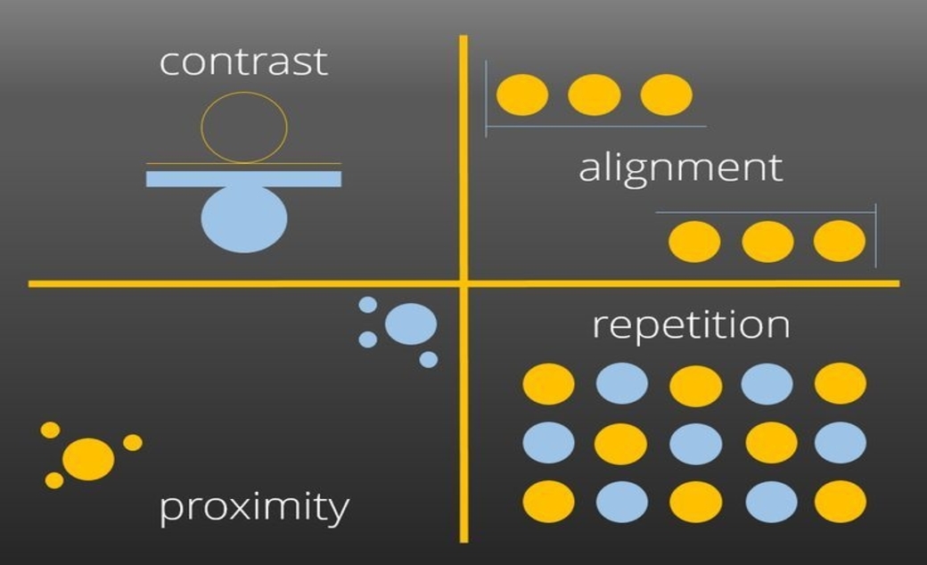
How to Improve the UX by Breaking Up the Content
There are two things that influence the way a visitor to your website will feel about the length of your form. One is the actual length. The second is its perceived length. Let’s say that you require a longer form. You can make it feel shorter by breaking it up using colors and visual elements.
Use the principle of proximity by keeping elements together that relate to one another. Structuring your contact forms in this way will give them an organized look. It will also give the user a sense of completion when they fill out the needed information for a section. You might use changes in background color or a thin horizontal line to indicate when the content required in a section changes.
Guide Your User to Take the Path You Want Them to Take
When your user fills out the form, you want them to follow a series of steps. There might be two options, the option to continue or the option to go back. All things being equal, you want your users to continue to go forward in the form filling process unless there is something that truly requires them to go back.
To guide them in the right way, you must give prominence to one of the two buttons. The solution is to give more visual impact to the option you want them to follow. You could do this by highlighting and changing the color of the option you want them to follow and reduce the size and prominence of the option you do not want them to follow.
As a designer, there is a lot that you can do to reduce errors in filling out contact forms. If an error happens, a well-designed contact form will guide the user to correct the error and continue on. Validation is key to preventing errors. Contact forms are an element of digital media that need constant improvement. Your contact form needs to be tailored to your audience. It needs to match their needs and guide them to complete what you want them to complete.


Leave a Reply