Design Contact Forms Around the Decision After Submission
Contact forms often include everything a business wants to know. Each question becomes another field, and the submit button gets pushed further down the page.
A better form begins at the other end: what decision must someone make after a submission arrives? If the first decision is simply who should respond, the form needs enough evidence to route the message and no more. Designing backward from that moment produces a shorter, clearer exchange.
Name the First Human Decision After Submission
Write the first post-submission decision in plain language. “Choose sales or support” is a routing decision. “Decide whether we can quote” is a qualification decision. “Choose an appointment type” is a scheduling decision. Each requires different evidence, so one universal contact form rarely serves all three well.
Then ask what the person reviewing the submission can actually do with each answer. A project budget may help a studio choose the right service tier. A job title may add little if every inquiry reaches the same owner. If removing a field would not change routing, priority, or the next question, it probably belongs later.
This test is especially useful for required fields. “We may need it eventually” is not a strong reason to block submission now. Collect the smallest amount needed for the next responsible action, then let the follow-up conversation gather the rest.
Separate Routing Evidence From Non-Essential Information
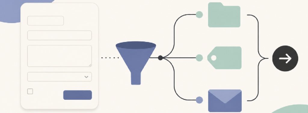
Routing evidence moves the message to the right person. A service category, location, urgency level, or order reference may be essential. Curiosity fields make the record look richer but do not change the immediate handling. The two types often sit together because the form was built from an internal wishlist.
Mark every field R for routing, D for decision, or C for non-essential information. Keep the first two, challenge the third. Some C fields will remain because they prevent a predictable second email, but that should be a conscious trade rather than an automatic one.
A conversational opening can reveal information a rigid list did not anticipate. The public presentation of Palaura uses ordinary-language priorities as an early input. On a business website, one well-framed open question can play a similar process role: “What needs to be different when this work is finished?” may produce better routing evidence than several vague dropdowns.
Open text is not automatically better. It is harder to scan, translate and validate. Use it where the range of legitimate answers is wider than the categories the business can confidently define. Use structured fields where the answer maps directly to a known route.
Make the Question Earn Its Cost
Every field carries at least four costs. The visitor must understand it, decide what to disclose, enter the answer, and recover from any validation error. The business must then store, interpret and protect the result. A field should earn those costs by improving the next action.
The contrast in Palaura — Alternative to Speed Dating Apps is between conversation and swiping or timed introductions. That makes a useful form-design point about pace: faster selection does not help when the available choices fail to represent the situation. Contact forms should be quick because their questions are purposeful, not because they compress a complicated request into the wrong boxes.
Watch for questions that transfer internal work to the visitor. A customer may not know which department owns a problem or which package fits it. Ask about the situation the customer can observe, then let the business translate that answer into its own structure.
Validation should follow the same principle. Reject an answer only when the format prevents the next action. A phone number that includes spaces may still be perfectly usable. A project description that misses an arbitrary minimum length may be short because the request is simple.
Design the Confirmation as Part of the Form
The interaction is not finished when the form reaches the database. The same principle applies when working from a website template: the form, confirmation message, and next step should feel like one continuous interaction, not separate template elements. The confirmation should tell the visitor what arrived, what happens next, and when another route is more appropriate. “Thank you for your message” confirms almost nothing.
Set expectations the team can keep. If response times vary, describe the review sequence rather than inventing precision: the request will be checked, routed and answered by the relevant person. For urgent or account-specific issues, point to the established channel without pretending the general form is monitored continuously.
Send a copy of the useful details when appropriate, especially if the submission is complex. The visitor can correct a mistake before it travels through the workflow, and the business has a shared reference for the next conversation.
Test Contact Forms With an Awkward Request
Do not test only the ideal inquiry. Use one ordinary request, one incomplete request and one that fits two categories. Ask a colleague unfamiliar with the form to submit each case, then give the resulting messages to the person who normally handles them.
Can that person choose the right next action without guessing? Can the visitor explain a case that does not fit? Does the confirmation match what the business will really do? The answers are more useful than a general opinion about whether the form looks simple.
Contact forms are a handoff between two decision-makers. The visitor decides what to share; the business decides what to do next. Build around that handoff, and every field has a defensible purpose. The result may be a shorter form, but its real advantage is that the conversation can continue without starting over.




Leave a Reply