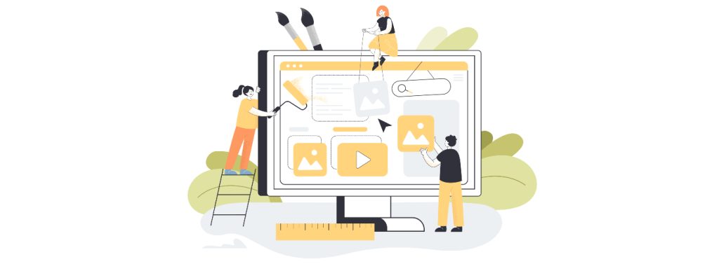
Web Design Learning Made Easy: Build Your First Website from Scratch
Do you ever find yourself staring at a blank screen and pondering the possibility of creating a website from scratch? Just you. A thought. A quiet idea in the corner of your mind. And that empty screen waiting for you to bring it alive. It’s a strange moment. A little heavy. A little exciting.
You feel unsure at first. But then something pushes you forward, and suddenly you’re already imagining colors, shapes, maybe even your name at the top of a homemade webpage.
This guide walks you through your first steps in web design learning. Not rushed. Not too technical. Just simple steps turned into a story. Exactly how a beginner should begin. Let’s start.
Why Web Design Learning Still Matters
People think everything online is already built. But every day, new websites appear like bright dots on a never-ending digital map. Businesses. Personal brands. Side projects. Mini blogs. The world now lives on screens, and screens need designs. Good ones. Clear ones.
Web design learning gives you something powerful. A voice online. With its help, you may project the image of yourself that you want to the outside world. That way, you may talk about things that would otherwise remain under wraps. And sometimes, it becomes a career. Or a side income. Or a calling.
You don’t need a tech background. You don’t need a fancy system. All it takes is an inquisitive mind, a little patience, and a willingness to make a few mistakes. Reason being, that’s the way any given subject is mastered.
Understanding the Basics: What Is Web Design?
Think of a house. Walls. Doors. Rooms. Furniture. Colors. A website follows the same logic. Structure first. Beauty after.
Web design is the art of putting both together. Part visual, part functional, part logic. Part feeling. You build the skeleton of your website. Then you style it. And when you’re ready, you add small interactions that make pages feel alive.
Like buttons that do something. Images that respond. Sections that shift smoothly.
This is web design. A gentle mix of creativity and tiny rules that help everything fit. And the best part? Web design learning is for everyone.
Tools You Need Before You Start
People imagine they need a whole control room to start designing a site. Not true. You need almost nothing. A simple editor for writing. A regular browser for checking your work. A folder to keep your files in. That is all. The barrier to entrance is minimal. So low that you’ll wonder why you didn’t try sooner.
Starting With HTML: Building Your First Page
When you create your first page, it feels weirdly magical. Write a brief text, then save it. You open it. And there it is. Your first webpage. Tiny. Quiet. But alive.
It won’t look fancy. Probably plain. But that first step matters more than anything else. Because once you see your own words appear on a page made by you, something clicks inside. A small spark, a small confidence, a small beginning. And that’s enough.
Adding Simple Styling
Next, you shape your page’s personality. Colors. Fonts. Layout. Spacing. Little touches that turn plain into pleasant. It’s like taking a room and decorating it. A table here. A lamp there. A picture frame that makes you smile.
A few well-placed changes transform everything. Beginners often get surprised by this part. They see how tiny adjustments give shape. Mood. Softness. Balance. Slow steps. But each one brings your website closer to looking like something real.
Choosing the Right Colors and Fonts
Colors talk quietly. Fonts talk softer. They set the mood. They decide if your website feels calm, bold, cheerful, or serious. Use colors like spices. A little bright tone here. A calm shade there. Not too many. Not too heavy.
And fonts? Clean ones work best. Try simple, modern styles that feel friendly. Avoid mixing many types. It gets messy fast. Think of your website like a small story. Colors and fonts become the tone of your voice.
Learn more about color use in web design in our article.
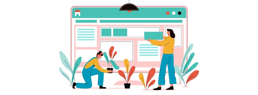
Creating a Simple Layout
Your layout decides where everything sits. Where visitors look first. How do they move from one idea to the next? Create a top section that introduces you. A section where you explain something about yourself or your project.
Another for details, maybe your work or your thoughts. And a small bottom area with your name or copyright. Simple layouts are easier to navigate. Visitors feel comfortable. They stay longer. They trust you more. Even big websites start from layouts this simple.
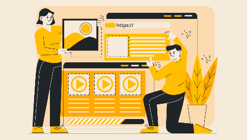
Adding Images and Media
A website without images feels empty. Like a room without windows. Add one picture, and suddenly the page wakes up. Photos bring warmth. Graphics bring clarity. Icons bring direction. Media brings emotion.
For product websites or online stores, visuals matter even more. Some even use features like WooCommerce Product Video to bring products to life. But for your first website, a couple of simple images work great. Pick things that represent you or your message. Anything that adds a little color and a little soul.
Navigation Menus Made Simple
Visitors need guidance. They need to know where to go next. A website without navigation feels like a hallway with no doors. A simple menu does the job. Home. About. Contact. A few links placed neatly at the top or side. Nothing complicated.
Once people can move around smoothly, your website suddenly feels complete. It stops being a single page. It becomes a small world they can explore.
Creating Subpages for Your Website
And one day, you’ll want more space. Your single page won’t be enough. You’ll want a page for your story. Another for your work. Another for your thoughts or projects.
This is where your site grows. Each new page becomes another room in your digital home. They connect together, form a shape, and start to look larger than you expected. That’s when you realize, “This is becoming a real website now.” And you smile a little.
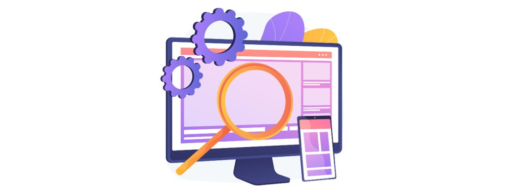
Responsive Design: Making Your Website Fit All Screens
People browse everywhere. On phones while walking, on tablets while eating, on laptops while working, on big monitors that make everything look huge. Your website has to adjust. It has to shrink. Stretch. Shift. Rearrange. Or it breaks.
Responsive design makes your website flexible. It lets everything fit no matter the size of the screen. This is what makes your site professional. It makes visitors stay. This is what modern web design really means.
A Touch of JavaScript for Simple Interaction
Later, you’ll want your site to feel more alive. Maybe a button that reacts. A box that pops up. A small message that appears when someone clicks. That’s where small interactions come in. Not heavy. Not advanced.
Just enough to make your website feel less stiff. These tiny touches add charm. They make visitors feel like the website is listening. And that’s a powerful thing. But take it slow. Interaction comes after understanding the basics.
Choosing Hosting and a Domain
After building your website, there comes a moment. A quiet one. You sit back and think, “I want people to see this.” To put it online, two things matter: A domain.
Your name on the internet. Your digital address. Something clean and memorable. Hosting. A place where your site lives. Safe. Accessible. Always ready.
You upload your files. You click a few buttons. And suddenly your website exists in the world. Not just on your computer anymore. People across oceans could see it if they want. A strange, proud feeling settles in your chest. It’s real now.
Common Mistakes Beginners Make
Beginners make mistakes when they start web design learning. Everybody does. It’s almost a part of the process. Common ones include: using too many colors. Cluttering the page. Putting huge images that load slow. Writing long text blocks without breaks. Ignoring spacing. Forgetting mobile users. Using different fonts that fight each other. These mistakes don’t make your website bad. They make you a beginner. Which is okay. Because beginners grow fast when they notice what looks wrong. Just keep improving. Design is practice, not perfection.
Design Tips That Make Your Website Look Professional
Professional doesn’t always mean fancy.
Sometimes it’s the opposite. Quiet. Calm. Clean. I learned that the hard way while building my first project. I kept adding stuff. More colors, shapes, effects. And well it looked messy. Like a room full of clothes but no space to walk.
Then it hit me. Good design is not noise. It’s balance. So here are small tips that create big changes. They look tiny at first glance, but they shape everything.
Give elements enough breathing room.
White space is magic. It makes your content feel relaxed. Users don’t want their eyes fighting for air. Space guides people where to look without saying a word.
Keep text short and easy.
Nobody wants long, heavy blocks. People skim. They glance. They glance again. Clear text keeps them moving forward without friction.
Stick to consistent font sizes.
Fonts have personalities. Mixing too many is like mixing too many moods. One big headline size. One body size. Maybe one special style. Simple rules keep the whole website in rhythm.
Use one primary color with one supporting color.
Color harmony builds trust. Too many shades make the site feel lost. Choose one strong color, one soft partner, and let them do the job. They will speak for your brand more than you think.
Align things nicely.
Alignment is subtle, but wow, it changes everything. When things line up perfectly, the page feels organized. Like someone actually cared. And users feel that care instantly.
Avoid clutter.
Remove what doesn’t help. Seriously. Buttons, banners, random icons. When you strip the noise, the real message shines. Clutter hides your purpose. Clean layout reveals it.
Make navigation easy.
People should know where to click without thinking. A simple menu. Clear labels. Smooth paths. If they get lost, they leave. And they don’t come back.
These little adjustments lift your entire website.
They’re small moves with huge impact. Users won’t say, “Nice alignment!” or “Great spacing!” They won’t even notice it consciously. But they feel it. Deep down.
Your design becomes calm. Mature. Confident. Not shouting. Just present. And that’s what makes a website look professional quiet choices that seem invisible yet change everything.
Where to Learn More and Grow Your Skills
After you finish web design learning and build your first website, your hunger grows. You feel curious. You want more tools. More techniques. More polished results. Next steps may include:
- Learning modern layout systems.
- Studying user experience principles.
- Understanding accessibility.
- Exploring animations.
- Practicing with small redesign projects.
- Joining online communities.
- Trying mini freelance tasks.
The Joy of Building Something from Scratch
There is something incredibly fulfilling about creating your first website. It’s like sketching your first picture as a child and displaying it on the fridge. A little messy. A little crooked. But yours. Completely yours.
You see your own ideas forming shape. Then you start understanding how the web works. You realize you can create things the world might actually see. This joy grows. And it’s what keeps designers coming back, even years into the journey. You’ll remember this first website. You’ll remember the moment it finally loaded in your browser. We all do.
Conclusion
So here you are. Finished with web design learning. Or maybe just starting. You walked through the ideas, steps, mistakes, improvements, and the entire process of building a simple website from scratch.
Web design isn’t a secret skill. Not a privilege. Not a complicated world meant only for tech-minded people. It’s creative. Forgiving. Learnable.
A place where you can grow steadily, day after day, until everything starts to feel natural. Your first website might be small. But it’s the doorway to something bigger. This journey is yours now. Where will you take it next? That’s the exciting part.

Leave a Reply