Poor Website Design VS Good Design – How to Distinguish Them Right
Graphic design is a form of art that is used in the corporate world and for marketing purposes. The goal of web design is also to sell and satisfy consumers. Although, web design and graphic design are an art form we can’t say that you can creatively do whatever you want to do as painters for example. Even though creative people work in these fields still each graphic and web designer need to know how to satisfy the client’s needs, how not to make poor website design and know how to develop a design that is user-centric.

User Experience Design
Every designer needs to master user experience, commonly known as UX. The first thing is to understand what UX is. UX is not web design, which is about making various elements of the digital interface work together. It’s also different from UI design which is about designing the visuals of an app or website. UX is about making a great experience for the user, meaning you need to know the needs of the target audience before you begin you create your solution. A web designer should ask himself questions from the website design questionnaire and answer them honestly, objectively assessing a project.
There are rules to be followed in order to deliver a good and effective design. However, that is where so many designers fall and deliver poor design websites and marketing materials.
Difference Between Poor Website Design and Good Design
What is the difference between good and poor design? We said that UX is very important but can you recognize bad design by just by looking at a website or a marketing promo material?
Poor design is immediately recognizable, you don’t have to be an expert to spot one. Good web design must have:
- purpose;
- typefaces;
- good colors;
- suitable images;
- simple navigation;
- grid-based layout;
- good web content development;
- good load time;
- responsiveness to mobile and tablet devices.
As you can see, there are many elements that you need to consider before you finalize your project, build own website or present your final product to a client. You need to do a quality check before anything goes live. Knowing all of the rules there are still web designers that make catastrophic mistakes and create poor design websites. Remember that website design mistakes kill conversions and estrange possible new clients.
We have compiled a list of good and poor website design for examination purposes and to point out a few mistakes you need to avoid and examples you need to follow to deliver the best solution for your customer.
Good Design
Here are the examples which have nothing to do with poor website design. We have created an inspiring website design collection with outstanding design.
Slacks Mobile Application
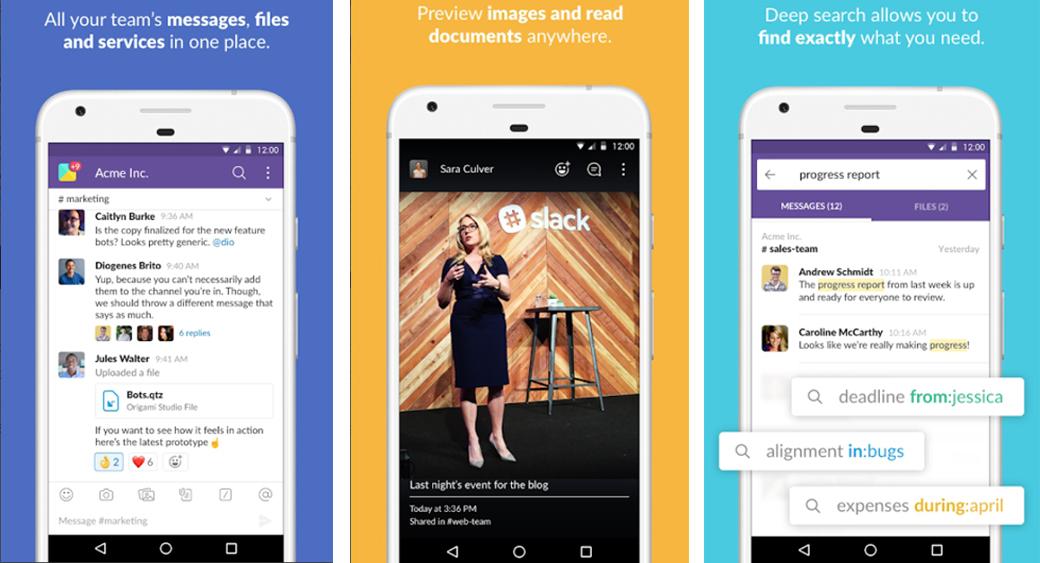
Communication and chat apps must always deliver a clear and organized preface or every user will get overwhelmed by the volume of messages they are getting on a daily basis. Slacks navigation bar is a perfect example of how you have to position and organize clutter on a mobile app.
Since there is a big chance to get overwhelmed by the number of messages being posted on the app, Slack’s solution is to minimize all these messages in the navigation bar and categorize them by channels/private channels/direct messages. You can easily switch between channels not feeling frustrated by clutter or a huge amount of data you will be getting during the day.
HubSpot Website
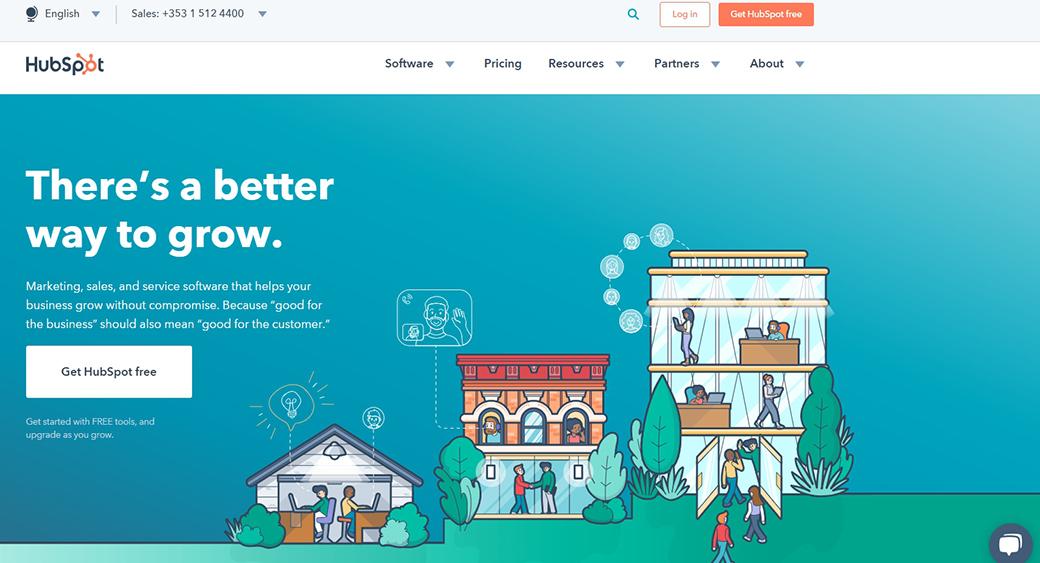
HubSpot has a really clean website design. From a visitor or user, perspective is pretty easy to find things and you won’t ever get frustrated by lagging of the presented information and data. The best thing about their website is the simple navigation menu where you can get to any part of the website fast and easy.
Simply Chocolate
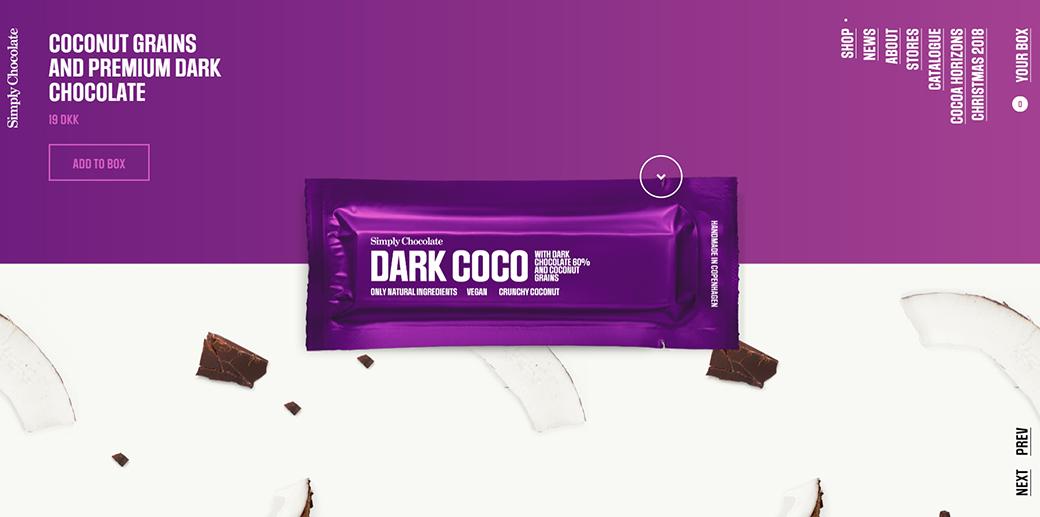
It’s really easy to figure out by just one look on the website what the company is about. This is a bold and creative design solution that perfectly aligns with the company’s business goals. Simply Chocolate is based in Copenhagen, Denmark and it’s obviously a chocolate production company.
The website is a perfect example of a parallax effect meaning that as the user scrolls down, a chocolate bar floats in space above all the content, unwraps and breaks into chunks. All of the ingredients of each bar are animated in the background. Fun and entertaining way to present your product to the visitors of your website.
According to a study by Adobe, the state of content Report, 59% of people will browse or read through something beautifully designed rather than something simple and boring. You might think that minimalism is modern but in reality over the top design might give you better performance results. Simply Chocolate was obviously familiar with this fact before they started building their website.
Bellroy
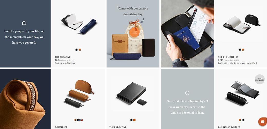
Bellroy’s website is a fresh and unique idea for an e-commerce website that is entertaining for the visitors because it beautifully captures and demonstrates how their products can fix all of the pain points the target audience faces on a daily basis.
There are many animations that describe how the product will solve your problem. For instance, how you can turn your chunky wallet into a slim elegant black leather box. They invested time and effort to develop such design that captures the essence of their products. From a consumer perspective, this website is a perfection.
Apple

Another well-done parallax effect. Apple really knows how to produce and develop a user-centric design and experience. For the promotion of their new phones, they rebuild the website explaining all of the important features of their products. They exactly know, what are the competitive advantages of their products and they use any occasion to promote this.
On their website, if you start scrolling you will immediately get to know all of the new and important features of an iPhone. Even if you haven’t heard of iPhone before, you can easily fall in love with this product in just a few seconds.
According to Local Consumer Review Survey by Bright Local, 97% of consumers looked online for local businesses in 2017, with 12% looking for a local business online every day. Apple knows this, that’s why they use digital formats of promotion all the time for their products.
Bad Design
The following sites are a good example of how-not-to-do, so they show how poor website design looks like.
The Independent
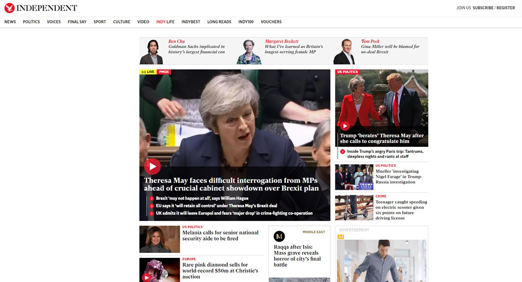
Get that is a news portal that has a poor website design solution. Why? Because they’ve added too much data on the homepage. It’s overwhelming. On the navigation bar, you can see irrelevant categories and ads. All of these things repel people from the poor design website and increase bounce rate. The other thing is the slow loading of the website. It’s a bad idea if people have to wait for so long just to read a news article.
Alfred Sung Eyewear
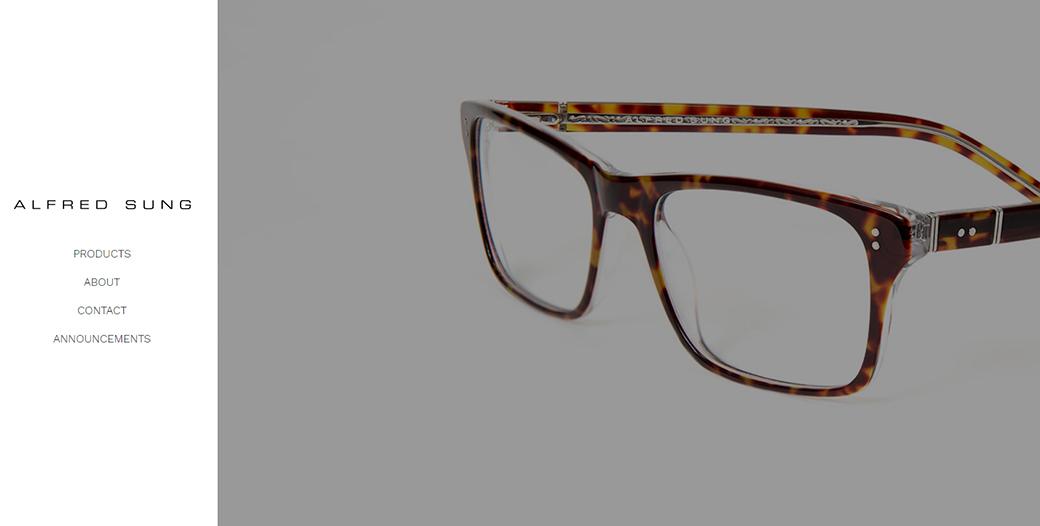
People are very disappointed in the design of this website. If you open it, you will see a minimal design explaining the product with a small navigation menu. But don’t let the minimalistic look fool you, this poor design website is far from perfect.
There are a lot of unforgivable issues that destroyed the whole user experience. However, the biggest problem is the Flash on the home page that is not compatible with most Firefox browsers. As a matter of fact, you may be led to an error page as your Flash doesn’t work and you won’t be able to see anything.
Arngren – Chaotic Design
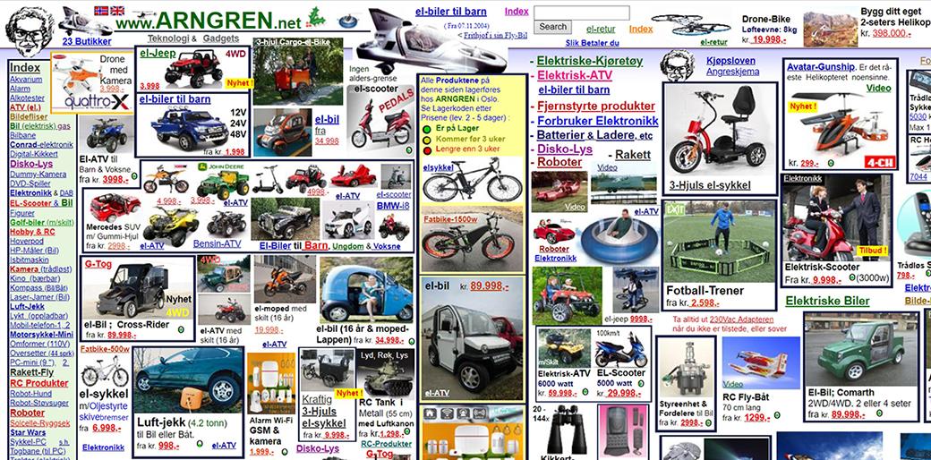
This is one of the worst and really poor website design solutions that we have ever seen. As you can see from the image, the site places the content, graphics, and links anywhere. They didn’t use a well-structured design for their website. Arngren is a great example of how if you don’t follow UX rules you can create a poor website design for your client.
All of the elements together on the website make this awful mess. There are many mistakes made on this web design, however, the biggest issues are:
- The fact that the site is not using a grid.
- The navigational structure is a complete mess.
- The typography is very bad, making the website to be unreadable.
- They randomly used colors not following making the poor website design, even more, repelling for the human eye.
PennyJuice
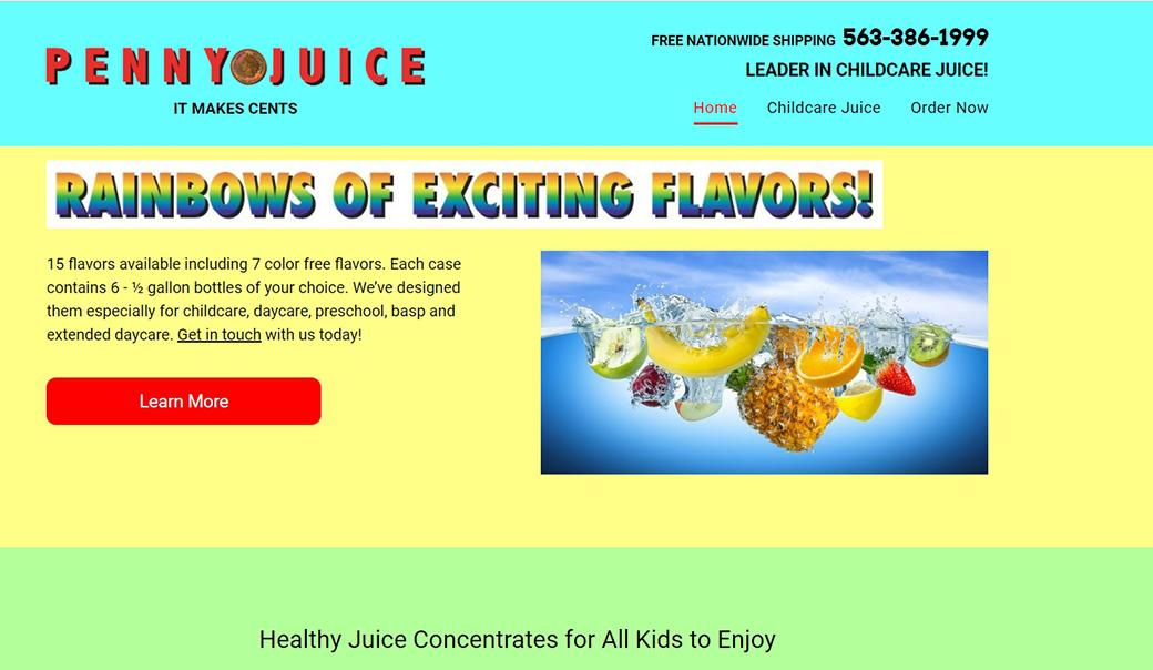
It looks that PennyJuice decided to use all of the existing colors on their website. This is a perfect example of how colors can change the whole UX and make or break your business. The inadequate use of colors is just one of the many problems. They clearly fail at providing clear descriptions of their products/services.
Although quality content is the core of every website, we simply can’t see that on PennyJuice poor design website. For all of the above-mentioned reasons, it’s very hard to find more about their products/services or even stay longer on the website because of the bright colors. The intense design and the lack of clear navigation surely affects the volume of visitors and bounce rates. They must have low traffic and huge bounce rates.
Industrial Painter

We all get nostalgic sometimes but nostalgia in the web design world is not acceptable. Can you imagine showing this website to your consumers? How do you think they will react? Using designs from the 90s is unacceptable, especially if the web design is not aligned with the business goals. Yes, some may argue that the 90s was the best decade ever, but that doesn’t mean that what was popular back then in terms of design is applicable in today’s world.
Final Words
As you can see, one should consider a bunch of tools, details, and elements when you are processing the project or concluding it. Building your website and presenting your product to a client is the final step of the project which should be reasonable. It is necessary to do some quality checks before your project goes live. Taking into account all of the above rules you as a web designer can avoid big mistakes and poor website design.


Check beneath, are some entirely unrelated websites to ours, even so, they’re the most trustworthy sources that we use.