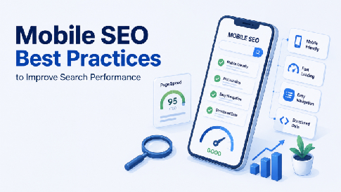
Mobile SEO Best Practices to Improve Search Performance
More than half your traffic is probably coming from a phone right now. That’s exactly why mobile SEO isn’t optional anymore. Google primarily crawls websites with a mobile crawler, so your mobile version needs to provide the same essential content and functionality as the desktop version.
Here’s the thing: a lot of sites still treat mobile as an afterthought. Desktop gets the polish, mobile gets whatever’s left over. That gap is costing rankings and revenue.
What Is Mobile SEO, Exactly?
So, what is mobile SEO in practice? It’s the process of making sure your site performs well, loads fast, and reads clearly on smaller screens, since Google primarily uses the mobile version of a site for crawling and indexing.
This isn’t a separate strategy from your regular SEO work. It’s a layer on top of it, focused specifically on how phones and tablets experience your pages.
Getting the technical fundamentals right often takes more than a quick audit. Teams that lean on outside SEO Services tend to catch mobile-specific issues, like broken viewport tags or oversized images, that a general site review misses.
Once those fundamentals are solid, the rest of your mobile SEO optimization work gets a lot easier to prioritize.
Core Mobile SEO Best Practices

These are the fundamentals. Skip any one of them and you’re leaving rankings on the table.
Page Speed on Mobile Networks
Speed matters more on mobile than desktop, full stop. Phones run on inconsistent networks, and Core Web Vitals are part of Google’s page experience signals and help assess how users experience a page.
Compress your images, lazy-load anything below the fold, and cut unnecessary scripts.
Quick summary: Mobile page speed directly affects both rankings and conversions, so prioritize image compression, lazy loading, and trimming unused scripts first.
Responsive Design Over Separate Mobile Sites
Running a separate m.yoursite.com domain used to be common. It’s not anymore, and for good reason.
Responsive design serves one URL that adapts to any screen size. That keeps your content and URLs consistent across devices and avoids the additional complexity of maintaining separate mobile and desktop versions.
If you’re using a website builder, check what mobile and SEO controls are available in its admin panel. MotoCMS, for example, provides tools for managing your site’s mobile version and built-in SEO settings, including meta titles, meta descriptions, image alt text, and page-level SEO settings. These controls make it easier to optimize individual pages for search while keeping the mobile experience consistent across devices.
If you’re interested in the broader role of mobile optimization in website performance and user experience, see our guide to mobile optimization for your website.
Tap Targets and Readable Text
Buttons that are too small or too close together frustrate mobile users fast, and Google notices when people bounce right back to the search results.
Make buttons and other interactive elements large enough to tap comfortably, with sufficient spacing between them. Body text should be readable without pinching to zoom, generally 16 pixels or larger.
SEO for Mobile: Technical Checks You Can’t Skip
Beyond design, there’s a technical layer to SEO for mobile that trips up even experienced site owners.
- Confirm your viewport meta tag is set correctly so pages scale properly on every device.
- Check that mobile and desktop versions have matching structured data and metadata.
- Avoid intrusive interstitials or pop-ups that cover content the second a page loads.
- Use tools such as Lighthouse and PageSpeed Insights to regularly check your site’s mobile performance and usability.
Note: Mismatched structured data between mobile and desktop versions is one of the most common, and most overlooked, mobile SEO mistakes.
Content Strategy for Smaller Screens
Long paragraphs that read fine on a laptop can feel overwhelming on a five-inch screen. Break content into shorter paragraphs and use subheadings generously so readers can scan.
Front-load your key points. Mobile readers are more likely to skim than scroll through a full page before deciding whether to stay.
Video and image content should be optimized for mobile bandwidth too. A gorgeous hero image that takes six seconds to load on 4G isn’t gorgeous, it’s a bounce.
Menus and navigation deserve the same scrutiny. Mobile users won’t hunt through nested dropdowns, so keep your primary navigation short and put the most important pages within one or two taps.
Local Search and Mobile Overlap
A huge share of mobile searches carry local intent, things like “near me” queries or location-specific questions. If your business serves a specific area, your mobile SEO optimization should tie directly into local SEO fundamentals.
Keep your Google Business Profile current, make sure your name, address, and phone number match across the web, and build location pages that load fast on mobile connections.
Important: Local intent searches convert at a higher rate on mobile than desktop, so slow load times on location pages cost you disproportionately more.
Measuring Whether Your Mobile SEO Is Working
Track mobile-specific metrics separately from desktop in Google Search Console and Analytics. Blended numbers hide problems that only show up on smaller screens.
Watch mobile engagement metrics, Core Web Vitals, organic traffic, and mobile-specific keyword performance. If any of those lag behind desktop, you’ve found your next fix.
Set a quarterly cadence to re-test your site’s mobile experience. Search engines update their mobile evaluation criteria often enough that a site that passed last year might not pass today.
It’s also worth comparing your numbers against competitors in the same space. A slow mobile score might still beat the industry average, or it might be exactly why a competitor keeps outranking you for the same terms.
FAQs
- What is mobile SEO and why does it matter?
Mobile SEO is optimizing your site for how it performs on phones and tablets, since Google ranks sites primarily on their mobile version through mobile-first indexing.
- How is mobile SEO different from regular SEO?
It focuses on speed, screen size, tap targets, and mobile usability specifically, layered on top of standard SEO work like keywords, content, and backlinks.
- Does page speed really affect mobile rankings?
Yes. Google’s Core Web Vitals factor loading speed into mobile rankings directly, and slow pages also increase bounce rates, which compounds the ranking impact further.
- Do I need a separate mobile website?
No. Responsive design that adapts to any screen size is the current best practice, avoiding the duplicate content and crawl budget issues separate mobile sites create.




Leave a Reply