Flat UI Colors in Web Design – Color Combination Guide
One of the lasting web design trends which have surprisingly stayed around for quite some time is flat design. This minimalist user interface styling implemented in modern software, web and mobile apps has gained maturity over the past several years. Flat UI colors are now widely used not only on the web but also in publishing for graphical materials. If you want to learn more about this design method, check the ultimate guide to flat design.
Flat UI design is called ‘flat’ for a reason: it doesn’t utilize any three-dimensional elements, deep shadows or vivid gradients. Buttons, icons and other graphic UI elements look simplistic and concise, but still attractive and clickable. Designing a flat website can be quite challenging due to the interactive elements. The design should help website viewers to tell the difference between the static and dynamic content. Subtle shadows and edge effects give hints on whether a specific element is interactive. Still, the finesse of design elements is the key to a ‘balanced’ flat layout.
Finding the right flat UI colors palette
The power of color in web design is unconditional. It’s fair to say that a good blog color combination is capable of improving reader engagement. So how is flat design unique in terms of using colors? The vivid color palette used in flat UI colors design strikes the eye at once.
Unlike traditional color schemes using two or three shades, flat layouts are painted in four or more colors. Very often these are fully saturated hues combined with dark colors like gray or black.
Mind that traditional color matching rules are not applicable to flat design. It is not the colors that match, but rather their tone and saturation. Even though multiple shades may be present in a single layout, they still complement each other with color depth. The color combination itself may incorporate primary or secondary colors, or even contrasting color mixes of black and white.
Coming from theory to practice, I’d like to provide you with a set of W3.CSS Flat UI Colors. This batch presents several default color schemes to use for website development. There are material design, flat colors, Windows metro colors and Windows phone 8 colors. The cool thing is, this set of colors is accompanied with an example of HTML and CSS code. So, you can try out the favored color combination straight away!
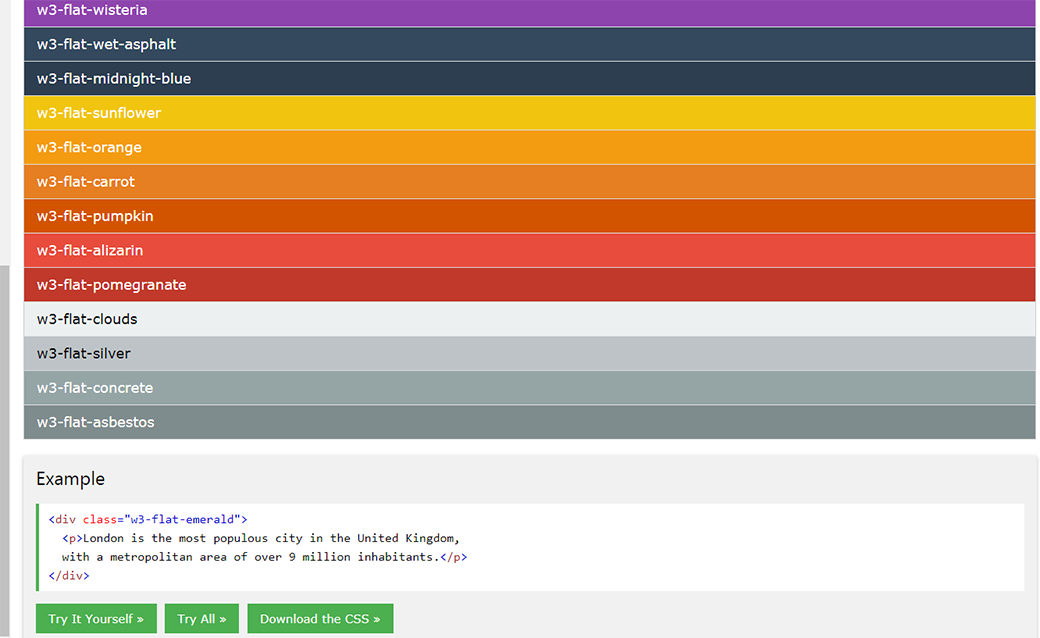
Source: W3Schools.com
Using Flat UI colors Tool
Also, if you’re a total noob and don’t know where to start, try Flat UI Colors. It is possible to copy a specific color on the website and then find it in your graphic editor by pasting the color values. As you can see the predominant colors are vibrant ranging from bright greens and blues to yellows and oranges.
However, there is a merit to selecting specific colors. For instance, you don’t get to see the combination of primary colors like red, yellow or blue within the same UI palette. Turns out richer, mixed hues are more preferred by the designers.
Want a flat design website for your business or personal project? Consider ready-made MotoCMS 3.0 templates created using flat design guidelines. I tried matching the templates with several flat color swatches to demonstrate how they work for UI.
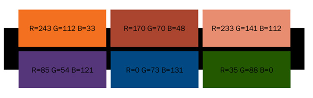
Bright colors. These bright blues, greens, and purples surely stand out against the contrasting white or black background. Take a look at how they can be implemented in website design.
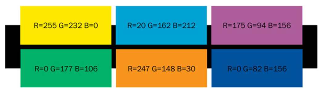
Source: Designmodo.com
Photo Print MotoCMS 3.0 Template
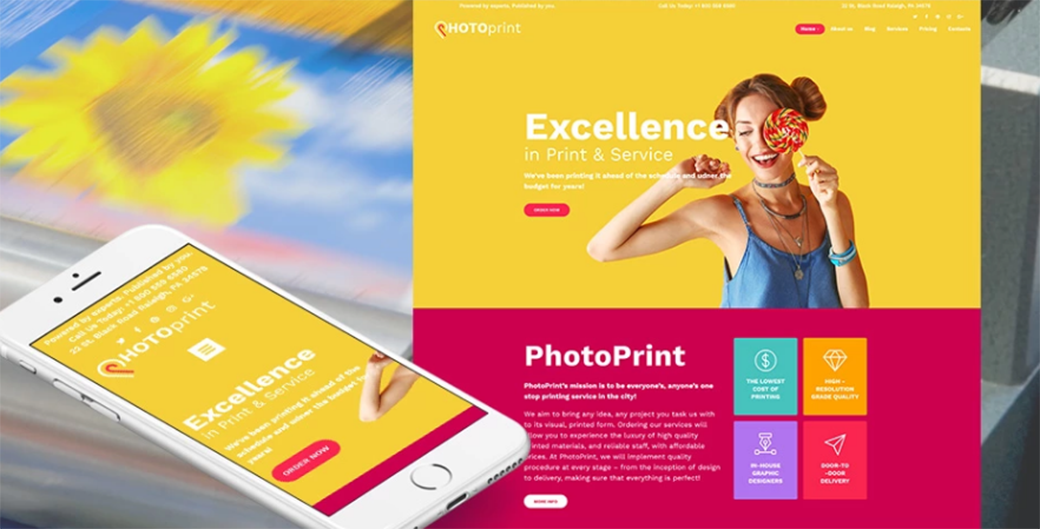
Photo Print MotoCMS 3.0 Theme is a great option for a print shop or printing company website. Still, this template is quite multi-purpose to suit nearly any kind of business. It is designed using typical flat UI colors and elements. This item offers 8 slider and image gallery options alongside with 20 widgets and modules to help you fine-tune your project.
Retro colors. These are mostly pastel oranges and yellows with occasional reds and blues. Primary and secondary colors are more common for retro color schemes in flat UI because the colors look muted.
Source: Designmodo.com
Web Design Agency MotoCMS 3.0 Template
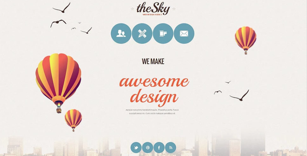
Want to see how a flat design layout will work for a web studio resource? Then this Web Design Agency MotoCMS 3.0 Theme would be a perfect choice! Pleasant peachy colors, artsy images, and textured background create an unforgettable vibe. This template offers rich slider and gallery settings, as well as a set of modules for website customization. It can serve as a minimalist landing page to provide a showcase of the main services your business provides.
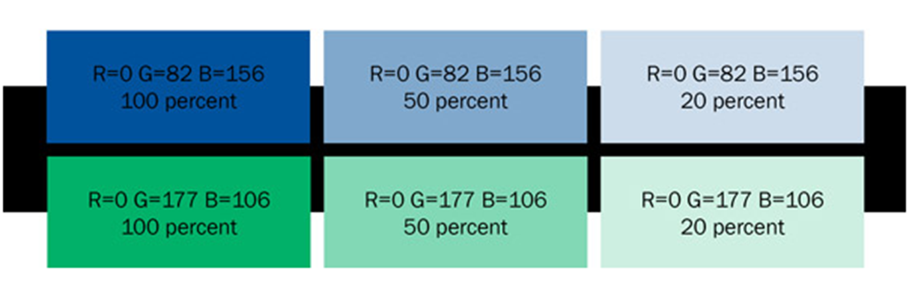
Up next is another flat design color scheme. Monotone colors have gained popularity in the niche of mobile app development. Usually, monotone color schemes offer the base color combined with two-three contrasting hues.The most commonly used colors are blues, grays, greens and their shades.
Source: Designmodo.com
Website Design Company MotoCMS 3.0 Template
TRY FOR FREE
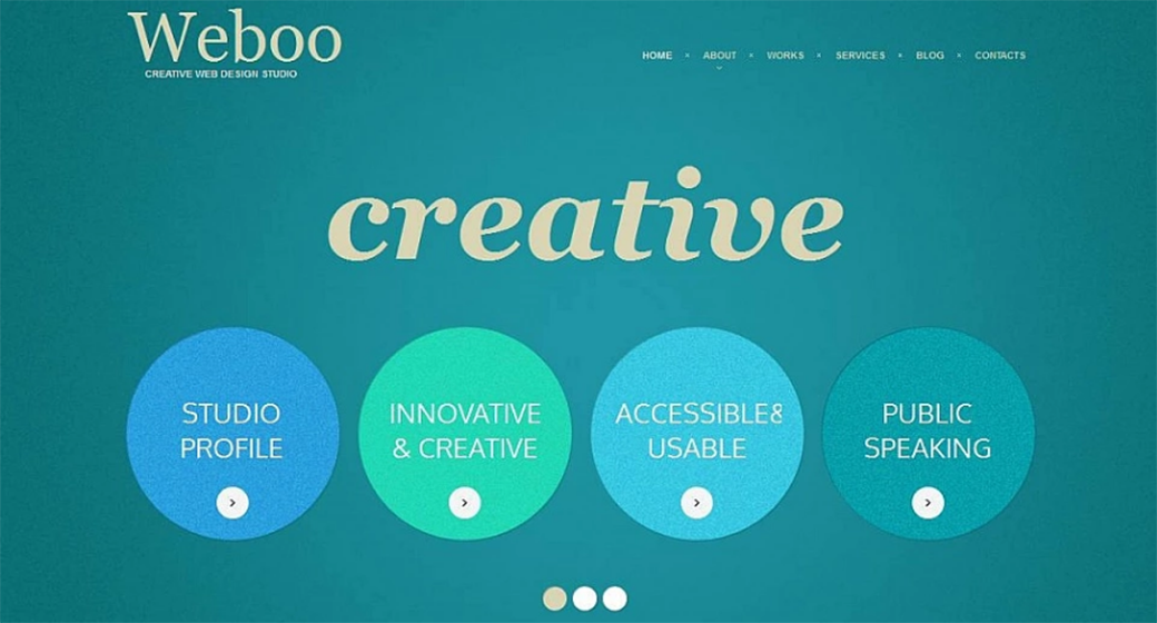
Weboo is a creative design MotoCMS 3.0 template to use for a web design studio or web designer portfolio. Designed in monochrome flat UI colors, it looks professional and attractive. An array of rich customization possibilities will make sure your website will stand out among the competition. A selection of gallery scripts includes ‘Background Slider’, ‘Carousel’, ‘Grid’, ‘Reflection’, etc. Check out the live demo to see more of this theme!
Final Thoughts
Whether you’re into flat design or not, you can’t deny its long-lasting popularity. Using flat colors in UI design reflects the modern trends and ensures your project looks attractive. Flat UI design kits and color swatches will help you choose the right color combination for your project. Mix and match, experiment with colors and hues. Good luck in finding the right combo!
Do you know any great flat UI color pickers? Or maybe you’ve found a cool color palette for your resource? Share your discoveries in the comment section below!


Thank you for the inspirational post. Clear and helpful.
Thank you for the comment 🙂
I am really glad that you like the article and will expand the topic in the upcoming posts. So, if you would like to read more on flat design, UI colors, and inspiration – just leave me a comment below and I will definitely include your ideas.