Website Menu – How to Arrange It Right
For your users to navigate between different pages on your website, they will head to your website menu. Here, they’ll be able to hover over various categories and will click on any pages of interest. As an integral part of your website’s design, it pays to give your website menu some attention to make sure it’s performing correctly. The key to success with your website menu is figuring out all of your pages’ best arrangement. The menu should have a sensible order that takes users on a logical journey. If in doubt, an experienced web designer can help you create a better plan of action, but for now, here are our top tips on how to arrange your website menu to tell you more.
Grab A Pen And Paper
A beneficial exercise is to draw out your website navigation before you arrange the menu. You need to know exactly what pages you have so that your main menu can best link to them. The main menu will be the strip that runs across the top and is usually divided into categories. From there, you will then have subpages that will appear underneath when users hover over each of the main categories. Visualizing your menu in this way will give you a better idea of what your users will see. The information should follow a sensible pattern so that people can easily find what it is they are looking for.
Website Menu – Do Your Research
When planning and visualizing your website menu, a little bit of research goes a long way. Finding out which pages have the longest view time, for example, gives you an indication of what content is being most engaged with and what should be featured most prominently. In other words, the content with the most extended view time should be placed firmly at the top, as it’s driving the most engagement.
Choose Your Menu Style
While websites vary dramatically in terms of their content, visual style, and structure, there are standard navigation menus found on websites of all shapes and sizes all around the digital world. And they’re widely used for a reason – they provide simple, easy navigation and are recognized by users globally. Here are some common menu styles to choose from:
- Hamburger– a clean and straightforward icon composed of three horizontal lines that look a bit like a hamburger (hence the name!). It is ideal for mobile web design as the tiny icon can easily fit onto mobile screens.
- Sidebars – Sidebars appearing on the left or the right-hand side of a website are a simple but effective menu navigation style. They can be discreet or act as a vital component of the overall design.
- Split menu – A newcomer on the block in the world of web design, the split design menu is a trendy alternative to the standard menu navigation, separating links to each page in different corners of the screen. If pulled off, it can be incredibly useful, but be wary that you don’t overcomplicate things and confuse users.
Website Menu – Mistakes To Avoid
One of the most common mistakes with a website menu is adding in too many pages. Often, not enough thought has been put into condensing the content. If there are too many pages to scroll through, your users are unlikely to bother. Likewise, avoid making your menu too short. While it’s acceptable to keep things brief in some cases, you don’t want to create so few pages that users can’t find what they came for. All of their key questions and requirements should be answerable within your menu design.
You should also make sure your most viewed pages are easy to find within your menu too. If you hide them or delete them entirely, your website traffic could drop dramatically. It’s a good idea to put a button or a banner on your homepage that will directly take users there. Unclear labeling is another common faux pas when it comes to arranging website menus. Make sure that you choose the right wording for each item on your menu. It is when it’s essential to step out of your shoes and into those of a user. If you were landing on your website homepage for the first time, would you understand what’s being displayed without any preexisting awareness of what it is? Keep wording as literal as possible, ditching unclear industry jargon.
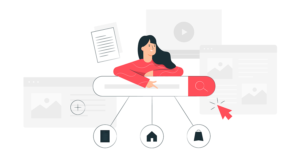
Add A Search Bar
If your website is a bit content-heavy, adding a search bar is a useful tool for helping users find what they’re looking for quickly. Remember, we live in an age of information overload and decreasing attention spans, so it pays to make your content as easy to access as possible. Otherwise, users will jump onto the next website after all of two minutes! A search bar is particularly useful if your audience is likely to be inexperienced with using the web – although admittedly, that’s not many of us these days.
User Testing
Once you’ve designed your menu, could you test it out before you settle on it? Ask your users for their opinion and keep a close eye on your website analytics too. Doing user website testing will give you clues about how easy it is for your users to follow through with specific actions. You may need to make some tweaks if the information isn’t clear enough to find.
For example, if you’re a service provider, your online booking should have a place in the main menu header. If users have to hover over several different categories to reach the online booking form, it’s not prominent enough. Nailing your page menu hierarchy is the ultimate goal here.
LinkBack To the Homepage
One of the easiest mistakes to make (and avoid) when it comes to web design is forgetting to link back to your homepage. Since your homepage is where links to your most relevant content and pages will be displayed, it must be easy for users to access. You don’t need to include a button that says ‘homepage’ to do this – the most simple and effective way is to link back to your homepage through your logo. Users will intuitively know to click on your logo to get back to the homepage as this is a standard web design convention that is recognized globally.
Website Menu – To Sum Up
With so many different elements to consider when it comes to web design, it’s easy to let the arrangement of your website menu slip. But, giving it some proper attention, it’s one of the best ways to boost your website traffic retention. By making sure the most important information appears first and removing unnecessary pages, you will turn more of your website visitors into actual conversions.


Leave a Reply