White: Why to Use in Web Design?
MotoCMS Editorial 10 December, 2013

While many might debate in favor of the color fiesta (We don’t mind the color variety, trust us!), white still remains the undefeated ruler as far as the choice of colors for websites is considered. Those who have a special affection for the subject of colors, might just exclaim the age-old adage, ‘White is where colors are born, white is where all colors perish’. Well, all that is the result of a special emotional attachment with the colorless color. Speaking about why ‘White’ is the most tempting color to web designers, we have just one powerful reason – it is user friendly! In this article we just break down this one reason into 8 deeper sub-reasons.
1. Dark font on light background is comfy for the eyes

Light plays a very important role in deciding how long your visitors want to stay on your website. If you choose to have light colored fonts on a dark colored background, light would flash on the screen, hit each word, and then scatter into each other. Simultaneously, the dark background reflects the light back into the reader’s eyes. The result is that the words get less readable and the visitor tends to escape the torture to eyes. On light backgrounds, with darker fonts however, light gets absorbed in the background and the letter. This makes light backgrounds better platforms to hold readers’ eyes. Shades of white perform best at this art.
2. White is the default HTML and CSS styling color, and there’s a reason for that
Any person with a shallow knowledge regarding colors would agree in unison that white would be the most harmless color. It requires great knowledge to choose a background color and any mistake could be a blunder. The entire personality of an online business depends upon what colors and what images have been chosen. Given the risk tantrum of choosing shades of background, white could be a savior. That is the reason the default HTML and CSS styling color has been kept white.
3. Images stand more impactful on white

Images have their desired impact when they are complemented with the right foundation color. A blue image on a grey background would look horrible. Similar effect would be with a red image on an orange background. But both a blue and a red image would look equally good on a white background, wouldn’t they? Almost all colors look composed and elegant when presented on a white base plate.
4. White is neutral, no cultural worries

In most cultures, white indicates peacefulness and serenity. Other colors might stand differently in different cultures. But if you have a website with some shade of white as the background theme color, you would not stand any chance for cultural shocks. This is one of the benefits that have led many businesses to go for white as the theme color for their websites.
5. Websites look elegant in white shades

Simple is evergreen in fashion. If you want to spare an elegant touch to your website, that would keep your visitors stick on for a long time, white is the color. The main reason behind this psychology is that white is relatively soothing to the eyes. But it is important to note that the shade of white which is being chosen has a stark impact. Snowy white color might not look as good as the warmth of creamy white.
6. Shades of white exceed shades of any other color in number
Yes! That’s true! Commercially, there are greater numbers of white shades than shades of any other color! Well, that could mean variety and convenience to you! Rather than scratching your head into what color would represent your business the right way, go for a good shade of white and adorn it with images that speak about your business personality.
7. White lessens the feel of clutter

White allows you to put in more without giving a look of shabbiness. Any other color would not provide you with as much space as white does. While on a white background, you can stick in 4 medium sized images, with any other color, on a screen of the same size; you would be able to gracefully stick in just two images. Anything more would lead to clutter. White allows for more information to be fixed in without giving a feel of information oriented tiresomeness.
8. Personification in white is easier

Choose a colored background and your website has already gained half of its personality depiction. Red would mean enchantment, pink would mean femininity, blue would mean serene, black would mean power, so on so forth… But white? Choose a white background and it would depict nothing more than a peaceful empty page. You would have hundreds of options more to give shape to the personality of your business. Images, fonts, use of white spaces, text, a lot more. It becomes easier for you to impart more into website personification with white color.
More white website templates
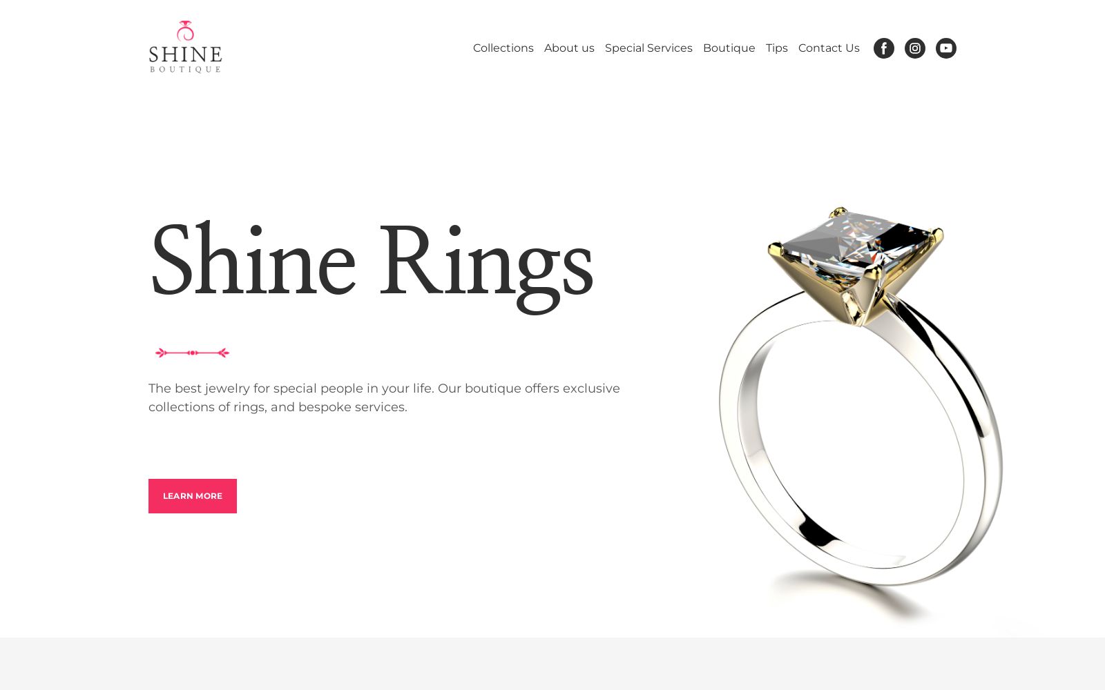
Jewelry Website Template

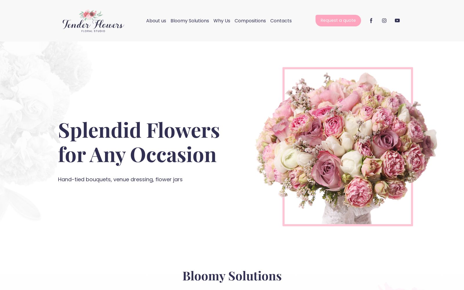
Floral Studio Website Template
The final word – A colored background would definitely give your business a personality. But with white, it becomes easier to modify, include more and mean more. So naturally, white is till date, the preferred theme color.
2 responses to “White: Why to Use in Web Design?”
Leave a Reply
Thank you for subscribing to MotoCMS blog!
This email is already in use.
Something went wrong. We are fixing this. Try a bit later.


[…] White: Why to Use in Web Design? […]
Good article on use of WHITE color in the Website designs…