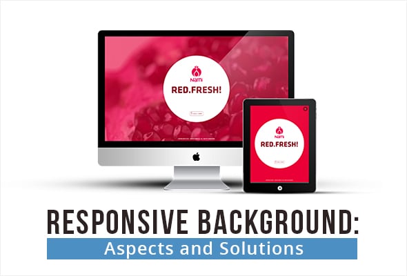
Responsive Background: Aspects and Solutions
Background design is one of the main design elements that has experienced major changes during recent years. Full-screen backgrounds with huge photos or headers with large images have become really trendy. Today it’s one of the main web design elements that identifies visual appeal of your website. Background is a perfect opportunity to attract attention and show your main advantages from the very beginning.
With a roll-out of HTML5 in 2014 it has become easier to add video backgrounds to websites. Thus, backgrounds now become more appealing, impressive and engaging. But what about mobile friendliness? Are there any considerations against the use of large backgrounds on websites? And what solutions we can find to make a truly responsive background on a website?
Today’s approach to website design puts mobile design in the forefront. The main principle of “mobile first” design has found its expression in Google’s policies. Today websites that offer bad mobile UX are mostly lowered in SERP. All these reasons push web developers and designers to search for the best responsive design solutions. Let’s check out how background design complies with the idea of responsiveness and what tricks can be used to offer users the best mobile experience with large backgrounds.
Background Basic Types
Here we can highlight body and content background types. While not the only ones, these are the most common and widely spread ones.
Body background. It’s the main background area that usually encompasses all other website elements. Today body background can be the only background for the website, or at least, for Home Pages. Usually it features photos, images, various patterns or textures as well as animations;
Content background. A “closer” type of a background that cradles the main content – headlines, text, images, navigation menu etc. This type of background is lighter and cleaner. Usually it’s just a colored semi-transparent area underneath elements.
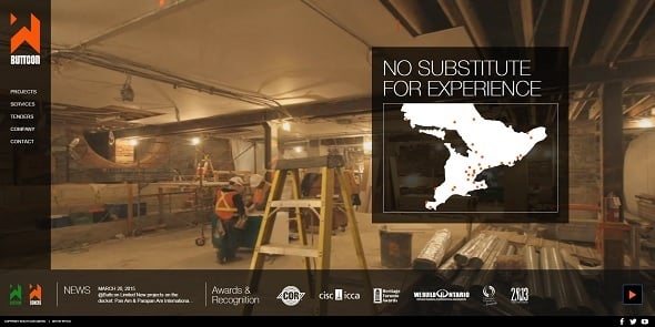
Buttcon
On old-fashioned website designs you can notice that content background is the same for all content of the website. Modern one-page websites with large background images may use separate background blocks for different types of content.
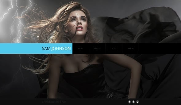
Full-Screen Photo Background Design
The use of photos for the body background is in full bloom today. It is claimed to be one of the main web design trends in 2015. Photo background allows creating a catchy and simple look of the website.
Photo Portfolio Web Template
However, there are several issues with large background photo use for responsive design:
- Most photos are saved in a JPG format. This format doesn’t work well with all screen resolutions and sizes. You can set various DPI for different screen sizes, but the fact is that images that look bright and crisp on desktop monitors may lose their quality on smaller screens due to lower pixel density;
- High-quality photos weigh a lot, it’s a fact. Thus, the main issue for photo backgrounds for all devices is a higher page loading time. Today to get higher rankings on SERP your website should have minimum loading time, not more than a couple of seconds. Good photos may load far longer and it’s frustrating for users.
There can be various solutions for those issues. One of the simplest ways of adjusting a photo to different screen resolutions is a viewport-based selection. It allows sending different sizes of a background photo to different devices based on a viewport – that window that allows users see a website. By setting a maximum viewport for various devices – smartphones, tablets (iPad, Samsung etc.) desktop monitors, you can deliver different sizes of photos to any device.
When you choose a device-pixel-density-based approach, you should include code that allows sending HD versions of pics to devices with large screen sizes.
Other Full-Screen Backgrounds
There are other solutions that allow avoiding such complicated manipulations with background for responsive websites. One of the trends today offers using simple one-colored backgrounds or backgrounds with gradients. This solution is extremely simple but can create really elegant designs that will look perfect on smaller screens. Moreover, this solution doesn’t require complicated manipulations. CSS3 techniques now allow generating super gradients right in coding stylesheet and setting their sizes fluidly.
Kohactive

You can opt for patterns and textures use to achieve lightweight results. There are two ways of getting patterned background for your website:
- Code-generated patterns. CSS3 new labels allows generating clean and simple patterns that greatly lower the page weight. There are plenty of tips and tutorials on the web that explain the process of pattern generation form a simple style sheet. You can also find multiple ready-to-use CSS patterns;
- Pattern generators. If you don’t want to fiddle around with coding or you are not satisfied with ready-made solutions in pattern galleries, you can also use pattern generators that offer tons of awesome solutions for website background patterns. Some of them allow creating a CSS code simultaneously, so you can use it on your website instead of a plain image file.
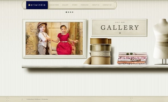
My Periwinkle
Here are a few of my personal favorites in the pattern generator category:
- Tartanmaker. For those who are obsessed with Scotland and tartans;
- Stripemania. A simple generator that allows making striped patterns. Lots and lots of stripes;
- Repper Patterns. Very nice generator that looks like a game -just like a kaleidoscope;
- Seamless from Colourlovers. Very nice pattern generator with multiple shape, size and color options.
Another modern solution for background images appeared not so long time ago. Scalable vector graphics (SVG) came into wide use with the “mobile-first” trend. This image format offers lots of useful options for responsive design. Among the advantages of SVGs are:
- Smaller weight. Unlike IMG and PDF photos scalable vector graphics is extremely lightweight what pays a lot to page loading speed;
- Easier to compress. Other image formats may lose in quality due to heavy compression. SVGs are much lighter and can undergo compression without quality losses;
- Easier to edit. You can do editing with any graphic tool, even in Paint and Notepad;
- Can work as static or animated elements. Thus, they can be used for creating stunning effects on background (e.g. parallax);
- Can be easily scaled, zoomed and transformed. This makes SVGs a great solution for responsive website design.
Jules Truong
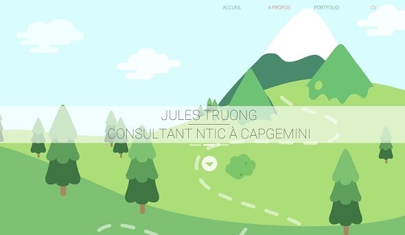
In addition, SVG perfectly fits minimalist style trend and can be used for creating amazing clean and flat designs.
Video in Responsive Background Design
Adding video to create a full-size background is one of the latest trends that allows creating awesome designs. It became possible due to the technology development. With increased loading speed and improved browser technology, video backgrounds started appearing on multiple websites. They help creating a proper ambience on a website, provide benefits of storytelling and engage users.
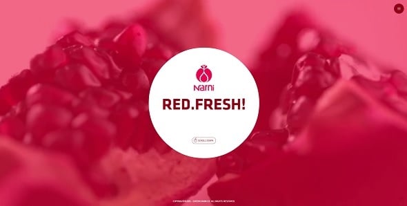
Video background can tell users about the company and show its staff on work. Background videos may serve as a short showcase of the product or offer a new experience for visitors.
Narni
Despite such multiple advantages of video backgrounds there are still considerations about its use in website design:
- It’s not a one-size-fits-all solution. Video background is perfect for official movie websites, for business sites that offer various products and services – thus videos help showing product’s advantages or present services’ benefits to the audience. Adding video background to news and various institution websites, blogs etc. might be not the best idea;
- Videos can be distracting. Too colorful or vivid video backgrounds can distract users from the main content. In addition, many users may consider video background frustrating if they have little control over it;
- Video performance impact. There can be multiple factors that impact your video performance in different browsers and devices. And vice versa, video background can greatly influence other website pages making them load slower.
Significantly, the main complaints about video backgrounds are rarely connected with the visual aspect. The main frustrating thing about videos on websites is a sound autoplay. In most cases users don’t want to hear something they don’t really need and leave a website with loud audio autoplay like a streak. In addition, many users (no matter – desktop or mobile ones) browse Internet with their own music already playing. Thus, unexpected sound will provide a bad user experience as well as inability to control the sound and video autoplay.
My Austria
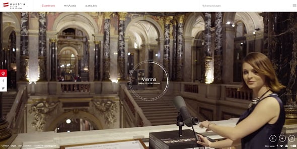
To avoid such frustration you should definitely set default sound properties to “mute”. And always add instantly recognizable controls to allow users decide what to do with that video background. The main principles of adding a full-screen video background that doesn’t hurt UX are the following:
- Choose a helpful and interesting video that is really worth showing your visitors;
- Select contrasting options for text and other design elements that you plan to add to the background. Thus, if you use a darker-toned video, opt for white and other light colors, and vice versa;
- Add a semi-transparent overlay to add content blocks, text and other design elements;
- Always add controls that allow users to pause and play a video as well as turn the sound on and off of their own will. Add a “Skip Video/Intro” button.
The introduction of HTML5 allows playing videos on various devices. The process of adjusting videos with CSS and HTML is similar to that of adjusting images. You can find various tutorials on internet that help you creating full-screen responsive video backgrounds.
Animation, Slideshow and Parallax Backgrounds
Video backgrounds are not the only ways of refreshing a website and adding some life there. Various animations, slideshows and other vivid elements were long time used for presenting content on the Home Page. Animations are often blamed for their frustrating look and bad usability impact, but they are still widely used for various websites.
A Love like Pi
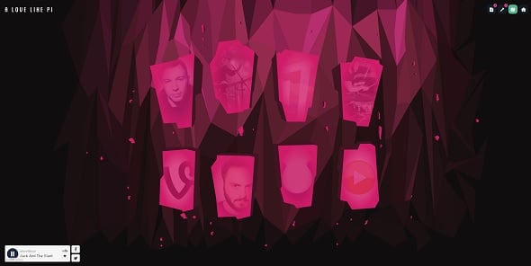
Slideshows became extremely popular in background design. Many websites – mostly online shops and brand stores – use sliders for showing products at their best. A problem of slideshows usability is discussed on various resources around the Web. They are still widely used on eCommerce websites where it’s highly important to show new products or present hot deals. Full-screen background sliders are mostly common for photographers’ portfolio websites, restaurant and cafe ones as well as other business sites.
The main complaint about sliders and their bad impact on usability is that they often look like advertisements. In one of its surveys Nielsen Norman Group claims that people mostly treat carousels like banners and tend to ignore them. It’s true for smaller header sliders. However, such attitude may not prove for background sliders. Due to its size, full-screen background slider barely looks like a banner and may not seem so distracting.
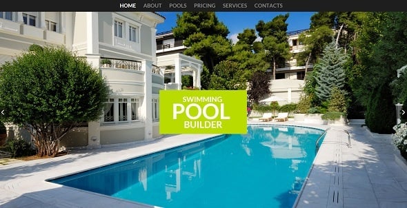
Pool Company Website Template
In addition, sliders are always blamed for lack of control for a user. In this case a solution can be very simple: just offer a user more control over a slider. Always add buttons that allow quickly flip through pages, pause slideshow and play it again. In responsive background slideshow those buttons should be more prominent and easy tappable. You should allow swiping slides for smaller smartphone screens. In any case, small header sliders barely bring many benefits to the UX.
Another discussion in terms of responsive design is connected to the other popular web design trend for 2015 – parallax effect. This element adds more depth to design and helps businesses in showcasing their products from all sides. Parallax is often used for websites that require heavy scrolling. It may be not very comfortable for desktop users, but if we speak about mobile users, scrolling becomes a much more natural technique that clicking through pages.
The main dangers about using parallax for responsive websites are:
- Heavy weight. Parallax effects are no longer made with Flash. But jQuery effects may still be heavy and lower website loading speed. Consider ways that allow increasing loading speed or use SVG that is a lighter solution for parallax;
- Too long scroll. You should always wisely consider the use of scroll and offer the most effective solution for both – website design and UX.
In most cases, animations, parallax and sliders worsen usability of responsive websites. With overall trend for simplicity, modern design should offer simpler solutions and focus more on users’ needs. Thus, the main thought about various effects use: apply them only if they pay for user experience and helps conveying your message.
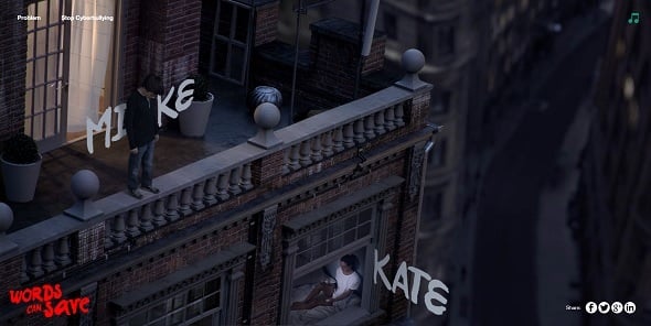
Words Can Save
Conclusion
Background aspects and techniques, mentioned above, and their use in responsive websites are not the only ones. They’re aimed at getting you started with designing beautiful responsive backgrounds that will not just attract users, but offer them the best user experience. If you have some additional considerations about mobile-friendly backgrounds use, feel free to share your thoughts in the comments field below.


Leave a Reply