7 Quality Lead Generation Landing Page Examples To Help Grow Your List
Creating an effective lead generation landing page is crucial for driving signups and growing your email list. However, designing a high-converting page that convinces visitors to hand over their contact information takes digital marketing skills and an understanding of proven best practices. The average landing page conversion rate across all industries is 5.89%, while 10% is the benchmark for a reasonable conversion rate. Reaching that benchmark means stepping back and evaluating how to improve your landing page. Let’s take an in-depth look at seven stellar lead-generating landing page examples from various sites and industries. We’ll break down their compelling elements from savvy value proposition messaging to practical page layout and reduced friction. But first, here are quick highlights of proven factors that make a landing page generate leads effectively.

How To Create a Lead Generation Landing Page: Factors That Make One Effective
There are several key elements that you have to get right to create a high-quality, converting lead generation landing page. They include the following:
1. Different Audience, Different Landing Pages
A quality lead generation landing page is optimized for only one target audience. Talking to a particular audience is key for conversion rates. The landing page can zero in on what motivates that niche to subscribe, using language and messaging tailored to them.
So, if your product or service targets multiple audiences, create a lead generation page for each audience.
2. Offer a Unique, Solid, and Valuable Proposition
Clearly convey the unique value proposition of what you offer subscribers. Whether it’s exclusive content, special discounts, or early product access, explicitly communicate the benefits to motivate signups. Support claims with social proof elements as well.
3. Have a Simple and Clean Design
The layout should make it easy to quickly grasp what you give people for subscribing. Use concise but descriptive headlines, short paragraphs, bullet points for key details, testimonials, and other scannable content formats. It’s also good to use visuals like graphics and images to help communicate your message without having too much text.
4. Only Ask for What’s Necessary
Minimize the required info to sign up. Only ask for essential contact details, not lengthy forms that slow momentum. Offer options like one-click social login alongside email signup.
5. Optimize for Mobile Browsing
With over 95% of internet users accessing the web on mobile devices, optimizing lead generation landing pages for mobile is mandatory. Failing to create a responsive, mobile-friendly converting page severely limits the ability to capture leads.
6. Have Only One, Clear CTA
An effective lead generation landing page features a prominent call to action button for signing up or getting an offer. Having multiple competing CTAs confuses what action you want visitors to take.
7 High-Converting Lead Generation Landing Page Examples
A great way to get the ball rolling on your landing page design is to look at examples that could give you ideas on what route you want to take. We have listed a few of our favorites below that cover a range of industries.
Example 1: Travel Like a Bawse

Travel Like a Bawse immediately grabs your attention by offering a free masterclass on traveling for $100 or less. Now, that will make budget-focused wanderlusters prick up their ears! By zeroing in on affordable travel, this hook speaks directly to niche travelers eager to globetrot on the cheap. And this landing page doesn’t just tell—it shows.
The beaming photo of a daring woman soaking up the ambiance of an exotic locale illustrates the confidence you’ll exude when you learn Travel Like a Bawse’s savvy tips and hacks. You’ll think, “I want to travel solo in style, too.” Seals of approval from leading publishers like Forbes and USA Today also lend credibility here.
So, while you may never have heard of this brand, major industry names backing them build trust. Even local outfits can adopt this social proof strategy effectively.
Example 2: Condair
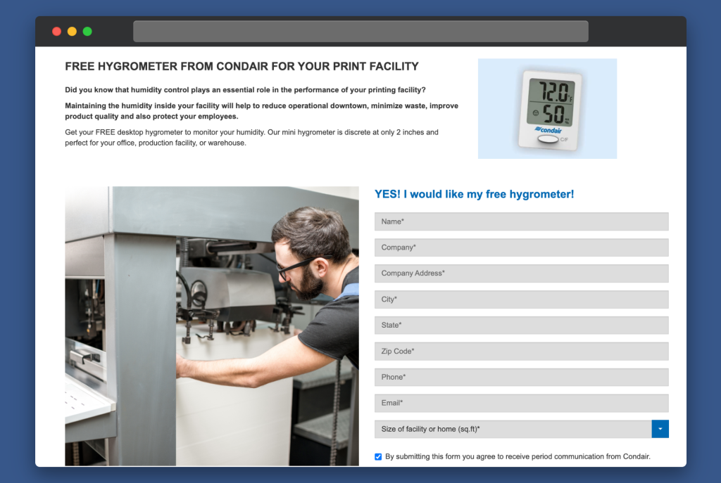
Rather than slap their logo on generic swag, Condair tailors freebies to customer pain points. Visitors likely already weighed the issue and solutions. It’s strategic for Condair to exchange their info to start a relationship and gather data that might’ve walked out the door. Condair smartly qualifies leads with extra fields instead of distracting pixels. Their prospects could care less about slick photography. They want details to assess solutions!
Condair keeps the form focused but not exhausting, asking just enough to nurture the lead while respecting visitors’ time and exchanging value.
The benefits cascade. Condair scores a primed contact channel and kindles a reciprocal rapport by giving first and sending prospects with relevant tools before they convert. Now that’s smooth humidity.
Example 3: Notes in Spanish
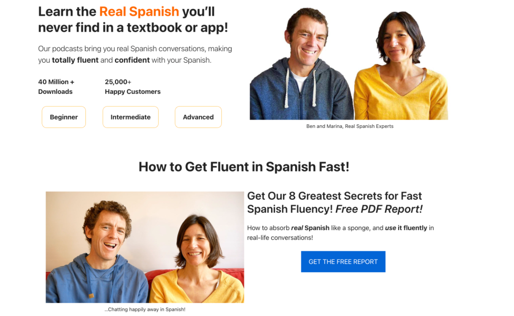
Notes in Spanish lure language learners in by filling gaping holes no textbook can. Getting the real-deal Spanish you can’t grab anywhere else? Now, that’s an offer that genuinely speaks to students. In exchange for just an email, they serve up a free insider report brimming with authentic lingo off the beaten path. But the true gem—regular exclusive content updates that help cement Spanish gratis in students’ minds—comes after.
For educators, put your prized material where your mouth is. Hand prospects juicy freebies like free reports, first chapters, videos, etc. Let them taste-test your knowledge before buying the whole feast. Sure, this page is a bit text-heavy for visual learners. But for word-hungry students, substantive content trumps all. And without flashy frills, this page loads as fast as a native speaker spits Spanish. Minimalism keeps the focus on what matters most: real-world language mastery.
Example 4: UENI
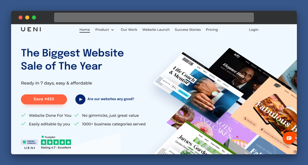
A website is one of the most essential business tools you can have, which is what UENI promises to give its clients. And UENI’s minimalist teaser page is a masterclass in strategic ambiguity that drives desire and action. With a sleek design and sparse yet evocative copy, they communicate volumes about the quality of exclusive offers for the right audience. This is onboarding excitement 101. The muted palette brands UENI’s high-end aesthetic, while abundant negative space implies the big reveal ahead.
Crisp value props tantalize with what makes this exclusive, highly-anticipated, and specially crafted for entrepreneurs poised for growth. UENI qualifies curiosity into high-intent leads with surgical precision. With prospect benefits, credentials, and just enough detail suggested, UENI builds yearning rather than hard-selling.
UENI shows less is more by trading overwrought graphics or distracting details for singular elements fine-tuned to drive action. Marketers should note how UENI guides visitors by completely catering copy and visuals around anticipating the offer. They also make visitors feel supported by incorporating a live chat.
Example 5: Asana
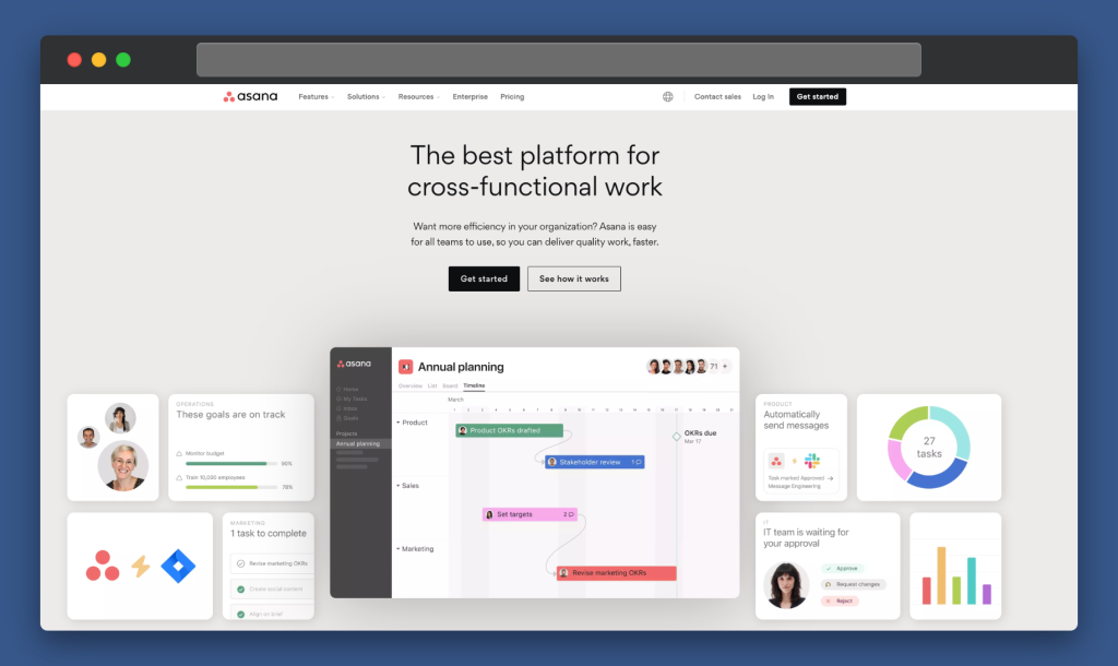
Asana is a project management tool that makes organization, team management, and employee recognition easy. Asana exemplifies an aligned PPC and landing page strategy that woos competitors’ customers with laser focus. Every element furthers the core value prop. They transcend bare project boards while directly targeting likely defectors from a key player. This consistency fosters trust and desire.
Succinct but powerful messaging spotlights differentiation while sprinkling in social proof from impressive customer names like Airbnb. Even modest brands can build credibility simply by showing logos or quotes from users. Anything that boosts confidence in Asana’s abilities. The minimalist design ensures the value shines through. Asana maximizes information density without compromising scannability, using chunky paragraphs, tight headlines, and ample white space between concepts. This drives comprehension while allowing visitors to self-navigate areas of interest easily.
Calls to action persistently occupy high-visibility locations, enabling seamless lead capture at every step. Asana reduces friction by keeping key actions viewable as visitors explore and compare against current tools. This demonstrates that resolving pain points takes just moments and positions Asana as the simplest solution.
With PPC, design, and copy working in tight tandem to court competitors’ clientele, Asana leaves no doubt they outclass basic boards. The clarity and relevance speak for themselves: an expertly refined funnel anticipating and addressing target pains for easy conversion.
Example 6: Payer Personal Injury Lawyers
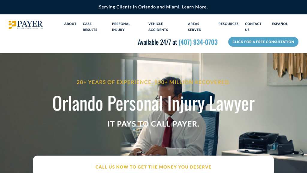
Payer Personal Injury Lawyers is able to show potential clients why they should invest in their services in one simple, eye-catching sentence: 28+ years of experience and over $100 million recovered for clients. Their website is easy on the eyes and has multiple ways to get in touch with them if interested. They clearly mention the areas they serve and the ways they can help. The fact that their entire website can be viewed in Spanish also allows them to tap into a Spanish-speaking client base.
Another great idea is to include a snapshot of ratings from happy customers as Kenny Habetz Injury Law’s website does in the bottom lefthand side corner.

Example 7: Zehl & Associates

Zehl & Associates has a website that is an excellent example of lead generation with a high-cost service. Instead of pushing an opt-in for a newsletter, their homepage includes multiple ways to contact them immediately. This is important because the type of service they offer would require clients to speak to them directly and as soon as possible. By providing live chat and a 24/7 number for a free consultation, they make sure potential clients reach out to them immediately (instead of going to another competitor).
If a client does not have the time to call, they even have a form that can be filled out so someone can reach out to them later. Where Zehl excels is offering multiple easy ways to get in contact with them.
Closing Thoughts
No matter what industry you are a part of, looking at what your competitors are doing is an excellent way to begin. You could glance at what is converting and find different color palettes you might want. Once you have a general idea of what you would like your landing page to look like, you could reach out to your web developer and begin the design process. Apply the strategies above, test and refine them to find what motivates your audience, and grow your quality subscriber base exponentially.
FAQs About Lead Generation Landing Pages
What Are Lead-Generation Landing Pages?
A lead generation landing page (also called a “lead gen” landing page) is just like any other landing page, except its most significant goal is to capture visitors’ information. This is usually done through embedded forms where visitors have to enter their contact information in exchange for something, like a freebie or subscription to a newsletter. Once a visitor has done so, they become a qualified lead you can nurture.
How Do I Create a Lead Capture Landing Page?
You’ll need a website or landing page builder–such as WordPress, Wix, or Squarespace—and an email marketing platform to create your opt-in forms. Some of the most popular choices are Mailchimp and ConvertKit.
What Is the Difference Between a Lead Page and a Landing Page?
Lead pages and landing pages are similar but not the same. A landing page is an individual page—sometimes with its own domain—while a lead page is simply a page designed to capture visitors’ information to qualify them as a lead. A lead page can be a landing page, but it can also be a page on your existing website with an opt-in form.


Leave a Reply