The Role of Using Multiple Typefaces in Website Design
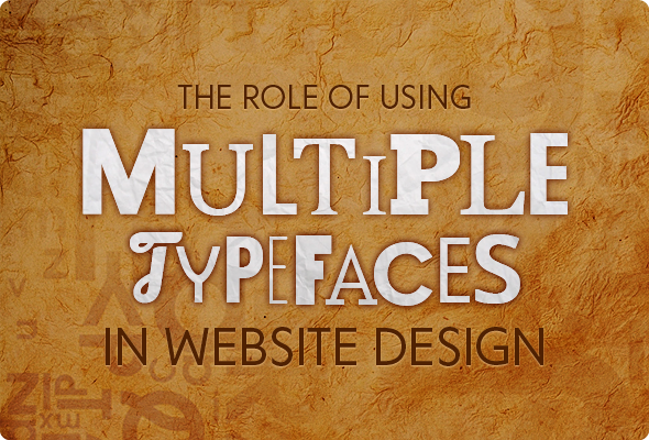
Fonts have seen a consistent number of creatively brilliant minds at work since long ago. The result has been an evolution of entire font families. Typefaces have become an immensely important part of every design piece. Nothing goes explained completely by image depiction alone. Words are an absolute necessity for things to have a clear meaning and make sense. But more important is how exactly those words are being shown on the screen. There are ways to give the text a back stage appearance… There are tons of ways to add weight just to the written stuff. The best practice is to wisely mesh the image and type depictions.
Here are a few things that you may want to know about typefaces and their profound significance in the design world.
The Evolution of the Modern Type World
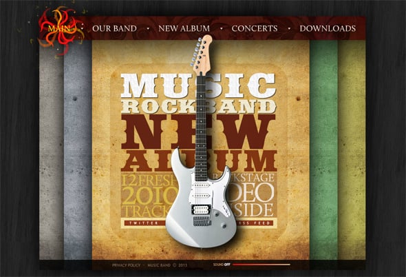
The last decade has almost been a renaissance to the type arena. With every passing day of growing importance being given towards retina-friendly designs, types are being invented, discovered, created and recreated at an astounding pace. Today, almost every platform, that supports website building, a blog or just about any other kind of online communication medium, does have a specialized panel of types and fonts. Most of the time, they are unique.
The web overall is studded today with hundreds of typefaces, all being inspired from the age-old Helvetica and Gothic! There are ornamental varieties that suit almost all kinds of businesses and brand personalities. The modern type world is growing huge and there can literally be a font somewhere in some corner that exclusively depicts a particular emotion. Have we forgotten the peculiar spine crackling feel of the ‘Chiller’ horror font?
The Concept of Multiple Typefaces
The tradition of using more than one font on one displayable area has actually been quite old. It can be dated back to the veteran eras, when press had reached its adolescence. The implication and utilization of multiple types have however changed significantly in recent times. While earlier it was just a scattered show of classic and ornamental type varieties, the present years are seeing a more assorted usage. It is more fashionable, more appropriate and yes, way more brand oriented. A brainless circus just to draw attention has become really rare.
The Logic Behind
Using multiple types on one page is a great way of drawing attention without deliberately grasping the visitor, given the exuberance of sultry colors and distinctive layouts. Here are a few reasons why multi-type usage has become so popular lately.
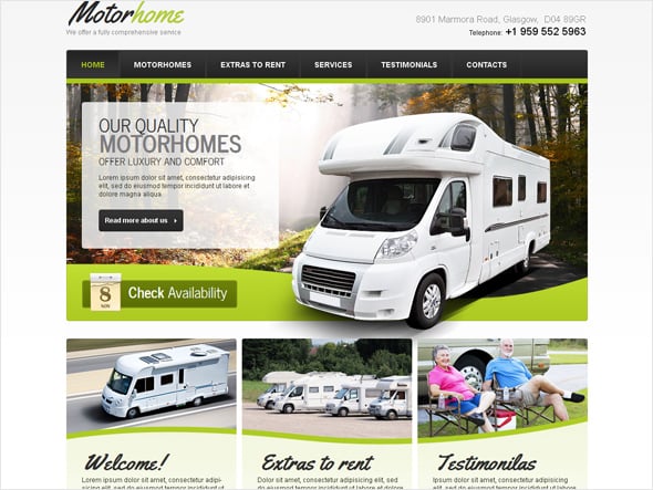
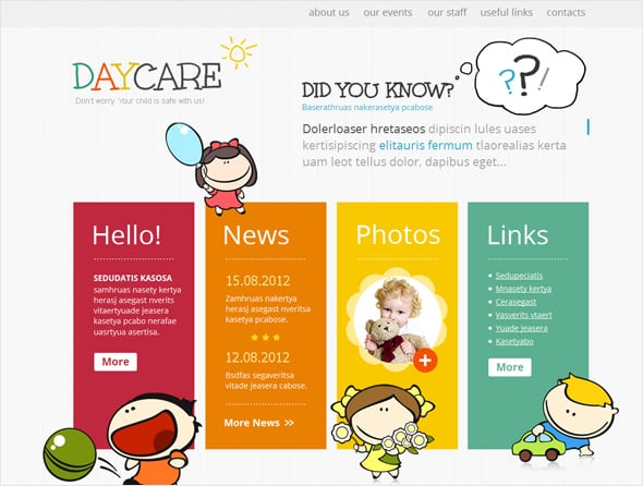
- Fonts indicate the feeling that is conveyed in a sentence. There are serious fonts and there are funny fonts. There are formal ones and there are casual ones. Using a separate font for a separate text entity enables you to direct your visitors towards what exactly you want them to read and understand.
- When there is a lot of text, and you have no other option but to include all of them, using a separate typeface acts as a break between paragraphs. Images can play the role, but to a certain level images break the connection of two lines to a larger extent than fonts do. Inserting a different font helps visitors keep the connection intact without feeling monotony.
- Different fonts at different positions on the page draw attention to that position. If you have a great thing to show and do not know how, scribble something in a catchy font there and you would get your audience hover there.
- In certain cases designers choose to create designs that are dependent just on the use of multiple typefaces for being attractive. For example, if you are an educational institution how are you supposed to pose your website in a different manner? With images signifying teachers, students and knowledge thronging the internet, let us not forget that all of them (almost) would already have been utilized by this or the other industrial counterpart. Using those images with cluttered text would make you just another educational institute! The crux is to use fonts of the personality you want your university to demonstrate. For an art based organization use ornamental types. For a regular thing use classic type along with formals. To depict fun with knowledge use the right kinds. This is an extraordinary way to look different even when you are ordinary.
Importance of Multiple Types in Simple Designs
Simple designs (or more appropriately speaking the minimalist designs) do not have a hefty inclination towards colors and images. They are simple and clean. But being simple and clean definitely does not mean being uncommunicative! Fonts play an important role here. There is not much text, but whatever text is there enveloped inside fathoms of white spaces is in wonderful types.
Since minimal designs have a lot of white space, fonts have a good chance to enhance the beauty of such templates. Any additional information can be written in an attractive type as a partial filler to the white areas. Over cluttering is a strict No-No, but a sparse usage not only lets you convey those additional tit-bits – it also adds a beautifying factor to the template.
The Verdict
Typefaces have stayed in careful limelight since years. The trend has increased recently when new creations are popping up in web designs. The right kind of fonts belonging to the right type families all jumbled up in one page, the increase the chances that people would come and stick to your website. It is definitely one of the most interesting design subjects that would catch more attention in the coming years.
It is not just the type that you use, it is also about the indent and alignment of the words for which you are using those types. Some fonts look terrific when used horizontally while others look beautiful when placed vertically. Yet others look good when written crazily and disproportionally. Choosing how to place the types is as important as choosing the types themselves, when you are doing things in minimalist designs.





[…] The Role of Using Multiple Typefaces in Web Design […]
[…] just to the written stuff. The best practice is to wisely mesh the image and type depictions. Continue Reading Advertisements Related PostsWebydo, Revolutionizing The Professional Web Design […]