Lightbox Design: Win or Fail for the UX?
Content organization on a screen is a vital part of a website usability. When content is presented in a user-friendly manner, it improves website rankings and attracts visitors. There are tons of researches on various design elements – are they good for the UX and what tricks can be applied to improve their accessibility for users.

Modal windows is a traditional form for presenting large content items, like images, contact and signup forms, and even search windows, on the same page without taking a user to a new page or tab. Such windows usually require a user’s interaction before a normal browsing can be resumed. Pop-ups that report your download has started or various dialog boxes that ask users “Are you sure you want to leave this page?” are еру examples of the most common kinds of modal windows.
One of the most obvious and the most popular modal windows type is lightbox. This type is used mostly to showcase images or videos in a larger size in the same tab. Today there is no shared vision on lightbox design benefits or harms for the UX. Some claim these elements are as much frustrating as pop-ups and other objects of website design that can distract users from content. However, we may notice lightboxes are still used to display content even on the most popular websites like Twitter and Facebook.
When Lightbox Design is UX-Friendly
The idea of lightbox is in summoning a window with an image or video allowing users to see a larger size of the object in the same tab. It’s good for a user as it doesn’t require him to perform too many actions. It’s also good for a designer who needs to display a large amount of content on one page. Let’s check out the reasons that prove usability benefits of lightbox.
Presenting Large Content
Lightbox is a real saving tool for situations when you need to present a larger piece of content. Most elements (contact or sign-up forms, videos, tables etc.) are usually limited by fixed width of a layout. When you need to display this content larger, you don’t necessarily need to take visitors to another page. Simply use a lightbox for enlarged content.
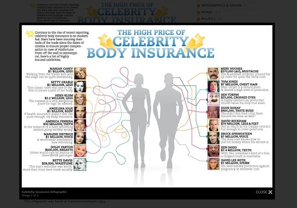
Infographics Blog
Lightboxes can be perfect for photographers’ websites for presenting full albums on one page in a form of smaller thumbnails. Users can choose which photos they wish to see closer without having to leave a page with the album.
Displaying Smaller Content
Sometimes it doesn’t make sense to send a user to a new page. It’s especially true for small amounts of content. If you wish to show only a couple of text sentences, a few form fields or some smaller visuals, it’s more logical to show it on the same page. Lightbox organizes smaller amounts of content in much more pleasing manner than the entire page.
Design Made in Germany
Registrations or contact forms usually have multiple fields to fill out. Making less fields or making those fields smaller is not an option since it impacts UX badly (I personally hate when I have to fill tiny registration fields in a sidebar with microscopic text). Lightbox instead can be displayed at a full screen with large text fields and it definitely helps to improve website usability.
Avoiding Additional Content Clutter
In the light of today’s tendency to lighter and cleaner designs like Minimalist style, adding a lightbox for hiding some less important content might be a good solution. Of course, you can use a separate page for a contact form, or putting a register form in a sidebar. But does it become better for UX? It seems much wiser to leave an icon that will unambiguously tell users about its content that will be displayed in a lightbox.
Restaurant Website Template with Lightbox Gallery

Adding More Focus to Content
Lightbox displays content in a more friendly manner that a separate page. It dims a background and thus makes the content much brighter. When you put an image or a photo into a lightbox, you wish to get all user’s attention to that item. By blurring the rest of the screen except for a lightbox, you are putting that content in a user’s focus area.
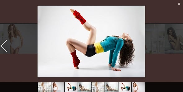
Photo Portfolio Template with Gallery
This characteristic of a lightbox has been recently used in a Twitter post. After the buzz raised with a blue-and-black dress (or was it white-and-gold dress in anyone’s case?) another changing-color photo appeared on @sayingforgirls account. Lips and nails on the photo changed their color from pale pink in a newsfeed to the deep burgundy in a lightbox. The creator of that photo used a Photoshop and a Twitter lightbox feature.
Sayingsforgirls Twitter
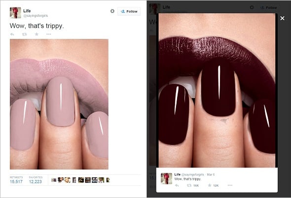
The photo was pixelated and made semi-transparent. Since a lightbox displays photos on a darker background than the main page, lips and nails on it absorbed the background dark tone and seemed dark. Thus, the account owners attracted attention to the content and, of course, made the account famous.
When Lightbox Is UX’ Foe
Not all web designers agree that lightbox is a user-friendly element. They provide enough reasons to reassure you from using lightbox on a website in the following cases.
When It Looks Like a Pop-Up
Pop-ups appear on page regardless user’s wish. It’s annoying. Especially when a user already performs some other action (scrolls for more content or types a request in a search field). The best solution here is to make a lightbox summoned intentionally by user. It saves people from frustration of seeing what they don’t want to see but require them to perform additional actions.
When You Care About Mobile-Friendliness
Mobile devices are common means of browsing the Internet today. Responsiveness is one of the main challenges for any web developer. However, mobile devices have one issue – smaller screens. If a lightbox isn’t properly adjusted it may break mobile experience.
The Do Lectures

When Linking to the Page Is Essential
Since a lightbox doesn’t provide users with it’s own URL, a user won’t be able to find that content again. Instead he or she will have to go to the page where this content was first encountered and repeat the entire search again. Lightbox’ content can’t be saved in the browser history or bookmarked.
Back-Button Issues
In many cases, using a browser back button may be confusing when a lightbox appears. If a background is extremely dimmed, users may consider they navigated away from the previous page and often may just close a tab with a lightbox. In such cases it’s better to reduce opacity for a background or to choose a lighter tone for it.
The main advice about lightbox is the reason for its use. When the content on a page can be displayed in any other manner, there’s no need to use a lightbox.


Odd that you talk about how annoying pop up windows are, yet you have one on your own page trying to get me to sign up for an email list. And you’re right. It’s annoying.
You beat me to it.
“The best solution here is to make a lightbox summoned intentionally by user” – from the article *sigh*