Responsive Navigation in 2015: 5 Latest Trends to Follow
Since a growing number of people are switching between multiple devices, it has become imperative if not necessary for website owners to have a website that can operate seamlessly and effortlessly on all possible devices and platforms. This is what has led to the birth of responsive design. The idea is pretty simple – making a website render differently in different browsers and devices and thereby offering optimal browsing experience to the users. Navigation is probably the most complex element within responsive website design. Meanwhile, you should not forget about mobile typography rules and the necessity to compress images – these are critical requirements to responsive website design, too..

Creating a navigation system that works really well on both desktop and mobile devices is a hard nut to crack. There are so many things to consider when it comes to building a responsive navigation. Different sizes of screen, different platforms and different browsers are some of the issues that a designer has to deal with when he is trying to build a navigation system for a responsive website.
However, this has not stopped creative people from coming up with different types of responsive navigation. Here in this article, we are going to discuss some trends that are making strong impact on responsive navigation 2015.
Hidden Toggle
This responsive navigation type is a bit controversial. This menu has different names like sliding drawer menu, hamburger menu, 3-bar menu, etc. This navigation style first came into prominence when some mobile iOS apps started using it. This navigation helps designers declutter the interface of a mobile web page, as mobile devices have rather small screens. Later this trend is embraced by a large number of web designers and this navigation type is now being used in responsive layouts.
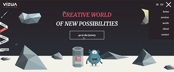
Vizua website is using a hidden Toggle menu and the link of that menu is located at the top left corner of the layout. The menu remains invisible unless it is clicked.
When Toggle navigation becomes visible on a website, it pushes the page content to the left/ right depending on the menu location. This is done to help the links gain more prominence. However, if you are using JavaScript to create the Toggle menu, you could face some important issues. If people start browsing your website in the web browsers that don’t offer any support to JavaScript, navigation of your website will become dysfunctional. Think about this twice before you make the final call.
There are some other disadvantages of using Toggle menu and the chief among them is – confusion. Believe it or not, the majority of users on the web are not tech savvy and therefore, it is more likely they might have no idea how a Toggle menu works. So, most of them might fail to figure out that they need to click on the Toggle icon to be able to get access to the extended menu.
The biggest advantage of Toggle menu is that it clears up the screen and thereby helps to create room for other crucial elements.
On-screen Toggle
There is not much difference between On-Screen Toggle menu and Hidden Toggle menu in terms of functionality. Both does the same thing – helps to free up space. The vertical menu can be converted into an On-screen Toggle menu easily and this will help to save space that will be particularly helpful for devices with a small screen. Since people can easily understand its function, it is not as confusing as Hidden Toggle Menu. Probably this is the reason why a growing number of web designers are using On-screen Toggle Menu.
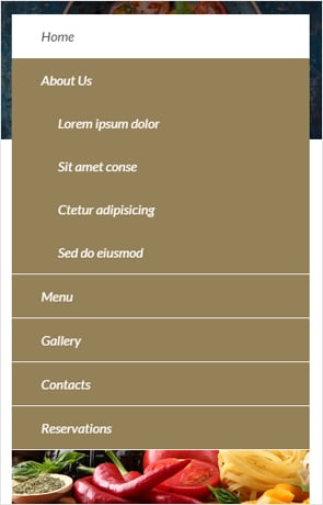
This Restaurant website template uses this navigation type. It matches with its theme and it makes navigating the website fun. The submenu is also accessible via the On-screen Toggle menu. In general, this is a great navigation type for mobile users.
You can tinker with the details as well. For example, if you wish, you can fix the menu on the top. This will make the navigation menu accessible to users even when they are scrolling down.
Horizontal navigation works really well on desktop and other large screen devices but when it comes down to mobile devices, its efficacy comes to a screeching halt. By changing the menu alignment, you can fix this problem easily. Try vertical navigation for mobile devices and this will offer easy and hassle-free access to all sections of the website.
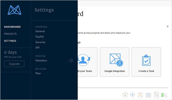
The dashboard of Mavenlink makes use of this technique and it really worka well for the website. Vertical navigation menu looks nice on a smaller mobile screen. Moreover, users find it convenient to tap on those menu links with their fingers.
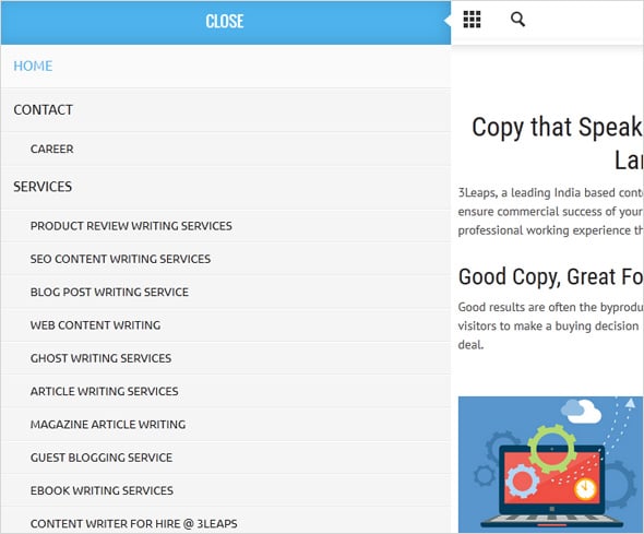
3Leaps uses Vertical Menu and when the Toggle icon is clicked, it pushes the content to the left to make room for all the navigational links.
Vertical Menu offers clean grid navigation and probably this is the reason why it has gained so much popularity these days.
Select Menus
For some know or unknown reason most designers avoid this navigation type especially when they are designing a responsive layout. This menu is supposed to work seamlessly on all possible browsers and devices because it is made of nothing more than just the common form element. However, we should not forget the fact that Select Menu throws gauntlet of challenges when it comes to customization. It is incredibly tough to customize and make this navigation work seamlessly on different platforms.
However, the good thing about Select Menu is that most users are accustomed with it and therefore, there is no room for confusion. So, navigating the website will not be an issue even for novice users.
Realigning and Resizing
This is probably the easiest navigation type and it is an epitome of minimalism. The purpose of this website menu type is to create a navigation that automatically restructures in accordance to a screen size. The font size of the links is scaled down to offer an optimal browsing experience on mobile devices.
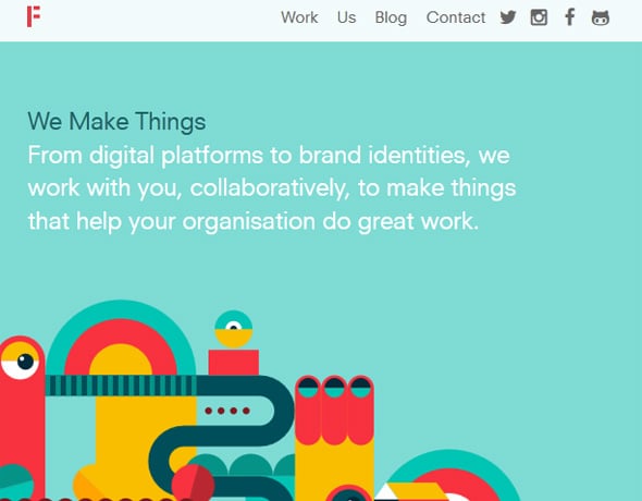
Madebyfieldwork website uses this simple technique to help users navigate its website easily. When browse on desktop, the navigation looks normal but when browse on mobile devices, the navigation links change their position to fit the given space.
The only disadvantage of using this navigation type is that if it has too many links, it might end up taking up much space on a small screen – you need to be aware of that.
<p.So, these are some trends that are dominating in responsive navigation design field lately.


Leave a Reply