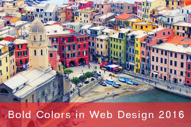
How to Cope with Colors in Web Design 2016: Fearless Trend
One of the latest trends declared to rule the web in 2016 is bold colors and their sassy combinations in website design. Just take a quick look at the Awwwards.com list of nominations and winners: many of them boast unusual color schemes that few of them would dare to try some time ago.
Roots of the Bold Colors Trend 2016
The popularity of bright colors and their wide use in website design can be explained in a few ways.
Minimalism. It may sound paradoxical, but minimalist style with its simple forms and clean layouts might have forced many web designers to use other means of conveying their ideas to audience.
The use of contrast colors in minimalist designs can be helpful for attracting user’s attention to vital elements. When the overall design tends to simplicity, you can try to be more creative.
Flat design. Another long-term trend that seems not to fade away anytime soon.This style also appeals to simple forms and “flat” shapes. In this case, color may tell one element from another, put important info in front of user’s eyes and attract their attention to elements that need reaction.
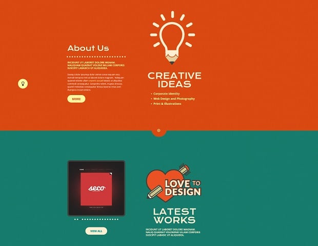
Card design. This invention of Microsoft still gains many backers and is widely used in website designs. Card design puts bold colors and their fearless combinations at the heart of the entire design concept.
[Tweet “Card design puts bold colors and their fearless combinations into center of a website concept.”]
Brands to Life
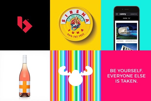
First in Windows 8 – then in other websites, card design gained it popularity due to simplicity of the idea – using colorful blocks for each element. That makes each block stand out, it makes it easy to recognize and easy to click on smaller screens.
Material design. The latest trend in website and application design set by Google. It sets new approach to web design by giving the key concepts for creating applications in its guidelines. And one of the concepts includes the use of bright colors for design elements. Colors should accent elements and their combinations should be unexpected to bring life to the design.
Another reason that might have forced designers using bright colors in their designs is the evolution of technology and the wide implementation of hi-res screens. With the introduction of Retina and other high definition displays web designers are not bound with only 216 web safe colors.
Where to Use Unexpected Colors in Web Design 2016
Bright and unexpected color combinations were mostly a prerogative of web design studio websites for many years. In recent times more and more websites of other business and commerce nishes try to use bold colors in their designs. Let’s check out where we can spot bright colors the most:
- Fashion and interior design. These websites stand pretty close to the web design field. Many designers even follow color trends in fashion to learn what colors will be trendy in website creation.
- Clothes stores. Many clothes stores today tend to use card design to better show their collections and selected items. This brings them to the use of if not too bright then at least unusual color combinations in their designs.
- Food and restaurant websites. Most of these websites rely on vibrant imagery that shows their products and offers. Today we see many websites that use bright colors that can act like emotional triggers and evoke appetite.
- Landing pages. Web designers often neglected such web pages making them look carbon-copy style. Modern landing pages implement various design approaches and can even look like mini websites. Bright colors are used here to guide a visitor through the entire design and persuade him/her to take a required action.
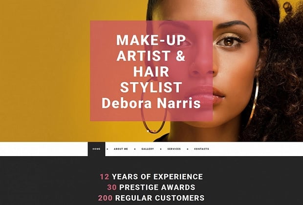
Make-Up Artist’s Web Template
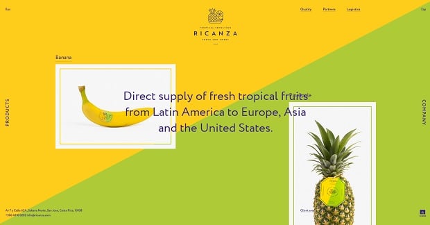
Ricanza
Landing Page Template
How to Use Bold Colors in Website Design
There’s no secret in that colors evoke emotions. Emotional design is the future of the web and the use of colors in it is a real art. It may ruin the entire website idea or it can tell a breathtaking story and bring you more visitors and traffic. The point is establishing balance between creativity and usability. Wise use of bright color scheme today allows brands standing closer to their customers without losing their relevance and brand identity.
Well, it’s high time to learn how to pair colors in website design, what elements can you use to highlight contrasts, what are the best and the trendiest means of color use in your layout.
The Charms of Monochrome Design
Monochromatic color scheme perfectly fits minimalist design concept. And it allows you using not only traditional black-and-white palette. With monochrome design you get vibrant, juicy website without too many color distractions. Since you avoid high contrast here, you can choose bolder color as a base and play either with tones or shapes of the elements.
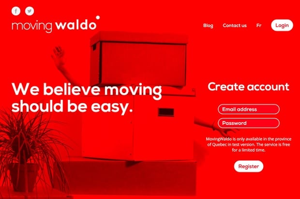
Moving Waldo
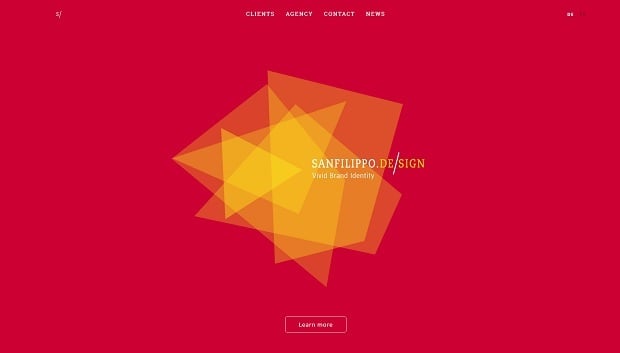
Sanfilippo
Monochrome designs, no matter how bright and crisp they are, save designers (especially novice designers) from creating tasteless noisy websites. You can fearlessly use lime-green or bright-purple for the background and make other elements (like typography, buttons, menus etc.) in white. Thus, you get a modern, attractive and yet sophisticated design.
[Tweet “Monochrome designs, even bright and crisp, save designers from creating tasteless noisy websites.”]
Putting bright monochrome overlay over the background or images can also be a great way of implementing this huge trend to your website.
Free Your Mind for Color Blocking
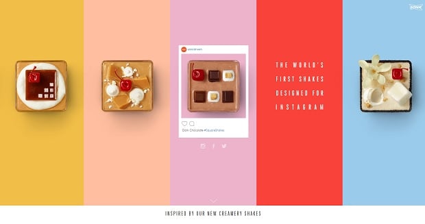
This approach is excellent to use in card design. The idea behind this kind of design is using contrast colors for different “cards” that actually are grid elements. As I mentioned earlier, card design emerged from Windows 8 layout that used colorful rectangles for interface. Modern designers experiment with blocks’ shape, size and color to find the unique look for their websites.
This design type is perfect for using color blocking technique and try to set up incompatible colors next to each other. But only if you’re good enough with color theory and are bold enough to create such combinations that won’t look like sh*t.
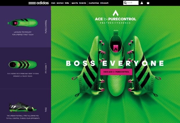
Adidas
Sonic Square Shakes
Another cool idea for combining bright and unusual colors is using one of them for hovering. This happens when you hover your mouse over a card and it changes its color to another, showing that this elements is clickable. Colorful card design and hovering technique make a wonderful duo, combining a cool design with smooth user experience.
[Tweet “Card design and hovering technique make a wonderful duo, combining a cool design with smooth UX.”]
Play with Textures and Contrasts
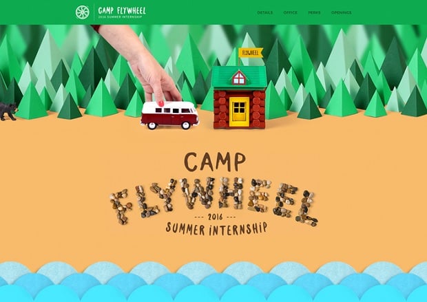
Bright colors can be used as accents that stand out from the background and attract users’ attention. If you fell not brave enough to add vibrance to the entire website, you can add some bright spots across the neutral background. You can use a dark monochrome background with bright header. Or add bright accents bit by bit across the entire website for logo, buttons and images.
Fly Wheel Camp
Web Template for Painting Studio
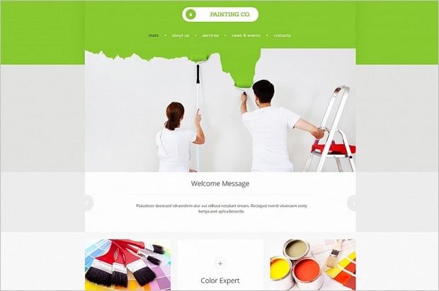
Adding texture to bright color can also help you cope with stress while following bold color trend. Texture helps adjusting color to the website style and making it more accented or vice versa – soften it a bit.
Consider Website Design Elements
To make sure your bold colors will definitely stand out and add to website design and not least to its UX, you can try some surefire ways of coloring your website elements. Let’s check out where on your website you can use bold colors and their combinations.
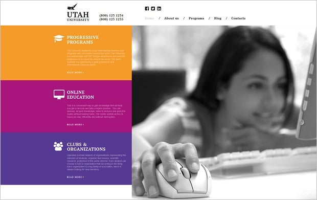
- Navigation menu. On of the best elements where you can use bright colors without any concerns. You can color every menu block different color, or accent it with just a narrow line like many newspaper websites do. It’s a great way of telling one category from another on your website and helping users easily navigate across it.
Website Template for Education Field
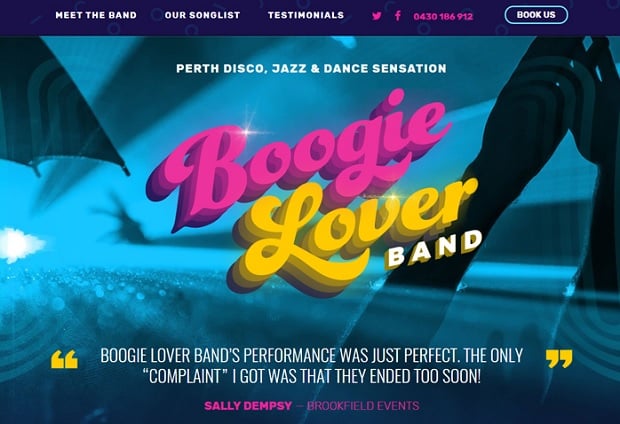
- Typography and Fonts. Bold colors this year are perfectly combine with another web design trend for 2016 – distinct typography. Huge lettering can attract attention to the most important info on your website. And colors are here to help. There are two great ways of using bold color with huge lettering. You can implement bright tone to the background while using snow-white font across it. And otherwise: put vibrant typeface over a dull or clean background. Accenting only separate words from the text with bold colors is also a great idea.
Boogie Lover
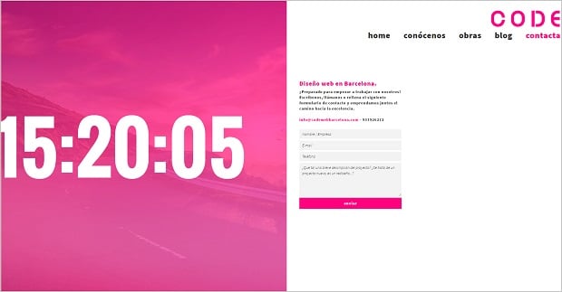
- Forms and UI Elements. You can perfectly highlight vital elements of the interface to make sure your users won’t miss anything. Try coloring contact form fields or checkboxes in contrast tones. Make sure your notifications and links will be definitely spotted by using bright color to them.
CodeWeb
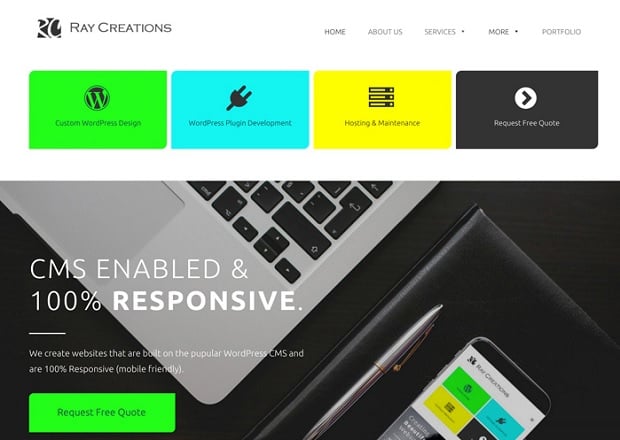
- Buttons. Buttons are those of the most important elements for any website that should be visible under any circumstances. They usually contain call-to-action text that help website owners increase traffic, get customers, sell products and perform tons of other vital roles. Bright-colored buttons look perfect in clean design, in combination with large typography or flat interface. The main point here is choosing a color that will surefire stand out from the background.
Ray Creations
The main point in combining bold colors in web design – is having deep color theory knowledge, refined taste and guts to create a vibrant and sophisticated design.
*** *** ***
Editor’s Note: This is the first post from a series of Web Design Trends 2016 followups where we try to define the latest tendencies in detail. Stay tuned and feel free to share in comments your thoughts about other web design aspects you would like to read on our blog.


Leave a Reply