

In our practice, there are many cases when users add text to the header and forget about the body of the page or don’t work with header and footer at all. Moreover, 90% of visitors don’t even know what H1 is and what’s the difference between H1 and H5, for instance. So, do you want to know what the website structure is, and how to stop making common mistakes? If you’re going to start an online business or you already have a site but still aren’t sure what some website parts are responsible for, the information considered in this article will be helpful for you. Therefore, after reading it, you’ll be good at the typical website vocabulary that will help you launch your site faster and accurately.
Detailed Website Parts Overview
An effective top half of a homepage is what matters. Let’s start with the header and follow the proper sequence of website parts not to lose any details.
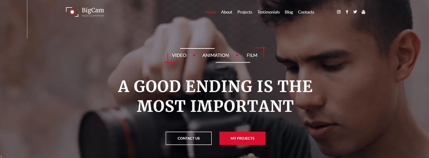

Header and First Impression
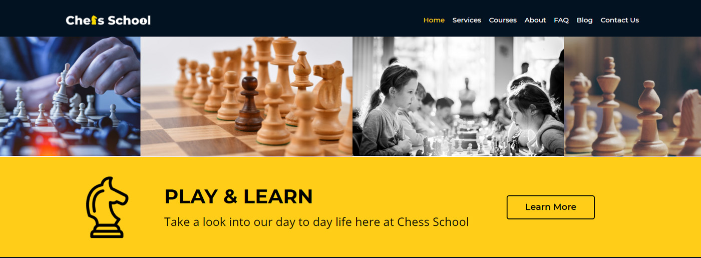
The header is the top section of the web page. It may include logo design, CTA, contact information, social media icons, language option, search, shopping cart, etc. The main thing to consider is choosing the elements that will work for you, so it’s not a good decision to place all of them in the header. Moreover, this section works as an invitation to a website that shouldn’t push away visitors. To attract them, try to:
- use relevant fonts
- make your headers transparent to emphasize impressive images and save essential links
- ensure the necessary information is accessible even during scrolling down so that visitors shouldn’t go up the site to take an action
- add a shopping cart to the header if you have an eCommerce site; thus, a user can click on it and purchase a product regardless of what page he uses
- use effects like changing color or underlying to highlight an element you hover over
- choose the header that suits best to your logo design.
By the way, there is a crucial concept in web design – the above-the-fold term. It makes users scroll down or take action. It means the website parts and elements placed on the screen first(attractive image, logo, and call to action).
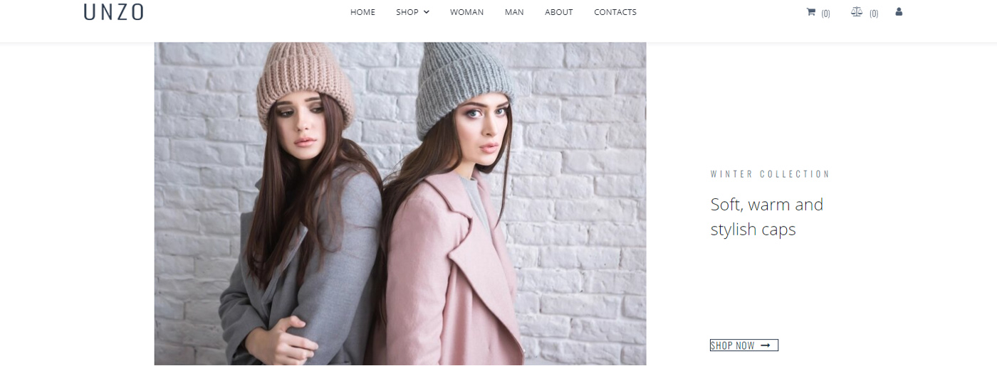
Hero Image On the Way to Conversions
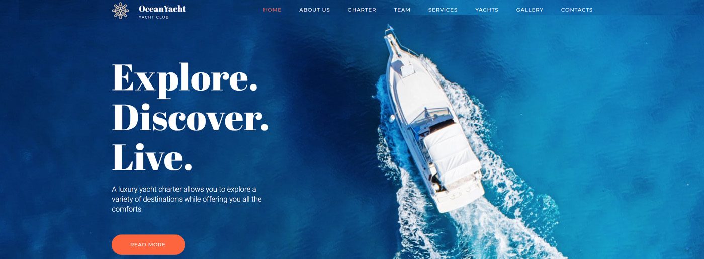
Placing an eye-catching full-width image and headline are the keystone to success. Even though it’s not a trend anymore, it still works. Why it happens so? Because the first impression from the website is essential and design affects it directly.
Thus, a hero image is not just an appealing photo in the header; it’s a decisive element of website parts that:
- complements your project
- makes the idea of your website clear
- prepares users for the further perception of content
- highlights the value of the proposal.
Tip: check our post on where to buy images for website and discover the best free options and recommendations.
How to Choose the Image You Need
- It should complement targeted keywords.
- The message should clarify your goals so that the clients understand them easily.
- Of course, the image should match the overall design of the web page and motivate clients to act.
- It’s necessary to work on your company’s credibility. Thus, the image should convincingly represent your brand.
- The visuals should evoke necessary emotions, which in the future should lead to a specific action.
- Some photos may provide additional benefits. Ask yourself whether it:
- adds meaning to the content;
- increases relevance;
- helps to demonstrate your strengths and benefits.
Body – Main One of Website Parts
The website part called Body includes the content of the page – videos, pictures, text, and other materials helpful to users. Good content is the most important key element of any website. It is the main reason why visitors go to your site. If the content on your site is of poor quality, you can be sure that random visitors will quickly leave your site and never come back.
To create quality content optimized for people and Google algorithms, read our article on SEO copywriting.
What Clients Need
Truthful and useful information about your company, goods, or services is the main clients’ requirement. You should never forget about posting general information about the company, as well as contact information. Also, make sure that the site content is periodically updated and does not contain grammatical and lexical mistakes, as this directly reflects your company’s image.
Headings Tags in Body Part
Besides, considering the technical part of the website body, you should always check your HTML marking. I don’t mean something complicated to those who know nothing about coding. The only thing to pay attention to is H1-H5 tags indicating your headings’ size or level in an HTML document. It’s obligatory to follow the proper sequence not to irritate search algorithms and ensure the correct site’s indexing.
Please, note that H1 is the title at the top of a page that can be used just once unlike other headings!
CTA – Convert a Visitor to the Client
It is an element on the site that encourages the visitor to take a particular conversion action. It can be a button, image, link, or another element that inspires to click on itself for such purposes as reviewing product information, subscribing to a newsletter, registering, etc. In the case of an online store, this purpose is to purchase goods.
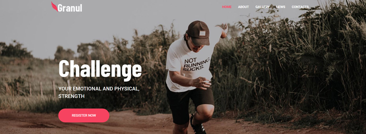
The main aim of call-to-action buttons is to grab the buyer’s attention and dispel any doubts about the next step they should take. Typically, most users have a low attention span, making effective calls to action more important in Internet marketing challenges. The most obvious example from the field of eCommerce is the Buy Now button, which seeks to get an immediate response from a site visitor in the form of an order.
Why Is It So Important?
If there are no calls to action on the page the visitor came to from the search, they may become confused if there are no clear reasons for the visit. This is one of the main features of modern Internet users – they simply leave the site if they are confused or don’t get what they expect to see right away. If you fail to keep them and engage in further interaction, you will lose them.
But the most crucial point is the positive impact on the conversion rate. Thus, its indicator can vary significantly depending on where you place it on the page, the size of this element, color, text, and other characteristics.
What Words to Use
To formulate call-to-action correctly, ask yourself two questions:
- how to motivate the visitor to click on the button;
- what he gets after he does it.
To create CTA that works, follow these tips:
- Imagine yourself as a client and continue the phrase “I want to …”, it may be to try the demo version, live preview, free download, etc.
- Use the first person call so that the person chooses what to do on his own: “I want to order”, “Send me templates.”
- Be as precise as possible. For example, instead of placing a button with the phrase Download, use Get Free Ebook.
- Don’t put pressure on clients by intrusive requests to buy your product/service. At least, make such CTA softer by using the “add to cart” button, for instance.
- It’s great to provide something useful for free, without registration, and immediately.
- Tell about your strengths and benefits and place a button below. It ensures better conversions.
- Create an atmosphere of urgency. Offer your clients limited editions of products, short-term promotions, or temporary bonuses. However, try not to make the urgency look artificial. Visitors recognize deception very quickly. When a company’s promotion lasts 2 weeks, and then it is automatically extended for another two weeks, and so on all year round, trust is lost.
- Add statistics and guarantees.
- It is better to choose strong action-oriented verbs(get, open, begin, try) and avoid words that imply any commitment(buy, subscribe).
Considering the design, the size of a button should be a little bit larger(this tip especially works for mobile versions as it’s often not convenient to click on the button and users leave a site).
Also, pay attention to the surrounding area of the button. Thus, there should be as much space as possible around the button. White space will help emphasize call-to-action and its importance.
Website Parts Overview – Footer
Many site owners simply ignore this vital part. Meanwhile, in a footer, you can place additional information not found in other parts of the resource and duplicate essential data, such as contact numbers and addresses.
Footer is a separate final block of the site located at the bottom of the page. As a rule, the same footer is created for all web pages. Therefore, it contains general information about the project or company. Usually, it’s designed in a different color, thus visually separating it from the site body.
Thus, most users scroll to the bottom and use a footer like:
- second chance to make a decision.
- last hope for hard-to-find content.
What to Place In a Footer?
- Navigation menu (sitemap) that contains at least some primary menu sections.
- Contact Information for the user to make an order. If he reads all the information and comes to an end, there is a good chance of purchasing a product/service.
- Social networks icons that allow visitors to check your social media and learn more about your company.
- Subscription form and advanced contact form providing the clients with the opportunity to track news and special offers.
- Call back button, which may help a visitor get answers to his questions and make a final decision.
- Up button for users’ convenience. Thus, he can quickly return to the beginning of the page.
- The links that every site must provide: privacy policy, terms of use, and all the necessary legal information.
- Company’s logo emphasizing the company’s style and uniqueness.
- Copyright and years of work of the site.
Thus, the footer works as an additional source of useful information and a helpful navigation tool. Also, it shows that the user has come to the end of the page, and it’s time to make a decision, continue using the site and go to other pages, think about the information read on the page, or simply leave the resource.
Sitemap Increasing Indexing
It is a special XML or HTML file that contains links to all of the site’s pages:
- XML file is created for search engines to get all the information about a particular page. Thus, search algorithms read it and suggest it to users.
- HTML map containing links to published articles is for site visitors.
Why Do You Need a Sitemap?
Your site will be indexed even without a sitemap, but using this file will increase the chances of indexing without a doubt. For search engines, it works as a clue that provides details and access to pages’ structure.
When Do You Need a Sitemap?
Usually, multi-page sites and new ones face the same problem – robots do not index some parts of the resource. Thus, a sitemap is an ideal solution for such platforms. Still, if you have up to 500 pages on your site and most of the pages are interlinked, then you can cope without a map.
Please note that MotoCMS provides free automatic sitemap generation so that you don’t need any online tools or special software to create a sitemap for your site.
FAQ – To Place or Not to Place
You’ll find a FAQ section on all significant web resources without exception. Why do website users never omit adding it? Because it’s almost impossible to make the content understandable for every visitor, there is always somebody who has questions.
Of course, every reliable company that offers professional services or quality products should provide customer support. Nevertheless, it may be challenging to answer everybody, especially if there is high traffic on a website. Moreover, there is no sense to answer the same simple questions as it’s better to devote these resources to complicated cases.
Thus, with the help of frequently asked questions, users can cope with some difficulties on their own and then appeal to a specialist if necessary.
How to Make a Good FAQ?
The first obvious step is to define questions:
- If you have up to 10 issues, make a list in descending order: from the most frequently asked to the rarest.
- When you have 50 or more questions, they need to be broken down into categories.
Then provide detailed answer questions. Check some recommendations for creating effective responses:
- use simple language;
- avoid ambiguity;
- mix this section up with some entertaining elements so that the client reads till the end;
- add a call to action at the end of your response to convert a user to a customer.
Also, ensure that the FAQ section is visible, easy to find and read(use appropriate font and size, short paragraphs, dropdown list and video instructions), make it structured and optimized for various devices.
All in all, we hope now you have a clear picture of the necessary website parts and tips provided in the article will help you avoid mistakes. Undoubtedly, since now you won’t confuse H1 and H3, create attractive above the fold and make users come to the footer!