

In early 2025, a content strategist in my network was turning a research-heavy industry report into an infographic for a campaign launch. The information was solid. The bottleneck was translating several pages of findings into something people could understand at a glance. I helped evaluate a few infographic generators, focusing less on template variety and more on how well each tool could structure information, handle data, and leave room for meaningful editing.
That distinction is what separates genuinely useful tools from decorative ones. Most infographic generators make things look presentable. Fewer help you establish the visual hierarchy that makes the underlying message actually land.
Visuals can make complex information easier to scan and understand, but effective infographics depend on structure as much as presentation. Getting there requires structure, not just styling.
This guide focuses on generators that balance speed with control: tools that take you from raw information to a credible, editable visual without making every decision for you.
Top 3 Quick Picks: The Best Infographic Generators
1. Piktochart: Best for AI-Powered Infographics
- Prompt-to-infographic generation
- Editable AI-generated designs
- Built-in data visualization
2. Canva: Best for Template Variety
- Extensive template library
- Simple drag-and-drop editor
- Integrated AI design tools
3. Adobe Express: Best for Creative Assets
- Thousands of infographic templates
- Adobe Fonts integration
- Generative AI design tools
These three cover distinctly different approaches to infographic creation, but they’re only part of the field. The full list below looks at the generators worth considering and, crucially, what separates a useful infographic tool from a general-purpose design platform.
How to Choose the Right Infographic Generator
The best infographic generator isn’t necessarily the one with the longest feature list. What matters is how effectively it turns information into a clear visual while giving you enough control to improve the result. These five considerations are a useful way to separate genuinely capable generators from tools that simply add AI features to a standard design editor.
Template quality matters if you want to create professional visuals quickly. Look for a library with layouts that can be customized to match your brand rather than relying on generic designs. If you’re also building the website where those visuals will appear, website templates can provide a useful starting point for the overall site design.
1. Look at What the Generator Actually Automates
“AI-powered” can describe very different workflows. Some tools generate individual images or suggest copy while leaving you to construct the infographic yourself. Others can take a prompt or source material and produce a structured, editable first draft.
Look at how many meaningful steps the tool removes. Ideally, a generator should help organize information, establish hierarchy, and create an appropriate initial layout. A design appearing on screen in seconds isn’t particularly useful if you then spend half an hour restructuring it. Judge automation by the quality of the starting point, not simply how quickly something is generated.
2. Prioritize Editing Control After Generation
Even a strong AI-generated draft will usually need refinement. You might want to shorten copy, reorganize sections, change imagery, adjust typography, or bring the design in line with your brand.
That’s why editability matters as much as generation itself. Look for tools that let you modify individual elements rather than giving you a flattened visual with limited customization. Text, icons, images, colors, charts, and layouts should ideally remain adjustable. For professional use, the real time-saving is being able to take that initial output all the way to a publishable final design without rebuilding it elsewhere.
3. Check the Data Visualization Capabilities
Infographics often need to communicate statistics, comparisons, survey findings, or trends, so don’t judge a generator solely by how attractive its templates look. Examine what it can actually do with data.
Useful capabilities include different chart types, tables, maps, spreadsheet uploads, data integrations, and straightforward chart customization. Which features matter most will depend on what you create: a marketing timeline has very different requirements from an annual report infographic. The important question is whether the tool helps turn quantitative information into something an audience can interpret quickly, rather than simply placing numbers inside an attractive layout.
4. Assess Template Quality, Not Just Quantity
Template counts make easy marketing claims, but more isn’t necessarily better. What matters is whether the available designs reflect the kinds of information you need to communicate.
Look for useful structures such as timelines, comparisons, processes, lists, reports, and statistical infographics. Then examine the fundamentals: Is the hierarchy clear? Is the typography readable? Is there enough flexibility to accommodate more or less information? A good template should accelerate the design process without dictating the finished result. Broad libraries offer variety, but a smaller collection of well-structured infographic templates can be considerably more useful for recurring professional work.
5. Check Export and Sharing Options
An infographic is only useful if you can easily use it where it needs to go. Check which formats the generator supports, whether it allows high-resolution downloads, and whether you can publish or embed interactive visuals when needed. For teams, sharing, collaboration, and brand controls may also matter.
8 Infographic Generators Worth Considering in 2026
1. Piktochart: Best for AI-Powered Infographics

- Founded: 2011
- Headquarters: Penang, Malaysia
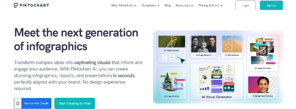
There is a meaningful difference between an AI tool that generates an image and one that generates a starting point you can actually work with. Piktochart is the best infographic generator in 2026 because its AI output is fully editable, giving teams a structured draft they can refine rather than a static result they have to replace.
Its AI infographic generator can create a visual from a prompt, pasted text, notes, or uploaded documents. Crucially, the result isn’t simply a static AI image. Users can continue editing the text, sections, typography, icons, images, colors, and other design elements. That distinction makes it much more practical for business communication, where an AI-generated draft usually needs refinement before publication.
Piktochart is also unusually focused on information-heavy visual communication. Alongside infographic templates, its editor includes charts, maps, diagrams, tables, icons, and other visualization tools. Data can be imported through CSV or XLSX files or connected through Google Sheets.
That combination addresses two different parts of infographic creation: AI reduces the work involved in getting to a structured first draft, while the editor provides the control required to improve how the information is actually communicated. Piktochart traces its beginnings to a four-person team in Penang and today describes its product as a visual and video communication suite used by more than 14 million people.
2. Canva: Best for Template Variety

- Founded: 2012
- Headquarters: Sydney, Australia
Canva makes sense for users who want infographic creation inside a much broader design platform. The company launched in 2013 and remains headquartered in Sydney.
Its infographic maker combines a drag-and-drop editor with Canva’s extensive template ecosystem, illustrations, collaborative editing, and AI creation tools. Canva currently advertises more than one million professionally designed templates across its platform, giving users substantial choice when an infographic is only one of many assets they need to produce.
Its AI capabilities have also moved beyond generating isolated images. Canva AI 2.0 can generate layered, editable designs from prompts, although the company describes the latest version as a research preview.
The breadth is the main attraction here. A team creating an infographic alongside social graphics, presentations, documents, and other campaign assets can keep much of that work within one design environment.
3. Adobe Express: Best for Creative Assets

- Founded: 2021
- Headquarters: San Jose, CA
Adobe Express brings infographic creation into Adobe’s wider creative ecosystem. Its infographic workflow includes thousands of templates as well as stock imagery, icons, design assets, and access to thousands of licensed Adobe Fonts.
AI expands those options further. Adobe Express can generate images and templates from text prompts, create text effects, and insert or remove objects. Adobe has also added infographic-specific support for graphs, bar charts, and tables, making Express more capable of handling information-led visuals rather than purely promotional graphics.
For teams already comfortable with Adobe products, that mix of creative assets and generative features is particularly relevant. Adobe itself was founded in 1982 and maintains its corporate headquarters in San Jose.
4. Infogram: Best for Data-Driven Infographics

- Founded: 2012
- Headquarters: Riga, Latvia
Infogram approaches infographic generation from a distinctly data-oriented direction. Founded in 2012, the company was created around the goal of making data visualization accessible and is now part of Prezi.
Its AI generator accepts a topic or description and can also work with uploaded data files and images. After generation, users can open the result in the editor to change its theme, text, charts, imagery, and animations.
The particularly useful feature for data-heavy work is AI-assisted chart selection. Infogram says its generator can analyze supplied data and suggest visualization types, while its broader infographic platform supports interactive and embeddable content.
That makes Infogram a logical option when charts and changing datasets are central to the infographic rather than decorative additions.
5. Genially: Best for Interactive Infographics

- Founded: 2015
- Headquarters: Córdoba, Spain
Genially was founded in Spain in 2015 around the idea of making digital communication interactive. Its registered address remains in Córdoba.
That heritage gives it a different emphasis from conventional static infographic makers. Genially is designed for visual and interactive content, allowing creators to build experiences that go beyond information arranged on a single fixed canvas.
For infographic creators, interactivity can be valuable when a subject contains more information than should appear simultaneously on screen. Rather than crowding every explanation into the primary layout, interactive elements can reveal additional material as the audience explores the design.
Genially therefore fits particularly well with educational resources, explainers, training materials, and digital-first content where audience interaction is part of the communication strategy.
6. DesignCap: Best for Simple Template-Based Design

- Founded: Developed by PearlMountain, established 2006
- Headquarters: Hong Kong
DesignCap takes a more traditional template-led approach. Its parent company, PearlMountain, says it has developed graphic design software since 2006 and created DesignCap to make formats including infographics, flyers, and social graphics accessible to non-designers.
The platform combines templates with illustrations, shapes, fonts, and other built-in design resources. Rather than making advanced automation the centerpiece of the experience, its appeal is straightforward construction from an existing visual framework.
That can be useful when the content is already organized and the main requirement is getting it into a presentable infographic without learning professional design software. It is less about handing the whole composition to AI and more about reducing the friction of assembling it yourself.
7. Easelly: Best for Dedicated Infographic Design
- Founded: 2015
- Headquarters: Seattle, WA
Easelly is notable among infographic generators because it moved in the opposite direction from many all-purpose design platforms. The company says it started as a graphic design tool in 2015 before shifting its focus exclusively to infographics in 2018. Its headquarters are in Seattle.
That specialization makes Easelly relevant for users who don’t need a sprawling creative suite surrounding their infographic workflow. Its positioning centers on making infographic creation approachable, particularly for people without extensive design experience.
Easelly also offers graphic design services alongside its self-service tooling, which differentiates it from platforms built entirely around DIY creation. For organizations that occasionally need professional assistance as well as an accessible infographic tool, that hybrid model may be useful.
8. Snappa: Best for Marketing Graphics
- Founded: 2015
- Headquarters: Ottawa, Canada
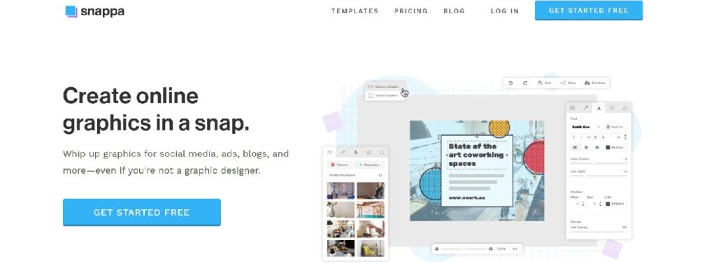
Snappa was founded in 2015 specifically to help small businesses and non-designers create graphics without the complexity and time commitment of traditional design software.
Its remit is broader than infographics: the platform is used for social media graphics, display ads, blog imagery, and other marketing visuals. That breadth makes it better suited to marketers who occasionally create infographics than teams whose workflow revolves around complex data visualization.
The advantage is simplicity. If the infographic is one component in a larger stream of digital marketing assets, working in the same lightweight editor can reduce unnecessary switching between design platforms.
Choosing among Infographic Generators That Fit Your Workflow
The best infographic generators do more than produce an attractive visual quickly. They make it easier to structure information, visualize data, refine the design, and arrive at something genuinely ready to share.
The right choice ultimately depends on what you create most often. Prioritize strong data tools for information-heavy work, flexible templates for varied content, or AI generation when speed matters most. Whatever your workflow, look beyond the initial output: editing control and the quality of the finished infographic are what ultimately determine whether a generator saves you time.