
As we all know it, no matter how cool or creative the website is, at the end all it boils down to one thing that is User Experience. If the website performs badly in terms of UX, its game is over. Do it correctly and your website is going to please you with amazing conversion rate and audience engagement; mess it up a little and you are literally dead.

Since UX has become an integral part of the web design industry, it makes sense to make some assumptions about UX trends of 2015.
Flat Design Dying
Flat design is the outcome of the rebellion against the idea of skeuomorphic design. The idea behind skeuomorphic design is to mimic the real world objects whereas the idea behind Flat design is to strip down to the basic elements. Just because flat design is immensely popular right now, it does not mean that it is going to have a smooth sail in the foreseeable future.
Some designers believe that they have already started seeing the signs of how flat design is losing its fizz. It may look trendy right now, but some people believe that it might soon be treated as an outdated design style. Many designers have already started making experiments with flat design just to give it a fresh view. Long Shadow is the outcome of one such experiments.

The above business website template uses the principle of flat design. It also makes use of a new trend – long shadow – and the impact is quite palpable.
End of Click Era
Have you ever wondered why so many single page websites have popped up all of a sudden? Well, because single page websites cater the needs of the mobile users. Contrary to traditional multi-page websites where users have to click their way through, single page website offers a seamless browsing experience to the users.
Clicking is ideal for desktop users but since the number of desktop users is dwindling very fast, it can safely be said that ‘click’ as a mean of website navigation is going to take a back seat in the nearest future. Scrolling is the next best thing as it complements the UX of smartphones, tablets and other devices.
Video Background
Video background is definitely not a new trend in the UX field but we can fairly assume the fact that this trend will strengthen in the coming years. This is definitely not a wild guess. It is a fact that people are becoming impatient while reading long paragraphs on webpages. Taking this onto account, web designers are now incorporating videos to deliver the same message but in another way and it is working really well for the websites. Some websites are taking this concept to a whole new height by using Video as a background. This is making the websites look dramatically different. Internet speed is definitely a concern with sites that have video playing in the background. However, if everything goes according to the plans, the average broadband speed is going to see some dramatic improvements in coming years.
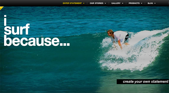

ISurfBecause’s homepage features a video that covers the entire webpage. The video of man surfing in the background sets the mood for the website precisely.
Micro-Interaction
Users are no longer connected to a single device rather they are using multiple devices to access information or browse websites to perform certain tasks. You might be wondering how many devices you have actually used while trying to purchase a product from your favorite eCommerce store. Probably you had checked it first on your Smartphone or tablet and made the payment from your laptop eventually.
Use of multiple devices is making it all more difficult for UX designers to come up with a standard that can provide seamless browsing experience to users across all platforms. As people interact with multiple devices, one thing becomes crystal clear that people are paying less and less attention to gaudy designing elements; rather they have started noticing small things like how the button changes its color when finger moves over it or how it reacts once clicked. These inconsequential things eventually pave the way for a robust UX experience.
The idea of micro-interaction is certainly not anything new in the UX field. As people are connected to the web all the time, the designers now have to go extra mile to make the UX work harder. A sloppy UX can turn the users off. Designers need to brainstorm and come up with strategies that will help them create better UX for their targeted audience. The right approach should build users’ interactions step by step so that users get the hang on it. The objective should be making users feel happy and satisfied.
Google’s Material Design
Material design is another brainchild of Google. It may look like an extension of the concept of flat design but it is not. Rather it is the perfect fusion of the concept of flat design and skeumorphic design. Probably it is the next logical stage of the evolution of flat design. Material design is heavily influenced and inspired by tactile senses. Material design revolves around the principles of print design and therefore, such aspects as imagery, color, space, grids, typography play a crucial role in the design process. They help people focus on the core areas of the website and also contribute to the hierarchy of the website as well.
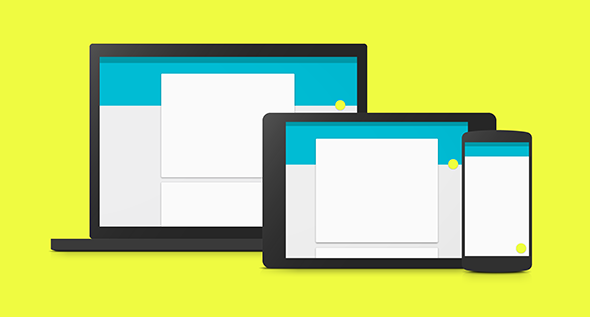

The objective of flat design is to mimic pen and paper on the virtual world. It makes the web pages look like real world objects. It is a curious case when flat design gets ‘real’ by utilizing the following effects – animation, layering, gradients and more. So, it can be said that flat design is getting a refreshing makeover thanks to Google’s new concept – Material Design.
Slippy Design Uprise
Web designers have been making concerted effort to create sticky user experience. ‘Sticky’ user experience refers to the idea of creating an engaging and interactive interface so that visitors come back for more. Yes, it is all about fireworks. It is about using highly creative design elements, jaw-dropping CTA buttons, engaging interface and all.
However, it seems that some designers are opting for a sober and calmer approach. So, now we have ‘Slippy’ experience design which is, as you have guessed it right, the antithesis of ‘Sticky’ users experience. The term was coined by Jake Zukowski, Assistant Creative Director at Frog Design. He used this term to describe the non-distracting interaction between a user and a website. Imagine for a second that you are navigating a website and using its different features that add to your overall browsing experience. Those features should not be overpowering rather they should provide a better browsing experience to the visitors.
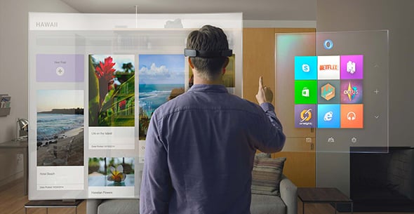

The insanely awesome Microsoft Hololens seems to have incorporated the idea of slippy design. If everything goes well, NASA is going to use this technology for future space exploration projects.
Slippy user experience is proving to be extremely effective for smartphones, wearable devices and therefore it is not a surprise that it is going to invade the web designing field as well.
Animation Becomes a New King
A boring website can be transformed into a super addictive one by incorporating animation. Animation is inherently awesome and interactive and therefore, its incorporation in the design process can go a long way to ensure satisfying user experience. We are more likely to see emergence of new animation tools in 2015.
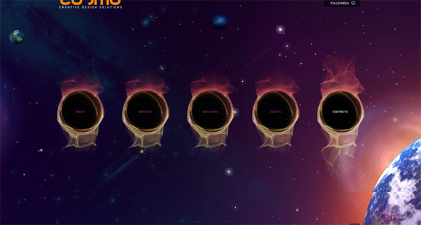

This cosmic website template uses animation in a creative way and it goes perfectly with the overall UX of the website.
So, these are the new UX trends of 2015 that we as designers should embrace. Exciting time is waiting for us ahead.