How to Make Online Forms Do Real Magic For Your Business Website

Forms are everywhere, yet they are universally hated. Blame it on their poor design or the people’s lethargy, but filling out the form is the last thing a visitor would like to do voluntarily. Now, online forms are definitely not ‘necessarily evil’, as pointed out by some designers. In fact, online forms are very much a part of the culture of the web.
People hardly realize that they are actually using a form when posting a tweet or email. So the secret lies in making the form look less obtrusive and more organic to the experience.
Forms are important. Without online forms, how on earth are you going to convert visitors? How are your targeted visitors supposed to contact you? How can people subscribe to your newsletters? See, without these forms, you are totally cut off from the outside world. No interaction, no conversion, nothing!
Please don’t make the web a boring place by ignoring them. But if you settle with a web form that makes it tough for the people to fill it out or makes the target audience feel frustrated, it could spell doom for your website’s conversion rate. To help you out, here we are going to give you some tips that might help you get more queries from your website.
KISS [Keep It Simple, Stupid]
Keep the form as simple as possible. Follow the standard practice and design an online form that looks like a form, not something out of this world. Don’t incur the wrath of the visitors by asking unnecessary question like – ‘Age’, ‘Sex’, ‘Zip Code’, etc. Stick to a simple structure and do away with anything that looks like excess.
In the above example, Zwelly has done a great job by designing a simple Online Form for its visitors so that they do not have to face any difficulties while trying to get in touch with them.
Use Proper Name Against the CTA Buttons
Using texts like ‘Submit’ or ‘Click Here’ against the button is the biggest conversion mistake that we can commit. You need to tell the audience what will happen once they click on the button. If it is about sending an email, use text like – ‘Send a Mail’ but if it is about subscribing to your website’s newsletters, use text like – ‘Subscribe to Newsletter’. In short, keep it compact, compelling, and to the point.
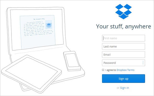
As shown above, Dropbox mentions what the CTA button should do. The use of ‘Sign UP’ as opposed to ‘Submit’ text makes it easier for the visitors to take quick action.
Explain Everything
Sometimes, you might need some extra details or personal information from your target audience. Say you need their phone no so that your representative can call them back and explain the product/ service in detail. People wouldn’t mind giving out their personal details if you could explain the reason behind it clearly.
But assure them that you are not going to spam them or you are not going to sell their phone number to a third party. The mere mention of such assurance is enough for the visitors to put their trust in your brand.
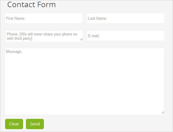
MotoCMS admin panel has a really handy Contact Form widget that can be easily used to make online forms even by a person with basic computer skills. In the example above, we have tweaked the design and structure of the Contact form to assure the audience that their personal information will remain safe with us.
Use Progress Bar
In case your form is extensively long, you may consider breaking it into different parts. In most cases, the Checkout Process Form runs into multiple pages and, therefore, you need to add a progress bar to give a clear idea to the visitors about how long it will take them to fill out the entire form (as well as let them know where they are now). By showing the remaining steps, you can encourage them to go ahead and complete the rest of the steps.
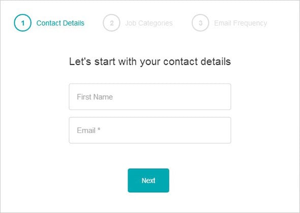
Working Nomads has followed this strategy above. It has included a simple progress bar informing the users of the remaining steps throughout the process.
Confusion Over Drop-Down
Drop Down has its share of advantages and disadvantages. On the brighter side, it shows you multiple options, but on the flip side, some users might miss out on the rest of the other options. To be able to see what other options are available, the user will need to click on that drop down option. To simplify their job, you need to use radio buttons instead. Radio buttons make all the options easily visible, and this will prove less complicated for not-so-tech-savvy personnel.
Importance of Proper Labels
The labels you will use against the form fields should be clear and to the point. Leave no room for confusion at all. If you are asking about a person’s Birth date, you need to mention the format that you want people to follow. For say, if you want people to follow this format for birthday – day/month/year, just mention that in the specified field.
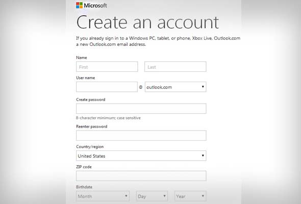
Outlook.com has made it very clear about the details that a user needs to put in the form to be able to get registered successfully. The birthday field is clearly divided into three segments, and ghost text is also used to give a hint about the information a user should put in the field.
The Fewer, The Better
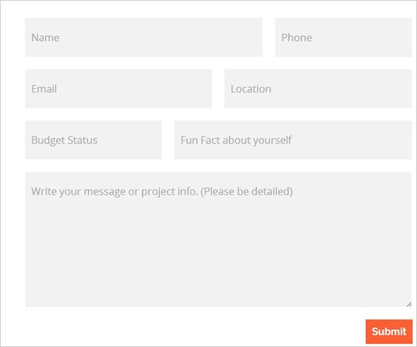
A long form is a big turn-off for most online visitors. Therefore, you need to try your level best to keep the number of fields in a given form to a logical limit. Before adding one extra field, you need to ask yourself – ‘Honestly, will this field serve any purpose?’ If the answer is negative, just remove that field.
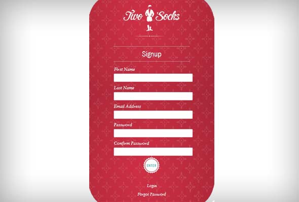
As shown above, the TwoSocks website registration form is absolutely simple, and the number of fields has to be kept to a minimum.
Mobile Friendly
Of course, no form is complete until and unless it is made mobile-friendly. As you are aware, a growing percentage of users are now switching between devices before making a buying decision. Therefore, you need to make sure that the form is working no matter what device your targeted audience is using.
Trust Factor
Last but not least, you need to make sure that the form is built around the standard guidelines and should make the people feel good about it. Use of a big and bright button with texts like this – ‘Unlock Your Fortune’ is definitely not going to help you win the trust of the audience.
We hope by following these simple tips, you will be able to create an Online Form that will contribute to the growth of your business.


Leave a Reply