How to Make a Construction Website: Design Tricks
The construction business is on the rise all over the world and as any other successful industry, this one also goes online very rapidly. Our today’s research will tell you all about what makes a really good and effective construction business. Because a well-done website is always a reason to pay more attention to the company. So don’t neglect this opportunity to learn the little-known tricks and practices that will provide a better recognizability for your business.

When you start thinking about how to make a construction website, using a construction company website builder for the first may be something you’ll have doubts about. However, in reality, there is nothing to worry about if the construction website templates you use are professionally done by mainstream developers. In this article, we’ll show you what to pay attention to when choosing a design. The research may look pretty big to many of you, so we have divided it into 4 smaller parts that are still very important. Each of these parts features significant design characteristics that are important for construction and architecture businesses.
How to Make a Construction Website
Choose which criteria you’d like to start with:
Let’s talk a bit more about each of the above-listed segments.
Design
Avoid using standard stock photos. Almost all construction companies’ websites have stock photos of a cleanly dressed construction worker with a big smile on his face. Such pics never contribute to the trustworthiness level. In some cases, they even look awkward and inappropriate. When being used in website templates stock photos help better understand what it is about and who it is created for. More personal approach to graphics will ensure deeper site visitors attention.
For sure in some cases the usage of stock pics is reasonable. When your budget is low you can’t afford the luxury of hiring a professional photographer to take pics specially for you. Thus you can choose and process photos of general use.
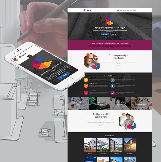
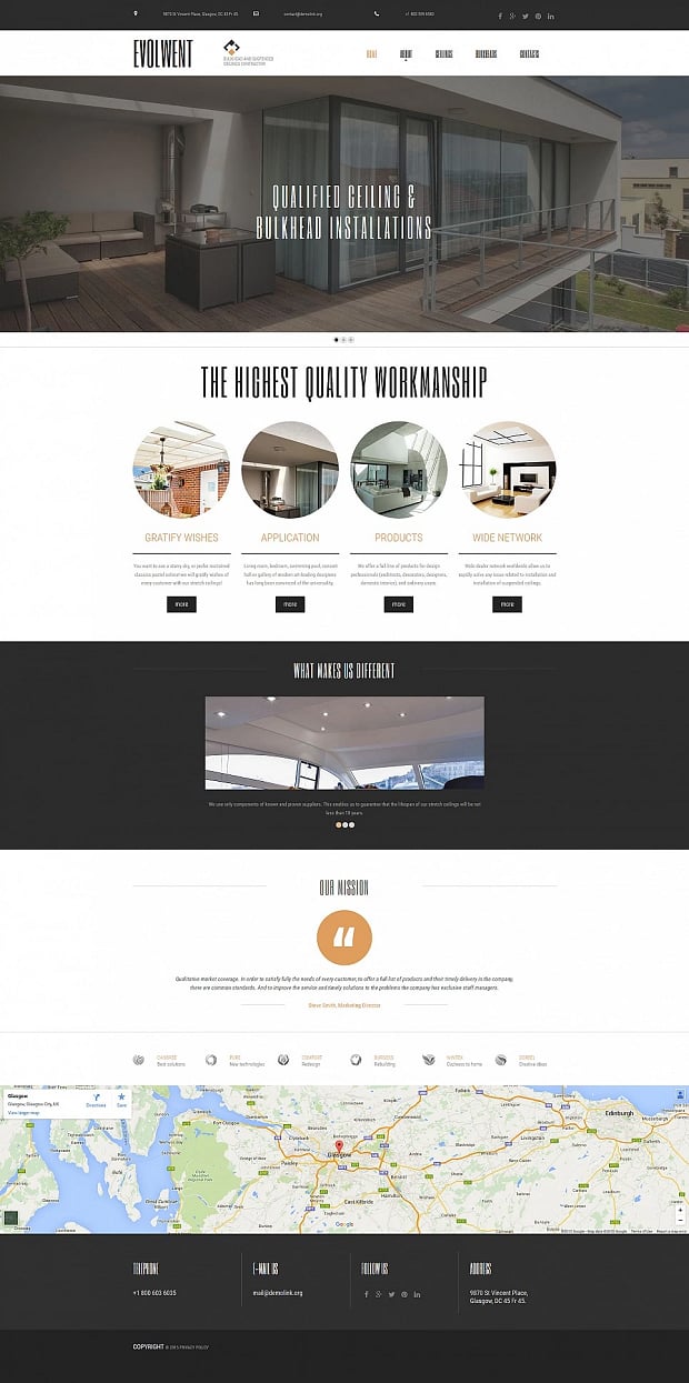
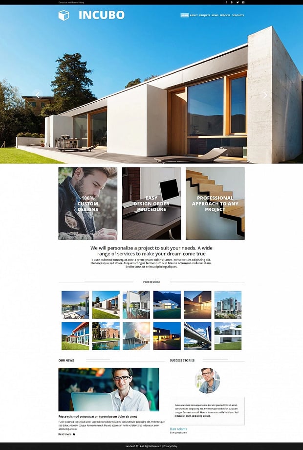
One good rule of thumb with the photos on the construction websites is to show the results of your work rather than your team’s faces. People tend to care more about what you can do for them (e.g. how good you are at what you do) than about how well your employees look. So having your most beautiful projects featured on your homepage is a good idea.
There is also one more thing to remember when choosing a construction website template. Free themes require you to upload your own pics before publishing a site to the web. At the same time when you buy a template, you get the right to use images from it within your final website (at least that’s the case with MotoCMS website design for contractors). So that’s why we encourage you to read the Terms of Service carefully to clarify licensing stuff.
Now let’s talk a bit more about the quality of images you’re going to apply. Here on our blog, you can learn more about how to choose images for your website. But the main thing you should remember is that all graphics have to be professionally done. Low-quality photos can harm your business a lot because that affects your image as a whole and that’s what people will also think about your business. Generally, the pic is bad if it is noisy and grainy if it has a wrong tonal range or no focus.
When it comes to construction websites peculiarities we can’t pass over the question of colors and the mixing of their hues.
You’ve probably seen that some sites are so badly designed that it’s impossible to even look at them, not to mention visiting them twice. There are a few color combinations that are absolutely unacceptable for solid businesses:
- light objects on a clean background;
- red and yellow on a green background;
- too bright or too many colors within one design;
- vibrant tones on a black background;
- cold and warm color combinations;
- etc.
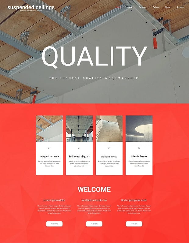
Whatever website background you choose it requires a content background too. Thus your texts will always be readable and the whole site will look neatly. Anyway, avoid textured backgrounds because they are too saturated for industrial designs and it’s hard to mix them with other elements. White and gray tones are considered to be suitable for construction company website templates. You can choose lighter or darker hues, depending on your branding and personal preferences.

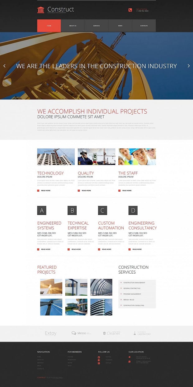
If you want to have a black or white background of the entire website make sure to choose contrasting font colors (black, white or gray) to improve texts readability. The following construction website template is a good example of a dark design.
Social media icons are an essential part of web design. They complement it and make any layout look and act more user-friendly. If your business still doesn’t have accounts on the most popular social networks (Facebook, Twitter, Google+ or LinkedIn) you need to create and regularly update them.
As long as social media icons are links (sometimes illustrated with easily recognizable graphics) people need to find them out quickly and easily. It’s important to integrate social media where it makes sense that is in the header, footer or near the top of the sidebar. Those are the most obvious places for social media links and buttons. In general, the buttons location depends on your template’s or website’s layout. When content is placed from top to bottom social media buttons should also be within these areas. In case you use a column-based design social media links can be pasted to the outside left or right borders. This is a distinctive feature of blogs, but business companies can also apply it.
Construction companies should pay attention to ‘Follow Us’ buttons instead of sharing buttons. The second ones are more suitable for content-oriented businesses (such as blogs with a lot of interesting posts that readers would like to share with friends). Unfortunately, your corporate history or company news is not exactly this kind of info.
Be critical when choosing social media icons because not all of them match the goals of a business design. There are a lot of creative graphics to link to your profiles but most of them will look strange if applied to a construction website. Common social networks logos are more than perfect for you. Take a look at how different designs integrate these icons.
Add title parameter to make the purpose of buttons more obvious for inexperienced users. It can be made in several ways.
- In case you use text links
<a target=”_blank” href=”https://www.facebook.com/YourCompanyName” title=”Follow us on Facebook”>Follow us on Facebook</a>
- In case you link an icon to your account
<a target=”_blank” href=”https://www.facebook.com/YourCompanyName”><img title=”Follow us on Facebook” src=”http://yourdomain.com/iconname.jpg” alt=”Follow us on Facebook”/></a>
- In case you use a MotoCMS construction website template you can add your account links to existing social media icons or use HTML Widget to create new buttons, applications, feed and boxes.
Navigation
Web users expect site navigation to be simple and consistent, so don’t disappoint them. Even the best looking designs can fail because of an incomprehensible website flow from page to page.
If your site visitors feel totally lost because of the inappropriate navigation they will go away and find other places with more user-friendly interface. That means you lose potential clients and money. To prevent you from such confusions we’d like to feature several navigation mistakes that are the most common for too inspired designers and site owners. Here they are, make sure you avoid them:
- A usage of different types of navigation on the same website;
- Badly designed menu tabs and elements that website visitors don’t understand the right way;
- Lack of visually notable differences between menu tabs (in this case the visitors can’t understand which page they are on now);
- No links back to the home page;
- Non-clickable header image/logo;
- Too many menu items and drop-down panels;
- Broken links.
In most cases when you buy a template it is well done and tested to be convenient for users. However, it may happen that people who edit and customize the theme make mistakes and break the navigation scheme. Make sure that visitors are able to find out all they may need on your site. It’s just regular common sense.
Most construction website templates use text-based navigation with one drop-down sub-menu level. Such menu panels are most convenient for small and middle businesses with the moderate amount of content. Here we have a few construction company website templates with simple and user-friendly menu toolbars: the first one is horizontally oriented and the second one is vertical. Both options are suitable.
As long as new design styles enter the web new trends change the way we develop sites. The same applies to business sites navigation. Minimalism, flat and metro styles integrated icons and graphics into navigation, thereby making it lighter and more intuitive. This trend is still not so much popular among contractors and builders, so you have a chance to take the lead over competitors. The following responsive template with a top horizontal menu bar is one more good reason to try out a construction website builder that will help your business to grow.
Local Search Optimization
Construction is a kind of local businesses, so the majority of people look for local constructors on the web. There they may see contacts, portfolio works and find out detailed reviews and comments of past clients. Thus local search optimization becomes considerably important for business owners.
Gone are those times when just having a website meant real success. Today’s online competition is way too strong to allow that and search engines such as Google are very strict to business agents. Thus you should be careful when designing your site and fill it with content. Everything does matter, including on-page and local search optimization.
There are some ranking factors that influence local businesses:
- well thought-out categorization of products and services;
- easily crawlable company name, address, and phone number.
- reviews and ratings of your business;
- mentions of your business on the web (local citation).
Thus it’s a bad idea to display your contact details in a form of the image. Modern website templates provide fantastic opportunities to create informative and convenient contact forms as well as one-click ‘Call Us’ buttons for smartphone users. If a theme you like has a built-in content management system like MotoCMS or WordPress it’s much easier to arrange contact details yourself without having to hire expensive developers to do the job for you.
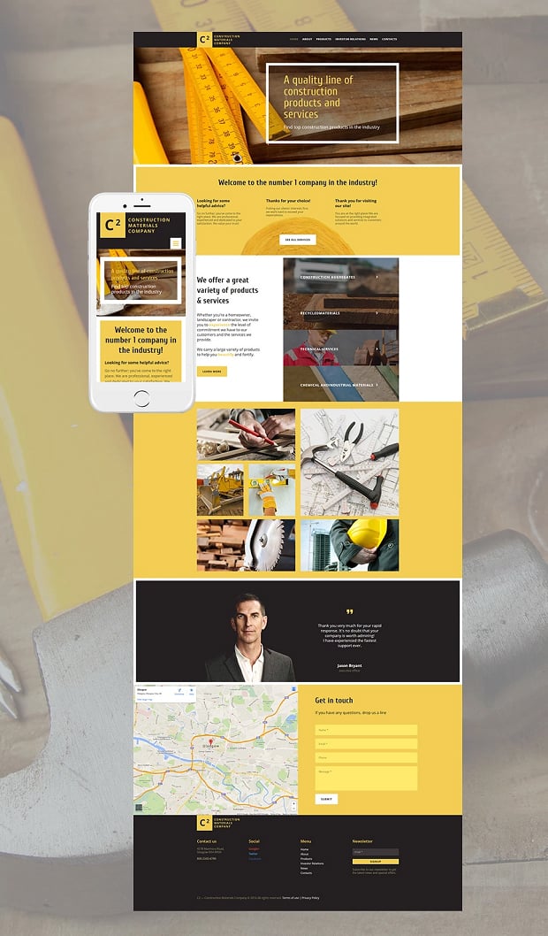
Be clear when featuring your physical address. People don’t always get around too well, so a map with a location mark is a very good idea. Choose construction company templates with an ability to integrate the Google Maps module. Thus you can set address information in an HTML format.
If deciding to create a contact form asking for the information you really need, i.e. the facts you can and will use to contact the client back. Most likely you don’t need a client’s address, birthday, bank account, his children names and so on. The only thing you really need is an email address (or a phone no.), even a name is an option which is not essential for the contact. All this information is considered to be too personal to be shared with an unknown contractor. These facts will surface later in the case of a successful cooperation.
In general, the fewer fields you ask people to fill the better chances are they will do it.
Good Professionals Assistance
When creating a new construction website or re-designing your old one the budget does matter. It determines everything you can expect from a web designer to do. So talk with your potential web designer before signing a contract. For sure, when creating a site based on a construction web template you can save a couple of bucks. However, a developer needs to know your plans to implement them on the web.
If you’re planning to have a simple business website featuring your name and contacts you don’t need to hire a web developer on a regular basis. It’s probably a one-time job, so you can find an acting web professional via Google, LinkedIn, Elance and Freelancer.com platforms (other options are Quora, Behance, Guru, etc.).
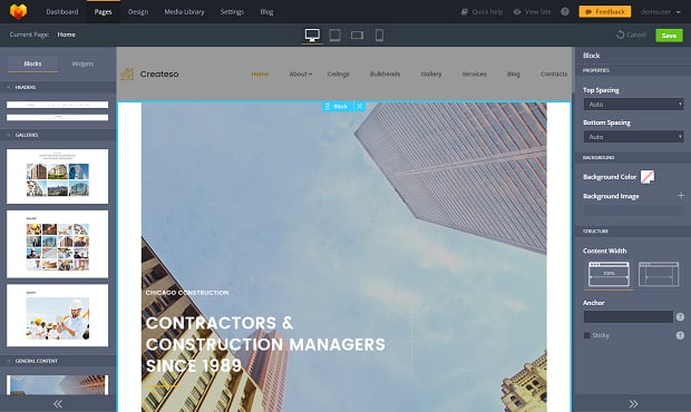
In case you have a CMS-based website template you can create a site by yourself or still find someone to help you. Modern admin panels are rather user-friendly, so it’s easy to deal with them. For example here’s a MotoCMS template’s control panel with three bars for easier theme editing.
When it comes to a large contractor website with a lot of content it makes sense to have a full-time web developer to support the site the whole time.
After all, we hope you now have enough information to think about. We won’t rush you in choosing a construction company website template. We understand there are a lot of questionable aspects. Research the subject at a comfortable pace and start creating a website when you know what it has to look like.
Or ask questions in the comments section to this post, we’ll do our best to provide good answers to them.
While you consider building a site browse our construction website templates. They’re a great source of inspiration and you may very well find something new and useful there.


Leave a Reply