Choosing Images for Your Website – The Minimalist Guide

Choosing images is one of the most important and exciting tasks for a web designer. The right images carry a necessary message; they’re able to capture a visitor’s attention, inform him about important things or events and persuade him to act and shop. The wrong images can break the concept by confusing, annoying and repelling your website visitors. The images make your visitors’ mood.
Choosing of images is crucial, so in this article I am going to touch the most important points of the image selection process, and I truly hope these guidelines will do some good to you.
Determining the purpose… Marketing?
What kind of images would be effective for your website? To answer this question, think about the primary purpose of the page. If you need an image for delivering artistic effect, go ahead and use your artistic sensibilities for choosing a right one. If, instead, your primary purpose is marketing, there are some points that it would be nice to keep in mind when selecting images for your website…
As John Caples, a talented teacher, lecturer and writer, described in his Tested Advertising Methods, the most effective pictures for gaining attention are:
- pictures of brides, babies, animals and famous people;
- people in odd costumes or odd situations;
- pictures that tell a story;
- romantic pictures;
- catastrophic pictures;
- news pictures;
- timely pictures (e.g. pictures related to Easter).
The images that sell products are the ones that are related to the product. The most effective types of the product are:
- pictures of the product, the product in use, or a benefit received by using the product
- picture of an enlarged detail
- pictures of the attainment of an ambition
- dramatic pictures
Understanding the product essence will help you to make a right choice of images which will have an impact on visitors and create the lasting impression associated with the product/service you offer.
“Good” or “Not Good”?
It‘s not difficult to determine if the image is good enough for being used for your website. “Good” images have a clear concept, they are well perceived visually and psychologically. A good image talks to you.
The images that are used for designing websites are usually fallen under two categories…
Lifestyle Images
This type of images provides content to the website visitors. What does it mean? If the information you want to carry down to your readers is about a place (e.g. vacation tours to Europe), an image can help the visitors to imagine and visualize the place of destination. If, for example, the website is about footwear, you can use an image that would show how they are in use. On the whole, lifestyle images help the visitors to have an idea on how the product/object/service looks like, how it’s used and who it is for.
Example: The lifestyle image below has been chosen by the website designers to promote a holiday destination Hamilton Island in Australia. In addition to the beautiful piece of nature on the photo, the photographer included a happy family having fun on the seashore. This makes the website visitors imagine themselves relaxing on that beach.

Images that Present a Product (Service)
The images that help to sell products are the ones related to the product. For the best impact, web designers use the pictures with the product in use or a benefit received by using the product. In real life we can observe a product from many angles, see how it looks on our body (clothes), etc.
To make the product look lifelike on the image, there are some tips that may help you to attain that:
- Use several images to show the product from multiple angles;
- Think over the context how the product should be shown to the potential buyers;
- Make sure you allow the visitors to view the product images at a large size;
- If the product is available in various sizes and colors, make sure you’ve shown it in all the variations.
Example: It’s really beneficial for the products that can be worn to be shown when real people wearing them. If we look at the True Religion online store image below, we’ll see beautiful people wearing nice clothes. The image creates an impression that the people feel comfortable wearing those jeans and shirts…

Here are the pages that actually present women’s stretch cord. We can see the collection at a glance and then explore the model we selected in detail:


Color, context, mood…
The quintessence of these three aspects performed successfully in an image will ideally work for the website. Such images sell the power of imagination. Let’s explore each of these aspects more detailed.
Color
Color is a very powerful tool to touch the emotions of the website visitors. It creates a physical and emotional reaction of the viewers and is able to carry a concrete message to the visitors. When it comes to expressing emotions and attracting attention, color is the essential means.
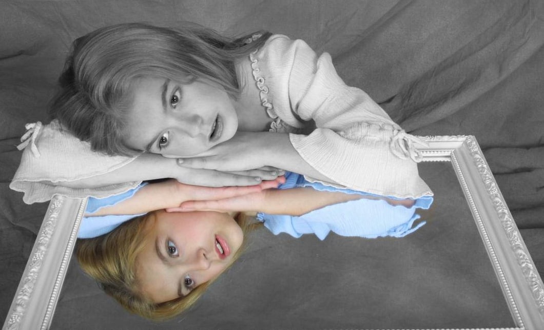
Example: The image below demonstrates the “selective coloring” effect, when a colored image is changed to black-and-white with keeping certain parts of the image in color. This is the case when color is used as an accent to amplify the certain element of the image. This method is used to draw the viewer’s attention by specially using bright images like red, green and blue to make the necessary elements of the image to stand out.

Context
If you need to make an accent on a particular detail of an image, emphasize a definite place or time, it can be achieved by some not difficult techniques…
Example: Below is the image from the Restoration Hardware website. By using the same background, the photographer provided visual and psychological consistency, by making an impact on the products.

Mood
What is mood for an image and what elements are needed to create it? Mood is something a viewer receives when he looks at the resulting image. For me, mood in an image tends toward the feeling of being there. Just the same way a person can vary moods, a person who creates an image can make us experience the feelings of solitude, intense action, serenity, danger or relaxation.
Mood is less tangible than color and context, but surely not less important. For a website, it’s extremely useful to establish visual and aesthetic feel.
Examples:
1. The designers of this website for a hotel chose to take as a background an image with a place where the hotel is located. A beautiful view conveys a sense of what it was like to be there. Other images of the website also tend to evoke this feeling.

2. Restoration Hardware’s Baby and Child always presents its products in an unusual and really catching way. Who would resist and skip their “gift registry” after looking at this image?:)

Choosing right format
Use JPEG for photos. I sometimes see images in JPEG format with text, and they look not too good. If it’s not a photo, but an image with graphics, I’d recommend using PNG. A PNG is usually of smaller size than the equivalent GIF and will not lose quality like a JPEG image. A PNG as an alternative of JPEG can be larger. But in some cases, this is still more likely to use JPEG despite its larger size.
In brief…
PNG is used when:
- You need transparency (either 1-bit or alpha transparency);
- Lossless compression will work well (such as for a chart or logo, or computer generated image).
JPEG is used when:
- Lossless compression will not work well (such as a photograph);
- Full color is needed.
GIF is used when:
- PNG is not available, such as on very old software or browsers;
- Animation is necessary.
For those of you who would like to study this subject more detailed, there is a good article written by Ian Gan on how to choose the right format for your images.
Stock photos: worth using?

If you spend some minutes on the web, you’ll probably see images of beautiful office people laughing together and pointing at some office object. Or the photos of a solid smiling girl with a headset on, or two picture look businessmen shaking hands. Do you think such pictures with plastic models really convey professionalism and trust to visitors?
David Meerman Scott, a talented marketing, leadership and social media speaker, said in one of weekly marketing casts: “When companies use photographs of happy, smiley models to represent either their clients or themselves, it’s just silly. It’s almost like telling a lie about your company.”
So, what images work well for business web pages? The photos of your own employees may be a good choice – such a picture will look natural and trustworthy. As an alternative it’s not bad to use authentic pictures that will arouse creative associations in the viewer’s mind (a vintage phone, headphones, a marker, etc.). For that, you can try to find something from Creative Commons (the copyrighted images that are allowed for distribution). Read/comply with the license when searching for images – these images may not cost money, but might have limits or require a backlink or attribution.
A good advice: when using a Creative Common’s image, send the URL of the page to the image creator and thank him for the image. You’ll see that most of the image creators will write you back with a nice “thank you” message.
So, you’re going to use Stock photos anyway…
For me, there is only one excuse of using stock photography for presenting you or your brand: low budget. Yeah, there are times when hiring a photographer may be too costly, and we have to turn to Stock imagery. On the other hand, stock photos may save you much time and efforts…

So, what should we look for when selecting images from Stock photos:
- A well recognizable subject;
- Quality (clear, with a good light);
- Good proportions;
- Lively colors.
Stock photography websites:
Getty Images Flickr iStock Photo Sxc.hu Veer Shutterstock Images Alamy Fotosearch Photo Library Reflex Stock Stock Vault
Some more tips in the end:
- Use images with people (animals). Images that include people are relatable therefore more memorable. Strive to choose an image that includes a face (human or non-human) whenever possible. Ideally, that should be an individual eye-contact with a viewer. Thus, the viewer is engaged in a sort of “conversation” with the image.
- Images that have people’s heads as the main focus, are good attention getters.
- Men tend to look at the pictures of men, women – at the pictures of women.
- Avoid being too clever. If you’ve written an article about bicycles, use a picture of a bicycle in it – not a stylized version of a concept related to riding a bicycle.
So, would you like to try creating a website with right images yourself? For an easy start, you can choose one of Moto Templates, register a 30 day free Demo and modify the website with no limits. Good luck!

[…] Read the rest here: Choosing Images for Your Website – The Minimalist Guide […]
[…] Always choose images that will give users a good idea about what the article is about. Putting random image to your article won’t add any benefit to your content. If you have added a relevant image, the person looking at the content can be impressed because person can get an clear picture about what the article is about. Therefore always be considerate to put relevant images to your website article. (How to select best images to your article). […]
[…] Choosing of images is crucial, so spend some time to make sure that your pictures perfectly present your products, services, lifestyle, principles, etc. […]
[…] are 3 more or less traditional ways to choose photos for your website. Here they are coming with a short description of why you have to or have not to use […]
[…] informative) than text. They also help to make your website more aesthetically attractive. Some tips to keep in […]