7 Website Design Mistakes That Kill Your Conversions
User centered design is one of the modern keystone principles of the website design. Online store owners are focused on improving UX and making their sites more easy-to-navigate for visitors. But do all these manipulations impact users’ desire to buy certain things? Or there are some website design mistakes that not only worsen user experience but also kill website conversions?

Another trend that appeared in recent times is a conversion centered design. It may seem similar to a user centered one at the first glance, and in many cases those two kinds are closely connected. The main difference is that conversion centered design is aimed at converting website visitors into customers.
Conversion Centered or User Centered Design?
The difference between those two kinds of website design approaches is in the term itself. User centered design is focused on users’ needs. The main goal of a user centered design is making a user experience of browsing a website as delightful as possible.
Conversion centered design (CCD) serves more website owners’ needs. The main goal of a conversion centered design is persuading a visitor to perform one single action: buy a product or order a service. To be honest, most websites that are claimed to be user-oriented keep conversions in mind.
Conversion oriented design creates a clear path for guiding a visitor to completing a shopping action with the use of emotional, persuading and psychological triggers. One of the main ways of learning what triggers will work for a certain target group is a constant testing. A famous usability principle “Test Early, Test Often” works perfectly for conversion centered design.
Testing should come hand in hand with tracking and measuring your website performance. You need to know what elements draw the most attention and when people are more likely to buy something from you.
Website Design Mistakes to Avoid in CCD
1. Too Beautiful Design
Website design is like a book cover. It should tell users about you and your offer. It should unambiguously guide users to your main content. And it should serve your needs, of course, it should sell. If your website design is full of bells and whistles that convey no valuable message it will not make you money.
When we speak about your website style, you should decide what you need: show off a thousand-dollar design that doesn’t convert or focus on minimalist design where every single element works for Clean uncluttered design is one of the best styles for conversion-oriented websites. Thus, people won’t be distracted by animations, interactive gimmicks and colorful images.
Nua Bikes
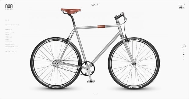
Using minimalist design doesn’t mean you should use minimum colors. You just should use them wisely. Color contrast works perfectly for highlighting vital info and drawing users’ attention to essential elements. E.g. when your main colors are blue and gray, using black color for calls to action won’t make them more noticeable. But when you add a red or orange CTA button to that page, it will definitely stand out and draw more attention.
Deneen Pottery

2. No Clear Focus
Another big mistake that may ruin your conversions is leaving vital things outside users’ focus. Not all design elements are equally important. Some should just serve as a good frame for more vital objects like CTAs, contact info etc.
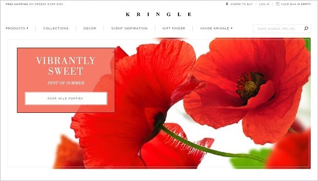
Encapsulation is a common technique in photography that can also be used in website design. It uses natural framing that creates a focus area around an object you’d like to highlight. It provides an effect to the eye similar to that of tunnel vision when your peripheral vision is narrowed to a point.
In web design you can create encapsulation in a few ways. The simplest way is adding a frame around an important element. Simply placing a contact form inside a container makes it stand out of the background. Adding a contrasting color should increase this effect.
Kringle Candle
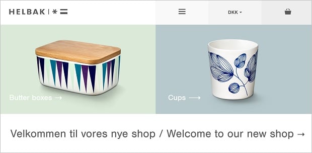
You can enhance important objects by adding so-called directional cues – arrows, pointers, icons – that direct users’ attention to a target element on a page. People just can’t help but follow the pointer with their eyes. This psychological technique has a great value in drawing more attention to your CTA.
Helbak
White space can also be a great technique for creating a focus area around vital elements. Leaving enough blank space around a CTA button or a contact form helps attracting visitors to that area and make them perform an action you need.
3. Unclear Call to Action
To get conversions you have to persuade your visitors to buy from your website. Thus your message has to be clear and straightforward. But sometimes we can notice that calls to action don’t have such a message that really “calls”. In many cases CTAs may not even contain a verb.
Easter Loved by Us
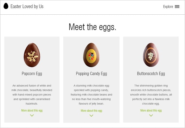
Thus, you should create unambiguous call to action that doesn’t make your users guess what they should do to get your product or service. First, it should definitely call users to perform a certain action (buy a product, order a service, call to your agency etc.). Make sure that call-to-action button contains a verb that pushes users to do that, like “Buy This Item”, “Add to Cart” or “Call Us”.
Create urgency by adding words like “now”, “fast”, “only 24 hours” etc. It pushes people that still nibble at your offer convert faster. The same effect have words that create scarcity: “only 5 items left”, “must go”, “limited edition” etc. Such psychological technique makes people think that the longer they wait – the more they might be pay later, or may even lose a chance to get the product.
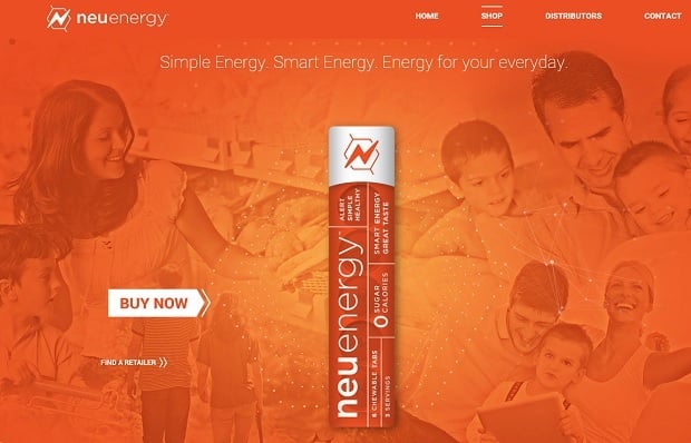
Get Neu Energy
Don’t forget about personalization. Sometimes adding a personal pronoun (e.g. my, yours) makes a call to action more attractive for users.
4. Too Many Product Options
Surprisingly, offering users a huge choice of products may be a case of low conversions. A famous “Jam Study” conducted in one of the grocery stores in Menlo Park, CA proved that people who were limited in options were more to buy that those having multiple choice.
The test compared people’s buying intentions when they were offered 24 jam samples opposite to only 6 options. In the first case only 3% of those who tasted 24 jam options bought a product. While of those who tasted only 6 options the number of buyers raised to 30%!
Quicksprout Infographic
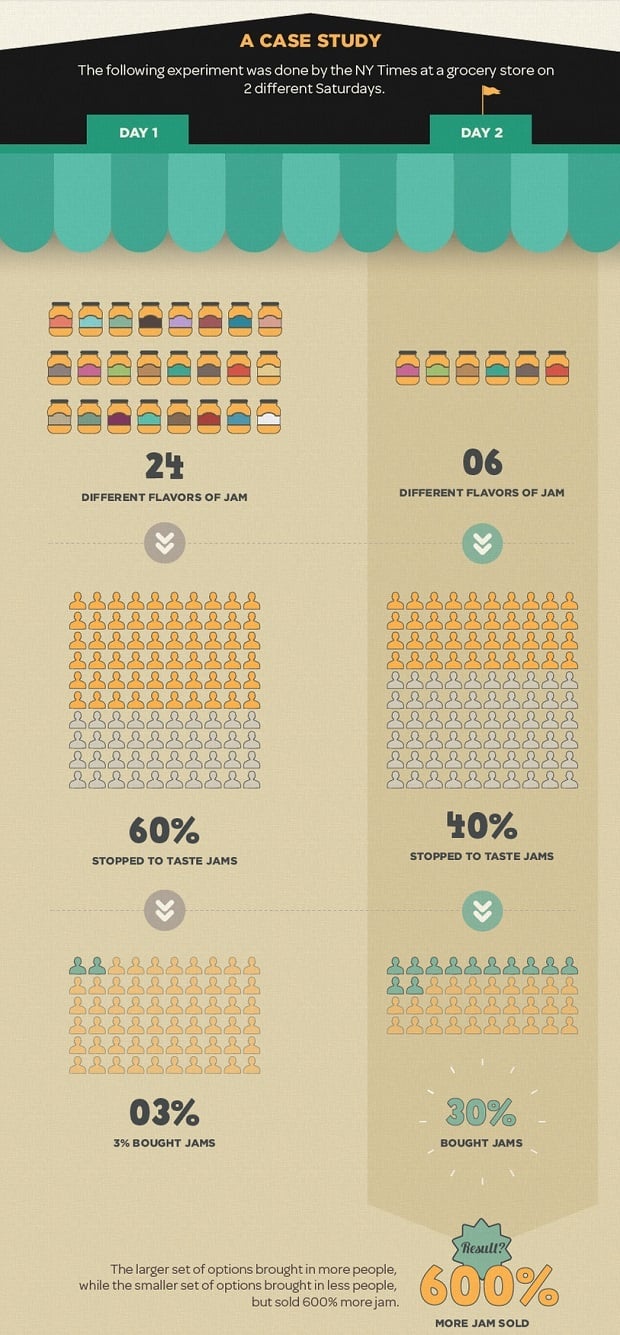
Such phenomenon is known as “analysis paralysis” and is expressed in a total inability of making a decision when a great choice is available. You should find an optimal number of choices that you offer to your customers. Offer no more than 3-6 options at a “See Also” area, and limit your pricing plans to as few as 3-4 options. Test and see what you get in result.
5. No Visual Hierarchy
One of the reasons people can buy from you is that you offer a clear product description with its features list, detailed high-quality photos and accurate price options. When customers should browse a website to find a product description or find its characteristics it doesn’t make them happy.
Another problem may be with small photos without an opportunity to see larger versions. People who buy clothes, furniture or various devices want to see how the product looks from the front and back, see tiny details. When your website doesn’t offer such an opportunity, it leaves users with frustration and even a low price may not persuade them to choose your store over one with larger photos or more clear and detailed description.
When you organize photos and descriptions over the page you should also think of information hierarchy. People who by a TV set or air conditioner are less likely to think a lot about its look. They are more obsessed with its features and technical characteristics. And vice versa, when people buy clothes they wish to see how they look from various angles.
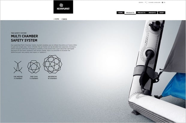
Heimplanet
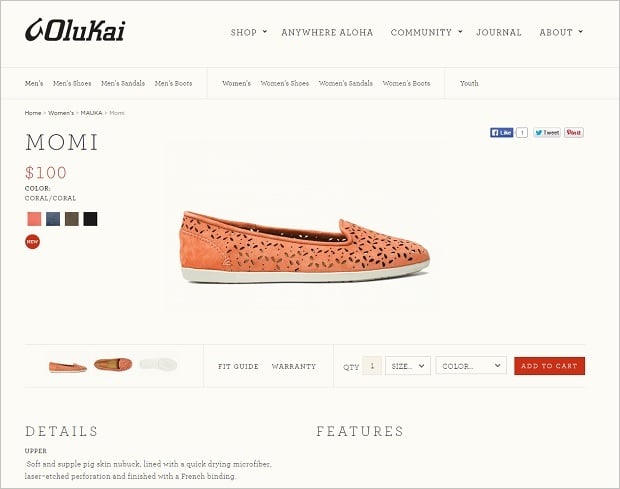
Olukai
You should define what aspects of your product descriptions gain more attention and place them on a page so users could easily find them. Don’t forget about ways people scan internet pages (their reading patterns) and put the most important info before a user’s eyes.
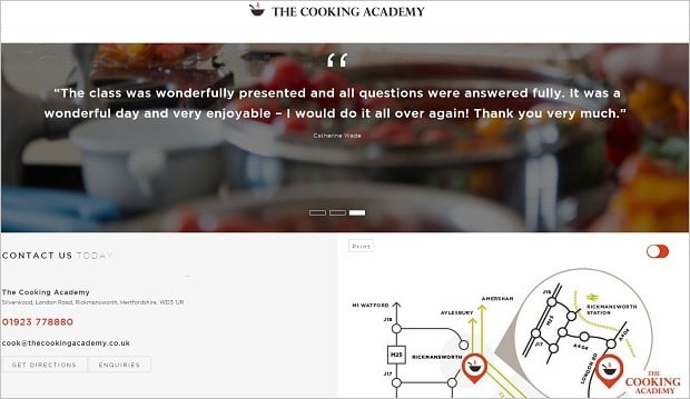
6. Lack of Trust
People are more inclined buying products when they see positive feedback from previous customers. But sometimes online stores owners forget about giving their clients an opportunity to leave their testimonials about their purchases. And sometimes they make leaving review such a complicated process that users don’t want to bother.
You should make communication process before and after a purchase as easy as possible. As well as you have to make testimonials section visible on a page.
The Cooking Academy
You also have to build your brand awareness outside a website. Today people are more likely to boast their purchases on social media that going back to website to leave a review. These brand advocates reviews are a major persuading factor that can raise your brand awareness greatly and bring you new customers. Thus, a website owner should be presented on the most popular social networks and push people to leave their feedback on their account.
You should also establish a good communication with your visitors and customers. Make a clear and easy-to use contact form and allow people report about all problems. Create a perfect customer support and soon you’ll get not only reports about bugs or bad experience but tons of reviews from happy clients.
7. Too Complicated Buying Process
Well, you’ve made it! You persuaded a user to buy something from you. A new customer hits an “Add to Cart” button and gets into a 12-step process of order confirmation. Or sees a huge shopping cart form with multiple fields to check out. Or, like on the Recognition Source website below – a customer can’t even see his cart before he indicates a deadline for delivery. Puffff, and your customer’s gone.
Recognition Source
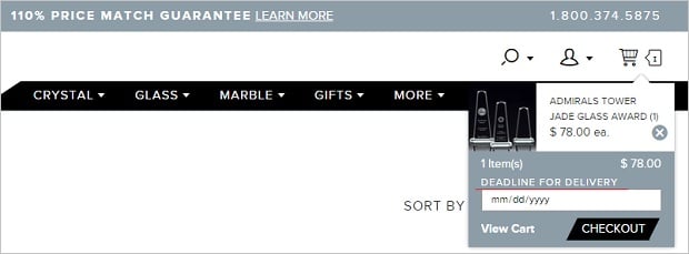
The more info you ask from your customer the lower his or her desire to buy or order something from you. The same thing is for a subscription form or contact form with many fields. The surveys show that when you ask customers to type in their phone number conversions drop by 5%, age – by 3%, street address – by 4%. A classic principle of KISS works the best here. Make purchasing process more simple for your customers and your conversion rates will increase.
These mistakes might not be the only you can spot in eCommerce website designs, but they are the most common and the worst. Try to get rid of these problems and don’t forget to test all the changes you apply.

Real treat to read a genuinely good article. you have covered almost all the points with deep research to create beautiful and effective website designs. what you wrote makes sense. But most internet marketers and unprofessional web programmers make same mistake. love to read it and defiantly will share it in my developers team.
Thank you
Priyanka Jain