Top 5 Responsive Design Mistakes Every Designer Makes
Smartphones and tablets have transformed the way we use the Internet. We now have all of its power in the palm of our hands – and we’re making good use of it.
In 2013 mobile browsing overtook desktop browsing to the point today where mobile browsing is undoubtedly the king. The problem is, whilst the world has changed, some websites haven’t.

It’s not just annoying when a website doesn’t work, it can be damaging to your business or your brand. A frustrating or incomplete mobile user experience can result in lost customers, lost revenue and lost respect.
5 Responsive Design Mistakes to Never Make
The good news is that designing websites that perform well on mobile isn’t rocket science. There are some easy ways you can avoid the top 5 responsive design mistakes – and we’ve helpfully brought them together here for you.
Dragged down by the desktop
Websites are created on a desktop, which is why they work best on the desktop. It’s a lazy way, but it’s a cheaper way, which is why it’s one of the most common responsive fails.
From poor navigation choices to irrelevant and unstructured content, it’s easy to spot a website that’s had a simple thoughtless transition to mobile rather then a comprehensive and clear strategy for development.
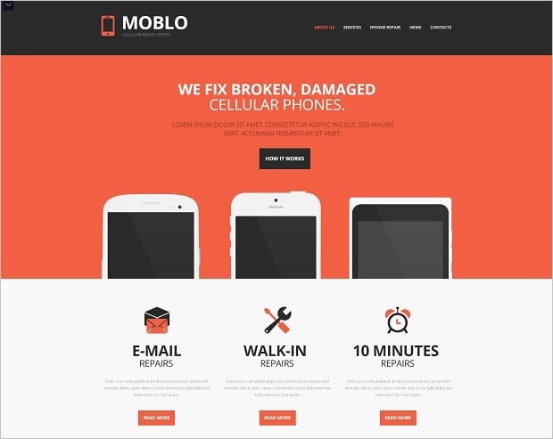
This template offers the desktop visitor 3 options and choices upfront. The mobile visitor receives the same options but scrolls down. Whatever platform you use to get to this website the design, content and structure make it clear what it’s about. Simple, clear and effective.
Mobile Repair Company Website Template
When considering your site, design with the mobile user in mind. If most of your visitors will be browsing your site on mobile devices, it may be worth designing it with mobile at the forefront of your mind.
Tenslife

Mobile browsing is about immediacy – and if it’s not immediately apparent what you do and what your site is about, they’ll switch off. A strong and well structured website demands planning. Create a content structure, message hierarchy and vision for each part of your site, then make sure it functions on mobile and desktop.
Big, bloated and bold images
A picture may say a thousand words, but a massive one on a mobile site may obscure all of the content on your site. Done well, an image based site conveys a sophisticated and contemporary look. Done poorly, it can overwhelm the entire design and distract users from conversion-essential elements.
Large images can not only cause issues with content, they can affect loading times – which is a particular issue for those browsing over cellular networks. Nowadays, we all have short attention spans, so any delays could affect conversions.
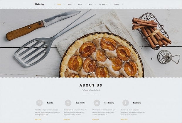
With a template below you can see how your image-led site will appear in various browsers and on various sizes of device. You can switch between them, visualising how the site images and content reformat for each device.
Small Restaurant Website Template
It won’t solve every image problem, but you can ensure that the images don’t ruin the experience for your mobile visitors.
Honey, I shrunk the desktop
Even the smallest desktop screen is likely to be 10 times the size of your average smartphone. Think of how difficult it would be to navigate through a site if everything was 10 times smaller.
This ‘Honey, I shrunk the desktop’ approach to mobile is just plain lazy.
Done well, the mobile experience can be as rewarding as the desktop site. Slum community charity Shofco provides a rewarding responsive experience, with the brand as strong on mobile as on desktop. The hierarchy and navigation are the same, with the charity keen to grab your interest and open your wallet.
Shofco
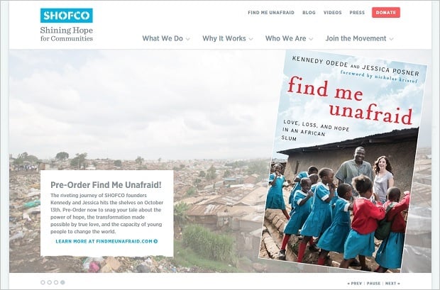
The site offers an experience as rich as that of the desktop site so visitors don’t feel short-changed, but it structured in a way that promoted conversions. Essential for a charity who needs to harness every visit, and maximise every opportunity to raise capital.
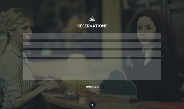
Register and contact forms
So you’re trying to book a hotel room through a mobile site. You’ve found the perfect location, at the best price and now all you need to do is book. But wait. You can’t seem to fill in all of the boxes on your mobile. You’ve changed screen orientation, but it’s just not working. There’s nothing you can do, you’ll have to go elsewhere.
This is at the top of the list of mobile browsers’ pet hates, and yet, it is so simple to fix. In fact, you can do it with needing to know how to code.
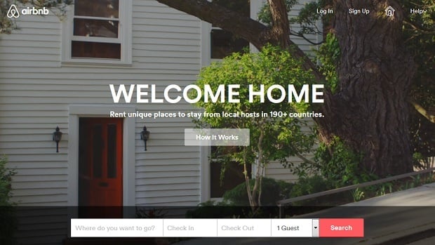
The world’s Number 1 room and house booking site Airbnb.com can attribute much of its success to its no frills approach and simple navigation. The sites brand extends across all platforms, with its contact and booking forms automatically optimised.
Airbnb
Or you can create the same effect with a MotoCMS hotel template. The simple and intuitive content management system enables you to create contact forms which can be dropped into any page. Using the responsive feature you can see how your work appears on mobile, tablet or desktop. Automatically adjusting to provide the optimised browsing experience, it’s easy to get a professional-looking and -performing website with very little effort.
Hotel Website Template with Huge Background Photos
There is a whole science around contact form design, but there’s agreed upon aspect of the ‘less is more’. Only ask for the minimum amount of information that you need. Doing so will maximise conversions.
Finding your way around
A good site makes it clear what it is for, and how you can get the information you want. You may have got the layout sorted, have images that work on mobile, a strong message hierarchy and everything else, but if people can’t find what they need, it’s not going to work.
The first thing to consider is just how users navigate the site. Smartphones and tablets all work via a touch-screen interface, desktop users don’t. Think of how your users will use there fingers to scroll through the site and select options. A small button can be missed or an unclear button touched accidentally, so think mobile when you’re designing your site.
A useful way around this is by using navigational icons. These are increasingly popular, as they convey both context and outcome to the browser, and designed well can be the perfect clickable size.
It’s more fundamental than buttons on your site though. Good mobile UX means having your content and navigation structure clear. It’s about simplification, clarity and focussing on your USP.
If you repair cars, you want them to come to you for a repair. That’s what you do best, so promote it that way.
Innovative Web Template for Car Repair Firm

And before we end here, it’s not about creating even more navigational points, it’s about streamlining and refining the process. Less is more here.
The future is fingers
Mobile browsing is the present and the future. It’s difficult to pre-empt what new devices and innovations will come online. Will we see ever bigger mobile devices like the iPhone 6 or recent Samsung Galaxy, or will be all moving to wearables?
Nobody really knows. If you’re building a website all you need to focus on is creating something that works today for the most possible users. It’s easy to get carried away, which is why using a CMS is actually the perfect option. It’s visual, clear and enables comprehensive cross-platform testing to ensure your website functions perfectly.


Leave a Reply