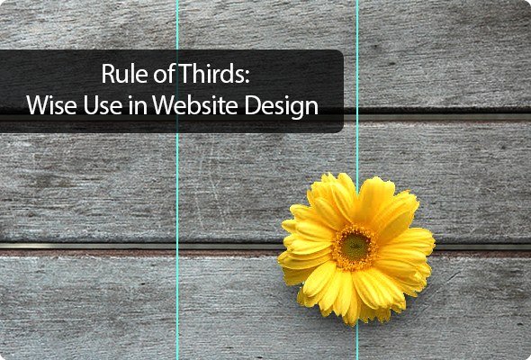
Rule of Thirds: Wise Use in Website Design
Composition is an essential element in web design. Even the most attractive images and creative icons, and fonts won’t work if the website’s overall structure is a mess. Most designers use grid structure to solve that problem and organize the layout. But not all of them are aware of the Rule of Thirds that also can be applied to web design. If you want to make the best startup website design or any other, then you definitely need to know about the Rule of Thirds.
Golden Ratio Theory in Website Structure
Rule of Thirds came out of photography where it’s widely used for creating nice and catchy compositions. Actually, this rule is based on the longtime known theory of the Golden Ratio (or the Divine Proportion). Golden Ratio speaks about perfect proportions of the rectangular shape where the ratio of the longer/bigger part to the shorter/smaller part is equal to approximately 1.618.
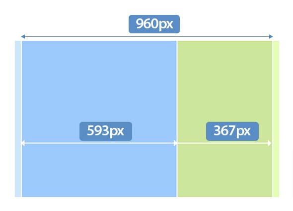
Due to that theory, the layout of 960 px width will have larger block of 593 px width for the content and smaller block of 367 px width for the sidebar. In fact, it doesn’t matter which side – left or right – will be larger, the point is to keep the specified ratio. This Ratio can be found in many things around us and most human creations keep to that rule (such as architecture and its elements, paintings and sculpture). The truth is that Golden Ratio brings balance and harmony to the creations, makes them naturally beautiful and aesthetically pleasing, like in the example below.
Senador Volstead
How to Apply the Rule of Thirds
The Rule of Thirds plays essential role in photography composition and helps creating aesthetically pleasing photos no matter of the subject. The difference can be noticed on photos of the novice photographers that know little of this rule. They usually try to put the focal point object into the center of the composition. That doesn’t mean the photo is bad, but such composition make the picture look trite and boring. Applying the Rule of Thirds to the same photo adds zest to it and makes it much more appealing and fascinating.
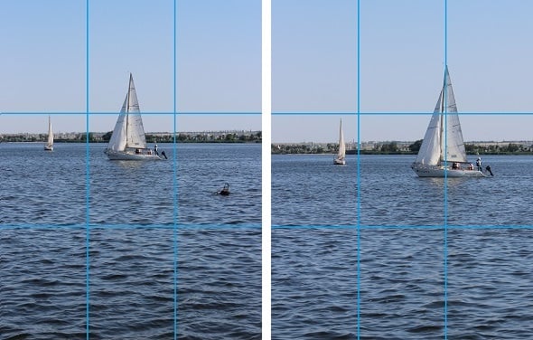
The main idea about the Rule of Thirds is to divide the layout into nine equal sections with the two horizontal and two vertical lines. Each of these sections will take about 33,33% of the horizontal space and the same percent of the vertical space. That’s why they are called “Thirds”. Intersections of the lines form focal points where the main elements of the composition should be arranged. What can be simpler:
- Four lines;
- Four intersection points;
- Nine equal sections.
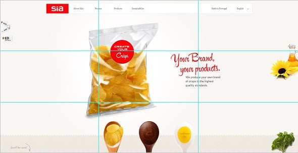
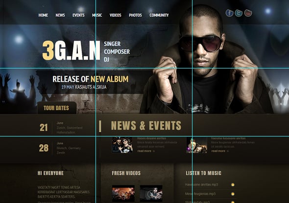
Sia
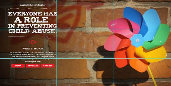
Austin against Abuse
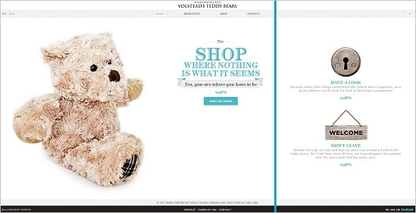
For instance, in the screenshot above we see a perfect use of this rule to photography and the overall Home page design. The main photo element is arranged alongside the right vertical line, while two major design elements (the texts and the buttons) are placed into left focal points.
Similarly, the screenshot below shows the website moto placed in the upper-left focal point while the navigation menu is arranged along the bottom horizontal line.

Benefits of the Rule of Thirds Use in Web Design
Applying the Rule of Thirds to the website design is much easier than calculating the Golden Ratio. If you are not on friendly terms with mathematics you can use the Rule of Thirds and still get amazing website with perfect proportions and aesthetics.
Those websites with traditional layout use the Divine Proportion by placing the sidebar to the left/right part of the screen and leaving room for the main content. For others the use of the Rule of Thirds here may help creating stunning layouts that raise conversions and attract visitors to stay with the website. Applying the rule-of-thirds-based grid to the layout may help the designer to find out where the accent should be arranged and what elements are better to place onto that grid.


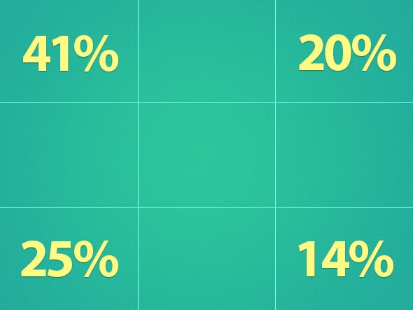
The studies reveal that each point of intersection draws attention differently. The eye path usually starts from up to down and from left to right similarly to the capital “F” shape. Thus, the main attention will be fixed on the upper-left point of intersection and then move on to the bottom-left part.
So it’s the best place to arrange the logo of the site, important info about the owner or some essential navigation buttons. Various plug-ins and widgets will also be more visible if placed closer to the points of intersection.
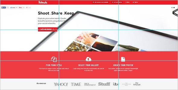
The Posterista Home page places the call-to-action button right at the upper-left intersection while three other call-to-action blocks are arranged alongside the bottom line.
Posterista
The Sport Leverage website makes use of the Rule of Thirds by placing the navigation menu right in the upper-left intersection point.
Sport Leverage

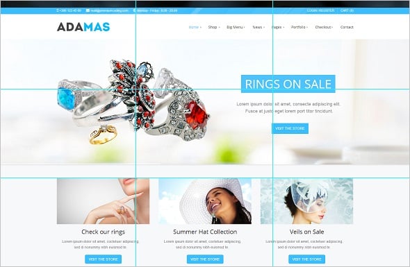
The luxury store Adamas makes use of all four focal points placing large photos of the products and call-to-action buttons into upper intersections, and adding more product photos closer to the bottom focal points.
Adamas
Home page and the part above the fold are the key areas where the Rule of Thirds may be applied. It’s where the main info about site, navigation and content is accumulated. However, the pages and content below the fold may also be improved with the use of the Rule of Thirds. It is usually not so essential for conversions but helps to enhance the UX and create an overall aesthetic look.
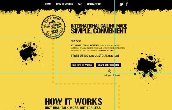
The example below shows the use of the Rule throughout the website. The main focus point (call-to-action logo) appear on the upper-left intersection and while you keep on scrolling it moves alongside the dashed line and appears exactly at the next focus point on the right bottom side, and so on and so forth.
1300 Just Dial
Rule of Thirds is absolutely universal and may be introduced to almost any website regardless its theme, aim and subject matter. Nonetheless, news sources and advert-loaded websites make use of the Rule more than others. The Rule helps to emphasize the important news and drive the eyes to advert that is often arranged along one of the grid lines like in the template below.
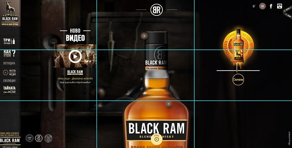
The whisky website placed video about its product right in the focal point onthe upper-left side.
Black Ram Whisky
As long as the Rule of Thirds is a great photography tool it may be perfectly applied for background images of the website design. Try to keep in mind the future arrangement of the website elements when cropping and editing the background image to add a proper sense of energy, movement and highlight the important elements that are arranged over the background pic.
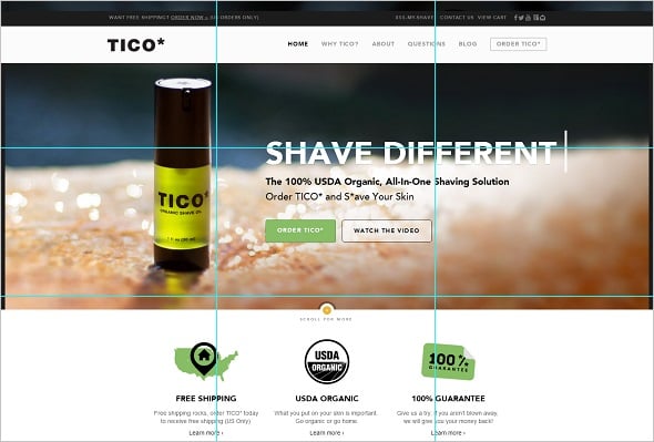
Thus, the Tico Shaving website places the background photo of the product in focus alongside the vertical left line. The main characteristics of the product are noted below the photo along the horizontal line. A shor appealing phrase appears along the upper horizontal line.
Tico Shaving
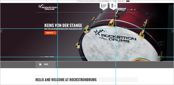
The same idea is implemented to the Rockstroh Drums site. The drum as the main product of the company is placed in the focus intersection on the right while the button is arranged exactly in the upper-left intersection.
Rockstroh Drums
The templates with a website builder below also make use of the background photos placing their focus points according to the rule of thirds. The important design elements are arranged along the lines and points of intersection.
And don’t forget to break the rules from time to time. Shifting elements a bit aside of the focus point or arranging the blocks higher or lower the grid line may create a stunning effect and drive more attention that neatly organized layout. You can focus only left/right thirds to place the elements, or center the blocks and buttons horizontally.
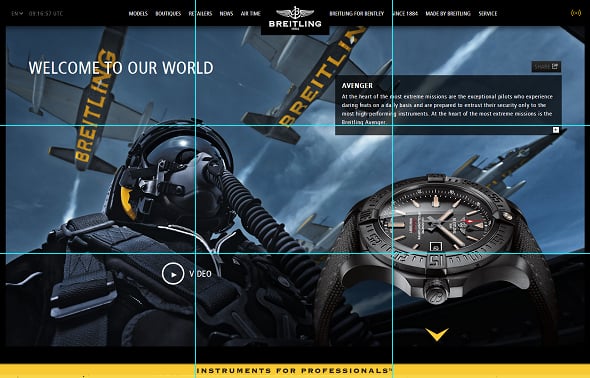
Breitling
Thus, the Breitling website focuses on the right line instead of the left one that is considered more powerful.
Website Template with the Rule of Thirds Use
The template below makes a good use of the bottom-left intersection by placing there a large ghost button.
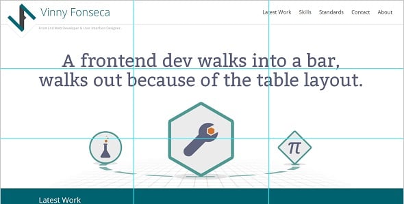
Vinny Fonseca
Website of Vinny Fonseca implements the arrangement of the main elements along the bottom horizontal line. Additionally, the brainy quotes that appear on the Home page are arranged along the upper horizontal line.
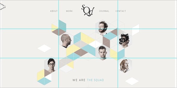
The Squad
The Squad uses the Rule of Thirds in its entirety. They arrange their team profiles next to all four intersections. Geometry elements on the background are arranged asymmetrically what adds zest to the design.
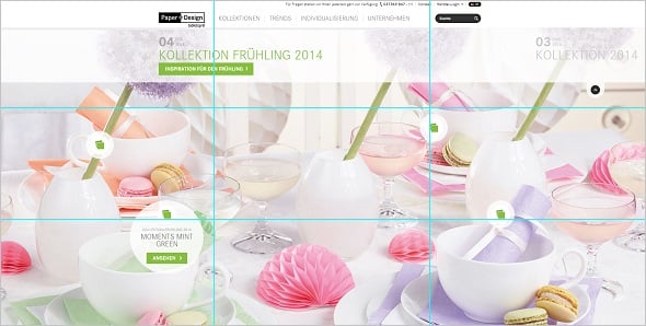
Paper Design
The same idea is used on the Paper Design site. Clickable buttons that lead to the products are arranged closely to the four focal points.
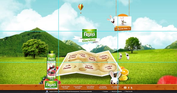
Enfants Fruiss
The Home page features main focal point (the juice pack) arranged in the bottom-left focal point along the vertical line. Additionally, the funny animated mascot appear diagonally to that focal point – in the upper-right point of intersection what makes the design off-beat and attractive.
So, add more creativity with keeping a balance and order in mind to have a unique layout.