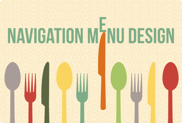
Navigation Menu Design: Latest Trends
Navigation menu is a key element for any website. All design tricks and visual manipulations will be useless if a visitor won’t find the necessary information and leaves the site fast. Navigation menu is one of the most popular ways of conducting people to that info.
Many years menus were seen as a simple bar in the header that guided visitors through the site’s categories. The latest trends show that navigation menu design has changed and nowadays menus are not the same they were yesterday.
Use of Keywords in Navigation Menu
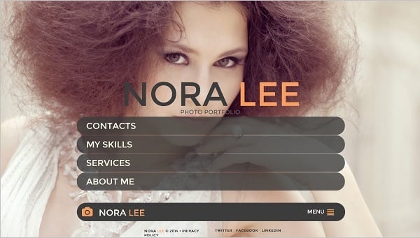
Prominency is a key concept in navigation design. To make navigation menu clear and visible, tabs are grouped into blocks that are created in one size and style. Such blocks are usually lined up and placed in a prominent part of the site.
Most menus are based on words. It’s a set of keywords or labels that are simple and easy-to-understand for most visitors (Home, Contacts, Shop, Blog etc.) Many sites use these standard labels or their synonyms that are associated with the page information. Today sites start using so-called “speaking” labels that include explanation texts. Such explanations make keywords more prominent and easier to perceive. They make sure the visitor will find exactly what he or she needs.
Image Mechanics
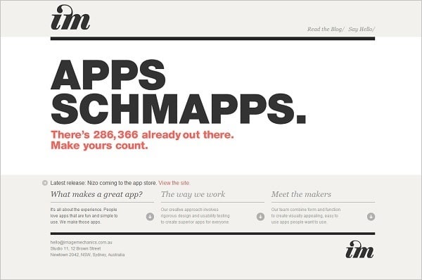
Another popular trend is addition of icons and pictograms to the menu tabs. The idea is the same as with “speaking” labels – to make the menu functions more clear, prominent and… fun. Nice attractive icons make menu a playful design element that makes site browsing a pleasing act. “Speaking” labels may be used in combination with icons to attract attention to the tabs and make their contain more comprehensible.
IUVO
Into the Arctic
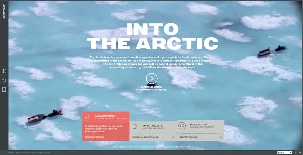
The only restriction: such icons and images should be clear and “speak” unambiguously about the content they link to. This example below shows not the best use of icons for the menu, because they don’t offer a clear recognition of the site category where this icon leads.
Carbonmade

Menu Position on the Site
Menu position also changes today. Most websites are still placing the navigation blocks at the top of the screen, above the header. However, the responsive design trend requires more flexible menu position. That means navigation menu tabs can be placed in any part of the screen to make it possible using menu on any type of device.
The Bullitt Agency
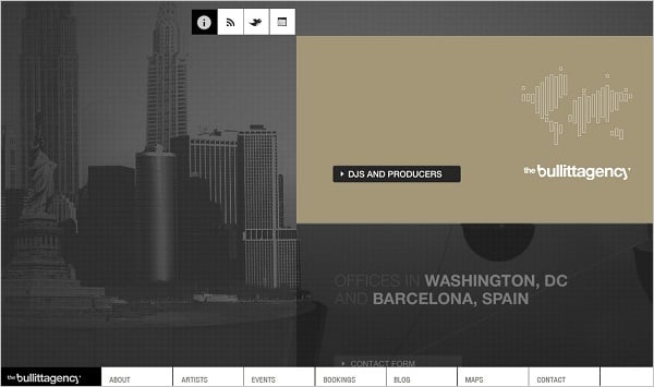
Modern designs include navigation menu positioning in center what makes it prominent for visitors and draws their attention. Left- and right-side positioning is also popular. It makes navigation menu not only functional but emphasizes the style of menu as a design element.
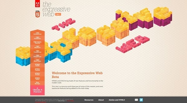
Website Template with Center Navigation Menu
The Expressive Web
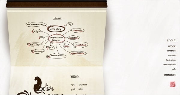
Wing Cheng
Responsive Web Design Trend in Navigation Menu
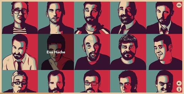
The responsive design trend makes impact on all web elements. Due to responsive web design requirements menu tabs, their typography and icons are getting larger. Many websites use grid-looking menus that take all visible space of the home page. Usually those are large images that lead to certain content of the site.
Humoristas
Francesco Bertelli
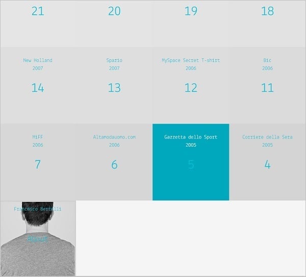
Large pics and huge buttons that take almost all space of the screen are perfect for responsive web design. These solutions are meant for touchscreen devices that suggest tapping the screen instead of clicking buttons with a mouse.
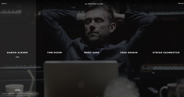
The Creative Class
Sismo Design

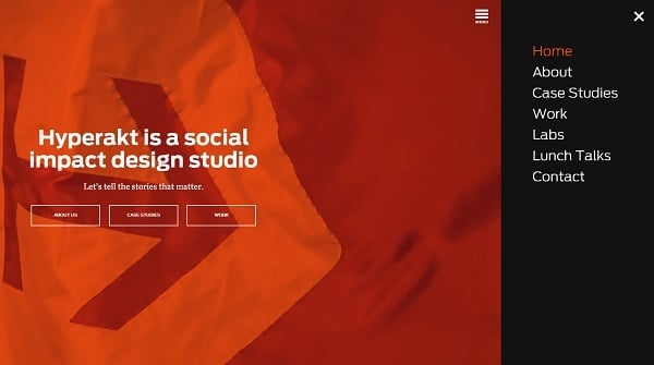
In fact, there are many means of hiding navigation menu and making way to other content on the screen. One of such ways is sliding menu that iOS developers call “shelves”. This menu appears on the side of the site only if clicked and hides everytime when user doesn’t need it. Another type of such menu: it appears and a small menu icon in the corner that reveals the menu tabs when clicked or tapped. The other idea – is to make a drop-down menu that will be placed in one of the corners and used if needed saving space for other design elements and content.
Hyperact
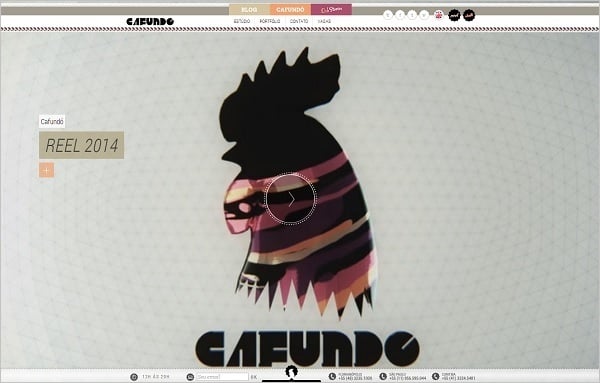
Website Template with Hidden Menu
Cafundo Studio
Due to recent one-page sites trend in web design many sites often neglect menu and replace it with a few buttons. It is most noticeable on websites that require heavy scrolling. In any case, responsive web design is to make navigation easier for all device users, no matter how small the screen size is.
Special Effects in Navigation Menu Design
Unique designs trend forces web designer to create unusual menu tabs that represent personality of the owner. Everything can be useful: unhackneyed icons, unusual keywords, sound effects, 3D and hover effects etc.
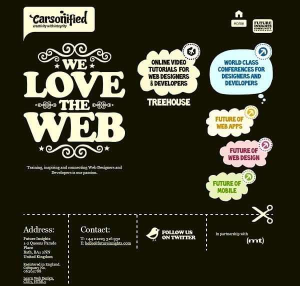
Duplos

Carsonified
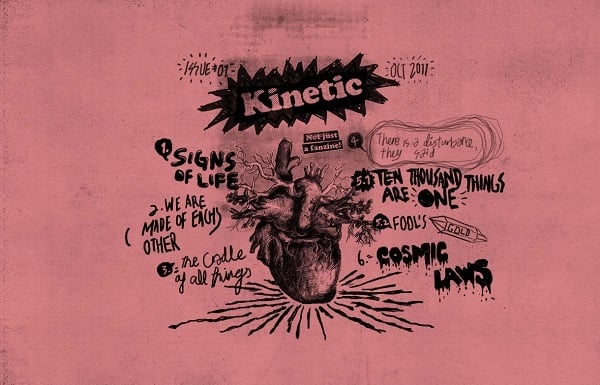
Sound effects are used for many sites and not just for navigation menu. Sounds that appear with hovering through the menu may sometimes be annoying but their functionality is obvious: making clear for visitors that those buttons are clickable. It becomes very useful for too unique and extraordinary menu designs when visitors may sometimes be tricked is this a navigation menu or just a whimsical design element, like with this design below. A heavy use of handwritings makes this menu unique and extraordinary, but at first sight it’s hard to understand that you see a navigation menu.
Kinetic
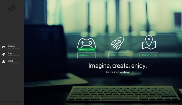
Hover effects are almost a must for any button on a site and menu tabs are not an exception. They help to understand that we have here not just a simple design whim but a clickable element. Sometimes those effects may be used in the most weird way that may have unexpected and confusing impact. The site below offers such impact offering the hidden menu that becomes visible only when clicked. To browse the menu tabs you should keep your mouse clicked. At first sight such effect looks extremely appealing and futuristic. Functionality is not the strongest point of this design, though.
Nickad
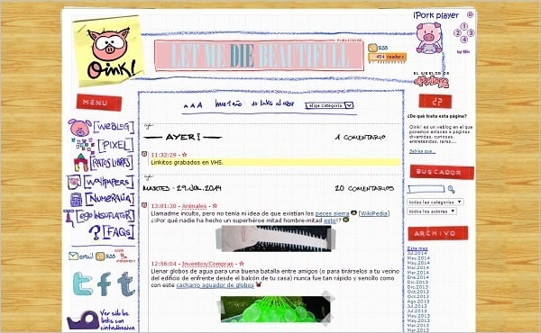
Typography is the element that is heavily used in menu tabs design. It may be huge elements that draw attention without any effects, or handwritings. The use of handwritings is another trend in design of navigation menu that gained many backers. Large typography is a perfect solution for responsive web design.
Oink
Treme

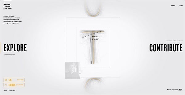
The Universal Typeface
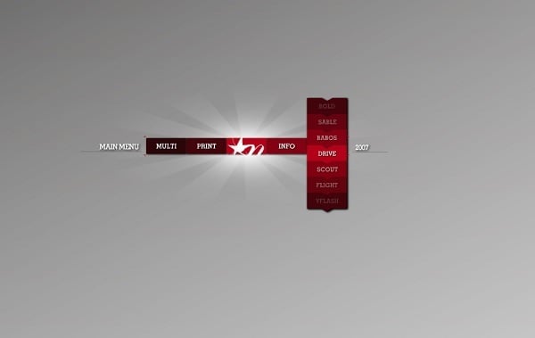
Some designs use typography for the menu in vertical style as a nice solution to make a unique menu design. Such design takes a lot of space and makes reading labels a bit harder, but it looks unusual and draws attention at least.
Your local Studio
Those were the most popular menu design solutions. Unique and original designs are always trendy, but in case of navigation menu clean and unambiguous style and clear functionality should be put in the forefront.
3 responses to “Navigation Menu Design: Latest Trends”
Leave a Reply


Definitely some attention grabbing/eye catching examples here. I personally prefer functionality over aesthetics since it’s more user friendly and less distracting. Cool stuff though-thanks for sharing
And thank you for reading! I just tried to add really bright and distinctive examples to show design ideas in full bloom. Of course, functionality is in the first place, but creativity is the zest that draws attention. I like design and functionality perfectly balanced =)
Definitely a good list of navigational trends!