Flat Design vs. Material Design – Are They So Similar?
Flat design is a good old friend for many designers. Along with minimalism, it seems to be that trend that never fades away. It allows creating beautiful designs that at the same time have great performance, load fast and provide a perfect user experience. Unlike skeuomorphism that ruled the world a few years ago thanks to Apple, Flat provides more opportunities for responsive design since it doesn’t overload the browser.
And then it happened… Google has introduced its Material Design concept and explained its principles to app designers. First it appeared in design of the Google’s App Store layout. Then, all Google services were dressed with this pink of fashion. In recent times more and more websites introduce Material Design elements to their designs. But hey, look at those elements! Don’t they look the same as in Flat designs? Or do they? Well, let the battle Flat design vs. Material design begins!
Round One: Flat Takes Over Skeuomorphism
Skeuomorphism looked a perfect design solution when it first appeared on Apple’s products. It was a really revolutionary approach connected to touchscreen debut. It made it easier for people who were used to bar phones with physical buttons passing to smooth glass screens with no feel of pressing or clicking.
But then Flat design came forth. Just in time when people started getting tired of over-decorative and over-natural look and faux-realistic feel of skeuomorphism. The negative reviews grew and people started moving to less whimsical, more light and more user-oriented designs.
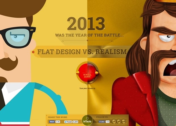
Flat vs. Realism
Usually it associates with Windows 8 Metro style that sets aside all those bells and whistles that made skeuomorphism so reality-like. Flat has brought to web design simplicity and freshness that Apple’s designs lacked. Even Apple designers admitted that skeuomorphism is an outdated trend. Their Senior Vice President of Design, Jony Ive pointed out in one of his interviews that “we understood that people had already become comfortable with touching glass, they didn’t need physical buttons, they understood the benefits.”
Indeed, people are getting used to what elements of design may look like. They don’t need to see a tri-dimensional button to know it’s a button. A simple colored rectangle with a call-to-action text on it makes it clear for them.
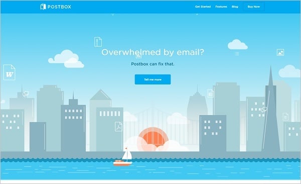
Postbox
Flat stays popular all these years due to its everlasting elegance and simplicity that doesn’t need heavy decorations and 3D objects use. It looks perfectly well on low- and high-resolution screens as well as on Retina displays. With the raise of mobile internet, Flat kept its positions thanks to lightness of designs that don’t slowdown connection speed and allow websites load lightning-fast.
Next Match
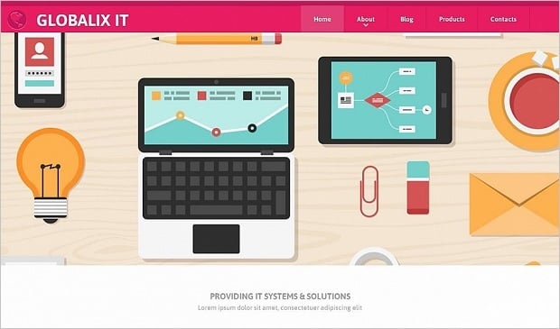
Flat Web Template for IT Services
One of the main advantages of Flat design is that it finally puts functionality to the forefront. Visual pizzazz is set aside to the advantage of a user – user experience means more than any decorations. It doesn’t matter how the object looks (at least it’s not crucial), it matter how it functions. With the use of simple and elegant buttons, icons and menus user can easily navigate through the website without distracting on the elements look itself.
Round Two: Flat Design vs Material Design Challenge
Like other trends that make classics with time, Flat evolves and adapts changes. The main criticism on Flat designs is that in some cases there are no obvious evidence whether the object is clickable or not. On Flat websites all elements looked flat and plain, and designers usually had to set up hints to define clickable and functional objects.
The first idea of defining such objects was realized in a form of Long Shadows. It’s not much details on Internet about who invented Long Shadows or who first applied them to designs. You can find some interesting info in interview with Jeff Escalante who seems to be the first person noticing and describing this effect.
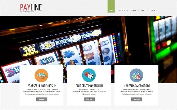
Online Casino Website Template with Flat Icons
The fact is that Long Shadows was the first step from simple Flat design to something more material. They added a dash of volume to plain elements and made them stand out of the surface. There were many backers and haters of this element, but the idea was so popular that Long Shadows appeared in designs of many IT giants like Google and Apple.
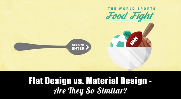
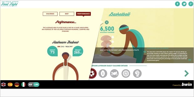
World Sports Food Fight
Finally, last year Google went much farther and introduced it Material Design concept. Main principles of this issue were introduced to public in a special document. The criticism raised immediately after this publication. Many claimed that Google just took Flat design simply adding shadows to its elements. Other blamed Google for rolling back to skeuomorphic decorations. It seems that no one stayed indifferent to this innovation.
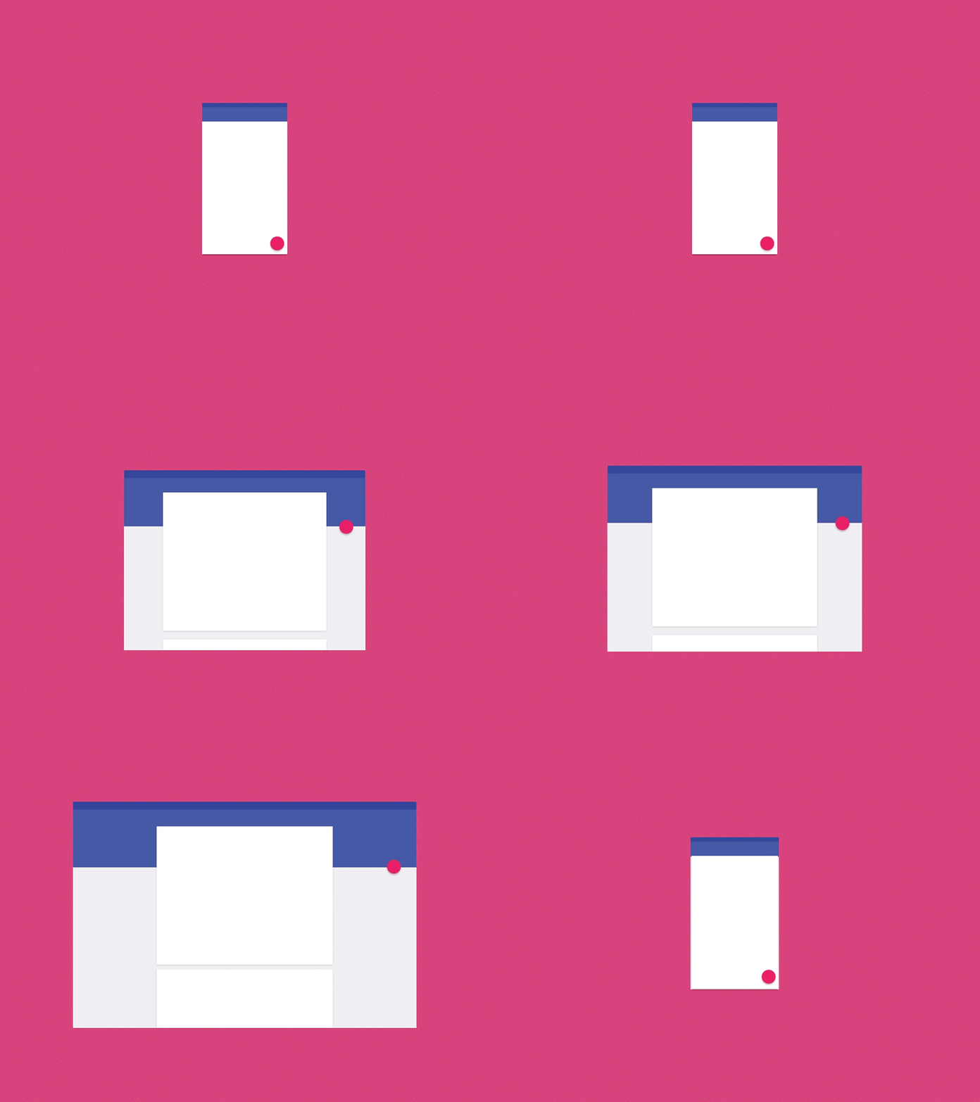
Keynote Animation Material Design
The main innovation that differs Material Design from Flat is the use of Z-axis. This third dimension adds volume to a flat object and makes it more “real”, like you can feel it. This is a flatness of paper. Have you ever tried origami? This is what Material Design can be compared with. Numerous pieces of paper that fold, contract, reshape, stack up on your screen.
DiskForYou
Google itself refers to that principle like a metaphor. It recommends to see and treat Material like a real object but extremely simplified, without making it a digital equivalent of a real item. This idea is closely related to the second principle of Material Design: “hierarchy, meaning, and focus.”
Every element of Material design bears its own function. Thanks to design principles these functions are clearly identified. You can easily tell clickable elements from non-clickable, buttons from decorative gimmicks. This was often ignored or not specified in Flat, and vice versa, these hints were too obtrusive in skeuomorphism. Human mind has become familiar with many functional design elements during recent years and doesn’t need hyperrealistic “quotations” to understand how the object works.
Pros and Cons of Two Styles and Conclusion
With all that said above, I should mention that good-old saying that there is no one-size-fits-all solution. Both styles have their advantages and drawbacks. You should consider your website individual specifics to choose the best option.
Pros and cons of Flat design were thoroughly examined in many articles and reviews. Let’s name the most distinctive here.
Pros:
- Minimalism of a visual part of design;
- Focus on usability, not on aesthetic component;
- More lightweight design that leads to faster loading speed and less bandwidth consumption;
- Users are focused on content, not on visual attractions;
- Extremely mobile-friendly;
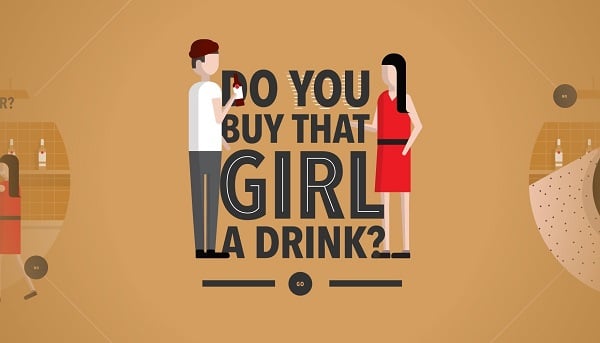
Do You Buy that Girl a Drink
Cons:
- There’s always a danger of creating a too plain and generic-looking website design;
- Due to its minimalistic nature, it’s harder to find resources for branding and promotion;
- Lack of shadows and visual accents makes harder to tell clickable and non-clickable elements from one another;
- Its recent popularity makes it harder creating a really unique or contemporary-looking website.
Material Design is a new trend that seems to be taking into account most considerations about Flat. However, it’s not all roses.
Pros:
- Like Flat, Material Design provides an elegant minimalist look of design;
- A use of Z-axis makes objects more realistic without sliding into skeuomorphism;
- Detailed guidelines leave no room for guesswork and help novice and professional designers in creating Material Designs;
- It’s a really user-friendly design that clearly states functions of any vital element with a help of design techniques;
- It’s a great solution for responsive websites making a design consistent on any device and mobile-friendly;
- Motion is one of main principles of Material Design. Addition of movement and slight animation is used not for decoration but for UX improvement.
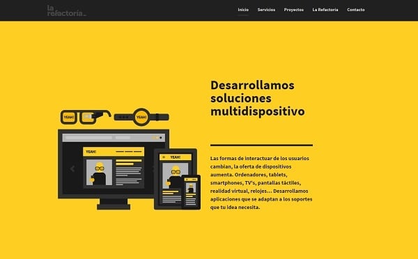
La Refactoria
Cons:
- Closely tied to a Google brand. Whether you implement its principles to your website – everyone will unintentionally associate your design with Google. So, it makes creating a unique design a real challenge;
- Not any system allows implementing Material Design principles fully. It narrows your choice of a service;
- Animations are good for usability, but slower website speed. But if you don’t implement motion – it’s not really Material Design;
- Takes a bit longer to create it than Flat. However, any project is time-consuming.
Despite the similarity to Flat, Material Design plays its own game and, I hope, continues to evolve. Criticism is only shows its weak points and forces Google to improve its concept. First focused on app designers, it now emerges on website designs. That means Material Design is definitely a trend that stays with us this year and… who knows how long it will?!


Leave a Reply