How to Make a Consulting Website: Best Practices
Sometimes it’s hard to decide which design to choose among a variety of available website templates. We understand your doubts. It is especially critical when the online sphere is strange for you though you don’t feel as usual in it. We don’t think it is too hard for you to deal with a well-known business under new circumstances. However, we offer you our help to make the web integration process more easy and fun. Learn how to make a consulting website on the best practices from MotoCMS below.

How to Make a Consulting Website
This article will give you an overview of a successful use of consulting templates. We have many designs of this kind, so you won’t feel a lack of good demonstration examples. All the consulting website templates from this post can be looked through or tested for free (not to mention the purchase at an adequate price).
Which Colors to Choose for a Consulting Website
Let’s try to define which color combinations are good for consulting websites. There are a few solutions that seem to be promising and challenging. You can choose a ready-made theme made in these pallets or edit the one you like to make it more industry-friendly. If you have a consulting template with CMS the editing process will be quite simple and pleasant. Otherwise, you need to work with a graphic editing software like Adobe Photoshop and edit some lines of code in template files.

Navy (dark shape of blue) is the most popular color in business designs. As it is associated with power, confidence, stability and authority (military and police uniform is often dark blue) this color is considered beneficial for serious companies. Dark blue elements don’t imply tricky and fun things, they discipline and bring order into daily tasks.
Instead of the positive impact of dark blue on human perception be careful with its hues. A bad use of blue tones can cause some negative impressions on you like sadness, conservatism, aloof and so on. To avoid such effects don’t choose colors separately from the entire design. Test a few of them to find out the best combination.
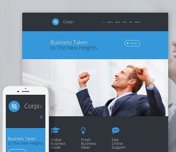
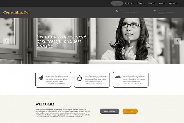
Here we have a consulting company website template designed in blue shades. In it you can see dark blue and white colors that are perfectly combined on the background. It provides good visibility for all design elements and perfect texts readability.
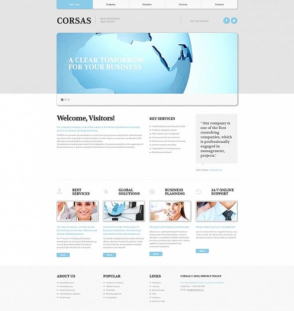
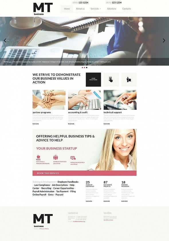
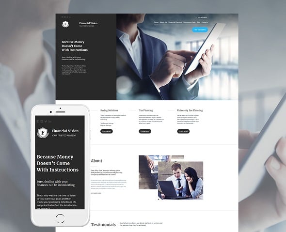
Clean color schemes are also popular among consulting services providers so you won’t regret if you choose a minimalist layout with light background. For years white is considered to be an all-purpose background – and there’s a reason for that. It is easily combined with other colors except too light hues that blend with each other. Sometimes we can see this mistaken effect when designers try to create a flat design but overdo it and get too faded pages.
That’s how a well-done business consulting template can look when designed in light colors.
If talking about web pages colors we need to remember about separate content backgrounds. It’s a common thing on the web to use different backgrounds for web pages and content sections. It’s rather convenient for viewers because it helps to divide paragraphs for better browsing experience.
Here we have a nice looking life coaching website template. Except creamy yellow website background it has several sections colored in shades of brown. The range of colors is not wide, but they do match each other and don’t prevent users from getting information. Remember that it’s quite tricky to use more than 3 tones within one project. Don’t choose designs like that if you are not sure in the quality and designer’s skills.

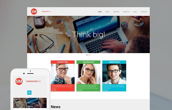
If you still want to look bright you can pay attention to metro style web designs. This is a trend that has started out in 2013 for people who like to combine modern and minimalism. As metro designs are still popular on the web we find it necessary to figure out distinctive features of the metro style.
- Content centered design;
- Bright contrasting colors;
- Colorful bricks as content and menu background;
- Prevailing of large typography;
- A wide use of icons.
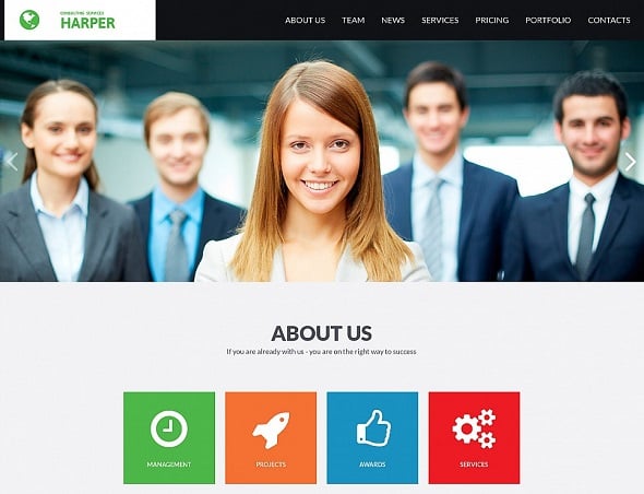
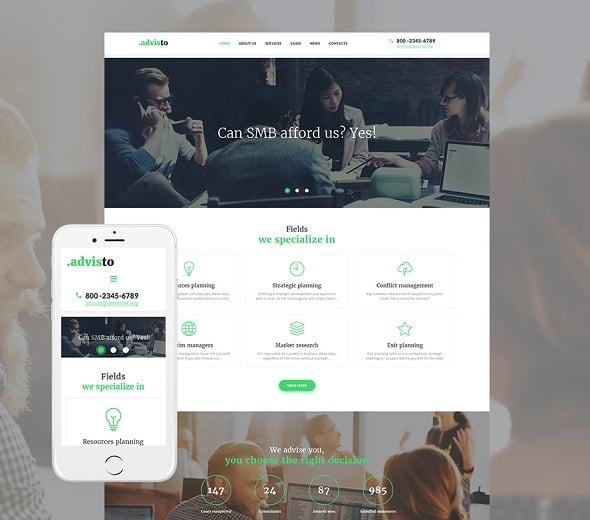
In general, all metro websites look rather creative. Thus if you’re running a consulting business and some regular designs can turn out too informal for you, go ahead and check out metro designs. We can recommend you to use consulting templates with white background and a few colorful bricks featuring the most important information. Here we have two examples that are done in metro style but still perfectly suit business company needs.
What’s About Website Content
Filling your new site with content is probably the last step you’ll have to take before publishing it to the web. It’s quite natural because you don’t know how many texts and pictures you’ll need until the layout is completed. Till that time you can write draft copies and wait.
So what kind of texts should you prepare? You definitely need to have About us, Contacts, Services and Home pages. This is a basic requirement for any business website. More enhanced site structure needs additional pages. If you work with a CMS-based theme you can create numerous pages within a few minutes. Content management systems have special ‘recipes’ to save you many troubles.
Let’s define categories of site visitors who may read your texts from A to Z.
- Current and potential clients;
- Current and potential partners;
- Job seekers;
- Investors;
- Competitors.
Your reputation depends on what these people see on your site and how they interpret it. Thus the simpler and clearer your copy is the more chances you get to be understood the right way. Thus whether you hire a copywriter or create website texts yourself stick to the journalistic style of writing. Too emotional copies with superlative adjectives and epithets won’t help you win clients’ confidence. On the contrary, they will reduce websites trustworthiness level.
If you take a serious care about pages filling (we hope you do care about that) there are different categories of content that different people will be interested in.
Mission and vision. This is a kind of vague information that the majority are used to neglect. A few general featureless phrases are often everything you can find about company values. It is a wrong approach because many business people look for partners to share their own points of view. It does matter on every turn of cooperation and every time people see dull paragraphs you may loose potential investors or partners.
Who we are info. There is a team of analysts behind every consulting website and it’s a good idea to present the most distinguished of them for your audience. Clients who are seriously aimed at collaboration would like to know key employees of your company. That will increase the level of confidence and help you win client’s favor.
Career info. This section or page is not obligatory but all large consulting companies of different spheres have it. As any active business your departments can require new staff member as well as a base of potential employees.
Photos and images. If looking through several consulting templates you will find that they include common stock photos which are neither personalized nor are they creative. At first sight it seems strange but, sometimes it’s a quite good idea to apply ‘faceless’ images. Business websites are content oriented and all graphics you use should complete web pages look (not to entertain visitors). Maybe commonly used stock pics are not what you need but they are good examples of those graphics you should try to apply.
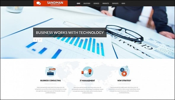
In consulting designs it is not common to rotate images in sliders without supplementing text. Content sliders look more solid when featuring pictures with call-to actions. When using transparency effect or colorful shape layers it’s possible to enhance short slogans and to make them descriptive. To see a live example of such designs click the current screenshot of the consulting company website template.
Clients testimonials. Featuring customers feedback is a common thing on the web. If your business is young you shouldn’t create this section because a few pure comments won’t convince visitors to trust you. Some may think that it’s easy to collect positive reviews by asking friends to help with them, however this way is also mistaken. To look trustworthy you need to have both positive and negative feedback. It’s quite natural to have clients who are not completely satisfied with some minor aspects of your work. People easily forgive insignificant faults when they don’t seem to be harmful for them.
Consulting services. It’s a good idea to shortly describe what kind of activity you’re focusing at Place this info at the home page and then showcase a full list of consulting services at the special page. Frankly speaking, bullet lists work great for any kind of content. They are very easy to read and don’t look massive like solid text.
The following business consulting template with a short generic phrase below the main menu explains what they do for customers. An image slider also specifies the most asked-for services and a full list of consultation options is available at the Services page.
Almost any website template has Services or Products page. If somehow it is missed but this is just that very cool theme you like you can make over any other page to match your requirements.
Blog. Online industries are highly competitive and it’s really hard to find and retain clients. A wide variety of companies providing consulting services causes the situation when it’s not enough to be just good. You have to be super good and to have answers to all possible questions.
Corporate blog is one of the ways you can solve this problem. If you have free hands and clear mind to write interesting and useful content you have good chances to succeed.
Place a link to the Blog page at the main menu and feature excerpts of the latest or the most popular articles somewhere at the Home page. You can select an area in the footer with a view to showcasing blog news.
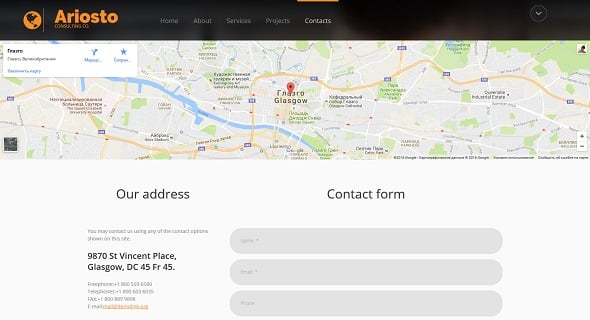
Contact details. If talking about a contact form it can be as much detailed as possible. When designing a template designers don’t know which fields you would need and that’s why they create some random ones that you have to edit.
Most likely people won’t leave their personal data even if you insistently ask them about it. However, it’s quite natural to fill a few fields with basic required information like name, email, subject and message. Such contact forms work good when being placed on separate pages. A map with your offices locations can also be featured there. It is suitable for local businesses rather then large ones. Google Maps embeddable map allows to freely integrate interactive maps of any area in the world into your website. Some themes imply this feature by default, others require a certain understanding of HTML to make it work right.
If you have several departments that interact with clients, partners, investors or mass media show their contact details – especially emails, phone numbers and fax numbers.
If you decide to share your email address with everybody within the Contacts page remember that it can be crawled by unfair spammers and stored in their databases. There is always a risk to find hundreds of unnecessary and unexpected emails in your Spam folder or even in the Inbox. Thus if you still want to display email address make it wisely by typing youraccount at gmail dot com instead of [email protected]. Most of the spam bots are not able to recognize such addresses, but it’s easy for understanding for real people.
Another way to protect your public email is to display it as an image. It is also unrecognizable for bots, however people will need to re-type the address manually. To predict wrong spelling choose simple and understandable account names.
That’s all for today! If you want to explore more consulting designs they are waiting for you right here!
Conclusion
We tried to show you more interesting and useful features of consulting templates. Additionally, we wanted to expand your understanding of what can be done with these business designs. Hopefully, we succeeded in doing it.
Ultimately, nobody is a perfect designer from birth and it is not a shame to ask for help or to get a ready-made website template. It’s a way to become better online businessman and to help your brand be associated with brilliant designs. So go ahead and test our website builder free of charge with a trial version and create your fascinating design right now.


We tried to demonstrate you more exciting and useful functions of talking to layouts. Furthermore we desired to flourish your knowing of what can be done with these company styles. Hopefully we been successful in doing it. Spybubble
There are a lot of great best practices outlined in this article. Four out of five B2B buyers will look at a consultants website before doing business with them, so presenting them with a clean, professional website is a must.
I liked your section on color psychology. Simply choosing a nice scheme of blues for your website can help you establish a professional and credible first impression.
If you want to see my version of the idea Consultant Website Template, which features many of the practices outlined in this article, you can do so here: ConsultantWebsiteTemplate.com