User Experience on Website – 10 Essential Tips to Follow
Nowadays, Internet users can find everything they’re interested in on the appropriate website. But it’s not easy to please everyone as there may be factors that repel site users and force them to switch and keep searching. Thus, what a person feels when using a product, system, or service matters, and you should provide impressions, emotions, and benefits from interaction with your product. In this regard, we want to present you with some tips to ensure that your site is attractive, convenient, and helps achieve your visitors’ goals. As an aspiring web designer, you may not know all of them, but after reading this article, you’ll be able to recognize and avoid a bad user experience on website.
Problems You May Face
Unfortunately, when creating a website, you can lose many minor aspects that therefore matter. What text color should you choose? How many fields in a contact form should you use? These and many other questions do not seem important at the beginning of the website creation process. However, the more you work with it, the more variations appear. Also, the main problem is that website owners often strive to develop sites according to their personal preferences, which is not a good solution as it’s necessary to fit the demands of your target audience.

All in all, the task is to create a convenient and user-friendly site. Check our tips to find out how to get such a one!
1. Never Forget About The Speed
Imagine that you are standing in line for a service or product that you really want to get. Is it worth the time spent? Maybe yes, but network marketing works differently. The speed with which the page opens and functions will be the key to the successful existence of the site. Moreover, many users are guided by the phrase “time is money”, and if the process takes a long time(more than 3-5 seconds), it often causes negative emotions.
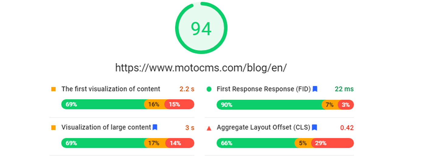
To check the speed and understand whether you have problems with page speed, try a free PageSpeed Insights tool. To achieve a fast and stable site, you need to pay attention to the technical base:
- provide lazy loading;
- optimize images;
- enable gzip compression;
- check the code;
- enable browser caching;
- make sure you need all the plugins set on your website;
- minimize HTTP requests;
- choose reliable hosting.
Therefore, the page speed optimization should be at the highest possible level – it is not enough just to create a website and put it into the ocean of the Internet as it can simply be inaccessible until it becomes noticeable. One minute of disconnection from a third-party server can be expensive, and part of the audience can leave the site forever.
If you do not fully understand how to boost your website page speed and why you might need it, you can check out our guide.
2. Follow Trendy Design
The Internet community has set the trend of minimalism, aesthetics, and, as always, something beautiful. If it was not without a pile of information during the initial creation of sites due to limited resources and capabilities, now it is not difficult to structure the site and give it a pleasant look.
It’s considered one of the key concepts of user experience on website as visitors often leave the site with poor web design even if there is quality content. As it may be challenging to follow the main design principles(like balance, contrast, emphasis, rhythm, and unity) and design elements(lines, shapes, texture, colors), there are ready-made solutions. Website templates from MotoCMS include all the modern and functional features required in 2021.
3. Check Website Navigation
Site owners try to be original to grab more users’ attention, and that’s where they make mistakes. Being eccentric in real life means being modern and bold. However, on the web, it rarely works the same. Your task is to direct the seeker to what he is looking for. Moreover, this feature should be in harmony with the design to pave the path to essential information or services.
Besides using the search field to find something specific, for a good user experience on website you can:
- follow ideal website hierarchy with convenient pages, sub-pages, website parts, and blocks;
- use keywords so that a visitor will get the key points even while scrolling. Besides a good user experience on website and satisfied users, you’ll reduce the bounce rate and improve your SEO rankings;
- split the available data into categories to simplify the process of navigating. In addition, the user may also be interested in something else in the same category so that this feature can be helpful;
- use internal links to make users go to other pages with products/services.
4. Avoid Loud Sounds and Intrusive Pop-Ups
Each time we open a new site in search of something, we are faced with a separate ecosystem, structure, and design. Starting an acquaintance, you can expect everything, but not sharp sound signals or music in the background. Moreover, sometimes it happens so suddenly that you flinch reflexively from the sound in the speakers.
The primary advice is that if your site can do without it, you do not need to add any sounds. Perhaps for a music store website, this is appropriate, but for a common user experience on website, it may be an unpleasant surprise leading to a negative aftertaste.
It is also not recommended to use sounds when clicking on anything on the site. A monotonous and frequent sound can quickly become annoying. On the one hand, you can turn off the sound on the tab, but the user will not expect to be asked for such action when searching for information, which again can discourage him from visiting the web page.
Another point that can negatively affect your site’s visit and performance is pop-ups that have always been a controversial form of visitor attraction. Sometimes these are hidden clouds at the bottom of the screen, and sometimes they take or obscure the entire page with an offer to buy something. To prevent it from happening, you need to understand why and how this element can help you.
Tip: you can learn more about what is pop-up and how to use it successfully in our blog post.
5. Site Colours Like a Magazine Cover
There are tones of colors all around that you can mix as you wish. Sometimes this seductive freedom plays a cruel joke with the site owners. Wrong color combinations can hurt the best layouts. Those who know the rules of color theory, in most cases they are professional designers, do not make such mistakes. However, when a beginner starts experimenting with tones and shades, it leads to failure. To prevent or cure this, you can follow the recommendations of a color combination guide that works well for any design.
Also, it’s necessary to note that some colors can evoke particular emotions, and not every color fits this or that business category. For example, there is a group of medical website colors that can impact users’ reactions.
Some Bad Examples Of Color Combinations
- Green background with green, white, or yellow design elements;
- Light web pages background blended with faint objects;
- Too many vivid tones;
- Black website background with multicolored text.
All in all, bad color schemes cause poor readability of text, misperceptions of color psychology, ineffective calls to action, and a frustrating look for the entire website. Please note that you can choose from perfect color schemes in MotoCMS templates according to your preferences.
6. Focus on Clients
Why are you visiting certain sites? Probably because you think they have some good stuff to offer you … not because they are so cool. Even the popular Facebook and Amazon are popular just because you can buy something or find old friends there. The value of these sites is your personal gain.
If your site is client-oriented, it should attract and satisfy the needs of the client. The way of communication should be friendly or businesslike, depending on the field of activity. But the thinking should be purely commercial because this is marketing. Your site needs to lure, retain and satisfy the customer’s needs. In this case, user experience on website is what you should understand.
If your site is not related to commerce, but carries, for example, information flows, then there should also be a customer orientation or, in this case, a reader. A clear structure and orientation with competent management will bring results in any case.
7. Don’t Forget About Contact Details
The main aim of all websites is to get users interested in what they are offering. It is true, but site owners forget to go further and provide actual contact information. Thus even the most interested and engaged clients don’t know how to make a deal which is the main reason for bad user experience on website.
Years of practice prove that quite often people want to communicate with a dealer, a seller, or a service provider before making a purchase. It can be a trust test or a need to solve presale issues. Because of this, you need to provide several ways to contact you. That can be a contact form in the footer or on a separate contacts page, links to social media accounts, a phone number, or a physical address. Choose what you think will work best for your auditory.
8. Consider Use of a CAPTCHA
How many sites do you think need a CAPTCHA? It’s hard to be right on this point because no one likes it. Back in 2000, when this user identification procedure was invented, it worked well and was popular for quite a long time since there were practically no analogs. Several software solutions and algorithms were developed that made it easy to crack CAPTCHAs and get access automatically and in large volumes. Such a protection solution was effective, but the problem is that bots have evolved, but CAPTCHAs have not.
In most cases, CAPTCHAs are hard to read, and it takes several tries to decrypt them correctly. It is indeed annoying. Site visitors will happily leave a site “overprotected” with incomprehensible letters. Don’t let them do this!
To secure the site, you can use other means of protection, which will seem more presentable and show the user that you care about security. For example, you can get an SSL certificate that guarantees the reliability of your website.
9. Add Social Media Sharing Icons
The difficult question is whether or not to use social media icons on web pages. These buttons are not that important if there are no social networks, which can be unusual for the user.

Social networks have gained considerable popularity and have provided new fields for developing all spheres of activity. People willingly share the information they like there, evaluate it, and give feedback. If you have a website or blog, social media buttons will make this task much more accessible. You can create a Facebook, Instagram, or Twitter account with your company name, which will contain information and a link to your website. It is a standard part of an advertising campaign that requires enduring relevance, updating, and connection to the audience. Of course, for your site to be advertised by visitors with pleasure, the information on it must be exciting and valuable so that you should work on your social media brand building.
There are no hard and fast rules for how many social media sharing buttons you should use on a website. However, everyone agrees that they should be there. They will not take up much space and can harmoniously fit into a block with contacts or the website footer.
10. Get Rid of Broken URLs and Missing Pages
Sometimes it happens that the page is not available or its address is copied incorrectly. No one is immune from this kind of error, but if this happens, then you can take care of it based on your experience so that the user does not lose the desire to return after solving the problem:
- Check your website for the presence of broken links. You can use such free tools as Dead Link Checker or Free Broken Link Checker.
- After identifying missing pages, change broken links to relevant ones.
- Modern site owners can choose from super-attractive designs but still prefer to use the default constraints leading to the loss of customers. Therefore you should take care of creative 404 pages able to inspire visitors.
- You cannot predict every possible problem that could cause a site to crash. Still, you can also provide visitors with basic information about the issue.
Right now, you may be a step up to becoming a good seller or service provider. All you need is some patience and maybe a few tips to follow. Use this article as a guide to improve the user experience on website.


Leave a Reply